
A dark living room feels inviting when contrast, texture, and light keep it from becoming flat.
Moody Living Room Ideas can help you find that balance, whether you pair dark leather with pale walls or use velvet to deepen the seating area.
The roundup also shows how daylight and shadow shape a room, why lamps beside the sofa matter after dark, and how reflective surfaces can add dimension to a deep palette.
These practical combinations make it easier to create a rich atmosphere while keeping the room comfortable and readable.
1. Frame Pale Walls With Dark Beams and Leather
Credits: Instagram
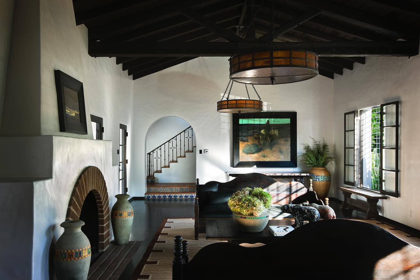
Dark beams and dark leather can create a moody living room while the walls stay pale. Here, the stained timber ceiling and sculptural sofa backs frame white plaster, making the daylight feel especially dramatic.
Amber drum pendants add warmth, and a light rug separates the seating from the dark floor. Borrow this contrast by repeating a deep brown or black finish at both ceiling and furniture level, then keeping the largest wall surfaces quiet.
If your ceiling is plain, use dark framed artwork and substantial wood furniture to establish the same rhythm. Choose a rug with a pale center so the seating area remains easy to read.
Let textured pottery and a restrained arrangement of greenery soften the strong outlines.
2. Let Daylight and Shadow Shape the Mood
Credits: Instagram
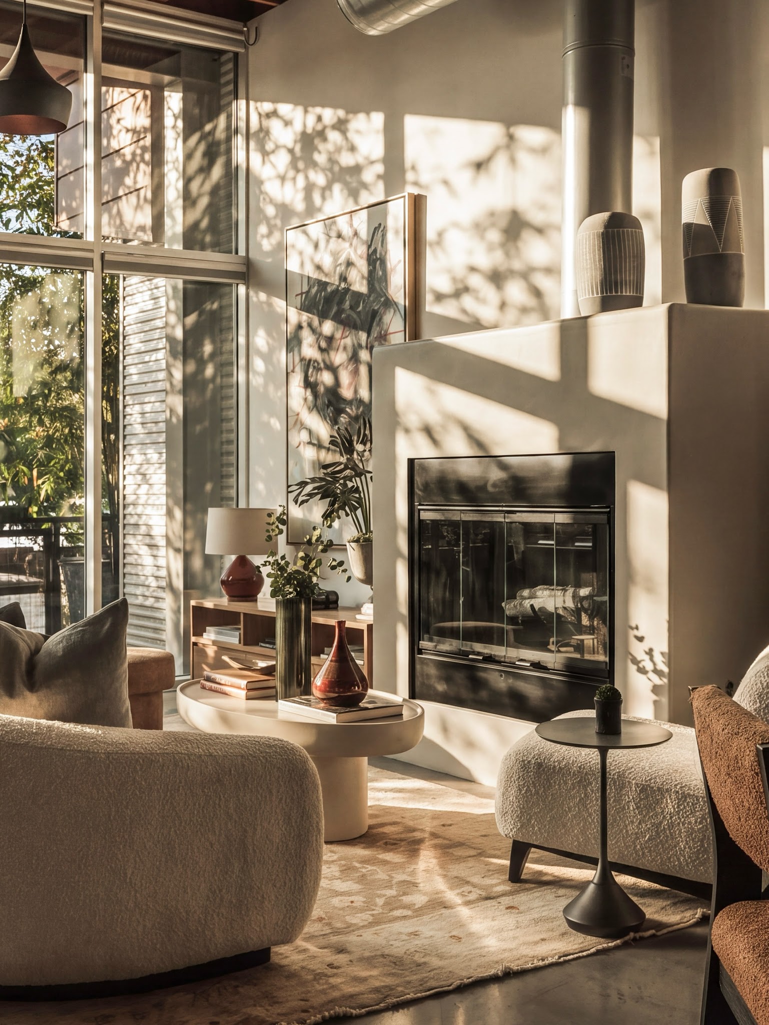
Directional daylight brings a moody atmosphere to this warm neutral living room. Here, tall windows cast strong bands of light across the fireplace, while leafy shadows add movement to the plain wall.
Let a few broad surfaces remain visible so these changing patterns have space to register. Before choosing a wall color, watch how sunlight travels through your room at different hours and compare samples in both the bright and shaded areas.
A black fireplace front and dark side table give the softer furnishings firm outlines. Reddish accents repeat warmth at a smaller scale.
Keep a lamp near the seating for times when daylight fades, then adjust its brightness to support reading or conversation within the room’s warm evening atmosphere.
3. Bring Depth With Dark Velvet Upholstery
Credits: Instagram
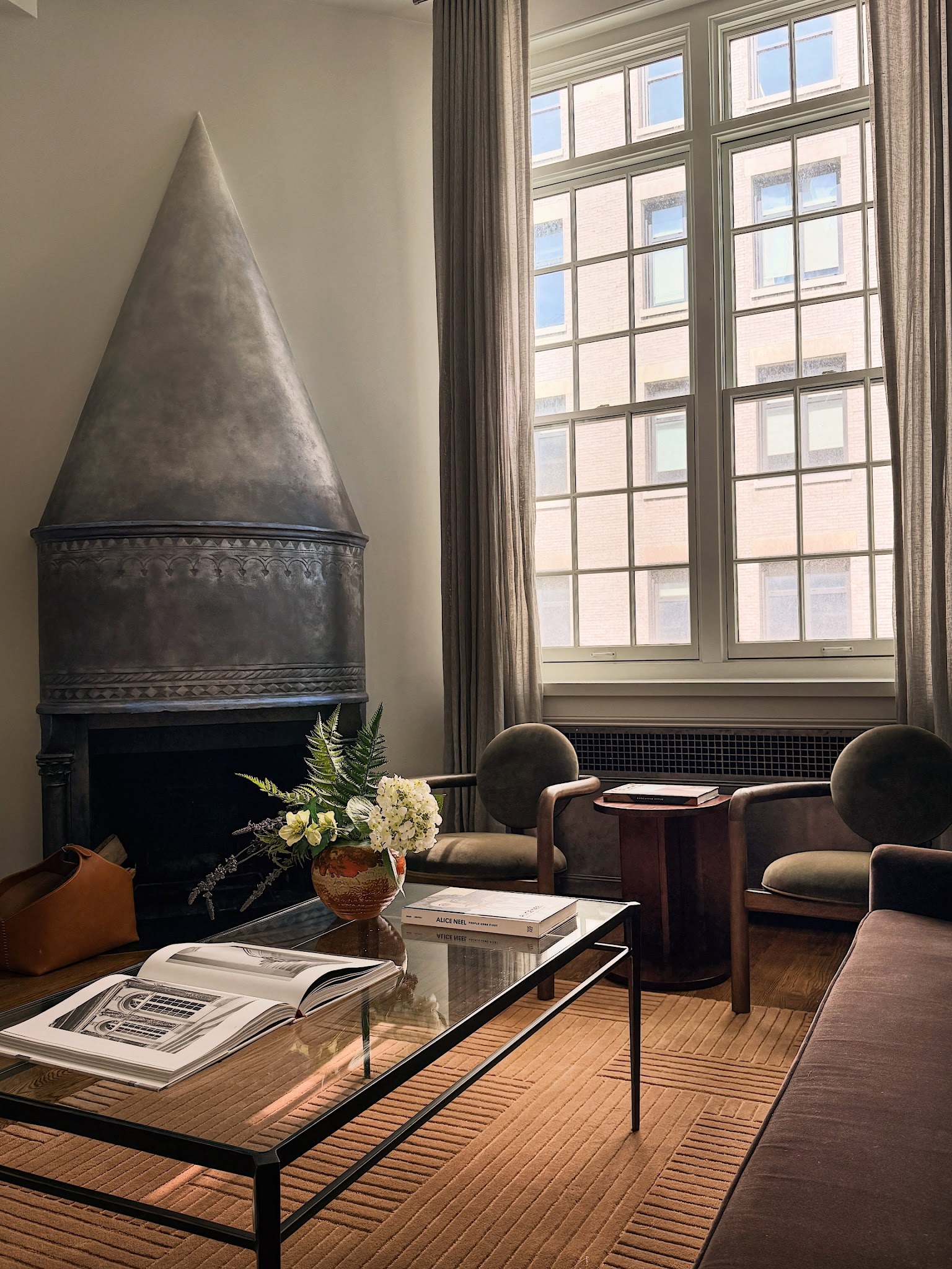
Dark velvet can create a moody seating area while the surrounding walls stay pale. Here, olive armchairs and a muted plum sofa gather the deepest colors around a long glass coffee table.
Their softly changing surfaces add interest without a busy pattern. Try combining two dark upholstery colors with similar muted intensity, then use a quieter rug to connect them.
Before committing, place fabric samples where the furniture will sit and compare how each looks from different angles. A clear tabletop keeps more of the rug visible between the larger upholstered pieces.
Limit cushions to a few complementary tones so the main fabrics remain the focus. Keep the lighter wall and curtain colors consistent to balance the concentrated color below.
4. Add a Reflective Surface to a Deep Color Palette
Credits: Instagram
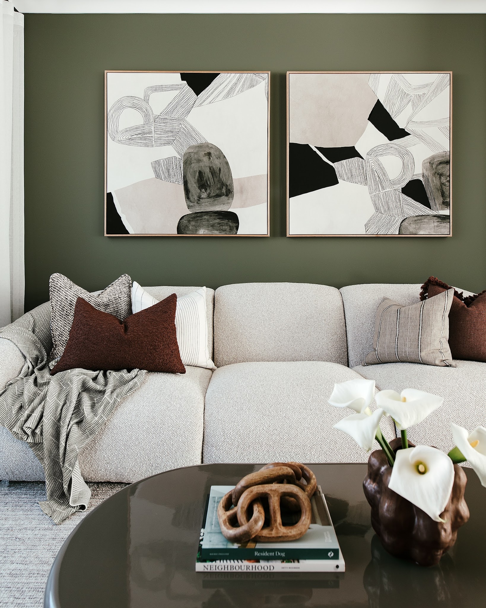
A reflective coffee table gives deep colors another surface to play across. Here, the dark rounded tabletop catches the shapes of nearby objects beneath an olive wall, while the pale textured sofa keeps the seating clearly defined.
Try pairing a smooth, glossy table with a quieter wall finish when a dark palette feels too uniform. Keep the tabletop arrangement compact so some reflective surface remains visible.
A few books and one sculptural object can be enough. Repeat the deeper tones in artwork or cushions to connect the table with the rest of the room.
Before choosing a finish, view it beside your upholstery in daylight and lamplight. Different textures can create depth even when the color range stays deliberately restrained.
5. Build Evening Mood With Lamps Beside the Sofa
Credits: Instagram
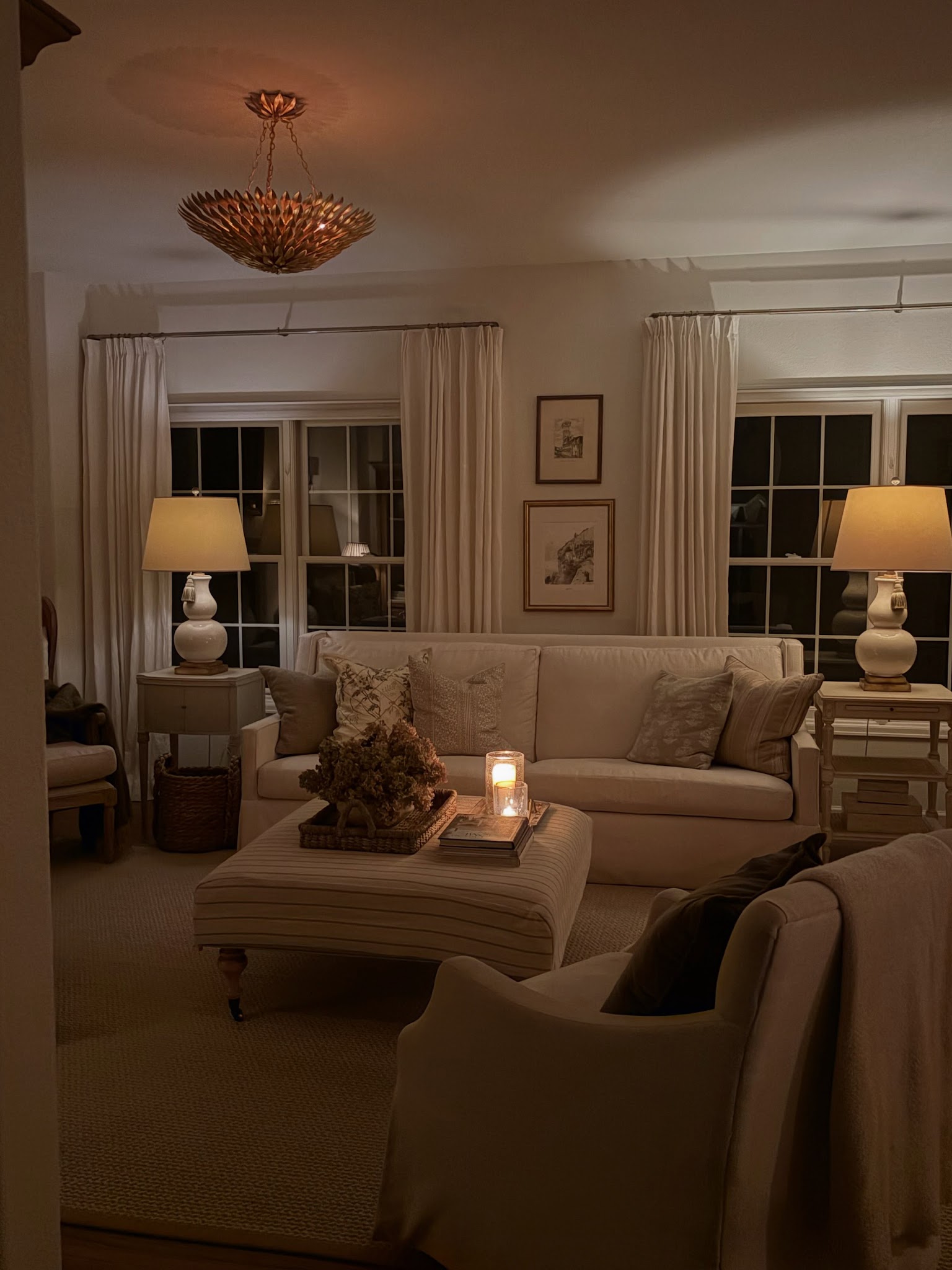
A pair of table lamps can bring a moody atmosphere to a pale living room after dark. Here, their warm pools of light frame the sofa while the windows and upper corners remain shadowed.
Place lamps near the seats you use most, then check the room from those sitting positions. The shades should soften the light without hiding useful surfaces in shadow.
Matching lamp shapes can create balance even when the side tables differ. Keep nearby upholstery and curtains light enough to reflect some of the glow.
Lighting the seating area at several points lets each lamp contribute a separate pool of warmth. Position each lamp to suit conversation or reading, while keeping the route through the room comfortably visible.
6. Let a Stone Wall Supply Texture and Pattern
Credits: Instagram
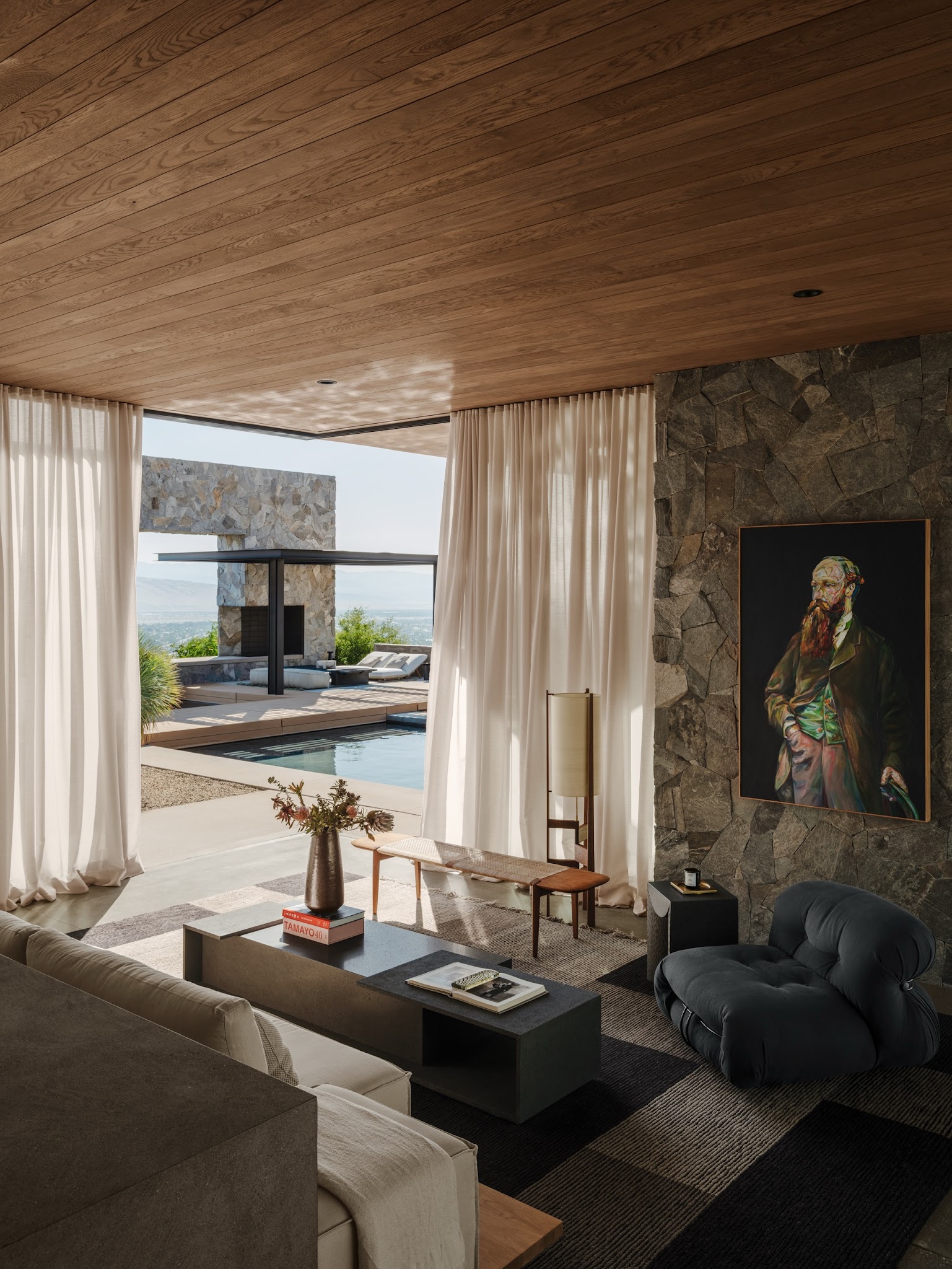
An irregular stone wall can provide the main pattern in a moody living room. Here, its dark pieces and uneven joints contrast with the long wood ceiling boards and simple rectangular coffee table.
The varied surface adds detail even where the room falls into shadow. If you already have stonework, give it space to remain visible instead of covering every section with shelves or small decorations.
Choose a few furnishings with clear outlines, then balance the harder surfaces with plain upholstery and soft, flowing curtains. One substantial artwork can sit comfortably against the texture when its frame stays simple.
Pull a darker tone from the stone into a chair or rug, helping the seating feel connected to its architectural backdrop.
7. Pair Dark Leather With Textured Chairs
Credits: Instagram
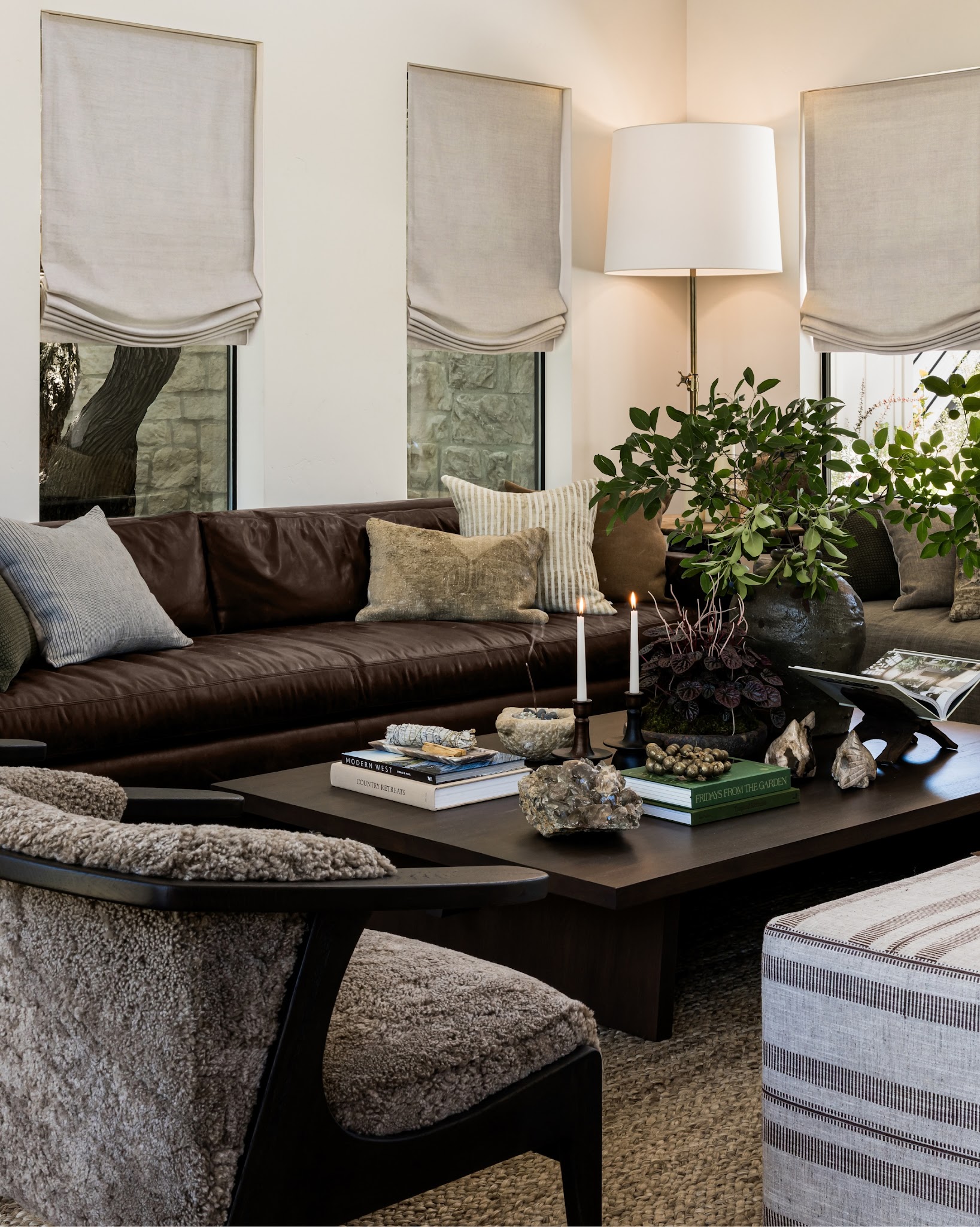
Smooth leather and nubby upholstery can give a dark seating group more depth. Here, the brown sofa’s broad cushions contrast with the textured armchair, while dark chair frames and a substantial coffee table hold the arrangement together.
Try a chair with a visibly uneven weave beside a smoother sofa, keeping both within a restrained range of browns and warm grays. Compare fabric samples against the leather before choosing, since similar colors can look different across surfaces.
Repeat the chair’s lighter tone in a pillow to connect the seats. A woven rug adds another texture beneath the furniture.
Keep some leather uncovered so its changing highlights remain visible, and use simple cushion shapes to let the material contrast do the work.
8. Keep a Side Table Within Reach
Credits: Instagram
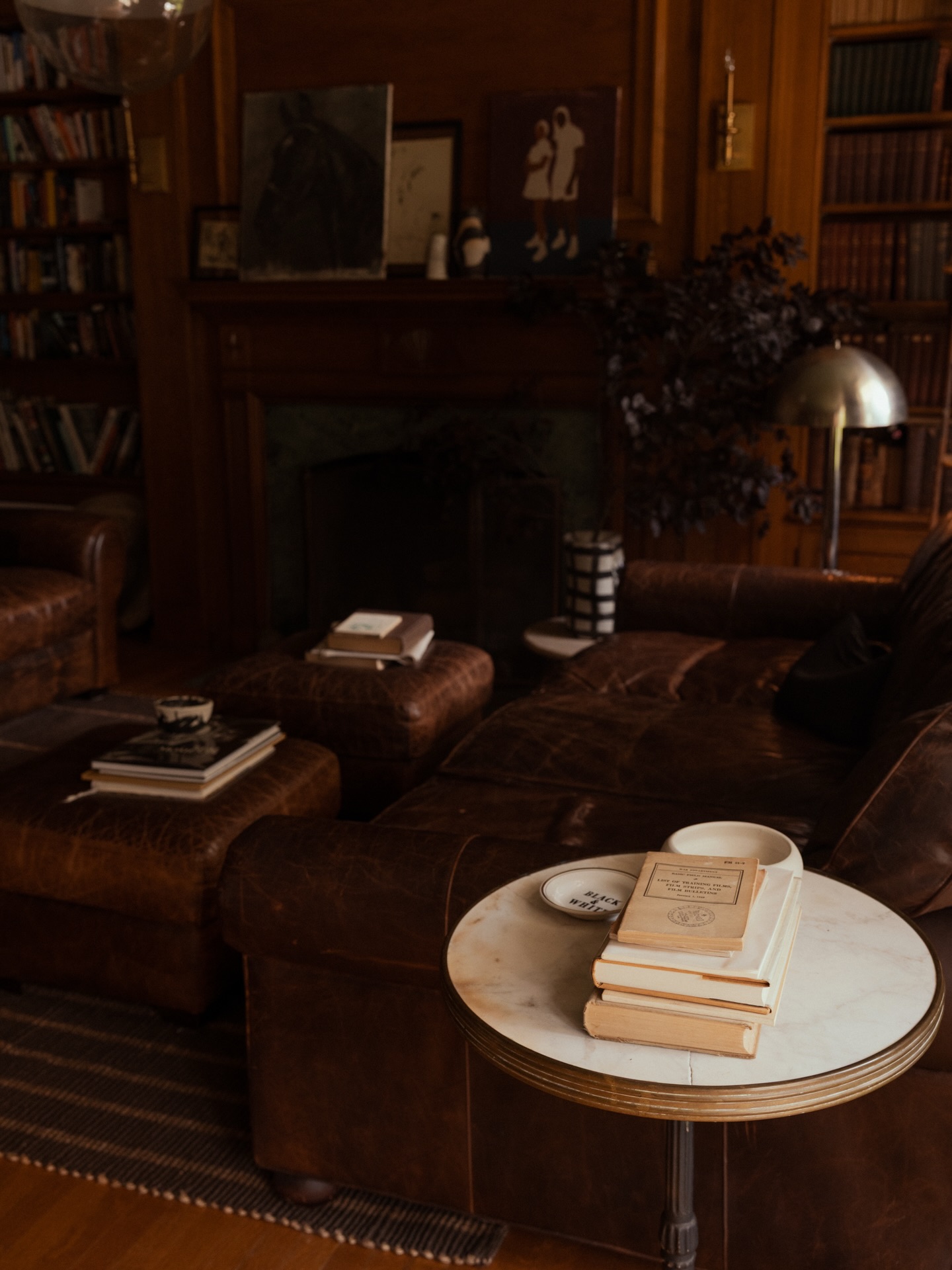
Deep seating feels more inviting when a useful surface is close at hand. In this dark library sitting room, a small round table sits beside the sofa, while low upholstered pieces hold books near the other seats.
The pale tabletop and cream book pages provide small points of contrast against the brown upholstery and wood walls.
Try placing a side table where you can reach it comfortably while seated, then leave enough uncovered space for a cup or an open book.
Keep the arrangement low so it does not hide the surrounding furniture. A few smaller surfaces can support different seats without requiring one oversized coffee table.
Repeat their warm tones, allowing the books and lighter tabletop to remain visible.
9. Group Round Ottomans in Front of the Sofa
Credits: Instagram
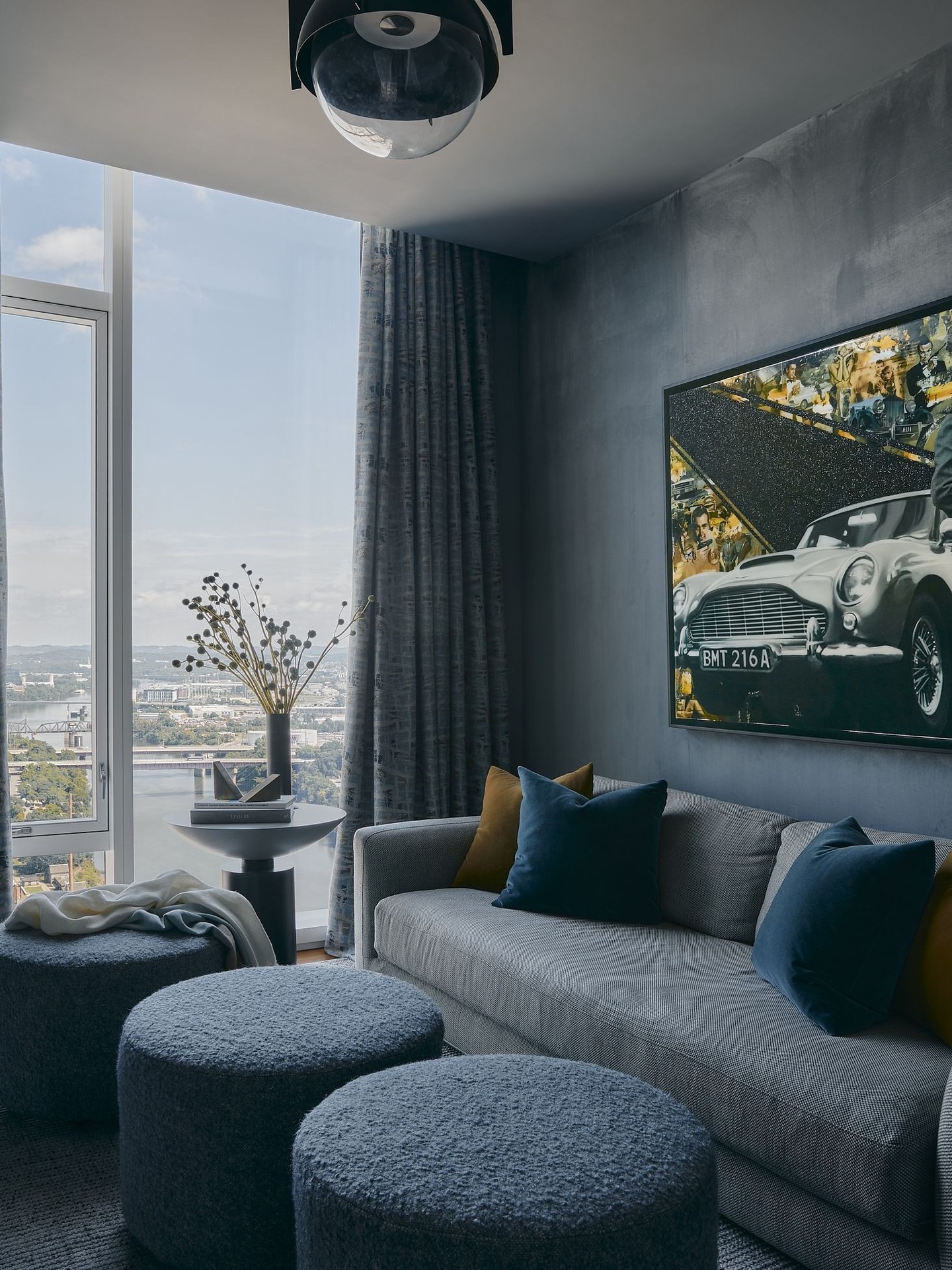
A group of round ottomans can give a moody seating area a softer center. Here, three blue upholstered pieces sit beside a gray sofa, repeating the dark cushions while contrasting with the straight window frames and rectangular artwork.
Their rounded outlines create a relaxed rhythm across the foreground. Try grouping smaller ottomans where individual footrests would be useful, then separate them when someone needs more space to move.
Choose a shared color and similar fabric so the group feels intentional. Leave enough room between the sofa and ottomans to sit down comfortably.
A pale throw across one piece breaks up the deep blue, while the nearby side table keeps books and other small objects off the soft surfaces when needed.
10. Display Record Covers on Pale Ledges
Credits: Instagram
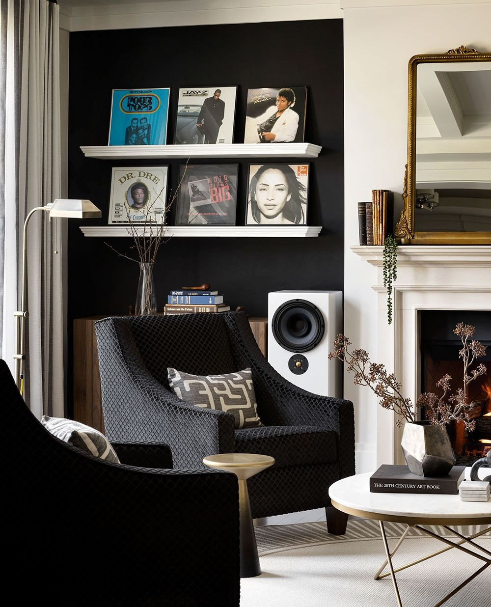
Pale picture ledges make a record collection stand out against a dark wall. In this listening corner, two white shelves hold framed album covers above the seating, turning favorite music into a personal display.
Their horizontal lines also connect with the nearby pale fireplace mantel. Try grouping covers in orderly rows while allowing their artwork to provide the color.
Keep some wall visible around the frames so the display feels deliberate rather than crowded. Repeat the darker backdrop in an armchair or another piece to connect the wall with the room.
A light rug and pale table then provide contrast near the floor. Choose covers you enjoy seeing every day, and rearrange the selection when the room needs a change.
11. Brighten Deep Green With Golden Branches
Credits: Instagram
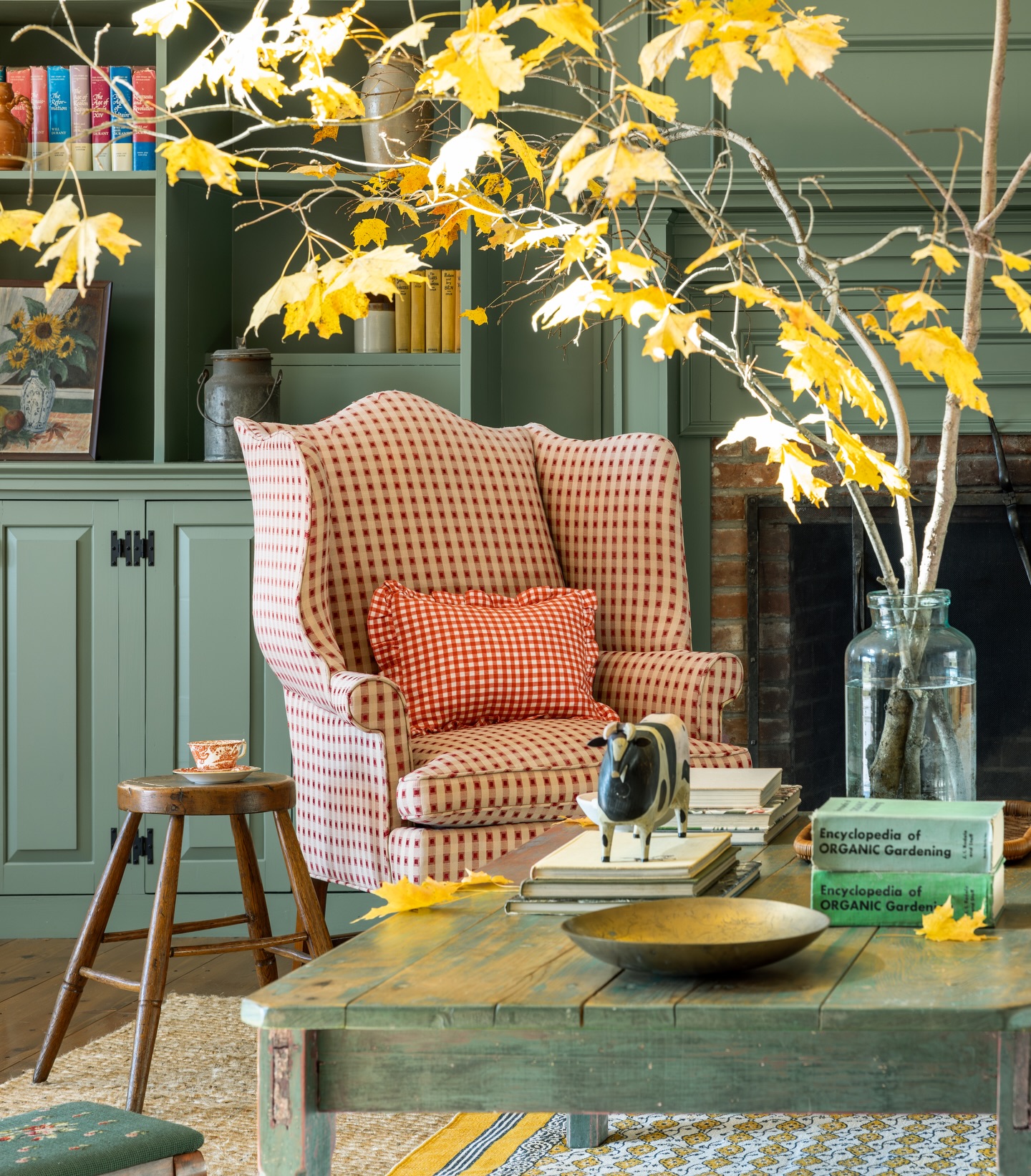
Golden branches show how a generous dose of bright color can lift a room with deep green walls.
Here, their loose silhouette spreads above a checked wing chair, while the green cabinetry and fireplace surround give the leaves a strong backdrop.
Try a few branching stems in a stable vase, choosing a spot where their height can be appreciated without interfering with a seat or walkway.
Keep gaps between the branches so the wall remains visible through them. One generous arrangement can carry the seasonal color, leaving smaller shelves available for books and familiar objects.
The clear glass vase also allows the stems to become part of the display. Replace the foliage as needed rather than adding more decorative pieces.
12. Layer Patterned Textiles Against Dark Timber
Credits: Instagram
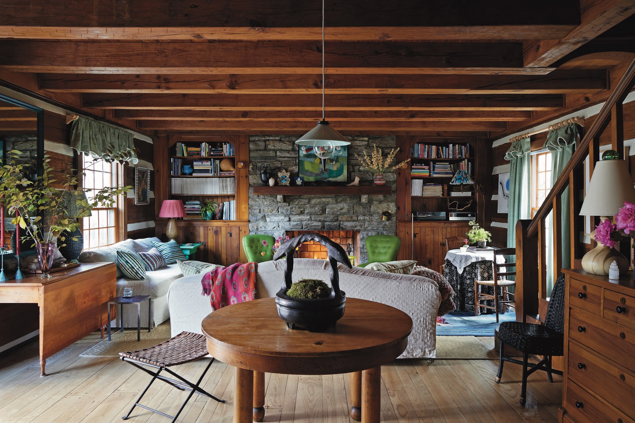
Colorful textiles can keep a dark timber room from feeling heavy. Here, striped pillows and a vivid pink throw stand out against pale sofas, while the wood ceiling and stone fireplace retain the room’s depth.
Start with a large, mostly plain upholstered piece, then combine a narrow stripe with a looser, larger motif. Repeating one color across the fabrics helps different patterns feel related.
Leave some upholstery exposed so the eye has a quieter place to rest. Try the fabrics together in the room’s daylight before adding more pieces; dark wood can make bright colors look especially strong.
A small change in pillows or throws can refresh the seating without covering the grain and texture that create its moody backdrop.
13. Blend Dark Curtains With the Window Wall
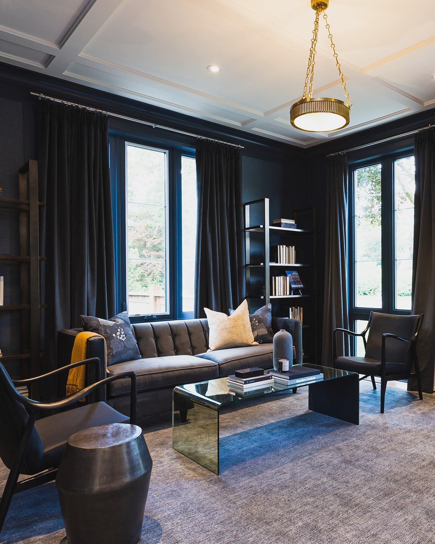
Credits: Instagram
Dark curtains can help a window wall feel continuous instead of dividing it into separate bands of color. Here, charcoal drapery sits beside deep blue walls and window trim, while the pale ceiling provides a clear boundary overhead.
Choose fabric samples alongside your wall color, looking for similar depth rather than an exact match. Open the curtains far enough to keep the glass clear when daylight is wanted.
A lighter rug and a few pale pillows can keep the seating readable against the darker background. The folds provide texture without introducing another busy pattern.
Before committing to fabric, check how it looks in both daylight and lamplight; neighboring dark shades can shift noticeably as the light in the room changes.
14. Overlap Nesting Tables at Different Heights
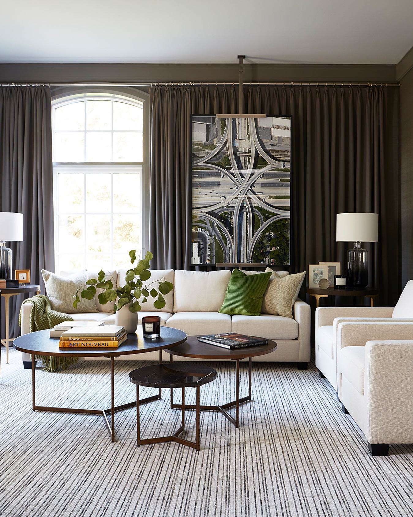
Credits: Instagram
Several small tables can make a dark living room feel less rigid than a single large block. Here, three round tables overlap at different heights, their slim bases leaving the striped rug visible underneath.
The dark tops relate to the curtains behind the white seating, keeping the center of the room connected to its deeper background.
Start by arranging the largest table near the sofa, then place smaller pieces where nearby chairs can reach them. Keep an open route around the group and check that each top remains stable.
A few books and one vase are enough to link the tables visually. Varying their heights creates interest while leaving room to easily rearrange the grouping as the seating is used.
15. Give Colorful Art a Charcoal Backdrop
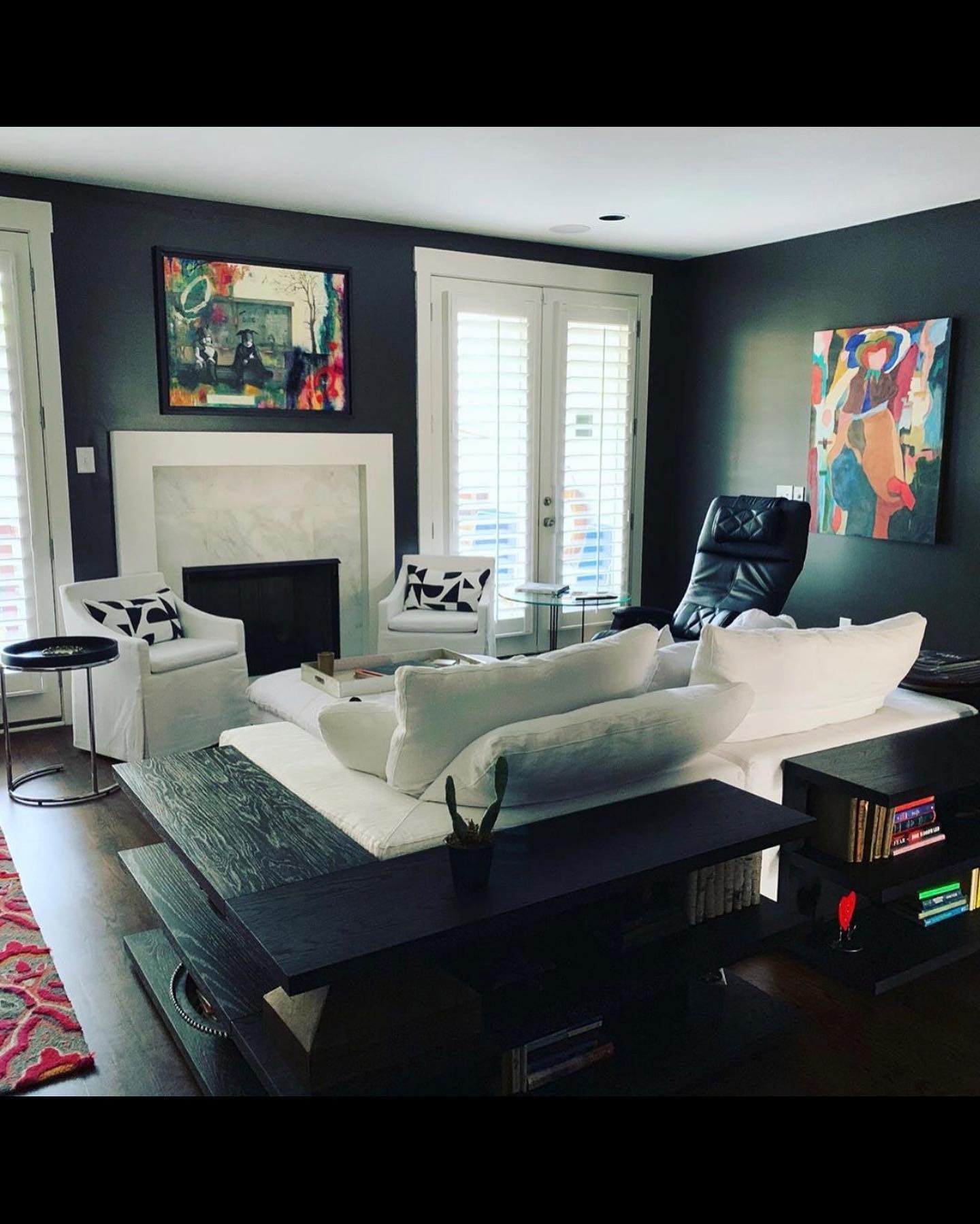
Credits: Instagram
Colorful artwork can bring energy to a dark room without filling every surface with accessories. Here, two bold pieces stand out against charcoal walls, while white seating and window trim create a quieter framework below and beside them.
Start with a painting you already enjoy, then test a darker wall sample behind its main colors. Leave clear space around the frame so its outline remains easy to see.
Keep nearby cushions mostly neutral or use a simple graphic pattern, as this room does, to avoid competing with the art. A large pale sofa also gives saturated colors room to stand out.
Check the arrangement from the seats as well as the doorway before deciding whether the wall needs another piece.
16. Anchor Busy Upholstery With Wide Rug Stripes
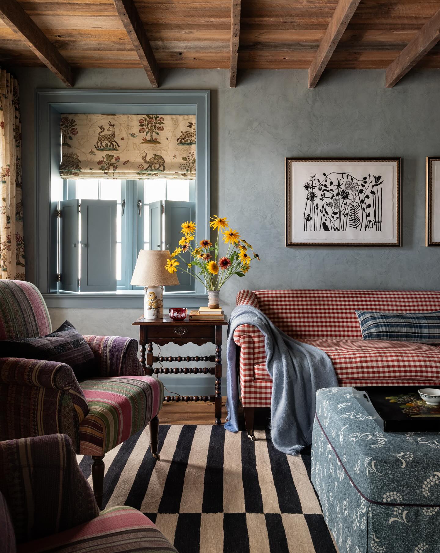
Credits: Instagram
A bold striped rug can give a room full of patterned upholstery a clear visual base. Here, broad black and cream bands run beneath a red checked sofa, striped armchairs and a blue floral ottoman.
The rug uses fewer, larger shapes than the fabrics above it, so each pattern remains easy to read. Try a simple stripe when several seats already carry detailed prints.
Keep enough of the rug exposed between furniture for its rhythm to show. Repeating black in framed artwork helps connect the floor to the wall without adding another color.
Muted blue walls provide a quieter backdrop for the mix. Check fabric and rug samples together before buying, paying attention to pattern size as well as color.
17. Lighten Dark Cabinetry With Fabric Panels
Credits: Instagram
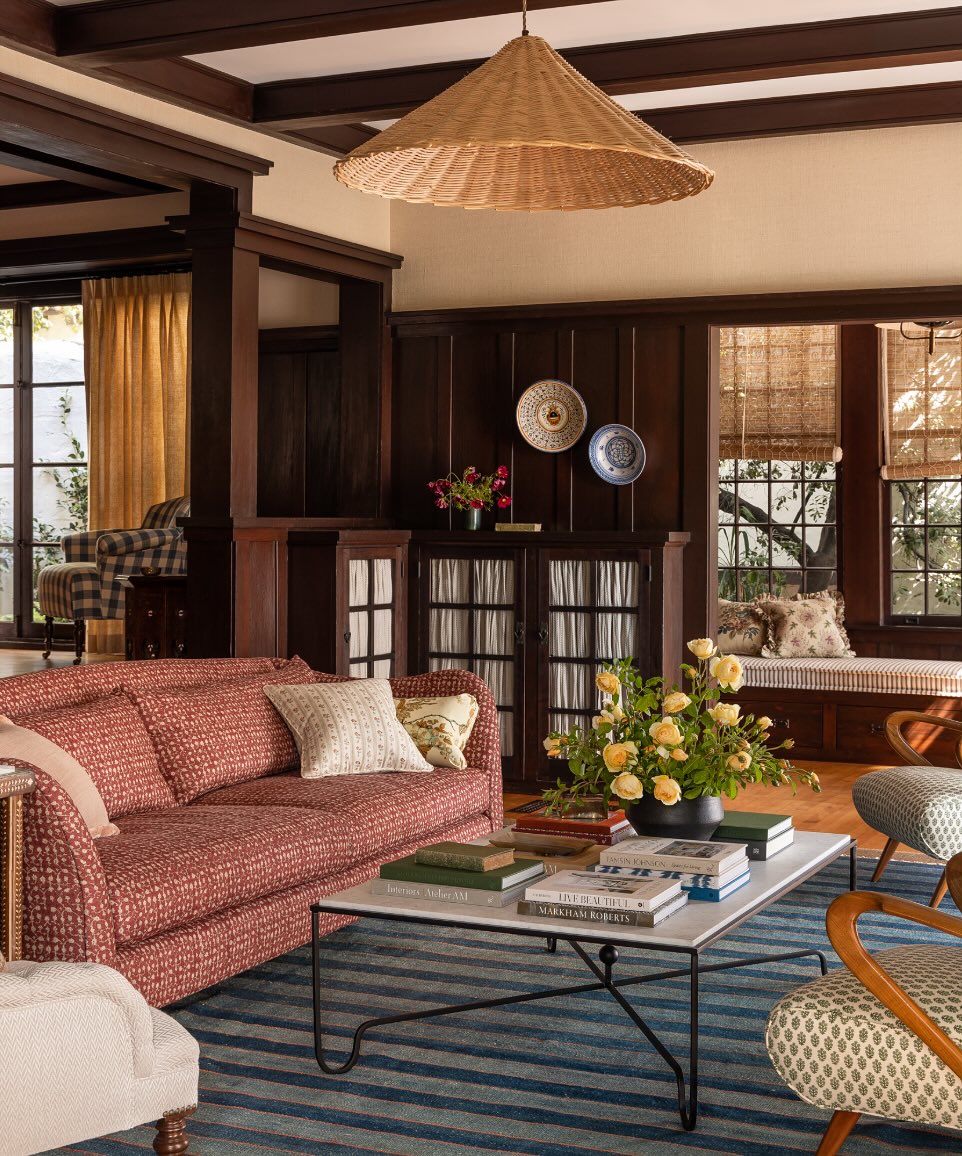
Pale fabric panels can soften dark cabinetry while keeping stored items out of sight. In this room, gathered fabric sits behind the divided cabinet doors beneath the wood paneling.
Its small folds introduce a lighter, softer surface without covering the surrounding joinery. Consider this treatment when glass doors reveal too many competing objects or everyday supplies.
Choose a simple fabric that relates to the ceiling or other light accents, and test its opacity against the contents before committing. Keep the cabinet top restrained so the doors remain part of the room’s architecture.
Here, two decorative plates and a small vase provide just enough detail above. The result combines the useful concealment of closed storage with the character of framed doors.
18. Link Different Seats With One Repeated Color
Credits: Instagram
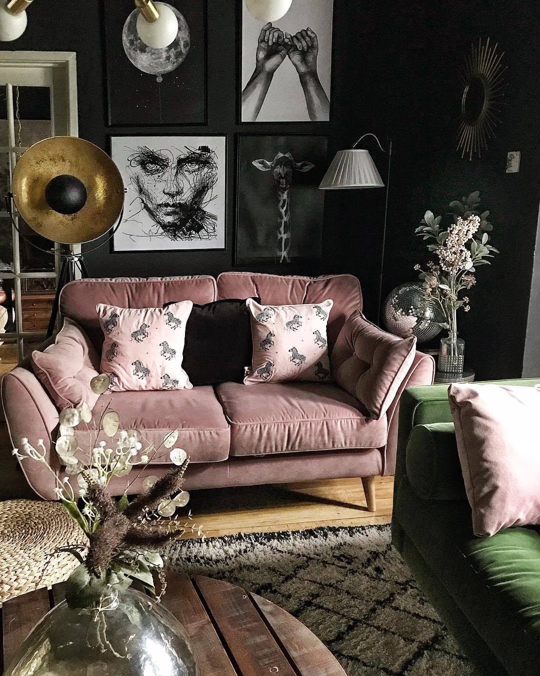
A repeated pillow color can connect seats that have very different upholstery. In this room, pale pink cushions pick up the pink sofa and reappear against the green seat in the foreground.
The shared color helps the pieces feel related, while dark walls and black accents give the arrangement depth. Choose one shade already present in your larger furniture, then carry a softer version onto a neighboring chair or sofa.
The fabrics do not have to match exactly; keep their undertones close and vary the pattern or texture. Leave some of each seat’s original upholstery visible so the contrast remains part of the room.
A restrained pillow palette can bring order to a space with several artworks and decorative objects.
19. Repeat Gold Tones Against Deep Blue Walls
Credits: Instagram
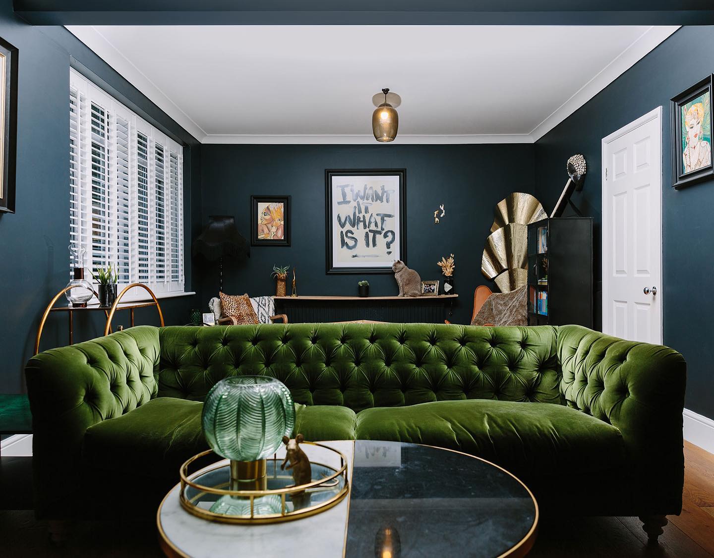
Gold tones stand out beautifully against deep blue walls without requiring another large block of color. Here, a round tray, curved cart frame and sculptural fan-shaped accent repeat that same warm finish around a green tufted sofa.
The repetition connects the foreground coffee table to the back of the room, making separate objects feel considered together. Start with one piece you already own, then echo its tone in two smaller details at different heights.
Keep their shapes varied so the room does not resemble a matching furniture set. Dark picture frames let the warmer accents remain prominent.
A white ceiling and shutters provide a crisp contrast, while the blue backdrop keeps the scattered metallic touches from overwhelming the seating area.
20. Paint Built-Ins to Match the Walls
Credits: Instagram
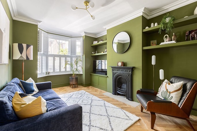
Matching the shelves and cupboards to the olive walls makes this compact snug feel like one continuous space. The built-ins sit quietly around the black fireplace, while a few pale ceramics and trailing leaves remain easy to see.
This approach is useful when storage occupies much of a small room: contrasting cabinet fronts would divide the walls into more pieces.
Keep the ceiling and cornice light if you want a clear upper edge, then repeat a darker tone in the seating. Here, the blue sofa and black chair deepen the palette without requiring another painted surface.
A pale patterned rug opens up the center, and the visible timber floor adds warmth beneath the green. Leave shelf space empty for balance.