
A room can feel colorful without every surface competing for attention; the trick is giving one shade the lead and letting the others support it.
These Living Room Color Combination Ideas show how blush pink can soften deep green, powder blue can take a cheerful turn with yellow, and cream can balance chocolate brown and black.
The examples also offer practical ways to connect colors, from repeating a shade in cushions or artwork to using pale walls and ivory accents to ease stronger contrasts.
Each palette makes it easier to picture a room that feels lively yet balanced.
1. Pair Blush Pink with Deep Green and Cream
Credits: Instagram
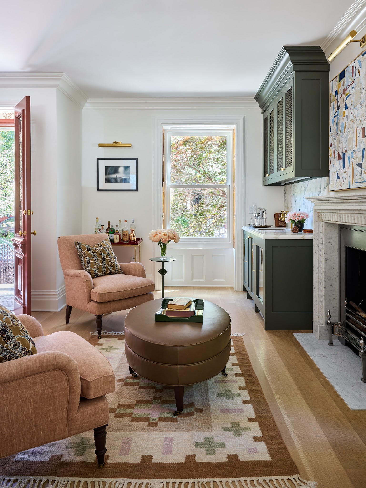
Blush chairs soften the deep green cabinetry in this compact sitting room, while creamy walls leave the combination feeling light. A brown ottoman provides a useful middle tone between the delicate upholstery and darker storage.
The patterned rug quietly repeats soft pink and green, so the colors connect without matching every surface. To borrow this palette, reserve the darkest shade for one substantial feature, such as a cabinet or fireplace wall.
Choose a muted pink that looks comfortable beside your existing floor. Small green objects can carry the cabinet color across the room; here, a tray does that job.
Keep larger wall areas pale, then introduce pattern through a rug or cushions that contain both colors in smaller, softer amounts.
2. Warm Peach Walls with Cream and Nearly Black Accents
Credits: Instagram
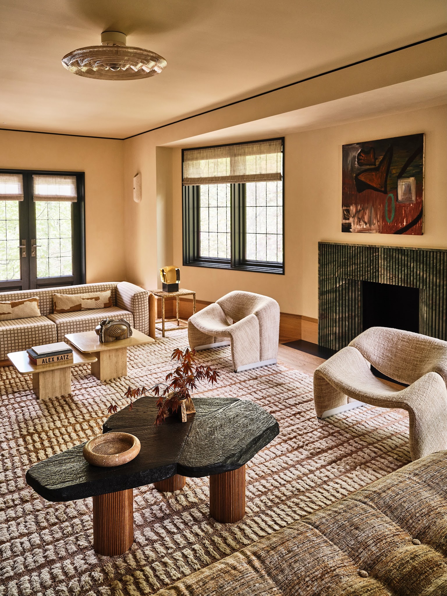
Warm peach walls surround cream seating in this living room, creating a soft backdrop for the darker window frames and coffee table. Those dark outlines stop the pale palette from feeling indistinct.
The fireplace adds a deep green note, while the rug repeats brown and cream in a raised geometric pattern. Start with a gentle peach rather than a bright orange if you want this quiet effect.
Test it beside upholstery, especially where daylight changes across the room. Repeat your darkest color in several separated places to give the composition structure.
Here, the windows, table, and thin ceiling border work together. Rounded chairs and textured fabric keep the contrast comfortable, while the limited palette allows their shapes to stand out.
3. Freshen Powder Blue with Yellow and Soft Green
Credits: Instagram
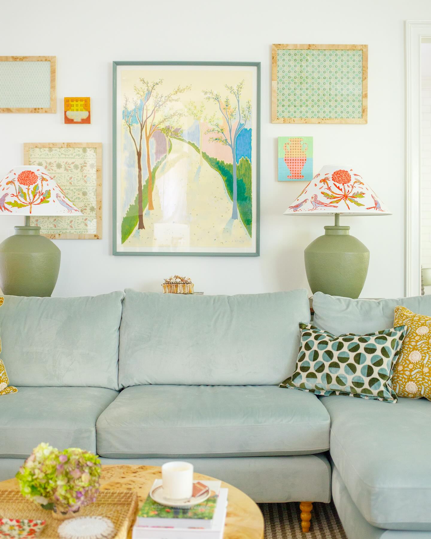
A powder blue sectional sets a relaxed tone, while yellow cushions and soft green lamps give this living room its cheerful lift. The large painting gathers those shades together, making the smaller accessories feel connected to the sofa.
White walls provide space around the colorful display. Try choosing artwork first when you like several pastel colors but struggle to combine them.
Pull one shade into the main upholstery, a second into paired lamps, and a warmer accent into cushions. Keep the patterns different in scale: the small yellow print here sits comfortably beside larger green circles.
A pale wooden table adds warmth beneath the cool seating. Leave some cushions plain so the fabric color still reads clearly across the room.
4. Ground Cream with Chocolate Brown and Black
Credits: Instagram
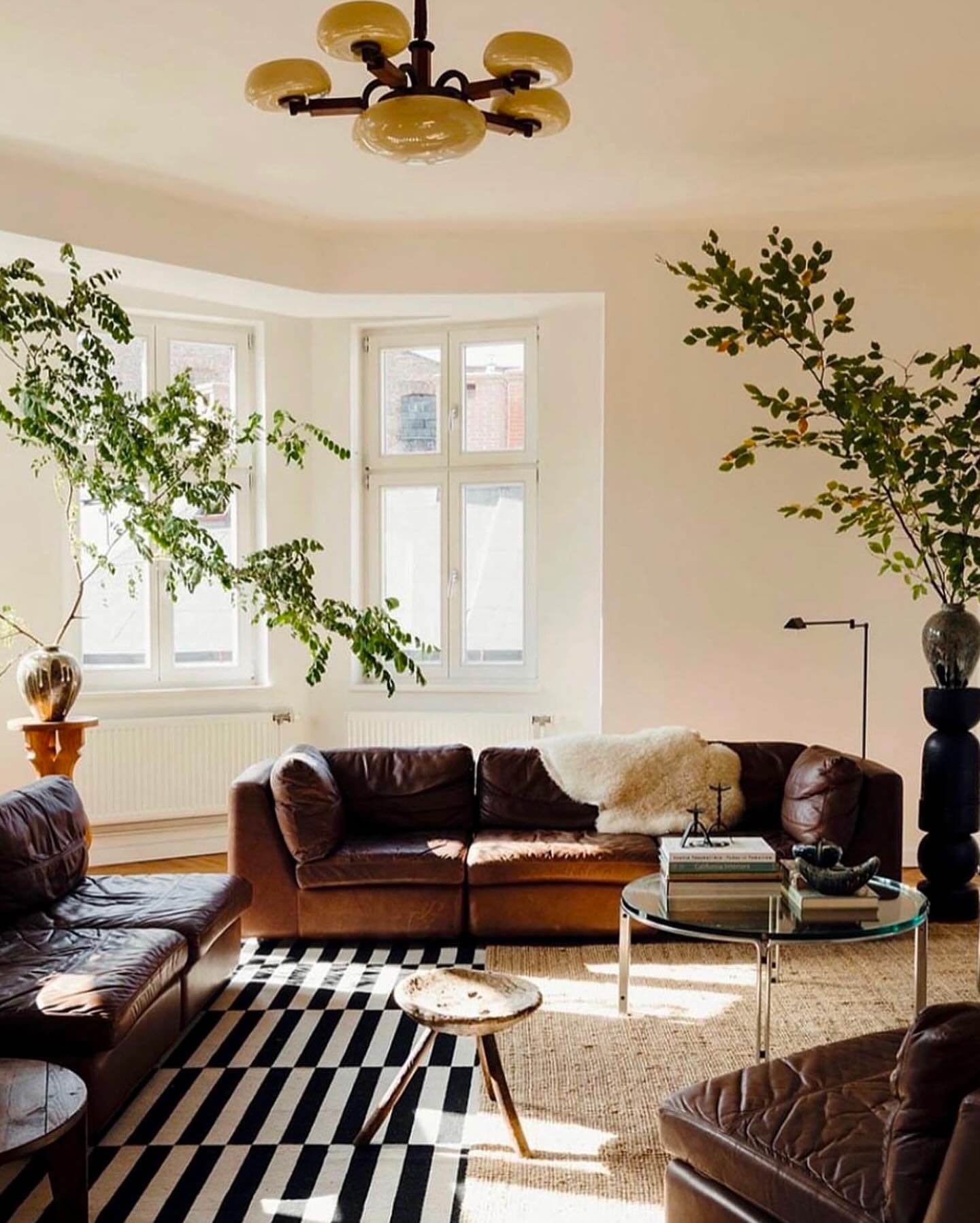
Chocolate brown seating gives this bright room weight, while cream walls and a pale floor covering keep the overall effect open. Black appears in the graphic rug, slender lamp, and sculptural pedestal, joining the softer brown with a sharper accent.
Large leafy branches break up the neutral palette without requiring another upholstered color. If you already own brown seating, try introducing black through a rug or lighting before replacing major furniture.
Choose a cream with warmth so it sits comfortably beside the brown. Vary texture between smooth upholstery, a nubby throw, and the woven floor covering.
The glass table keeps the center visually light. Repeat the darkest tone above floor level so the graphic rug feels connected to the room.
5. Combine Kelly Green, Cornflower Blue, and Pink
Credits: Instagram
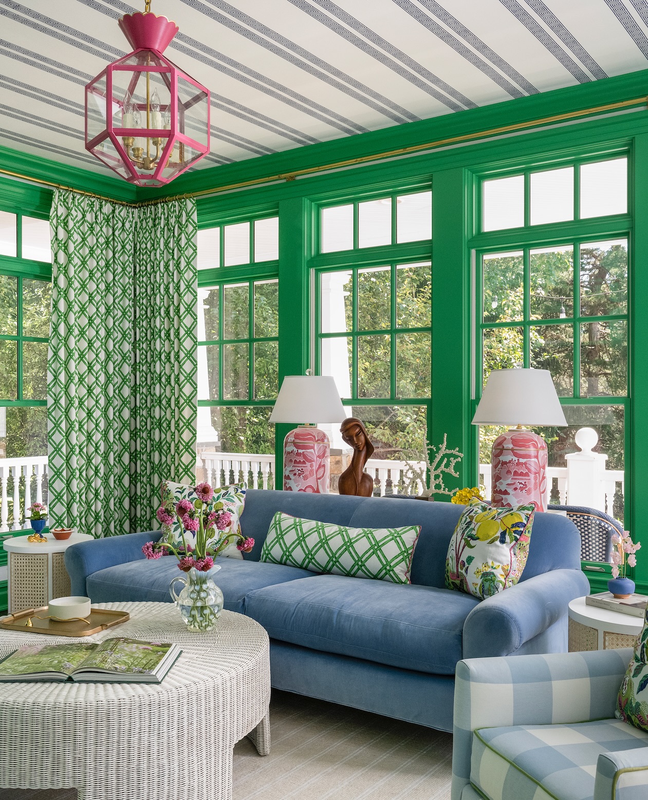
Kelly green window frames make a vivid backdrop for the cornflower blue sofa in this sunroom. Pink lamps and a pink pendant add a warm counterpoint, while white tables, lampshades, and ceiling space prevent the combination from becoming overwhelming.
The green lattice pattern repeats on both curtains and a cushion, connecting architecture with upholstery. For a similar palette, choose one clear green and use it consistently on trim or a substantial furnishing.
Let blue occupy the broadest seating surface, then keep pink to smaller pieces. Patterns can mix successfully when their background colors agree.
Here, generous amounts of white link stripes, checks, and floral prints. Test the three main shades together in daylight before committing to curtains or larger furniture.
6. Soften Blue Gray and Charcoal with Ivory
Credits: Instagram
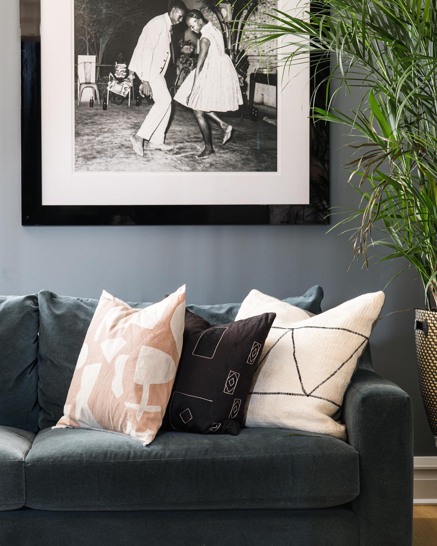
Blue gray walls sit close in tone to the dark sofa, making this living room corner feel cohesive and calm. Ivory cushions create clear breaks across the upholstery, while black details in the artwork and cushion patterns sharpen the arrangement.
A pale blush pillow adds a small amount of warmth without changing the quiet character. This is a useful combination when you prefer subtle color to strong contrasts.
Compare your wall sample directly with the sofa, because similar shades can have different undertones. Choose light cushions with varied patterns rather than several unrelated accent colors.
The broad white border around the photograph echoes those cushions above eye level. A tall plant brings movement and a fresh green accent beside them.
7. Enrich Grass Green with Mustard and Navy
Credits: Instagram
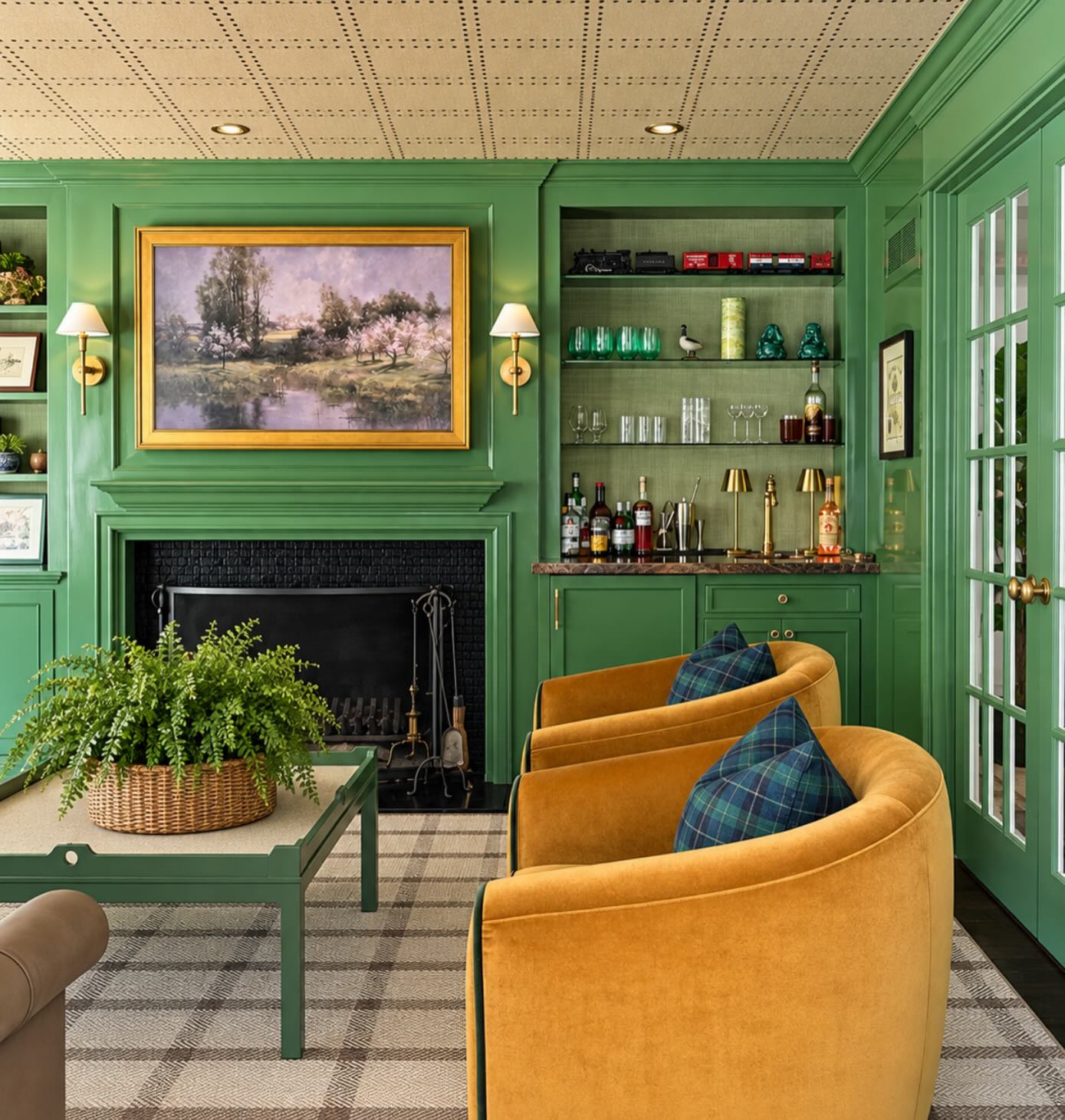
Grass green walls, shelving, and doors create an enveloping setting for two mustard chairs. Navy plaid cushions bring a cooler accent onto the warm upholstery, while the pale checked rug gives the room a quieter foundation.
Repeating green on the coffee table connects the furniture to the architecture. You can adapt this combination without covering every wall: begin with green cabinetry, mustard seating, and one navy textile.
Keep the yellow earthy so it complements the green rather than competing with it. Small golden details in the picture frame and lighting reinforce that warmth.
The pale ceiling helps the saturated walls feel less heavy. Display a restrained selection of objects on open shelves so the surrounding color remains easy to appreciate.
8. Wake Up Gray and White with Bright Red
Credits: Instagram
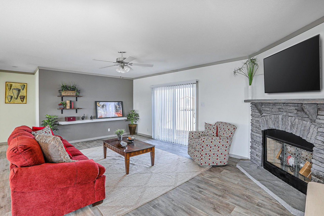
A bright red sofa gives this gray living room a clear focal point. The gray accent wall, fireplace surround, and floor create a consistent background, while white walls and blinds keep the space bright.
Red details in the patterned chair repeat the sofa color at a smaller scale. This approach works well when existing gray finishes are staying.
Introduce one substantial red piece, then choose a second textile that combines red with the room's neutrals. Avoid scattering equally bold accessories everywhere; the sofa already supplies plenty of energy.
A pale rug defines the conversation area and reduces competition from the floor pattern. The warm brown coffee table adds another quiet contrast, keeping the scheme from feeling entirely cool and flat.
9. Give Yellow Walls a Blue and White Foundation
Credits: Instagram
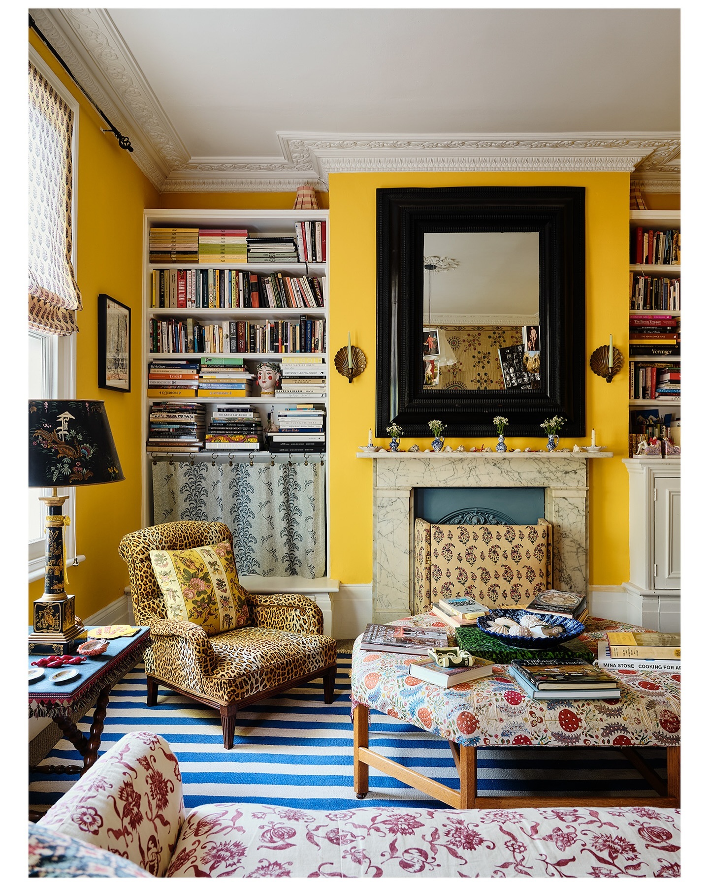
Golden yellow walls bring warmth to this sitting room, while the blue and white striped rug supplies a crisp, cooler foundation. White shelves and ceiling details separate the saturated walls from the room's many patterns.
A large black mirror gives the fireplace a strong outline. Borrow the color balance before attempting the full mix of prints.
Start with yellow walls, a blue rug, and substantial white trim; then introduce one patterned chair or ottoman. Repeating blue in smaller objects helps the floor color travel upward.
The yellow ground of the chair fabric connects it to the walls without requiring a plain matching seat. Keep the largest patterns at different scales so they remain distinguishable when you view the room together.
10. Set Navy Seating Against Sage and Tan
Credits: Instagram
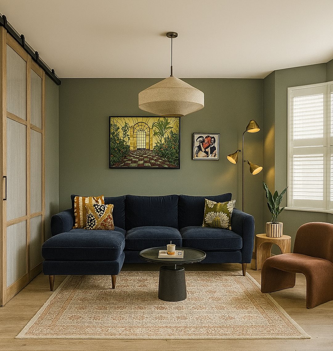
A navy chaise sofa stands out against sage green walls in this compact living room. Tan enters through the rounded chair and wooden door frames, warming a palette that might otherwise feel cool.
The pale rug and ceiling give the darker furnishings breathing room. To recreate the balance, choose a muted green for the largest wall area and reserve navy for the main seat.
Repeat the warmer tone in a side table, lamp, or cushion rather than adding another major color. The patterned cushions here contain earthy greens and yellows that bridge the scheme.
A small dark coffee table keeps the center simple. Leave a visible margin of floor around the rug to make the seating group feel comfortably contained.
11. Layer Slate Blue, Citron, and Burgundy
Credits: Instagram
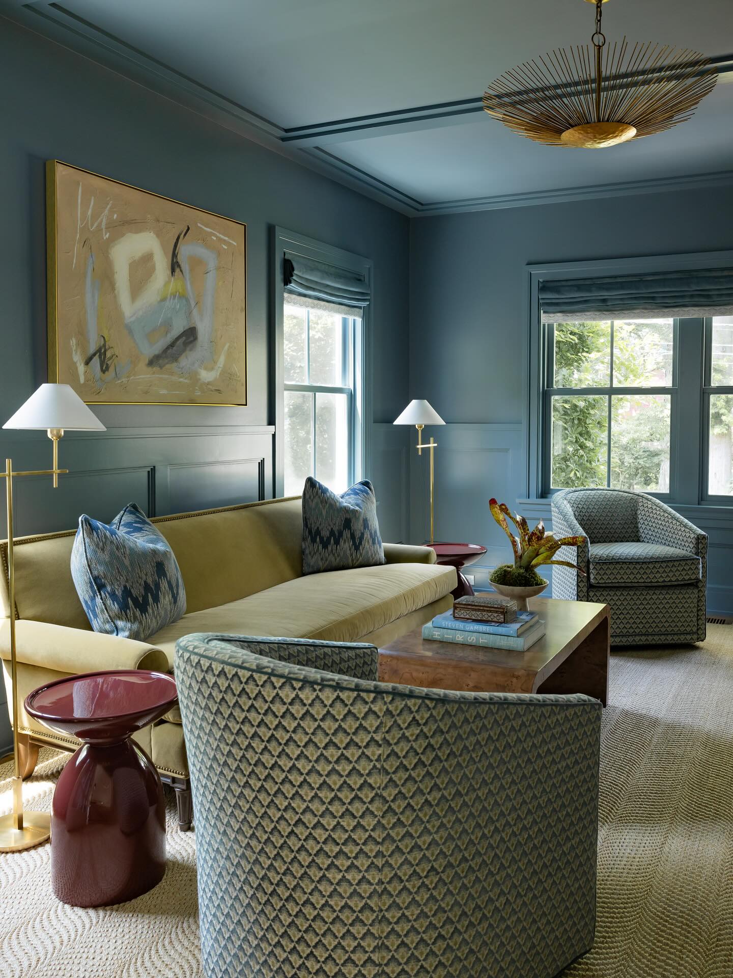
Slate blue walls and ceiling create a continuous backdrop for the pale citron sofa in this sitting room. Burgundy side tables add a concentrated warm accent, while patterned chairs connect the blue and yellow green tones.
The pale carpet keeps the lower half of the room from becoming too dark. Choose your sofa fabric before selecting a wall color for this approach, then test both beside any patterned upholstery.
The blue should provide enough contrast for the sofa to remain distinct. Keep burgundy to small, clearly shaped pieces so it feels deliberate.
Here, paired tables repeat that accent across the seating group. Light lampshades and a softly colored painting introduce resting points within the enveloping blue, especially above the sofa.
12. Blend Cream, Blush, and Misty Blue
Credits: Instagram
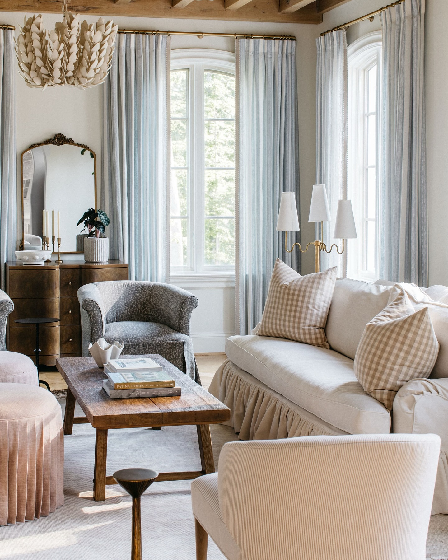
Cream upholstery forms the comfortable base of this living room, while misty blue curtains and a gray blue chair add cool variation. Blush ottomans introduce warmth without interrupting the gentle palette.
The brown table and cabinet keep those pale shades grounded. This combination works when you want color to register quietly.
Begin with cream seating, then compare a pale blue fabric and a muted pink beside it in your own light. Avoid choosing every item in the same texture; the photograph mixes stripes, checks, pleats, and small patterns.
Their similar softness helps them coexist. Repeat white or cream in lampshades and trim to connect the room.
A few dark table bases provide definition without making the overall effect feel heavy.
13. Sharpen Mint Green with Black and Cream
Credits: Instagram
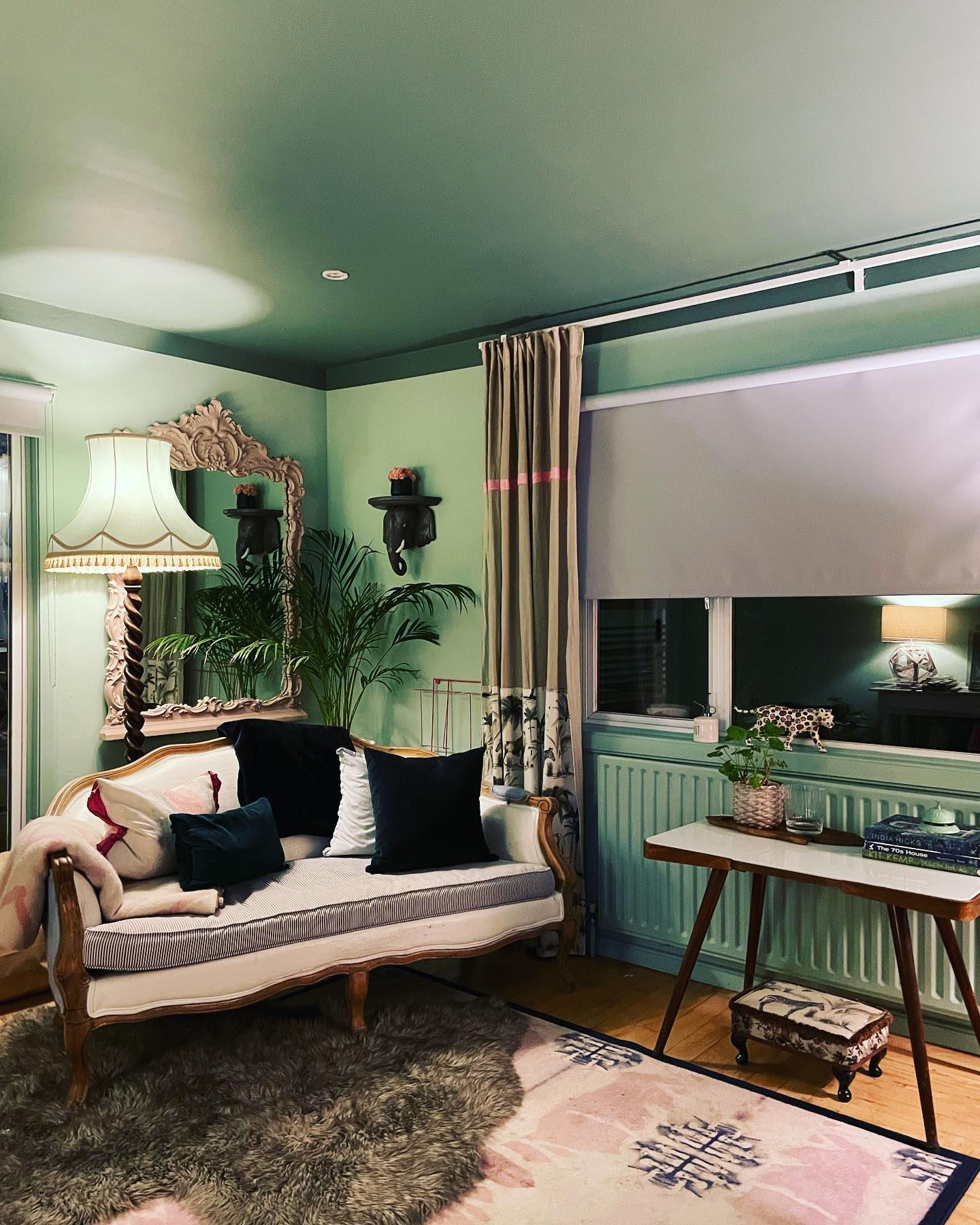
Mint green walls surround a cream sofa in this sitting room, while black cushions and decorative details add definition. A deeper green ceiling makes the pale walls feel more substantial, and the pink patterned rug introduces a quieter warm note.
The cream upholstery is an important buffer between those contrasts. Try this palette with a mint wall sample, one cream fabric, and a black cushion before adding decorative accessories.
Keep the black concentrated in recognizable shapes, such as cushions, frames, or a small table. Repeating mint on the radiator here helps that practical feature join the room.
A warm wood floor prevents the cool green from feeling chilly. Use soft lighting to balance the darker ceiling when daylight has faded.
14. Make Raspberry Pop Against Black and Tan
Credits: Instagram
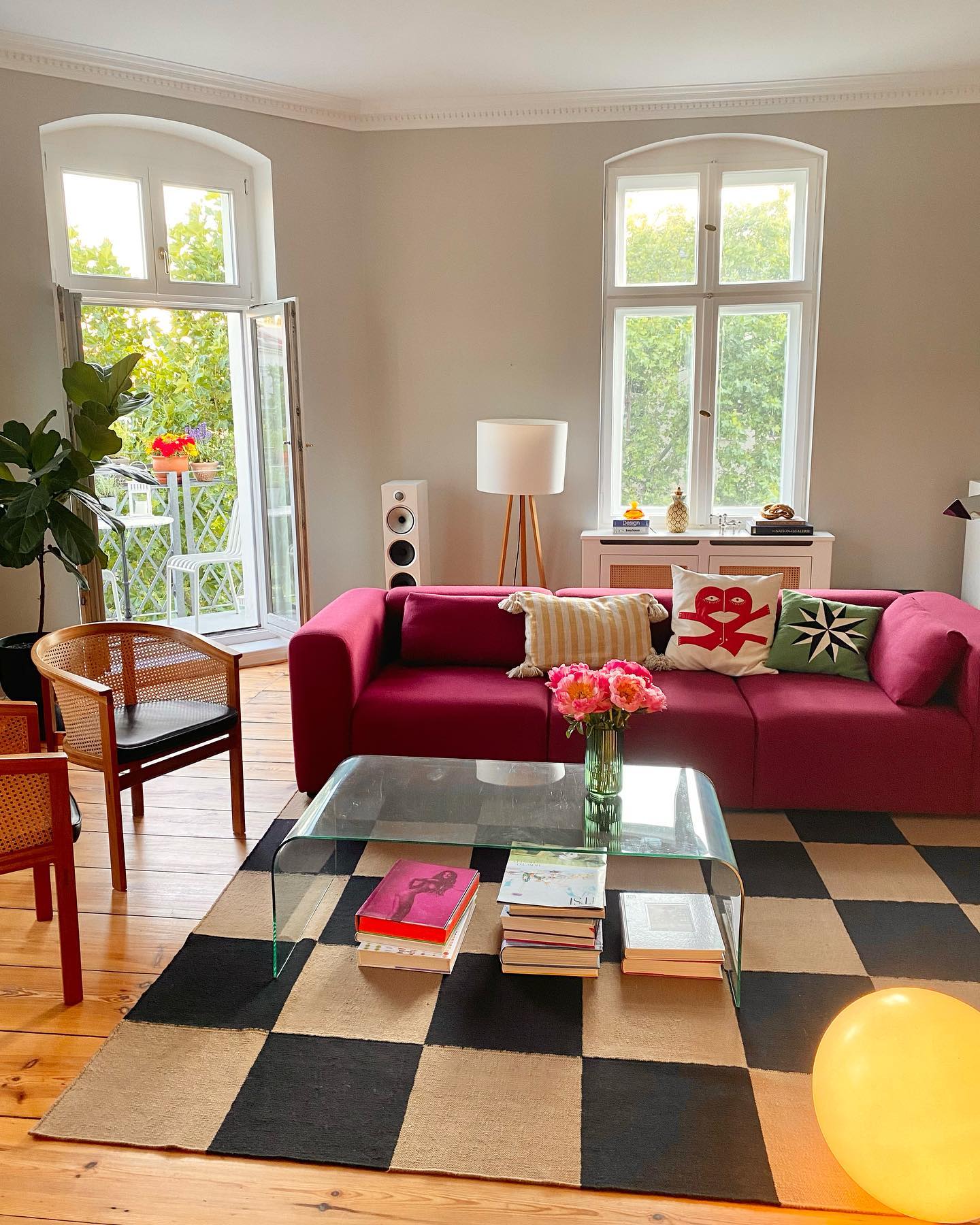
A raspberry sofa brings a single saturated color into this bright room, where a black and tan checked rug creates the main pattern. Pale walls and generous window light give both elements room to stand out.
The transparent coffee table preserves a clear view of the checks, keeping the composition open. If you love a bold sofa, you can build a complete scheme around it without matching the walls.
Choose a graphic rug in two neutrals, then repeat one of those tones in chairs or lighting. Warm wooden furniture connects with the tan squares.
A few colorful cushions are enough to personalize the sofa. Keep larger accessories simple so the strong upholstery color and confident floor pattern remain the focus.
15. Put Hot Pink and Chartreuse Against Gray
Credits: Instagram
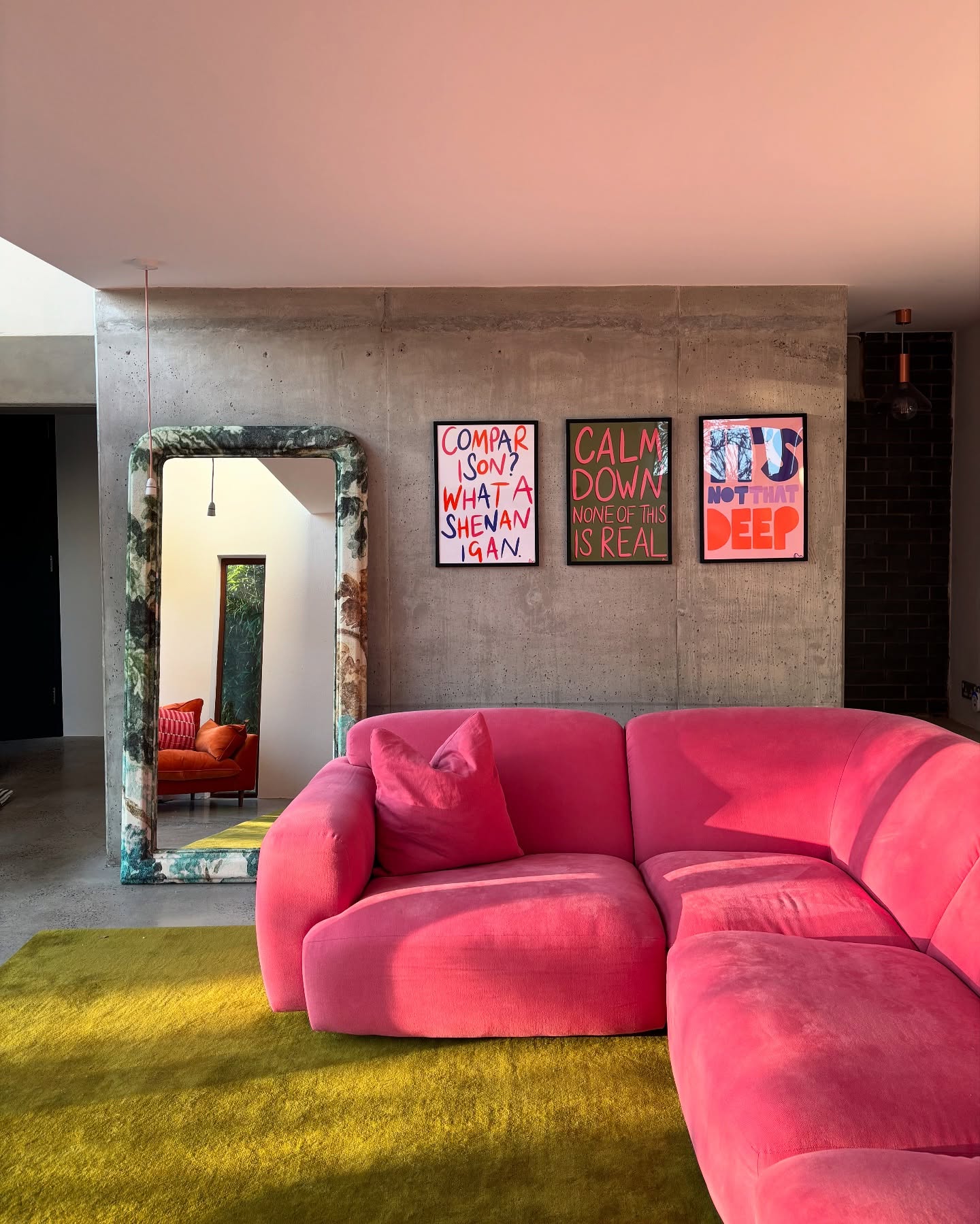
Hot pink seating and a chartreuse rug bring strong color into a room with gray walls and flooring. The neutral background gives these two bright surfaces clear boundaries, while the framed prints repeat pink above the sofa.
A tall mirror adds another vertical shape without introducing a third large color block. Start with one vivid furniture piece and one contrasting textile if you want to try this approach.
Compare their colors together in daylight; both need enough strength to hold their own. Keep the surrounding walls quieter, and avoid filling every seat with additional patterned cushions.
Here, the plain upholstery lets the curved sofa shape remain visible. Smaller accents in the artwork can echo the palette without expanding it further.
16. Soften Warm Brown with Dusty Rose and Cream
Credits: Instagram
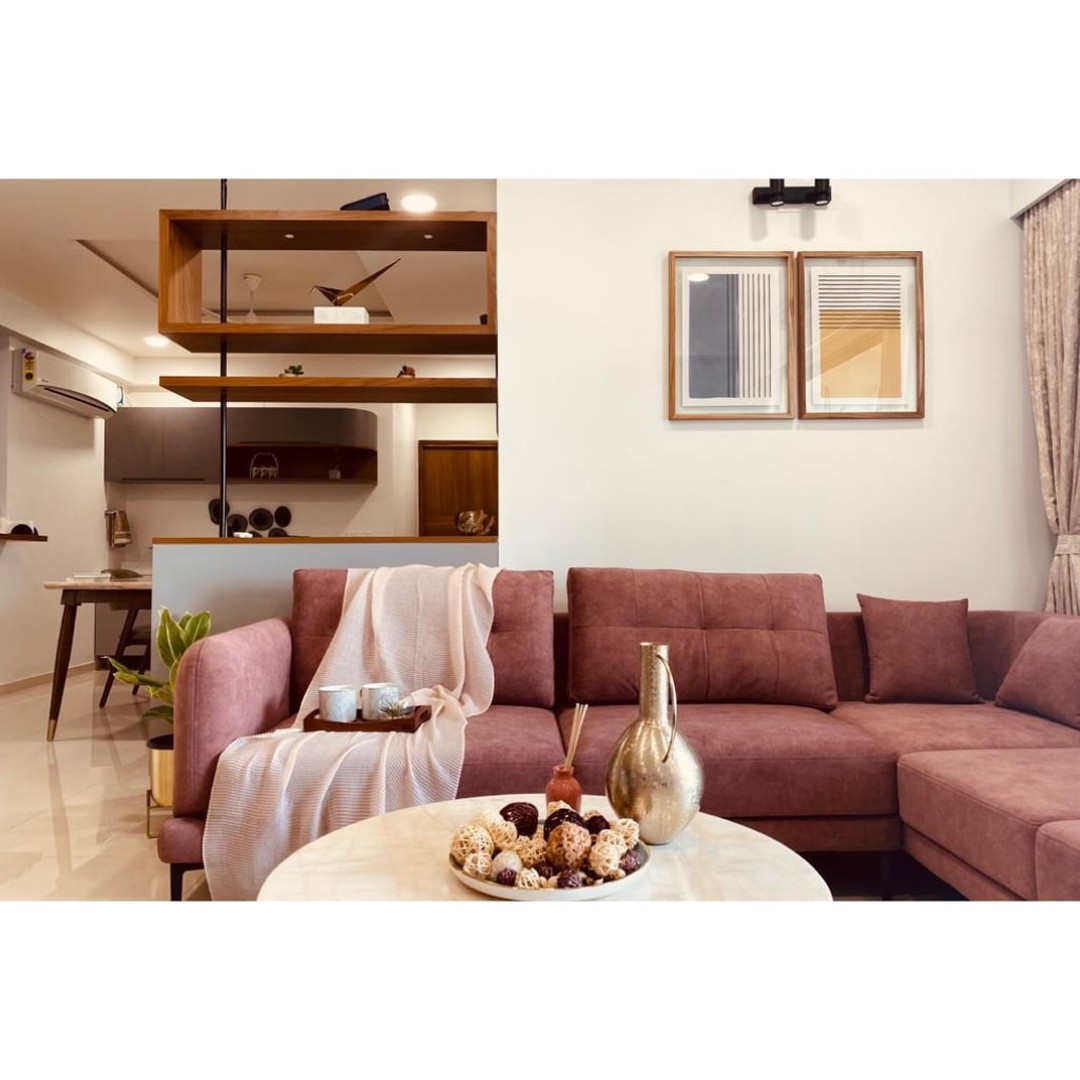
A dusty rose sectional gives this living room its main color, while warm brown shelving and picture frames add structure. Cream walls, a pale table, and a light throw keep the upholstery from feeling too heavy.
The small artwork repeats the room's restrained colors instead of adding a competing focal point. This is an approachable palette for an open living area because the brown can continue into nearby dining furniture or storage.
Choose a rose with muted undertones, then compare it with your existing wood finishes. Keep the largest background surfaces light and introduce darker details sparingly.
The open shelves here allow views through the room, so the substantial sofa feels connected to the adjoining space rather than visually isolated.
17. Pair Coral and Mauve with Nearly Black Walls
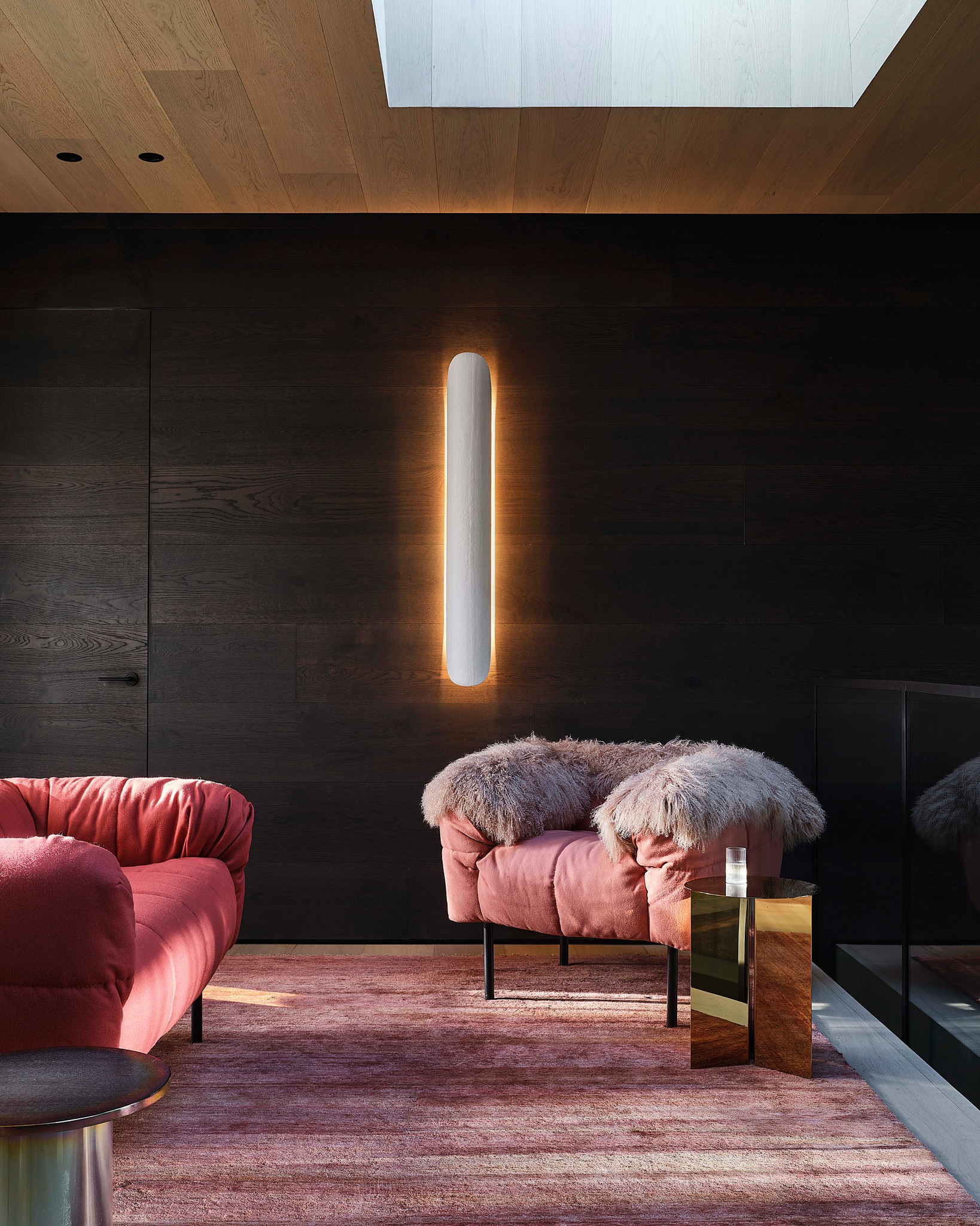
Credits: Instagram
Nearly black walls give the coral seating and mauve rug a dramatic backdrop in this sitting room. The colors stay within a related warm family, but their different depths prevent the furniture and floor from merging.
Golden reflections from the side table bring a small brighter accent. To borrow the effect, start with a dark wall behind one seating group rather than assuming the entire room needs the same treatment.
Choose a rug with several related pink or purple tones to connect the upholstery. Keep lighting soft and focused so the dark surface retains texture.
The pale wall light and bright overhead opening provide contrast here. Leave some wall space undecorated to let the rounded furniture silhouettes carry the composition.
18. Cool Rust Tones with Blue and White
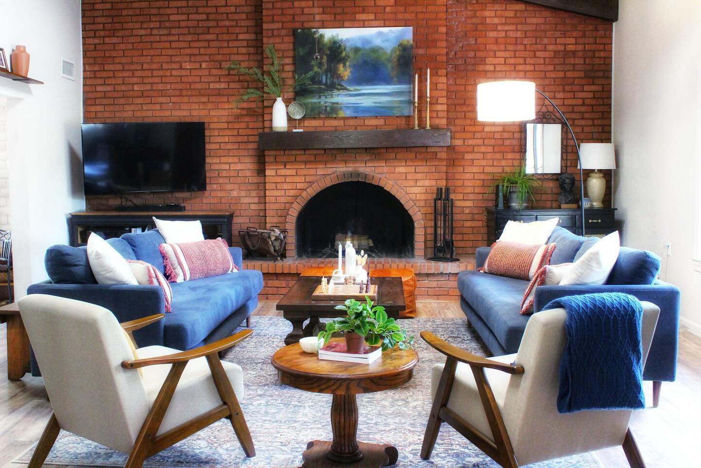
Credits: Instagram
Two blue sofas bring a cool counterpoint to the rust colored brick wall in this living room. White chairs and cushions provide lighter breaks between the richer colors, while warm brown tables connect with the fireplace mantel.
The landscape painting repeats blue above the seating, carrying the palette across the room. This is a useful approach when an existing brick feature is staying.
Treat its warm color as part of your scheme, then compare blue fabric samples directly against it. Use white or cream on smaller seats to keep the arrangement from feeling crowded.
A patterned rug can gather the warm and cool tones together. Repeat the blue in a throw or artwork rather than introducing several unrelated accent colors.
19. Set Burgundy Against Olive and Warm Neutrals
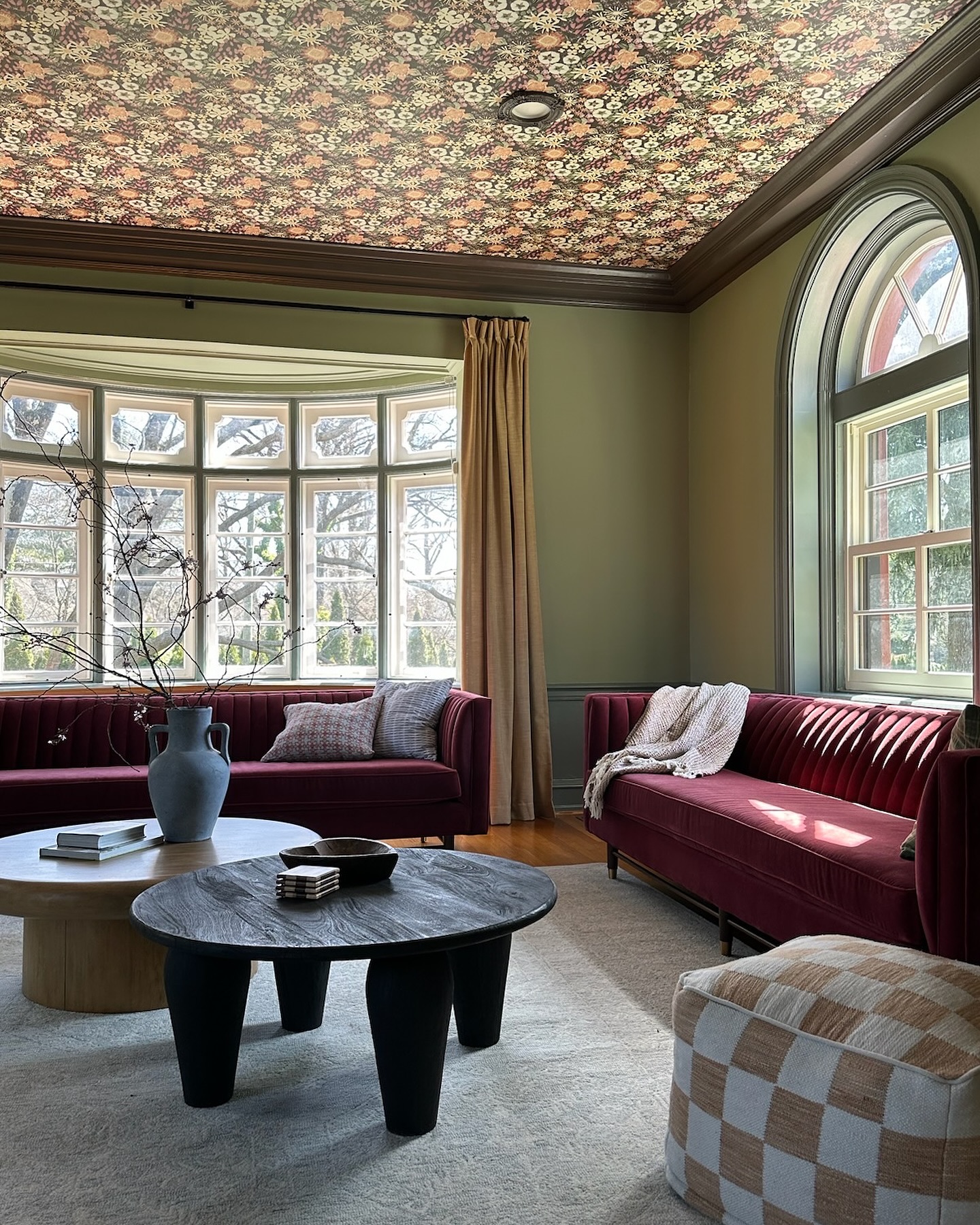
Credits: Instagram
Burgundy sofas bring rich color to this living room, while olive walls and pale curtains create a softer surrounding layer. The patterned ceiling contains related warm and green tones, tying the upper part of the room to the seating.
Cream carpeting leaves the center calm despite the strong colors above it. Try the burgundy and olive pairing with fabric samples first, choosing muted versions if you want a relaxed result.
Keep the floor treatment light and let one major pattern connect the palette. Here, the ceiling supplies that pattern, so most furniture remains plain.
A black coffee table adds definition, and the checked ottoman introduces a larger, simpler motif. Leave space between tables and sofas for comfortable movement and conversation.
20. Bring Olive, Dusty Pink, and Rust Together
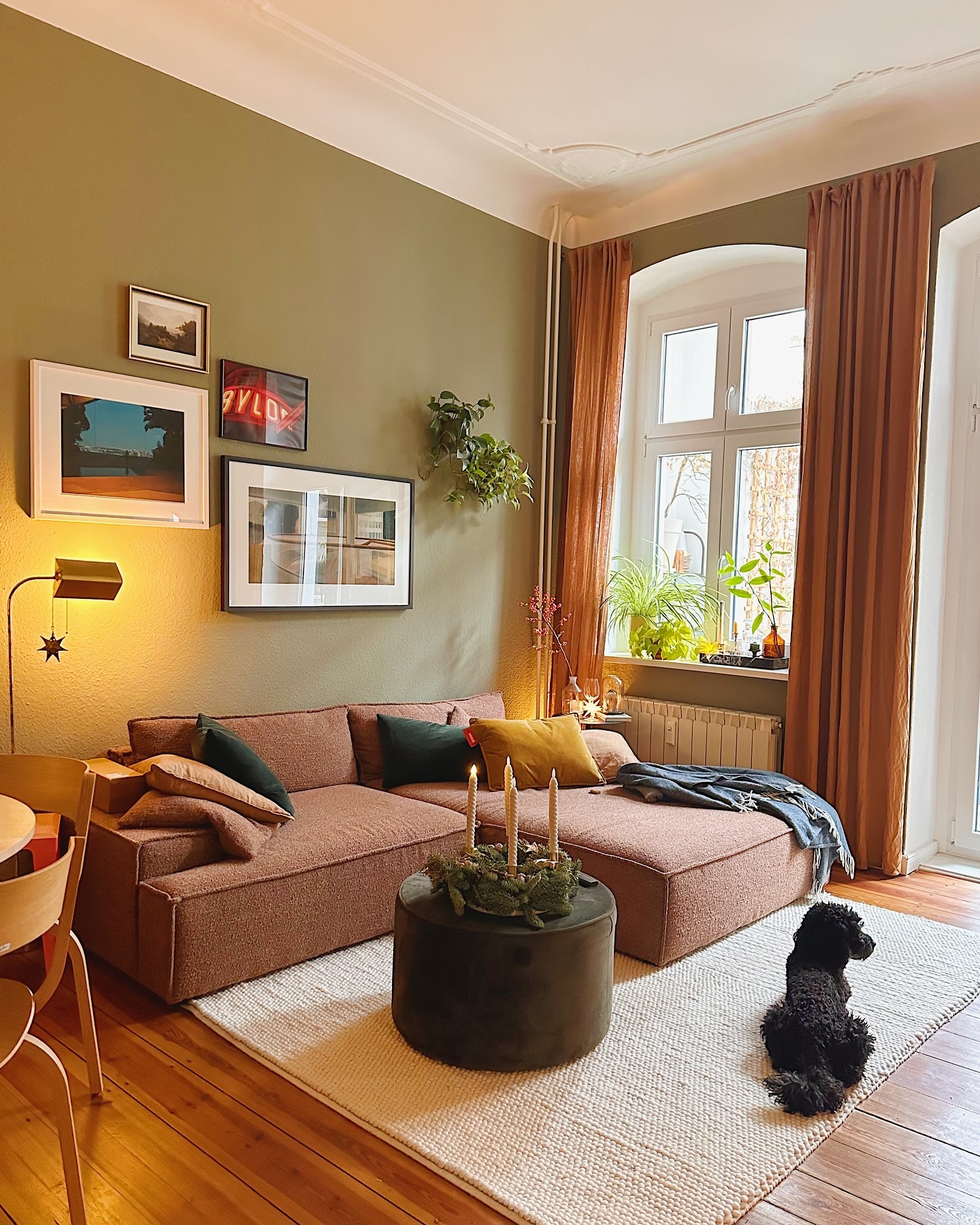
Credits: Instagram
Olive walls create a muted backdrop for a dusty pink sectional and rust curtains in this living room. The warm colors gather around the window, while a cream rug separates the seating from the golden floor.
Dark green cushions and a matching ottoman add depth without introducing another color family. Start by comparing a warm green wall sample with pink upholstery and a rusty fabric swatch.
Keeping all three colors muted helps them sit comfortably together. Repeat the darkest green in smaller pieces rather than covering every surface.
Here, pale trim and the broad band above the walls preserve some lightness. Choose simple curtains when the palette already has several colors, and let artwork provide small variations within that scheme.