
Turquoise can shift from a subtle accent to a room’s main backdrop, depending on where you use it and what you pair it with.
These Turquoise Living Room Ideas show how the color works across walls, ceilings, cabinetry, and upholstery, with contrasts that keep each scheme balanced.
See how a pink fireplace stands out between turquoise shelves, how an orange sofa enlivens muted blue-green walls, and how a soft teal sofa holds its own against dark walls.
Practical details, from testing paint in different light to adding warm wood or pale accents, help make the combinations easier to adapt.
1. Frame a Pink Fireplace with Turquoise Shelves
Credits: Instagram
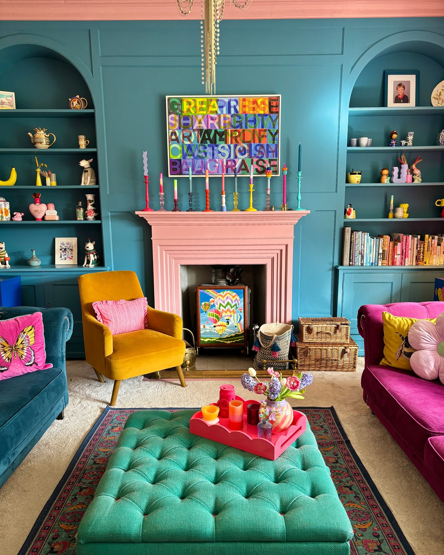
Turquoise built-ins give this colorful living room a steady backdrop, while the pink fireplace stays clearly defined between them. The tufted ottoman repeats the blue-green family at floor level, linking the architecture with the seating.
Yellow and magenta chairs add variety without interrupting that connection. To use this idea, choose one continuous paint color for shelving, cupboard doors, and the surrounding wall.
Then reserve a contrasting shade for the fireplace or another feature you want to emphasize. Leave breathing room around small objects on the shelves so their silhouettes remain visible.
A tray turns an upholstered ottoman into a useful surface for drinks and flowers. Repeat the fireplace color in one cushion or accessory to bring the scheme together naturally.
2. Carry Turquoise Across the Ceiling and Cabinetry
Credits: Instagram
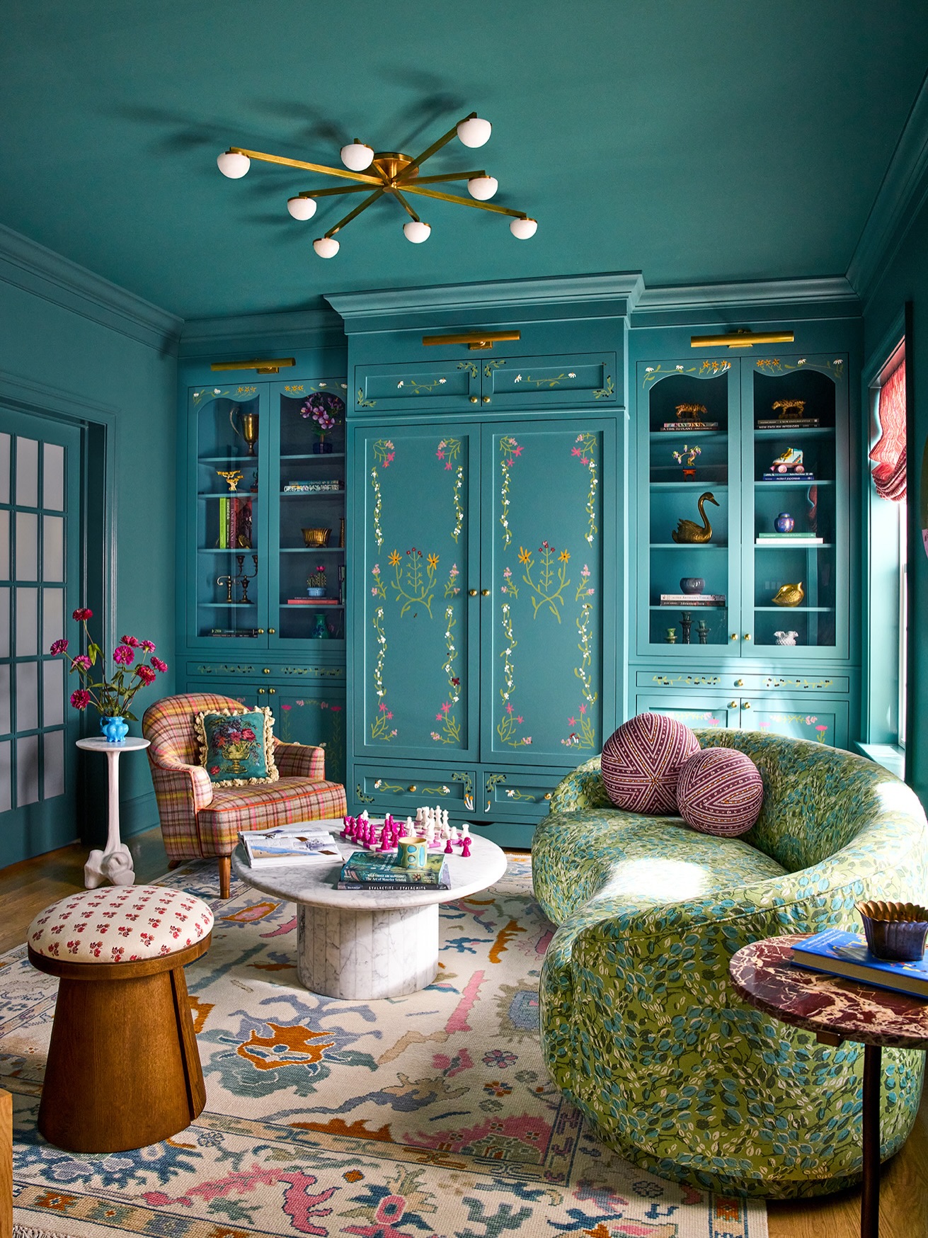
Color continues from the cabinets onto the walls and ceiling in this enveloping lounge. That consistent turquoise background lets hand-painted flowers, brass fittings, and patterned upholstery stand out as individual details.
The curved sofa and circular coffee table soften the straight cabinet fronts, while the pale rug introduces a generous area of relief.
Start with a favorite fabric or rug when planning a similarly colorful room, then pull the surrounding paint shade from its smaller motifs. Try the paint on several surfaces before committing, since horizontal and vertical planes catch different light.
Keep cabinet shelves lightly arranged to preserve their outlines. Mixing closed storage with glazed doors also gives everyday belongings a home without making the display feel too crowded.
3. Set a Soft Teal Sofa Against Dark Walls
Credits: Instagram
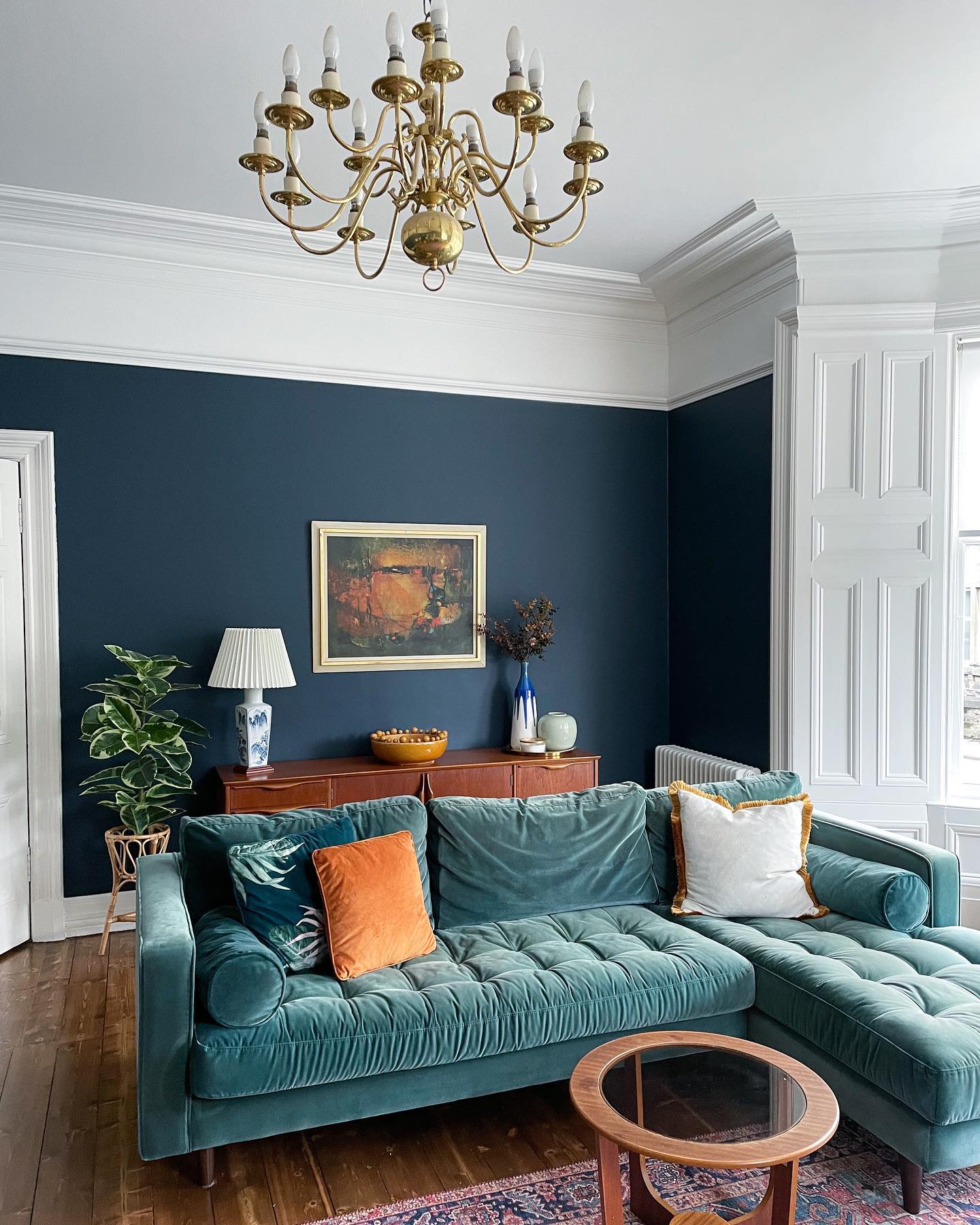
A muted teal sectional brings softness to this room's dark blue walls and crisp white woodwork. Its loosely gathered upholstery contrasts with the clean lines of the wooden sideboard behind it.
Orange and white cushions lift the sofa without covering its color, while the small round table leaves the chaise easy to approach. For a similar balance, compare upholstery samples against your wall color in daylight and lamplight.
Choose enough contrast that the sofa remains a distinct shape after sunset. A warm wood finish helps connect the cool colors to the floor.
Keep the furniture behind the sofa lower than the artwork, and leave sufficient space around the table for someone to sit down comfortably and stretch out their legs.
4. Pair Muted Turquoise Walls with an Orange Sofa
Credits: Instagram
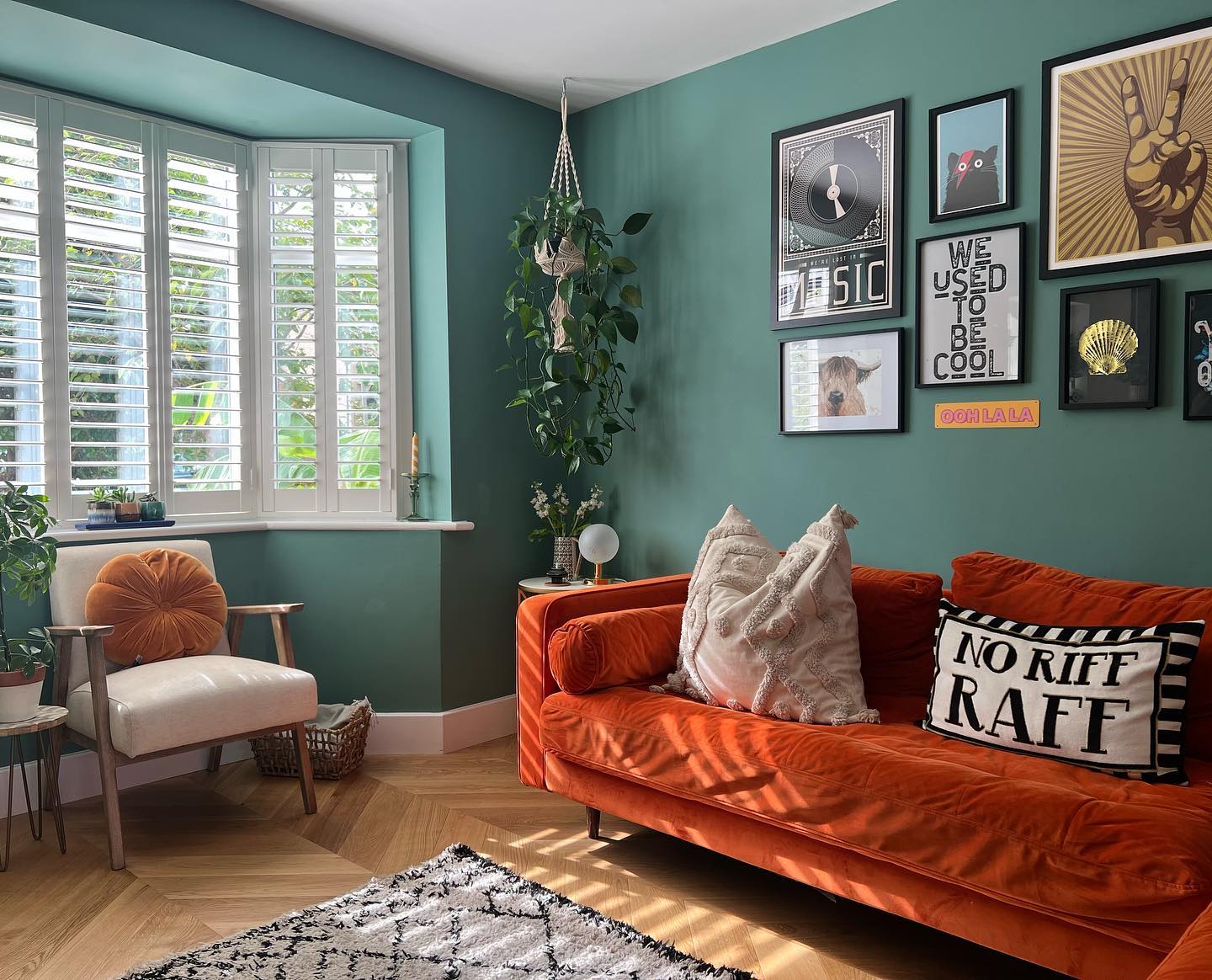
Soft blue-green walls surround this orange velvet sofa, creating a lively contrast that still feels comfortable. White shutters and a white ceiling bring light into the palette, while black picture frames give the gallery wall a consistent outline.
The hanging plant fills the corner without taking up floor space beside the armchair. To borrow the combination, choose a slightly muted turquoise rather than matching the intensity of every colorful furnishing.
Repeat the sofa's warm tone in a smaller cushion across the room. A neutral chair and pale textured pillows provide quieter places for the eye to rest.
Plan the artwork as a group before hanging it, keeping its lower edge comfortably above the sofa cushions and clear of seated heads.
5. Connect a Turquoise Sofa with Vintage Florals
Credits: Instagram
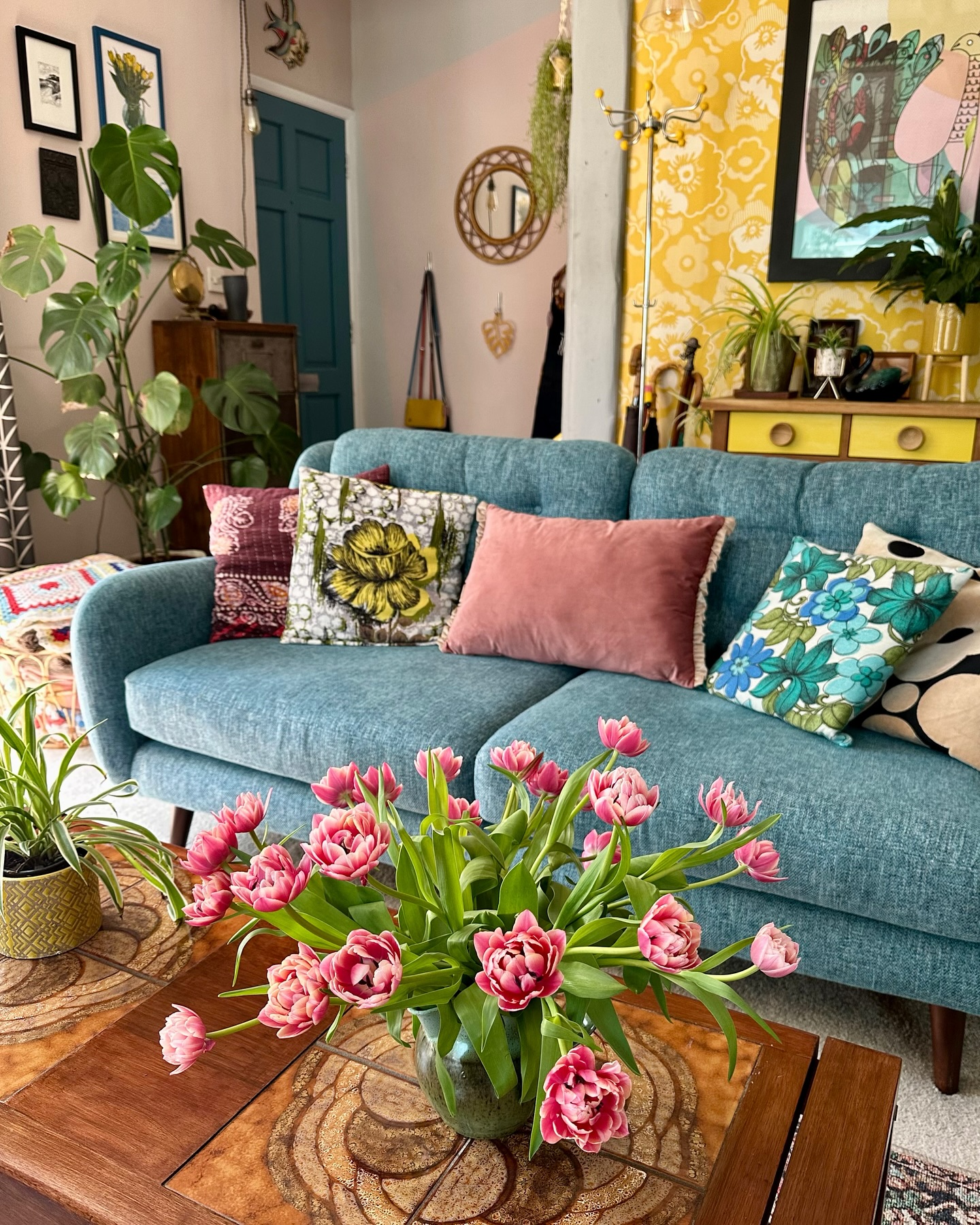
The textured turquoise sofa anchors a cheerful mix of yellow wallpaper, floral cushions, and pink accents. A painted door repeats its color deeper in the room, so the upholstery feels connected to the background.
Wood furniture and green plants add natural surfaces between the printed fabrics. This approach suits a collected living room where pieces arrive gradually rather than as a matching set.
Begin with one floral cushion containing the sofa color, then introduce a second pattern with a different scale. Keep a plain cushion between busier designs to make each one easier to appreciate.
Pink flowers can echo the textiles, while a substantial wooden coffee table provides a practical, calm surface beneath the arrangement and keeps everyday essentials nearby.
6. Give a Sculptural Chair a Turquoise Finish
Credits: Instagram
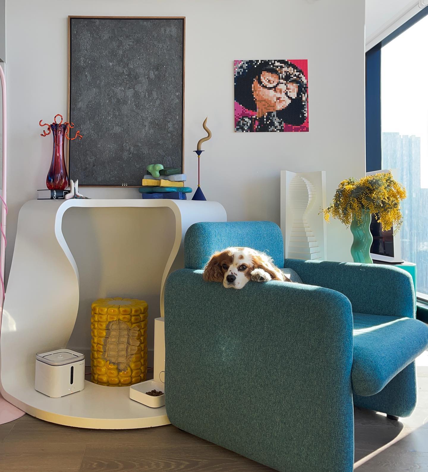
A turquoise armchair makes this bright corner feel like a destination. Its broad upholstered sides have enough presence to sit beside the curved white console without being overshadowed.
The surrounding walls stay pale, leaving room for unusual objects, colorful glass, and a small portrait. If you want a strong color in a compact living room, a single substantial chair can supply it without requiring new paint.
Check its depth and arm width before buying, especially when it will sit near storage or a window. Choose a side table that is reachable from the seat and keep the route behind it clear.
A small turquoise accessory elsewhere can repeat the color, while warm yellow flowers bring a contrasting note into view.
7. Warm a Deep Turquoise Snug with Shelf Lighting
Credits: Instagram
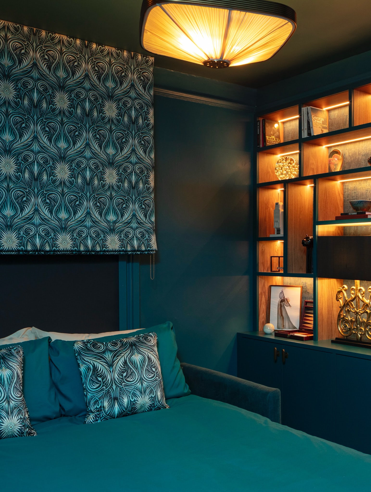
Deep turquoise wraps this snug in color, from the sofa and cushions to the walls and built-in storage. The patterned blind repeats the same family with lighter lines, giving the window definition without introducing another dominant shade.
Warm shelf lighting reveals the wood interiors and keeps the darker cabinetry legible. To adapt this idea, combine plain upholstery with one detailed textile rather than adding pattern to every surface.
Consider where you will read before deciding on lighting; decorative shelf strips should work alongside a useful nearby lamp. Leave some shelves open around the objects so the glow can spread.
Pale cushions tucked behind the turquoise ones provide a subtle break, preventing the seating from disappearing completely into its surrounding wall.
8. Make a Turquoise Cupboard the Cottage Focal Point
Credits: Instagram
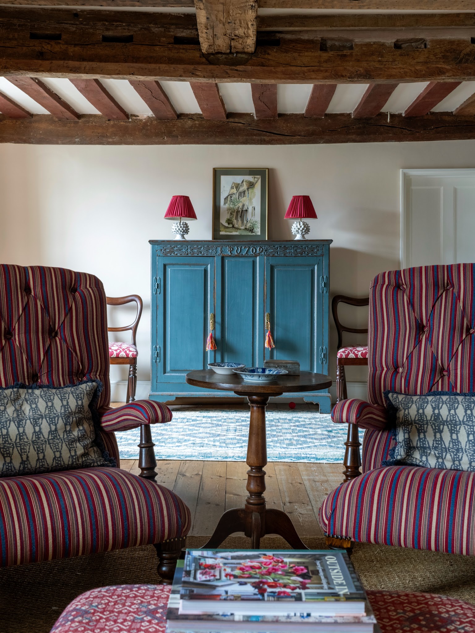
A painted turquoise cupboard brings a clear point of color to this cottage sitting room. Rough ceiling beams, timber flooring, and a dark pedestal table keep the setting grounded, while striped chairs echo the cupboard through narrow blue lines.
Matching red lamps give the tall furniture a balanced top edge. You can achieve a similar effect by repainting one substantial storage piece instead of changing every wall.
Choose a finish appropriate for its surface and test a sample beside existing upholstery first. Repeat the color in a rug or cushion so the cupboard feels integrated.
Keep the display above it simple, allowing carved details and worn edges to remain visible. Smaller tables between chairs preserve useful surfaces without crowding conversation.
9. Repeat Aqua Through an Open Living Area
Credits: Instagram
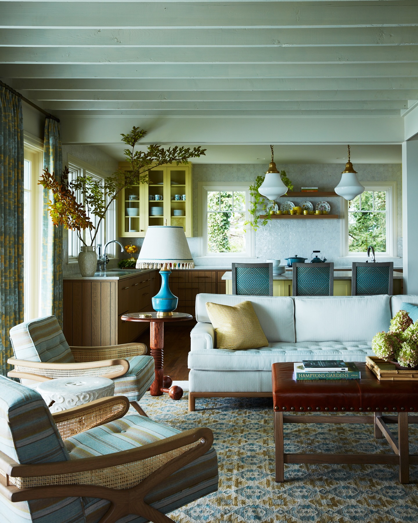
Pale aqua seating, a brighter turquoise lamp, and patterned chair backs carry one color family through this open living area. The repeated notes connect the lounge with the kitchen beyond it, while yellow accents and wood surfaces add warmth.
A brown upholstered coffee table gives the seating group a darker center. For a similar room, choose two or three places where your accent color can be seen together from the main entrance.
Vary its intensity rather than matching every item exactly. Curtains and a patterned rug can bridge those shades through smaller woven details.
Keep the largest furniture comfortable and relatively simple, letting the lamp provide the brightest accent. A few yellow cushions connect the lounge to nearby cabinetry naturally.
10. Paint the Fireplace and Alcoves as One Feature
Credits: Instagram
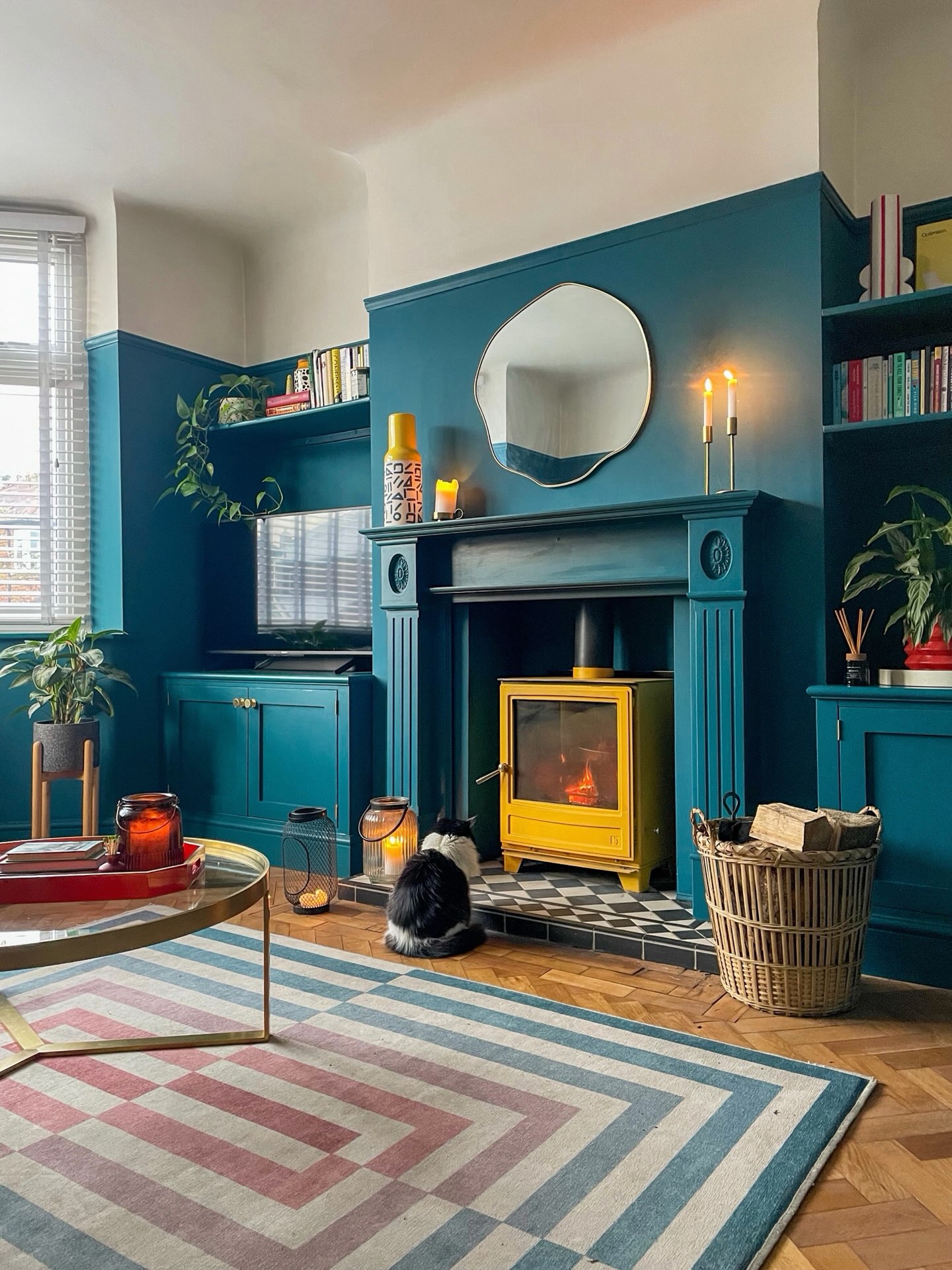
Turquoise paint unifies the fireplace, alcove cupboards, and shelving in this living room. The color stops below the ceiling, leaving a broad white band that keeps the upper walls lighter.
A yellow stove provides a vivid focal point, echoed by the vase on the mantel. The geometric rug carries smaller turquoise lines across the floor.
To borrow the principle, treat connected architectural features as one composition when selecting paint. Check which surfaces require specialist finishes, and follow the stove manufacturer's clearance guidance around any heat source.
Keep shelving practical with books and a few plants, while reserving the mantel for a simpler arrangement. Repeating one warm accent in two places gives the strong blue-green backdrop a friendly, deliberate counterpoint throughout.
11. Ground Pale Seating with a Deep Teal Backdrop
Credits: Instagram
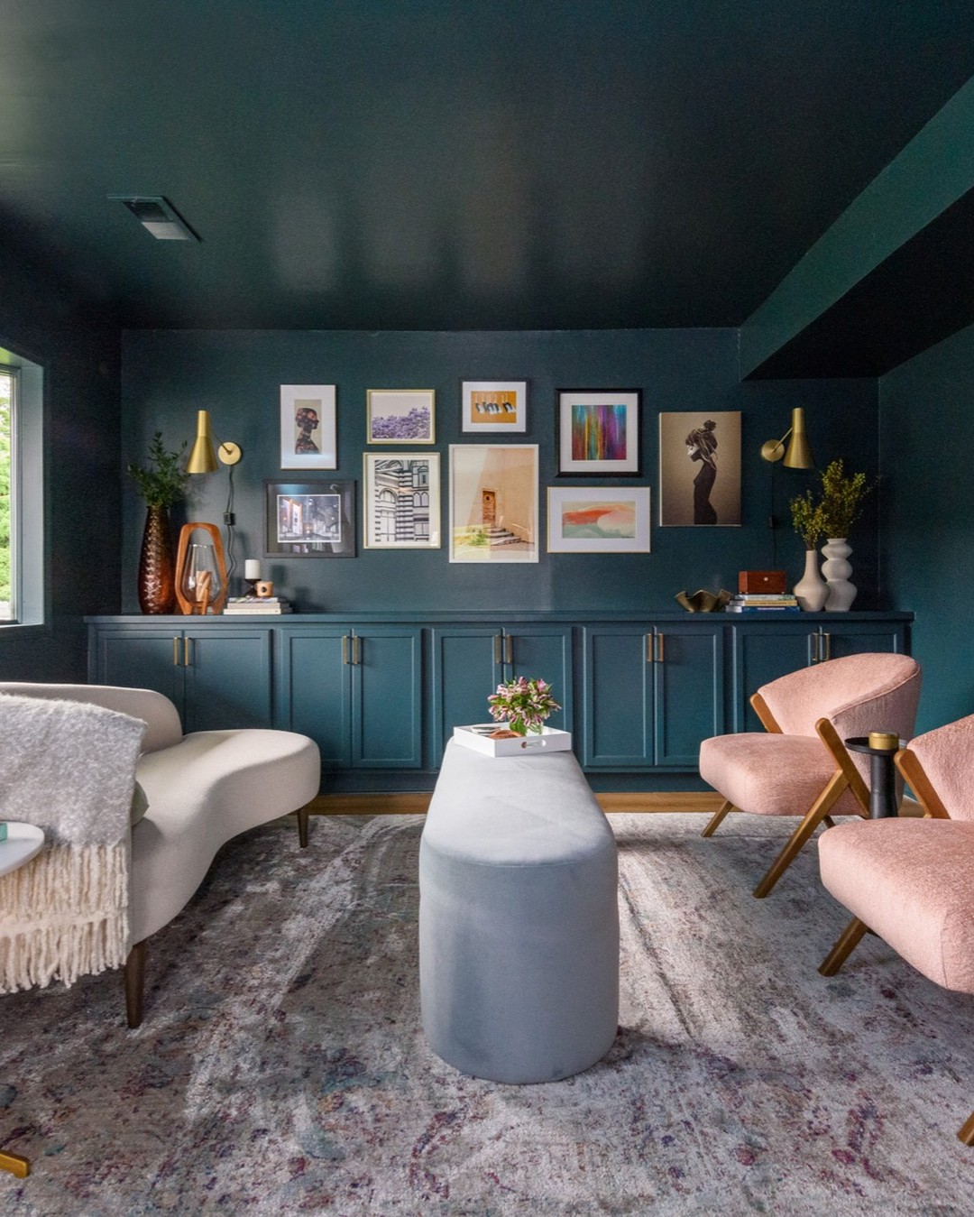
A deep teal ceiling and storage wall give this small lounge a clear identity. Pale curved seating and pink chairs keep the furniture distinct against the darker paint, while a long, narrow coffee table preserves movement between them.
The gallery arrangement stays above the cabinet line, bringing personality to a practical storage feature. If your living room also acts as an entry area, begin with the route people need to take through it.
Choose seating and tables that leave that route open. Painting cabinetry to match the wall can reduce visual interruptions without sacrificing useful storage.
Light upholstery, a pale rug, and a few brass details then keep the composition readable. Add lamps near seats to support comfortable evening use.
12. Build a Turquoise Reading Nook Around Books
Credits: Instagram
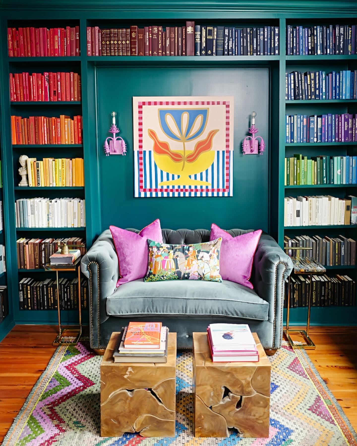
Turquoise shelves frame a compact sofa in this colorful library corner. The central painted panel gives the artwork a clear background, while books arranged in broad color groups create their own pattern around it.
Pink cushions and small pink wall lights repeat a cheerful accent at different heights. To create a similar nook, measure the sofa first and allow room beside it for practical tables.
Keep shelving deep enough for the books you actually own, with adjustable sections where possible. A plain upholstered seat helps balance the many spines, and a patterned rug can bring their colors together below.
Two small tables are easy to move when someone needs more legroom or when the corner becomes a spot for conversation.
13. Combine Turquoise Paneling with Graphic Furniture
Credits: Instagram
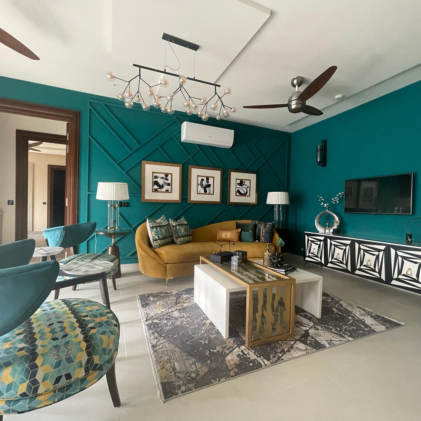
Turquoise walls and matching geometric trim give this living room its strongest visual feature. The mustard sofa adds warmth, while patterned chair seats contain both colors and help connect the arrangement.
A black and white media console introduces a sharper pattern at the opposite side of the room. When using several geometric elements, vary their scale so each remains legible.
Here, large wall diagonals sit behind smaller upholstery shapes and bold cabinet fronts. Keep the ceiling and floor comparatively quiet, and choose simple artwork with generous white borders.
Position the main seats around a reachable table, leaving clear access to the doorway. Matching the trim to the wall gives architectural texture without introducing another competing color into the lively scheme.
14. Outline Bright Windows with Turquoise Walls
Credits: Instagram
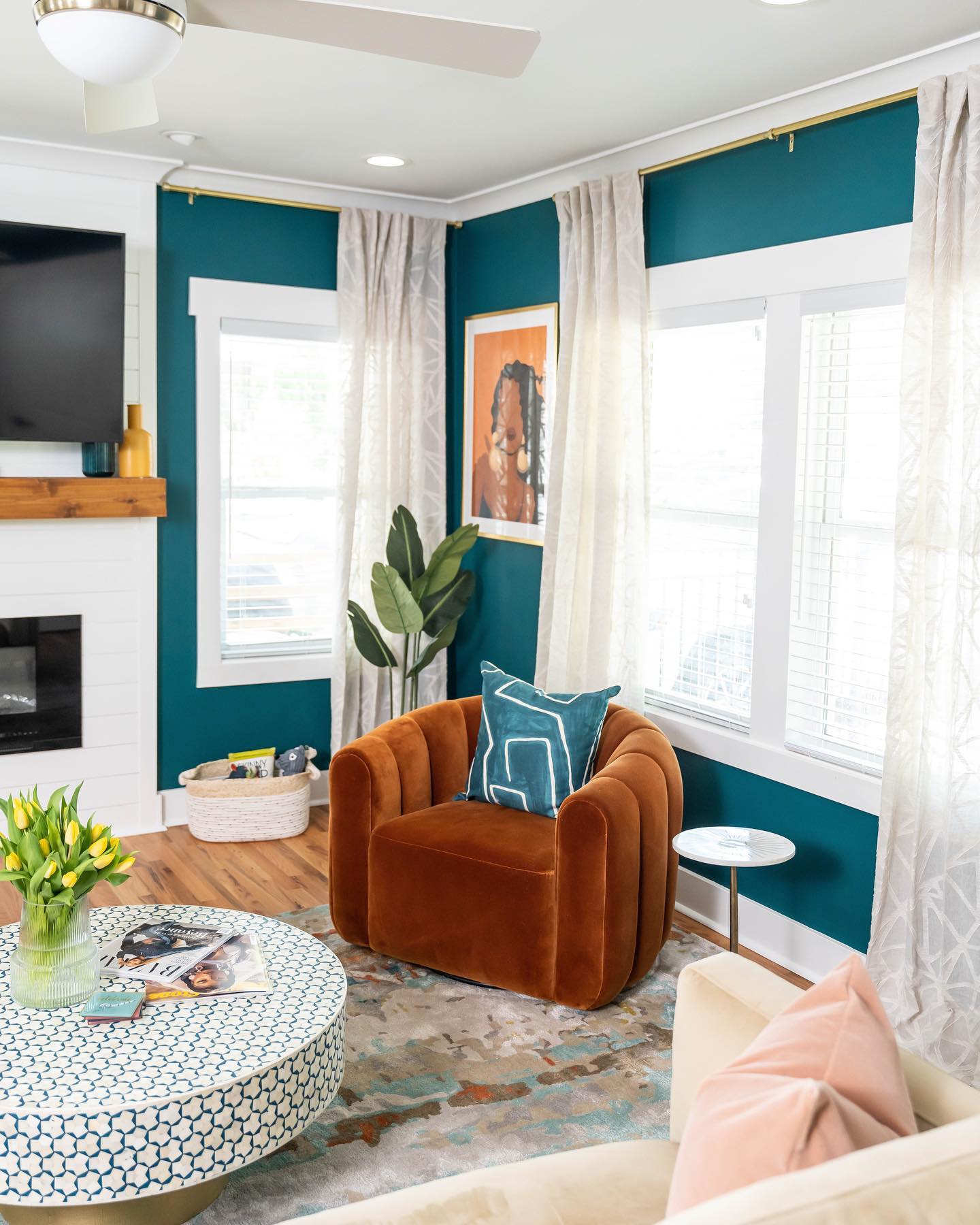
Turquoise fills the wall spaces around these bright windows, giving white trim and pale curtains a crisp outline. The rust armchair brings warmth into the corner, while its turquoise cushion repeats the surrounding paint at seat level.
A patterned round table and softly colored rug add detail without blocking daylight. This is a useful approach when windows occupy most of a living room wall: the remaining painted sections can still carry a strong color.
Hang curtains where they can stack away from the glass, and test your paint beside both the trim and fabric. Choose a comfortable chair that fits between the window and main seating.
A small side table makes the corner useful for reading, drinks, or quiet conversation.
15. Bring Gold Highlights into a Turquoise Room
Credits: Instagram
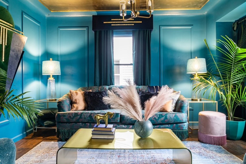
Bright turquoise walls give this sitting room a dramatic envelope, while the gold ceiling catches light above it. Dark curtains and patterned upholstery deepen the palette, with pale lampshades and a light rug providing contrast.
The sofa's fringe adds another texture without requiring a new color. To borrow this effect, decide whether the ceiling or furniture should supply your metallic statement, then keep smaller gold details consistent.
A reflective table can repeat the finish at a lower level, but leave enough clear surface for everyday use. Use plants to soften the corners and break up the wall color.
Before committing to a metallic ceiling, test its appearance from several seats, since reflected light changes across the surface throughout the day.
16. Soften a Media Wall with Muted Turquoise
Credits: Instagram
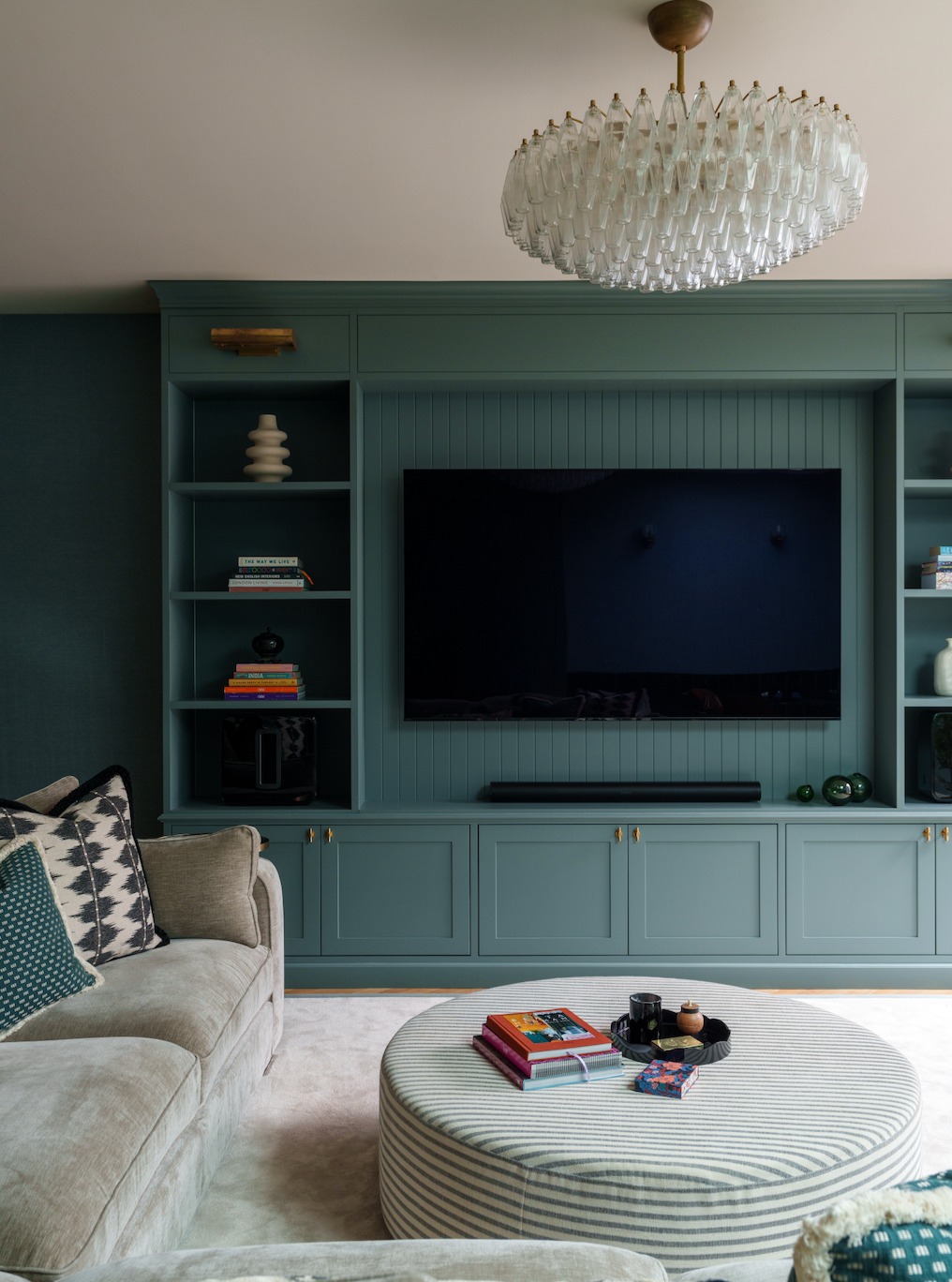
Muted turquoise cabinetry gives the television wall a softer presence in this living room. The same color runs across doors, shelves, and the paneled backing, making them read as one fitted feature.
A pale sectional and striped round ottoman lighten the foreground, while brass handles add small points of warmth. For a similar setup, plan storage around the equipment you use and allow the ventilation its manufacturer requires.
Closed cupboards can contain games and spare cables, leaving open shelves for a few books and objects. Repeat the cabinet color in cushions or narrow fabric stripes instead of matching the entire sofa.
An upholstered ottoman supplies a softer center, with a tray available when you need a steady surface for drinks.
17. Use a Turquoise Ottoman as the Color Bridge
Credits: Instagram
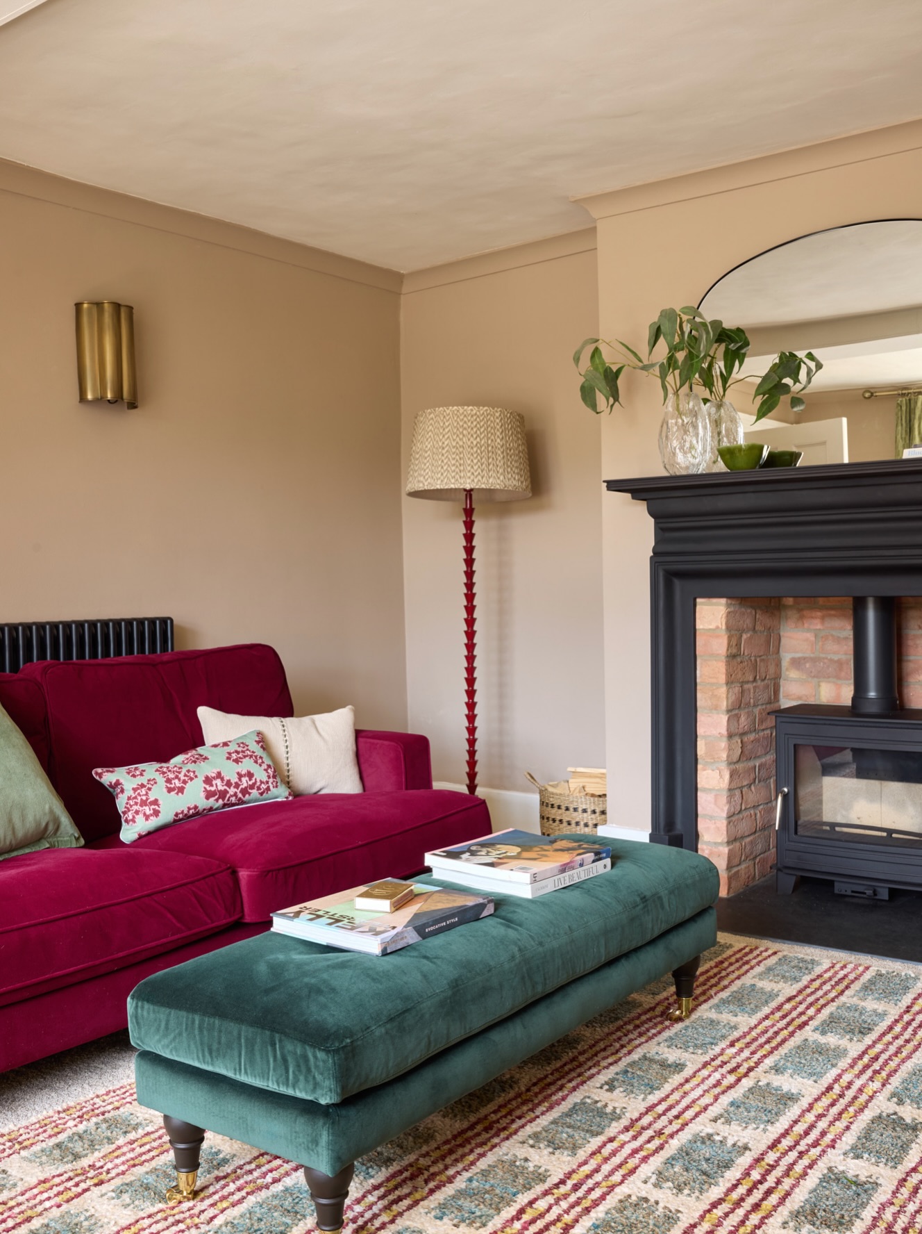
A long turquoise ottoman links the seating to the striped rug in this cozy room. Its soft upholstery contrasts with the dark fireplace surround, while the berry sofa supplies a richer companion color.
Pale walls keep the jewel tones concentrated around the furniture rather than across every surface. This is a manageable way to introduce turquoise when you already own a colorful sofa.
Pick an ottoman that leaves comfortable walking space at both ends, and check that its height works with the seat cushions. Pull another small note of turquoise into a patterned pillow or rug.
A tray can make the padded top more useful for drinks. Keep a nearby floor lamp for reading and the tabletop arrangement relatively low.
18. Echo Statement Artwork with a Turquoise Sofa
Credits: Instagram
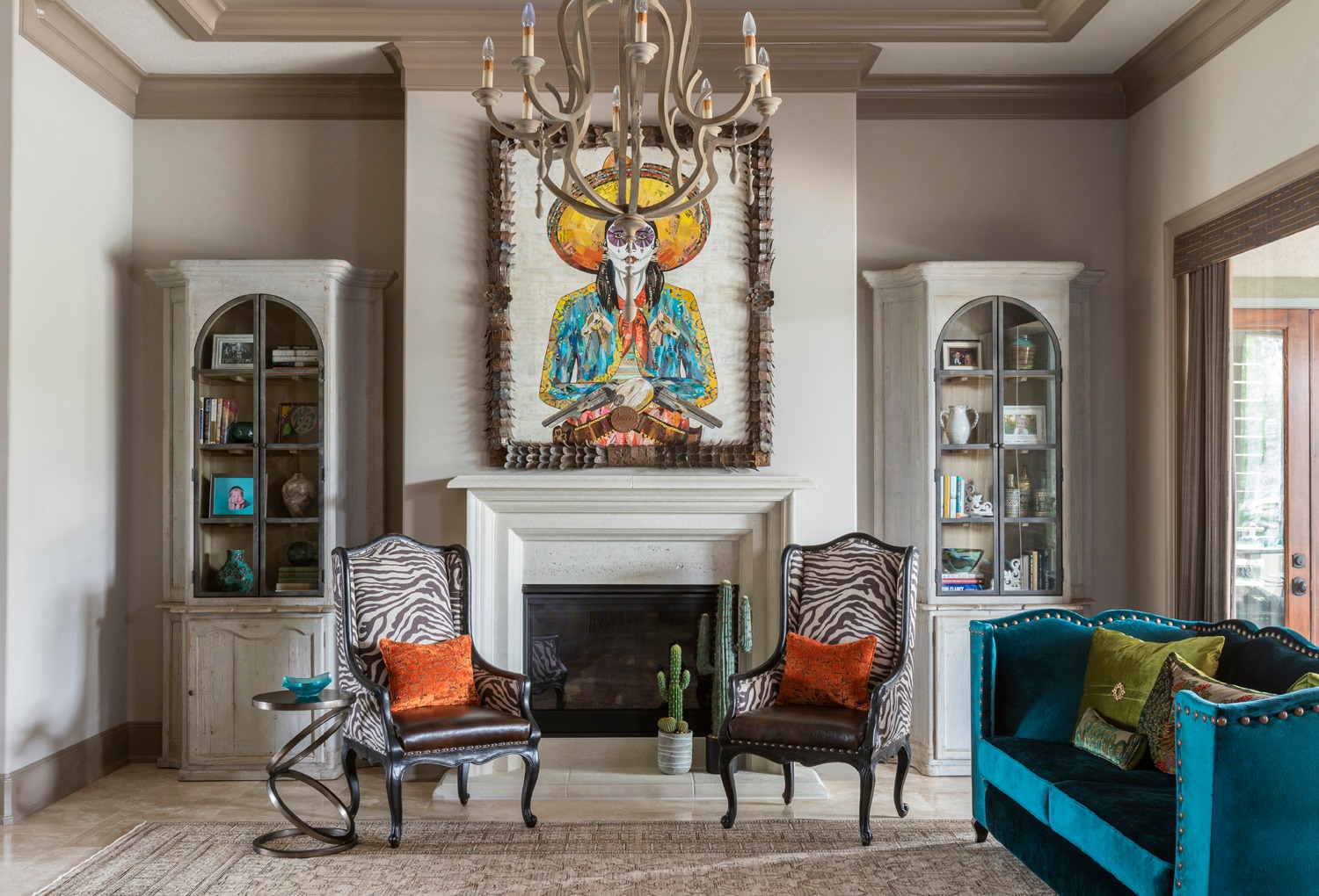
A turquoise velvet sofa picks up the vivid blue-green details in the large artwork above this fireplace. The rest of the room stays relatively restrained, with pale cabinets and walls allowing that connection to stand out.
Zebra-patterned chairs and orange cushions add contrast without repeating the sofa's entire surface. Start with a piece of art you enjoy when planning this kind of palette, then choose one smaller color within it for the main upholstery.
Keep surrounding storage quieter so the artwork retains its role as the focal point. A matching pair of cabinets can give an eclectic scheme structure.
Repeat turquoise in a small bowl or vase, and use warm wood or dark metal to connect the contrasting furniture shapes.
19. Layer Turquoise Upholstery Under a Gold Pendant
Credits: Instagram
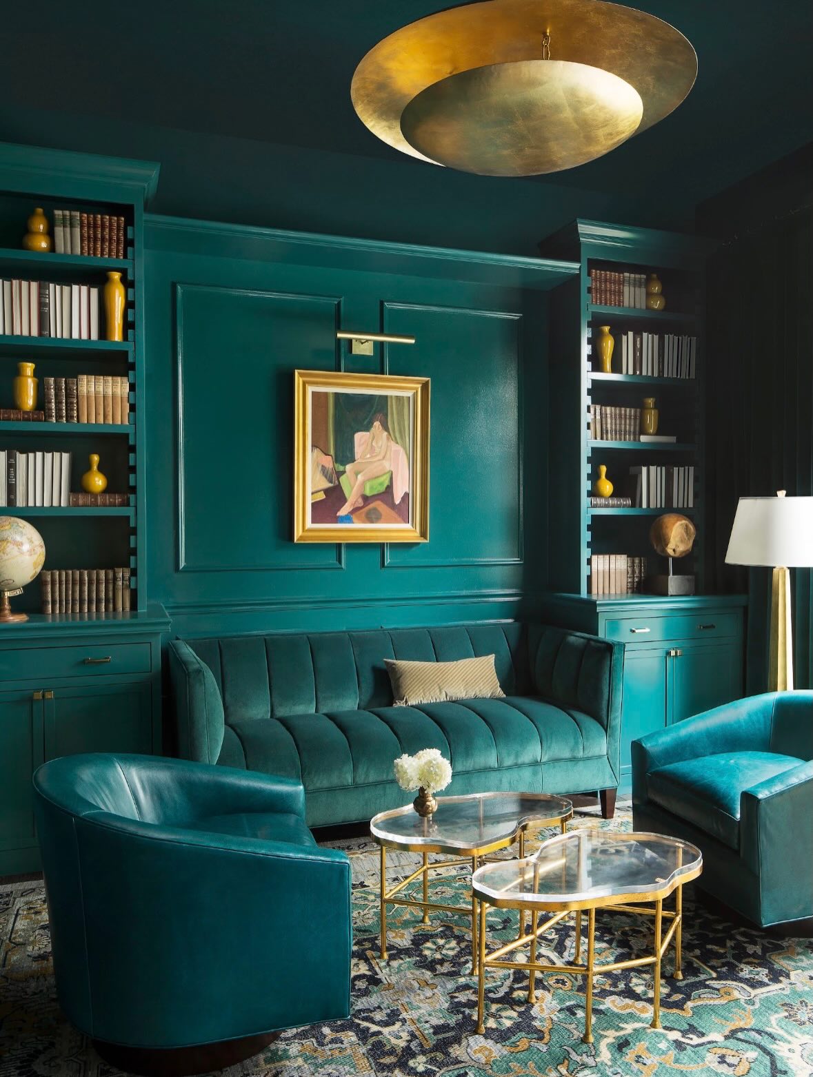
Turquoise appears in several finishes in this compact sitting room: glossy paneling, soft sofa upholstery, and smoother armchairs. Those variations make the single color family feel layered.
A large gold pendant and glass tables introduce reflective surfaces, while the patterned rug connects the furniture to warmer yellow notes.
If you want a similarly immersive palette, choose related shades with different textures instead of expecting every material to match exactly. Leave some pale book spines or lampshades visible against dark shelves to maintain definition.
The two small tables can be shifted toward individual seats, making the arrangement flexible. Keep a little space between chairs and the sofa so people can move comfortably and the upholstery shapes remain distinct within the room.
20. Set Gold Seating Against a Turquoise Accent Wall
Credits: Instagram
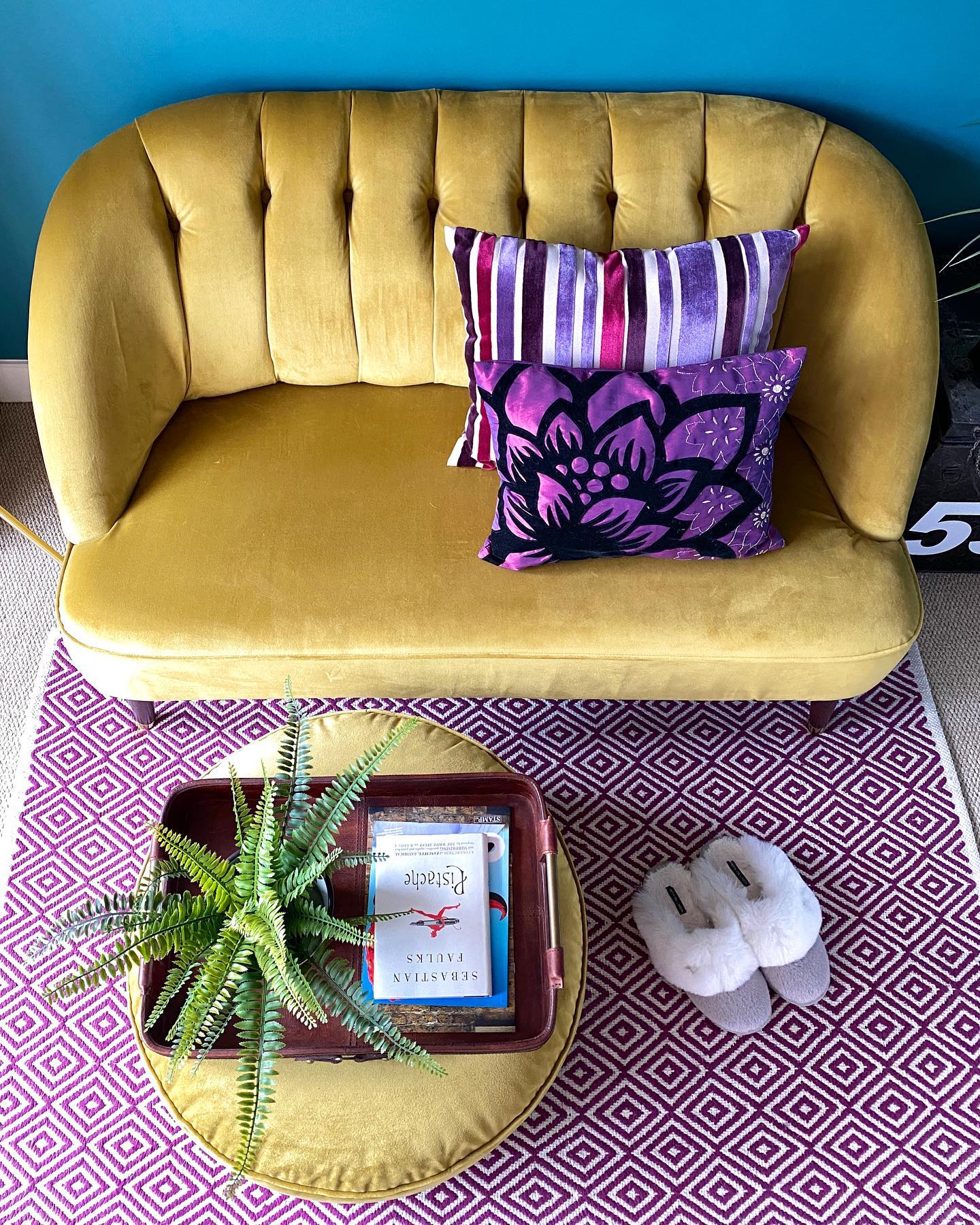
A vivid turquoise wall makes the rounded gold loveseat stand out in this cheerful sitting area. Purple cushions and a diamond-patterned rug add another color family, while the matching gold ottoman repeats the upholstery close to the floor.
The arrangement shows how a small section of strong wall color can support furniture with an equally confident personality. Begin with three main colors and vary their proportions, letting one dominate the upholstery and another define the background.
A plain seat gives patterned pillows room to breathe. Use a tray on the ottoman to collect books and a plant while keeping part of the surface free.
Measure the gap between the ottoman and loveseat so the area remains easy to enter daily.