
A lively accent color can make a mid-century room feel personal without overwhelming its clean lines and warm wood.
A Mid-Century Modern Living Room Color Palette can start with a quiet neutral base, then bring in coral red, turquoise, or green through a chair, cushion, or small decorative piece.
The combinations here also show how olive upholstery pairs with buttercream leather, while moss green gains warmth from walnut and oatmeal. Use these ideas to decide where color should lead and where lighter tones can give the room breathing space.
1. Wake Up Charcoal Gray With Coral Red
Credits: Instagram
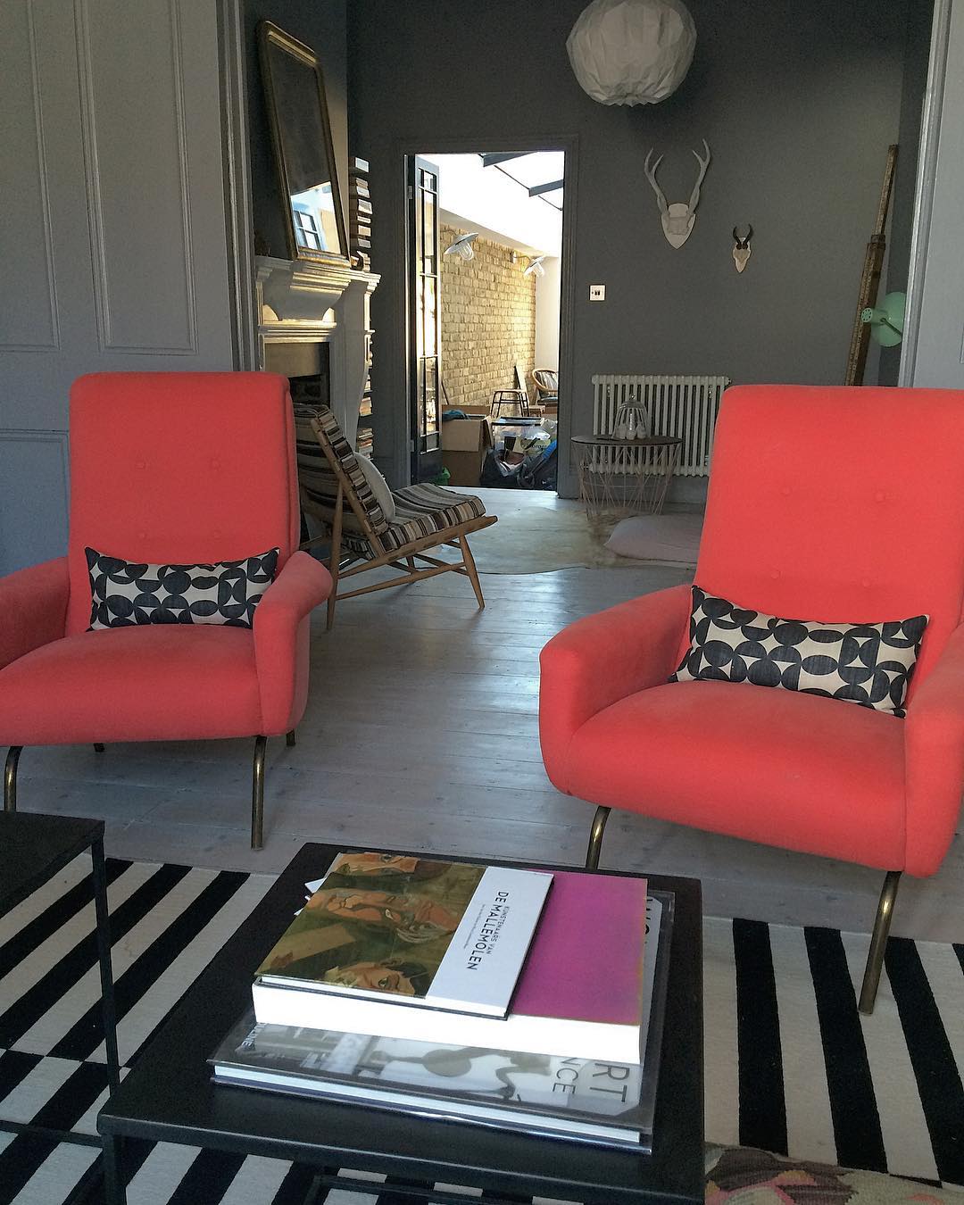
Coral red looks especially lively when the surrounding room stays quiet. Here, two high backed chairs put a warm punch of color against charcoal walls and pale gray floorboards.
Their slim, gently angled metal legs keep the saturated upholstery from feeling bulky, while black and white cushions connect the chairs to the striped rug.
Use this approach when you love a strong accent but want flexibility elsewhere. Choose one substantial upholstered piece or a matching pair, then repeat its supporting neutrals in the floor covering and table.
A little warm, natural wood softens the contrast. Test your chosen red fabric beside the wall color in daylight; an orange leaning coral will create a warmer effect than a blue leaning crimson.
2. Soften Black With Cream and Leaf Green
Credits: Instagram
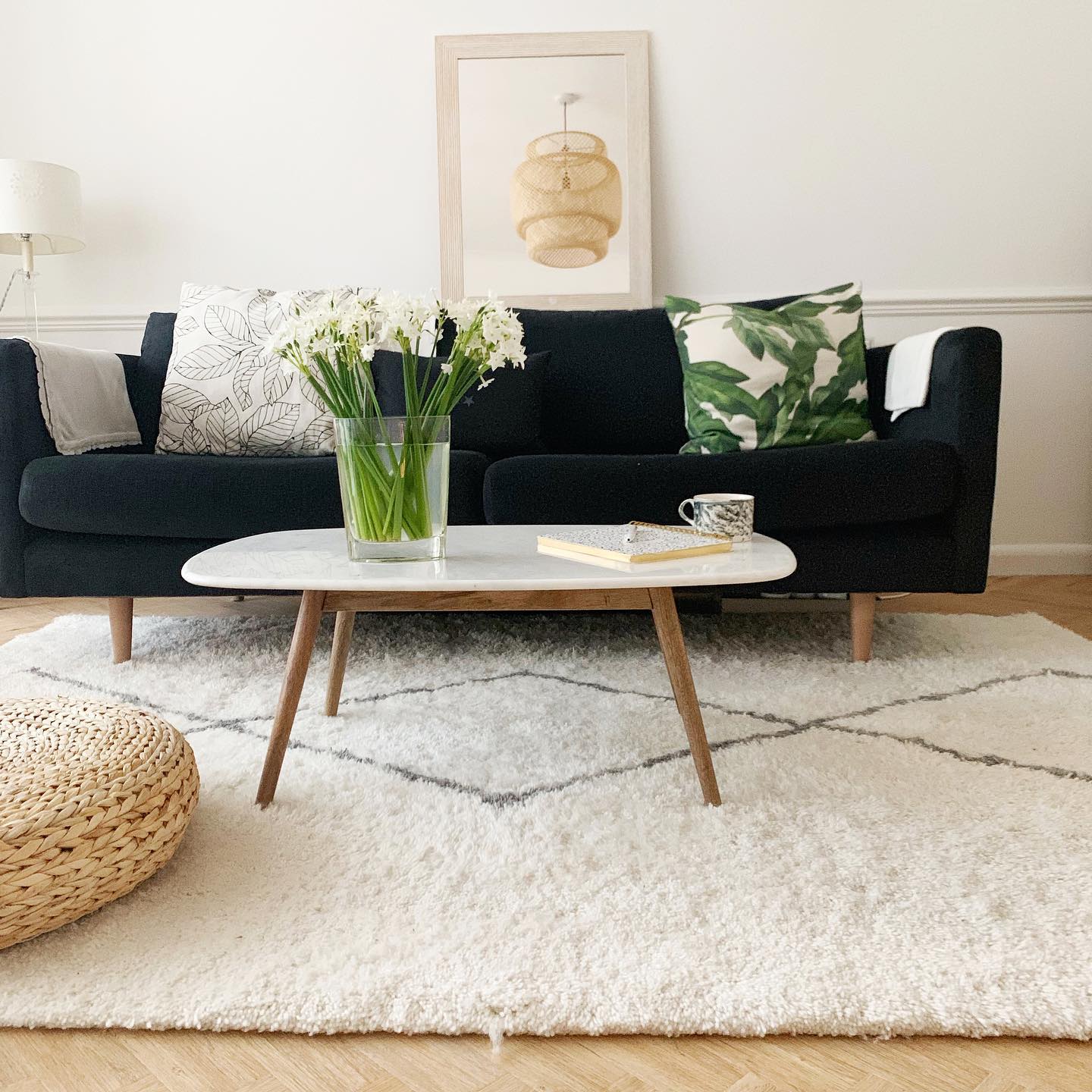
A black sofa can feel fresh and relaxed when cream takes the larger share of the palette. This living room balances dark upholstery with white walls, a plush, generously sized pale rug, and a slim oval coffee table.
Light, tapered wood furniture legs add the warmth that a strictly black and white scheme can lack. Green enters through a botanical cushion and the stems in a clear vase, keeping the color easy to change.
Start with the sofa as your anchor, then select several creamy textures instead of matching every white exactly. Keep patterns simple and spaced apart.
The result suits midcentury furniture because the contrast makes tapered legs and curved silhouettes easy to appreciate without adding much visual noise.
3. Give Warm Neutrals a Turquoise Focal Point
Credits: Instagram
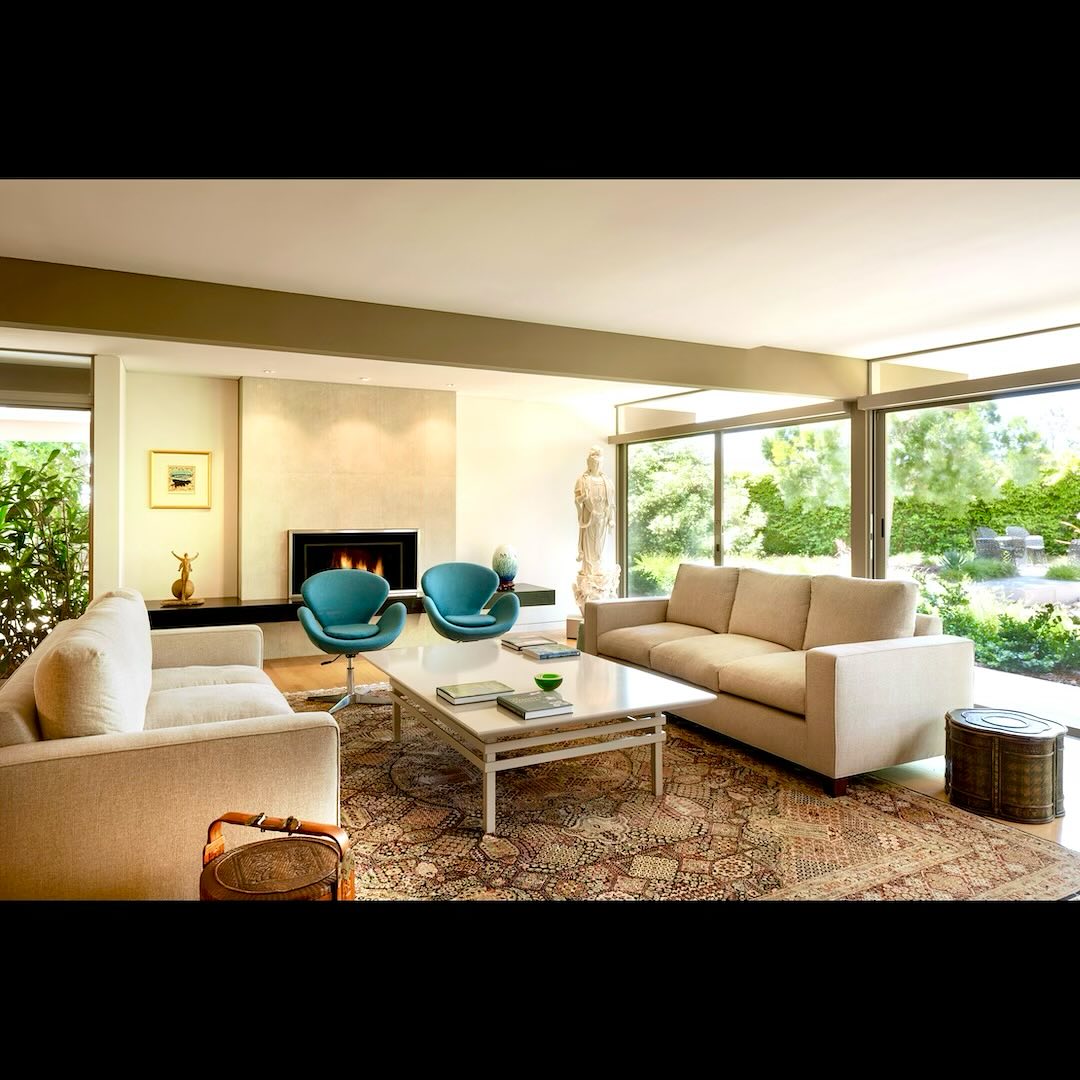
Two bright turquoise chairs supply the clearest color note in this otherwise quiet living room. Cream sofas, pale walls, and a softly patterned rug leave the curved seats room to stand out.
The garden adds another layer of green through broad windows, so the interior already feels connected to nature before accessories enter the picture.
Borrow the balance by keeping your biggest upholstered pieces neutral and concentrating a brighter hue in one or two smaller seats. Turquoise works particularly well beside honey colored floors and warm beige textiles.
Repeat it sparingly, perhaps in a bowl or small artwork. A pale coffee table preserves the open feeling between the sofas and prevents the center of the arrangement from looking overly heavy.
4. Pair Olive Upholstery With Buttercream Leather
Credits: Instagram
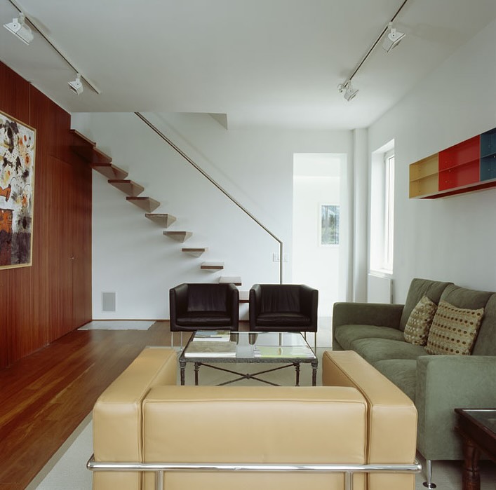
Olive and buttercream make an especially calm combination for a room filled with angular furniture. The green sofa here sits opposite pale yellow seating, while chocolate chairs and reddish wood paneling deepen the scheme.
White walls give each tone breathing room. A small horizontal wall shelf adds brighter red and blue without taking over the seating area.
Try this palette by choosing a muted green with a gray undertone, then balancing it with a warmer pale neutral. Let existing woodwork count as a major color rather than treating it as background.
Chrome and glass can keep the arrangement feeling light. Reserve stronger primary colors for one deliberately small, compact accent so the soft upholstery remains the visual center of attention.
5. Use a Green Accent Against Soft White
Credits: Instagram
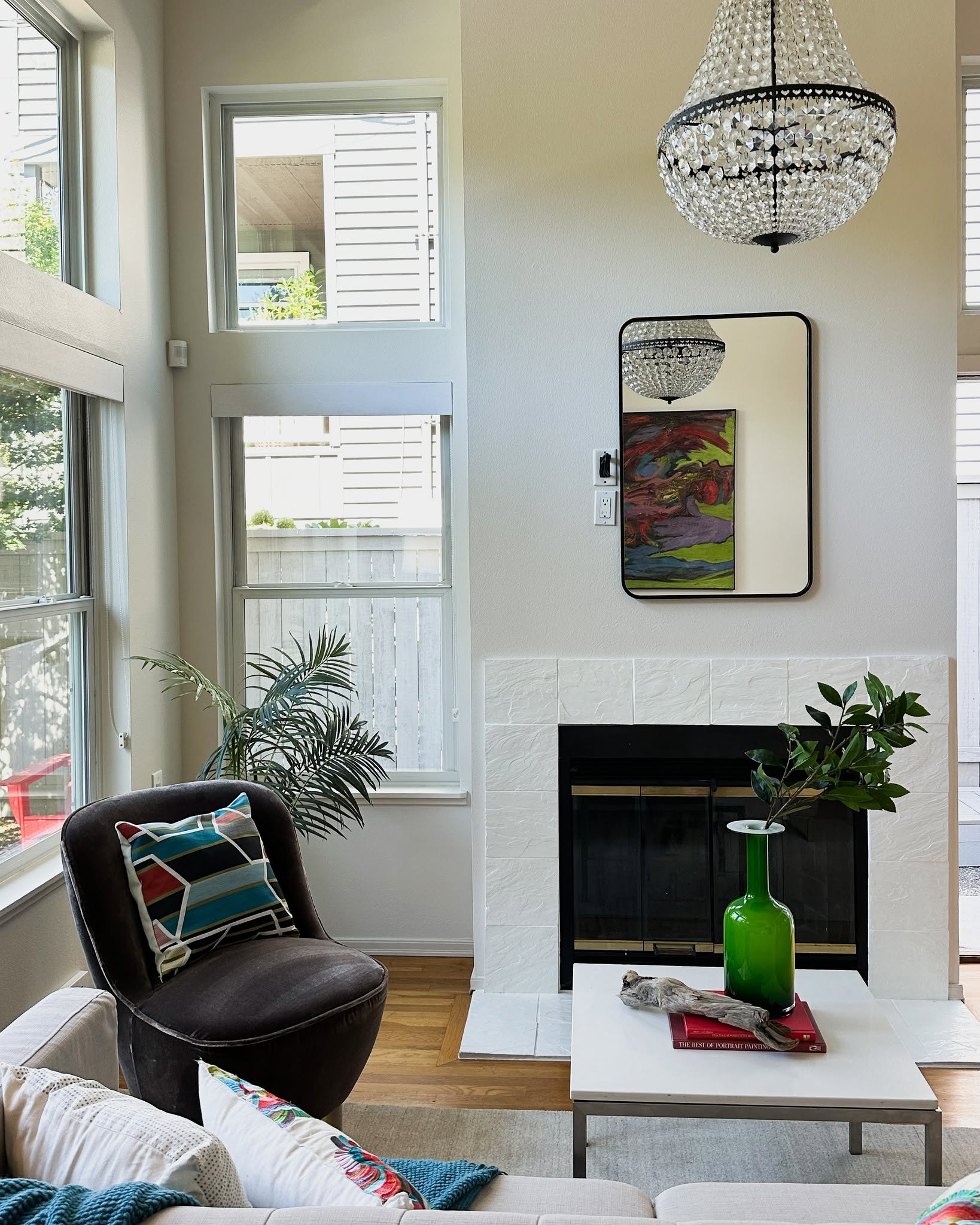
A bright green glass vase turns a mostly white living room into a cheerful color lesson. Its clear saturation contrasts with the charcoal chair, pale sofa, and white fireplace, while smaller turquoise and red notes appear in patterned cushions.
The wood floor warms the entire arrangement. You can use the same idea without buying new furniture: choose one vivid object with a simple, clearly defined silhouette and give it space on a table.
Pull one or two related colors into textiles elsewhere, keeping the largest walls and upholstered surfaces quiet. Black outlines on a mirror or lamp help organize the lighter background.
This approach lets midcentury shapes share a room with decorative lighting while the palette keeps everything feeling connected.
6. Layer Moss Green With Walnut and Oatmeal
Credits: Instagram
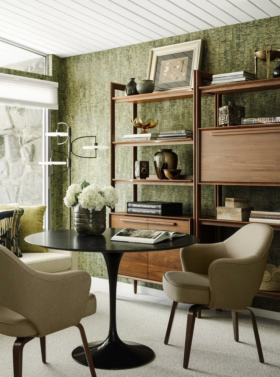
Moss green wallcovering brings a natural, richly textured backdrop to this compact den. Walnut shelving gives the green a warm partner, and oatmeal seating keeps the composition from becoming too dark.
A black pedestal table provides a crisp center point beneath the pale ceiling. The useful lesson is that a green room needs differences in value as much as differences in material.
Choose a wall tone deeper than your upholstery, then introduce wood with visible grain for another quietly contrasting layer. Keep the largest horizontal surface dark if you want a grounded feeling.
Cream flowers, light lamps, and a pale rug can supply small areas of relief. Leave some generous shelving open so the beautiful wall texture remains visible throughout.
7. Frame Chalky Whites With Dark Brown Beams
Credits: Instagram
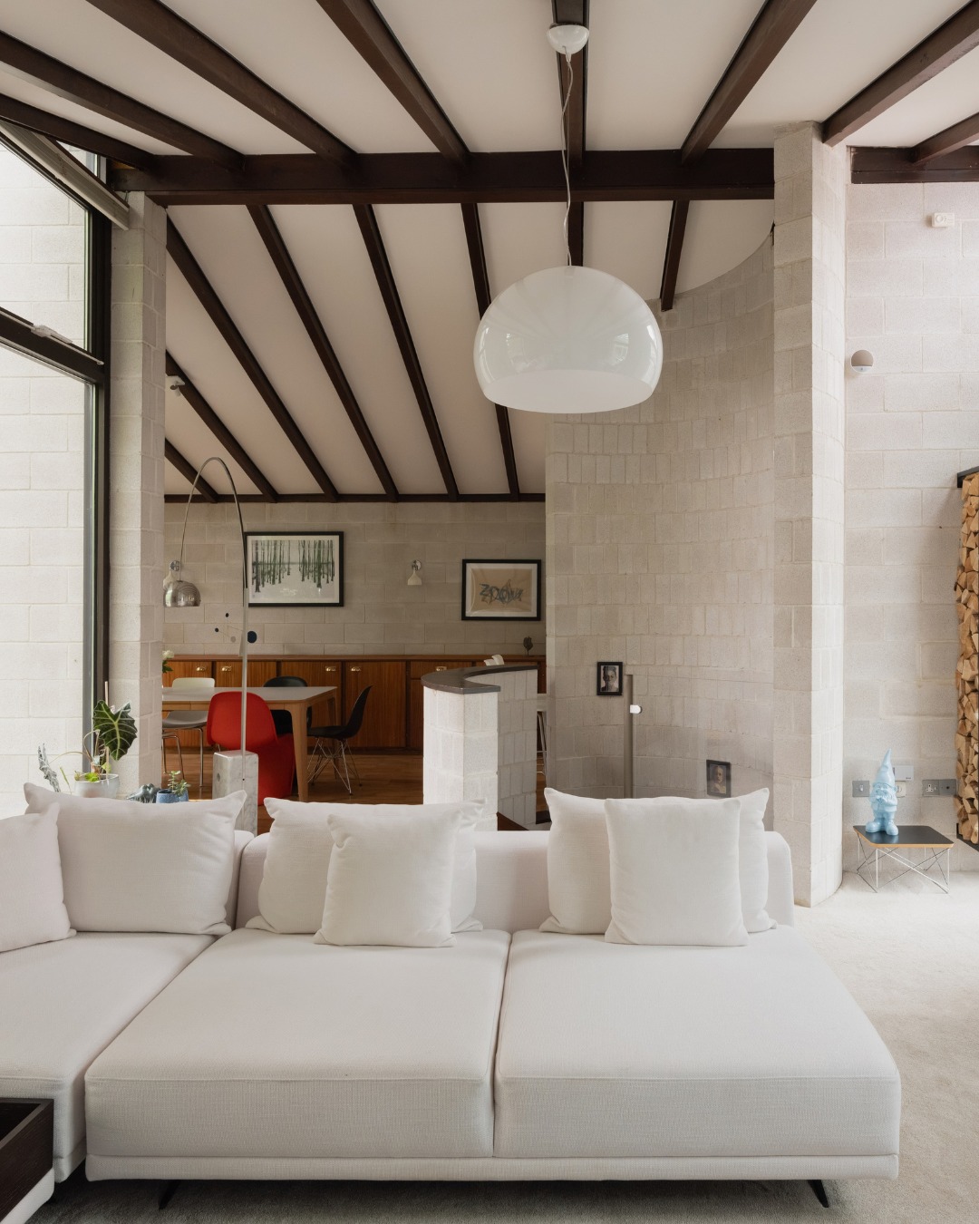
A nearly white palette gains definition from the dark timber structure in this bright, carefully furnished modernist living room. Pale masonry, soft carpeting, and generous white cushions create a continuous light background.
Brown beams draw clean lines overhead, while warm cabinetry and a red chair add depth farther back. To recreate the balance, vary the texture of your whites instead of searching for one exact shade across every surface.
A woven sofa, matte wall, and smooth pendant will reflect light differently. Retain dark architectural details where they already exist; their contrast can make the room feel more legible.
Use one small, clearly saturated accent to prevent the scheme from becoming flat, especially where the living space connects to another area.
8. Repeat Tomato Red Beside Caramel Leather
Credits: Instagram
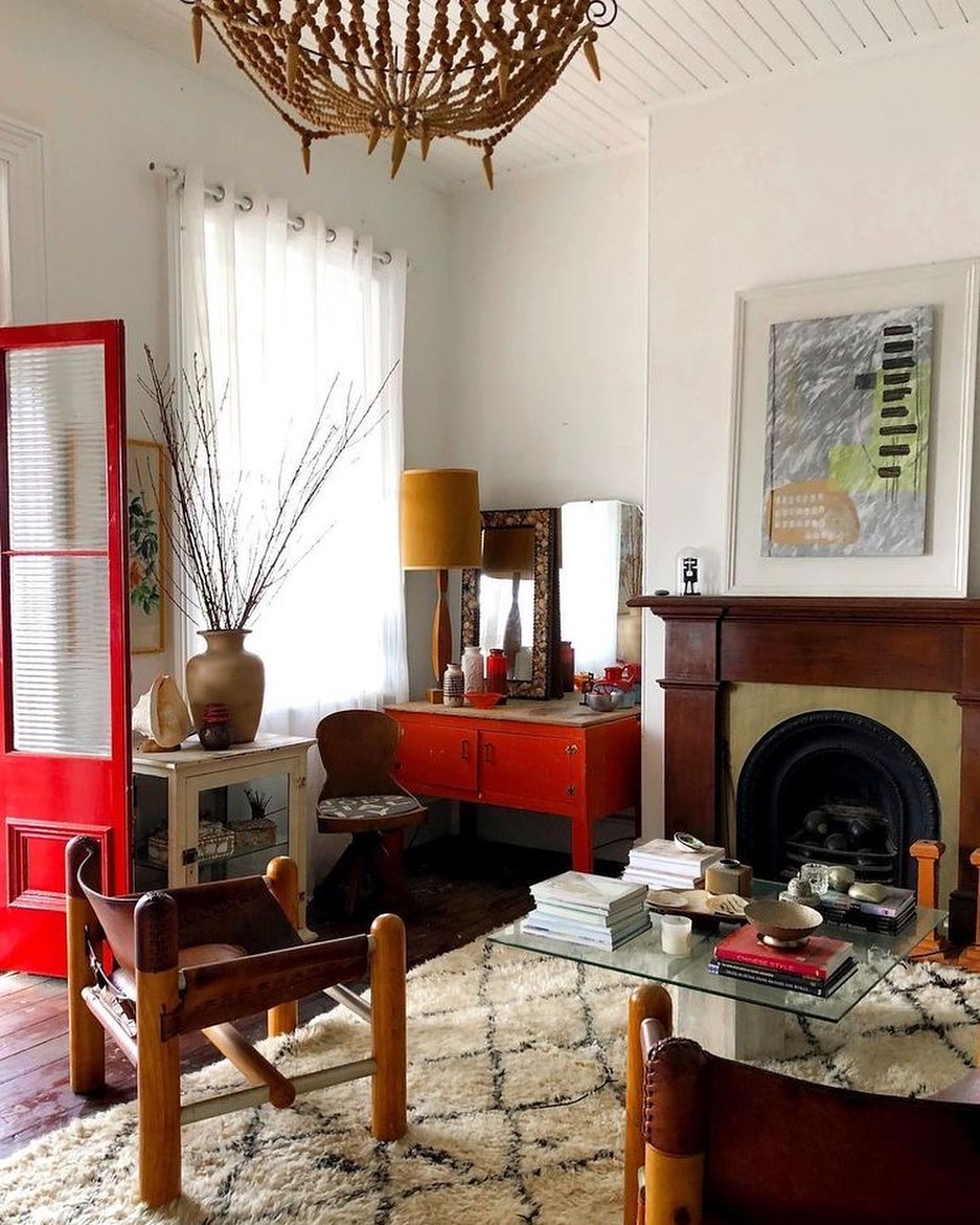
Tomato red gives this collected living room its warm, playful energy.
A painted door and a low console repeat the color on opposite sides of the corner, while caramel leather chairs and dark wood keep the warmth moving through the space.
White walls and a cream rug stop the stronger tones from crowding one another. This is an effective way to introduce red around vintage furniture: use it on two separated surfaces rather than concentrating everything in one spot.
Choose a mustard lamp or cushion as a quieter warm accent. A glass coffee table helps the patterned rug remain visible and lets substantial wood framed chairs feel lighter.
Keep additional accessories neutral so the repeated red stays easy to follow.
9. Balance Terracotta With Cream and Pale Green
Credits: Instagram
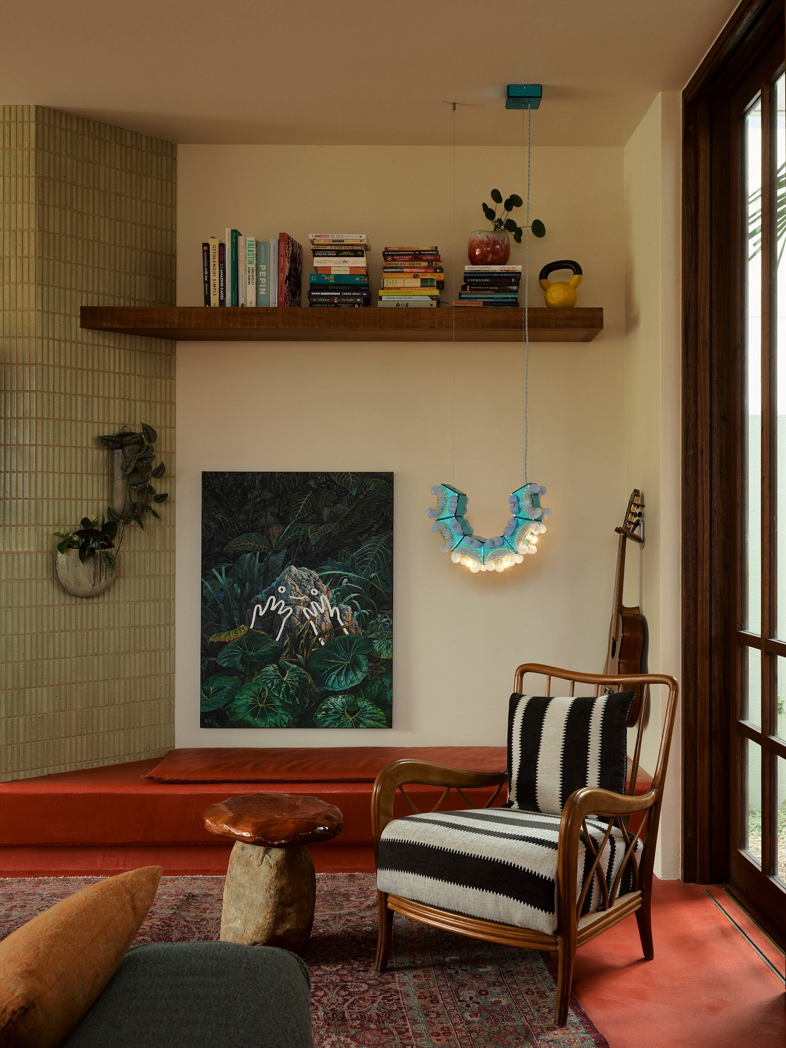
Terracotta-colored flooring gives this sitting area a warm foundation, while cream walls and pale green tile keep the color from feeling overwhelming.
A slender, warmly colored wood framed chair adds black and white stripes, creating a graphic counterpoint to the softer surfaces. Lush green artwork reinforces the cool side of the palette, and a small turquoise light supplies an unexpected spark.
Start with terracotta on one generous surface, such as a rug, floor, or sofa. Then choose a pale green with enough gray to feel settled beside it.
Cream makes a useful bridge between the two. Repeat wood tones in a shelf or chair frame, and limit high contrast pattern to one seat or cushion for an easy midcentury mood.
10. Blend Cognac Leather With Peach and Cream
Credits: Instagram
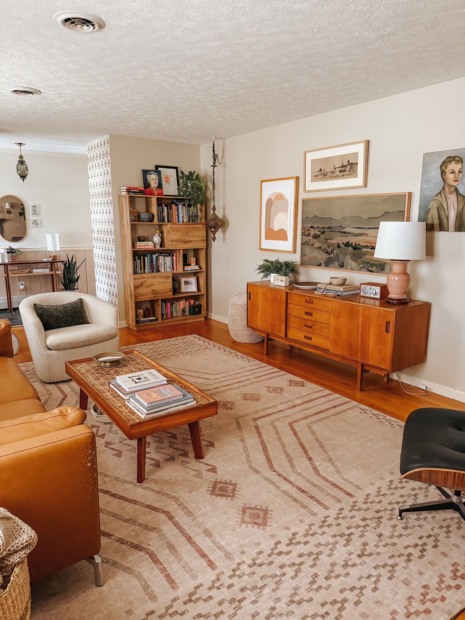
Cognac leather and glowing, honey colored wood establish a comfortably warm base in this vintage furnished living room.
A peach lamp and softly colored artwork extend that warmth, while a cream chair and pale patterned rug give the eye room to rest. Small green touches prevent the palette from becoming entirely brown.
Try this combination when you already own a midcentury sideboard or coffee table with a rich finish. Match its warmth with leather rather than trying to match every wood grain.
Then choose peach as a gentle accent in ceramics, artwork, or a cushion. Keep the wall color light and creamy.
Several textures within the same restrained palette will make a room feel collected without requiring many additional colors.
11. Cool Golden Wood With Dusty Blue
Credits: Instagram
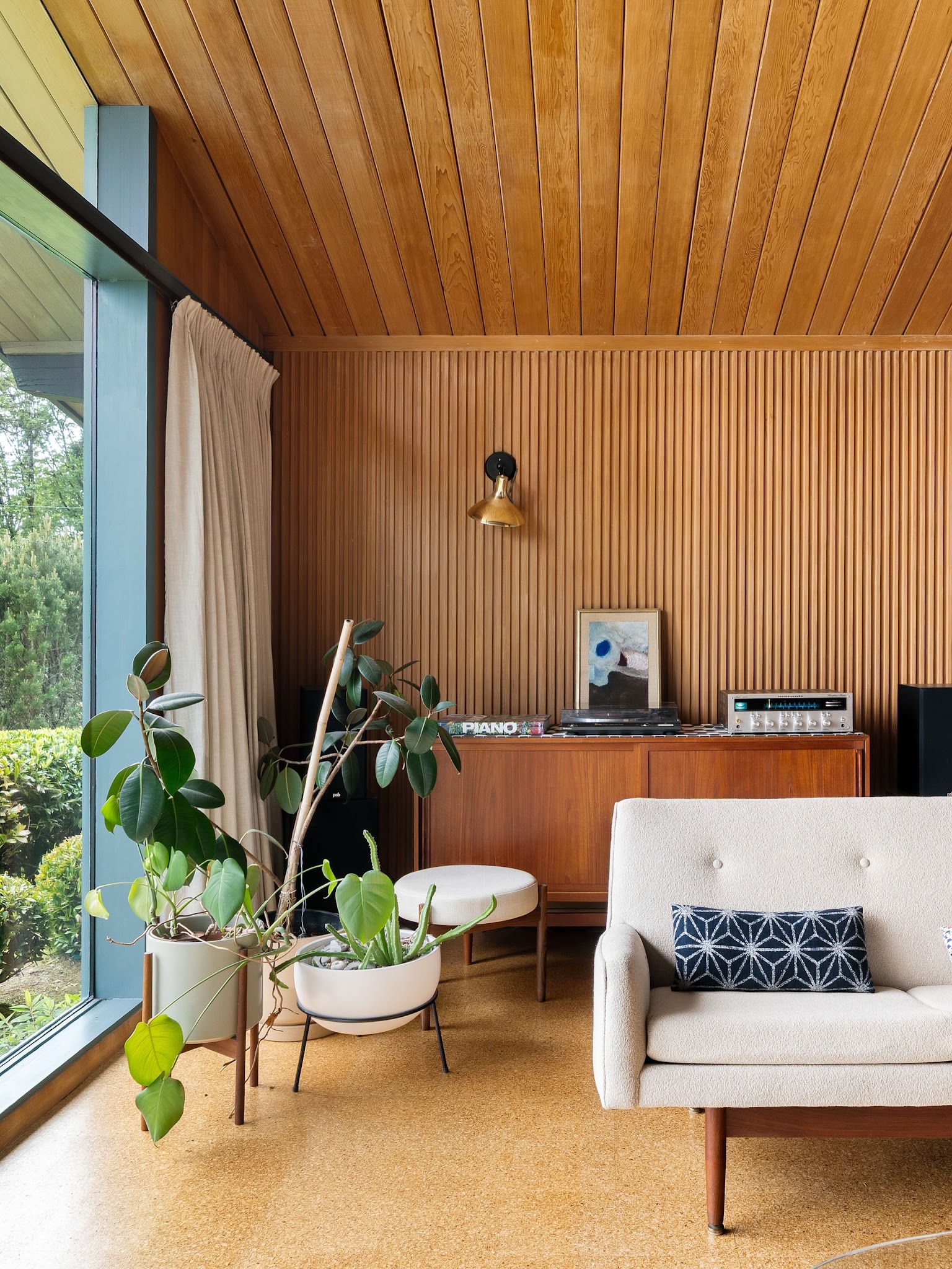
A dusty blue window frame gives golden wood a cooler companion in this midcentury living room. The ceiling, fluted wall, and low cabinet each show a slightly different warm finish, while a cream sofa keeps the corner feeling light.
A blue patterned pillow repeats the window color at seating level. This is a useful palette for a room with extensive paneling and attractive original details.
Preserve the wood as your dominant tone, then add a muted blue through trim, textiles, or an accent chair. Avoid matching every wooden piece perfectly; a small range of honey and caramel tones feels natural.
Cream curtains and pale planters provide a gentle pause between wood and glass, with greenery supplying the final fresh layer.
12. Punctuate Pale Gray With a Red Chair
Credits: Instagram
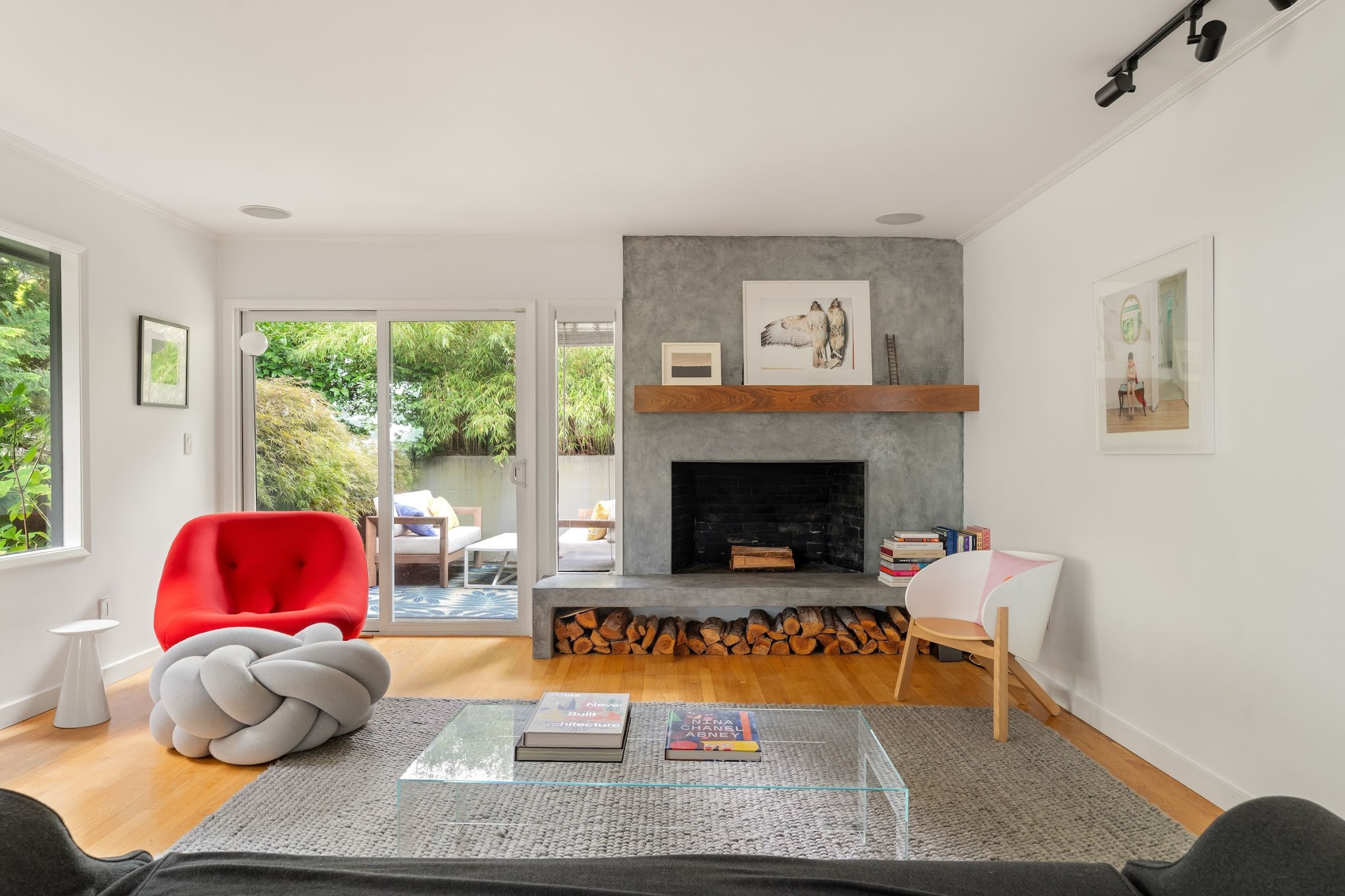
A vivid red chair gives this bright living room a single, unmistakable focal point. The gray fireplace, gray rug, and pale walls form a quiet setting around it, while honey colored flooring prevents the cooler surfaces from feeling chilly.
A clear coffee table leaves the floor pattern and seating arrangement easy to read. Try this balance when you want a bold color without painting an entire wall.
Choose a chair with a strong, generously scaled, curved silhouette and let its upholstery carry the statement. Echo gray in a small, soft ottoman or pillow, then use white to soften the transitions.
Keep additional red objects limited so the chair remains the room's main visual destination rather than one accent among many.
13. Combine Red Upholstery With Mustard Curtains
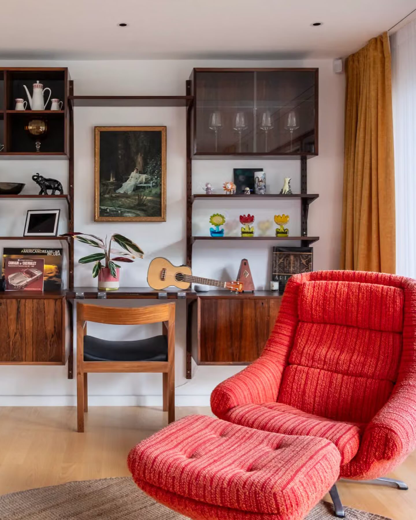
Credits: Instagram
Red and mustard can look comfortable together when dark wood sits between them. This living corner uses a richly textured red lounge chair beside soft golden curtains and a modular wooden wall unit.
White wall space breaks up the warm colors, while the open shelving keeps the dark cabinet from feeling like a solid block. Begin with one strong textile, then choose a second warm color that differs clearly in depth and intensity.
The mustard here is softer than the red, which gives the chair priority. Keep the floor pale and let smaller decorative objects introduce tiny additional colors.
A simple wooden desk chair supports the vintage mood without competing with the generous upholstered seat at the center of attention.
14. Give Olive Seating a Warm Evening Glow
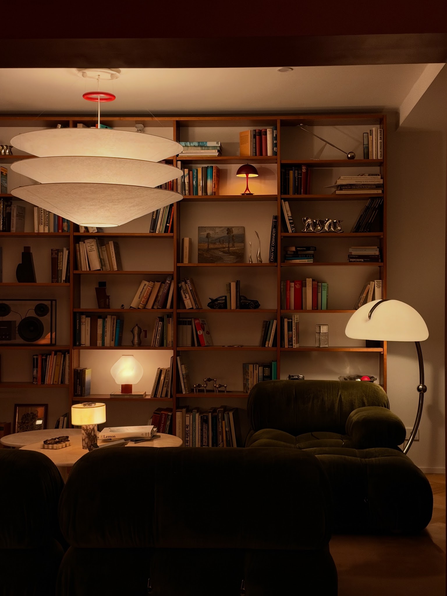
Credits: Instagram
Deep olive upholstery becomes especially inviting beside warm wood and soft, creamy light. In this living room, low modular seating sits in front of open shelves, while several lamps create a gentle rhythm across the background.
A large pale pendant keeps the darker seating from dominating the composition. The palette offers a useful reminder to test colors after sunset, when a room often gets the most use.
Choose an olive fabric you enjoy under both daylight and warm bulbs. Keep lampshades within a cream or ivory family, then repeat wood in shelving and small tables.
A restrained red accent can add energy without changing the relaxed mood. Spread lighting across several heights so darker colors retain their depth and detail.
15. Balance Ink Blue With Burnt Orange
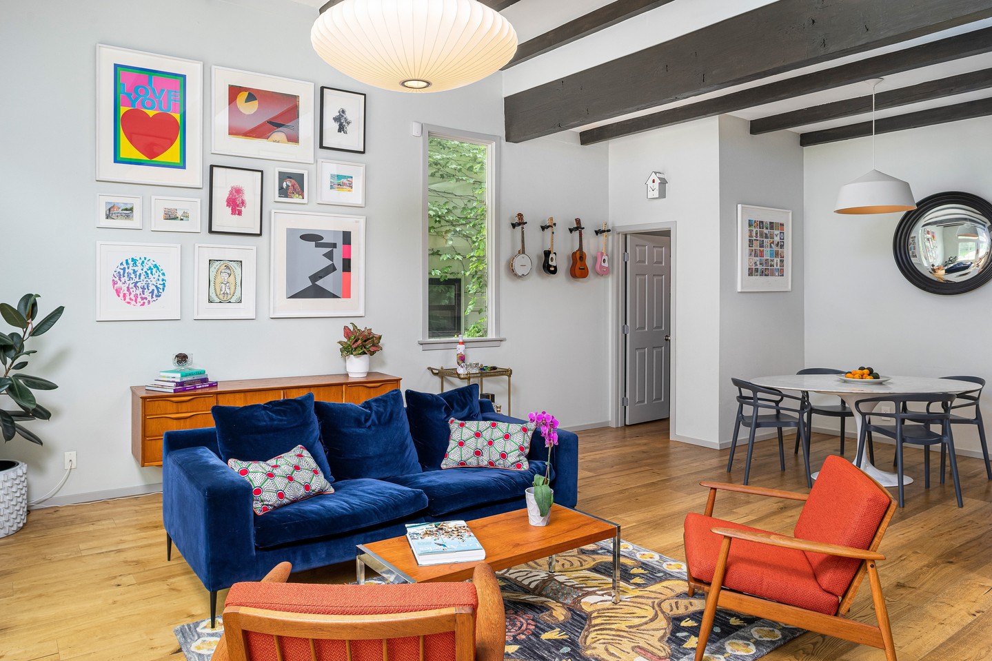
Credits: Instagram
Ink blue velvet and burnt orange upholstery create a lively partnership in this open living room. The sofa holds the darker tone, while two wooden armchairs carry the warmer color.
White walls and exposed dark beams keep the background simple enough for a varied collection of artwork. A honey colored table bridges the furniture without adding another strong hue.
To use the pairing at home, give blue the larger upholstered surface and let orange appear in smaller seats or cushions. Choose a rug that includes both warm and cool details.
Repeating wood through the chair frames and storage helps the palette feel connected. Leave some wall space clear so the colorful furniture and collected artwork each have room to breathe.
16. Set Dark Brown Against Salmon and White
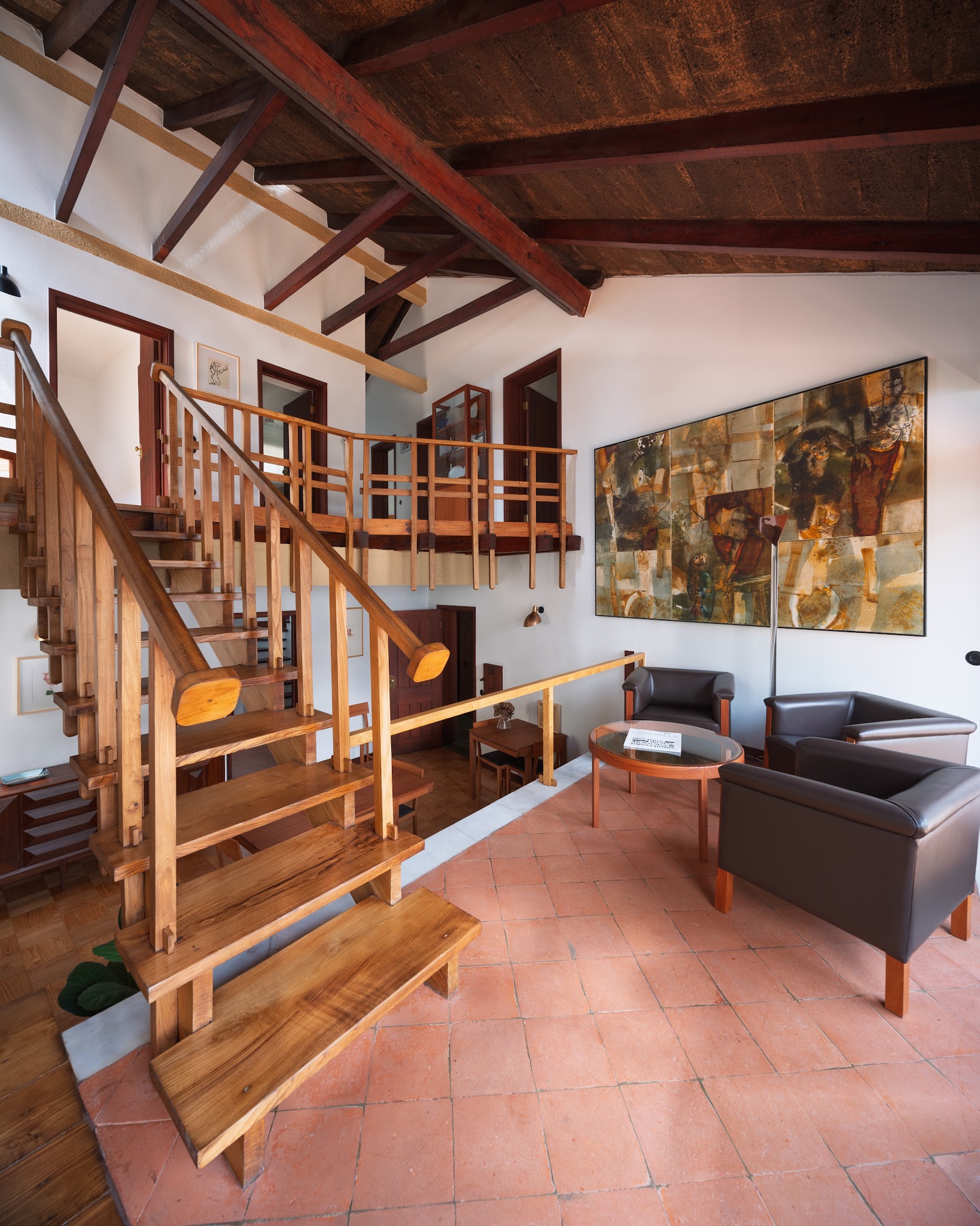
Credits: Instagram
Soft salmon colored floor tiles warm this modernist sitting area from the ground up. Deep brown seating and reddish timber beams add weight, while white walls keep the tall room bright.
The artwork gathers several of those earth tones into one large focal point. Borrow the balance by letting an existing warm floor guide your upholstery choices.
Dark chocolate creates a clearer contrast than another similar orange or pink shade. Keep major walls light and airy when the ceiling already contains rich wood.
A simple wood and glass table can echo the architecture without blocking the floor color. Choose artwork that includes both lighter and darker notes, giving the whole palette a clearly defined, shared visual reference across the room.
17. Freshen Wood Paneling With Slate Gray
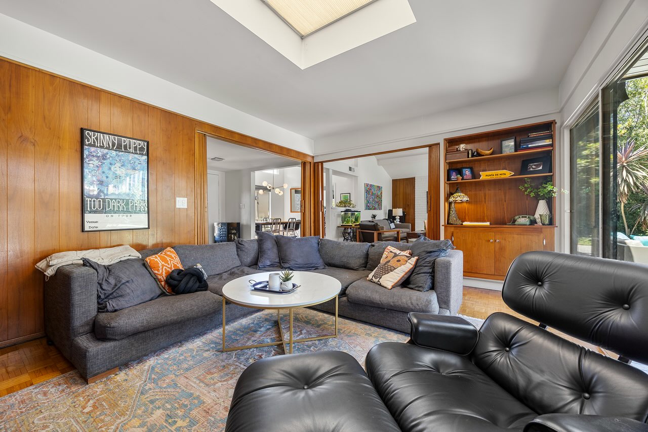
Credits: Instagram
Slate gray upholstery gives warm wood paneling a quieter, slightly cooler and more contemporary partner. This living room pairs its generous sectional with a black leather lounge chair, while a white round table breaks up the darker seating.
Small orange cushions echo the warmth of the walls without making everything match. If your room already has substantial paneling, choose a gray fabric with enough depth to stand beside it.
Test the sample near the wood, since some grays can turn unexpectedly blue or purple. Keep the ceiling and table light to prevent a heavy overall effect.
A faded patterned rug can mix gray, cream, and rust below the furniture, helping the existing natural finishes and upholstered pieces feel comfortably connected.
18. Balance Black Leather With Pale Natural Tones
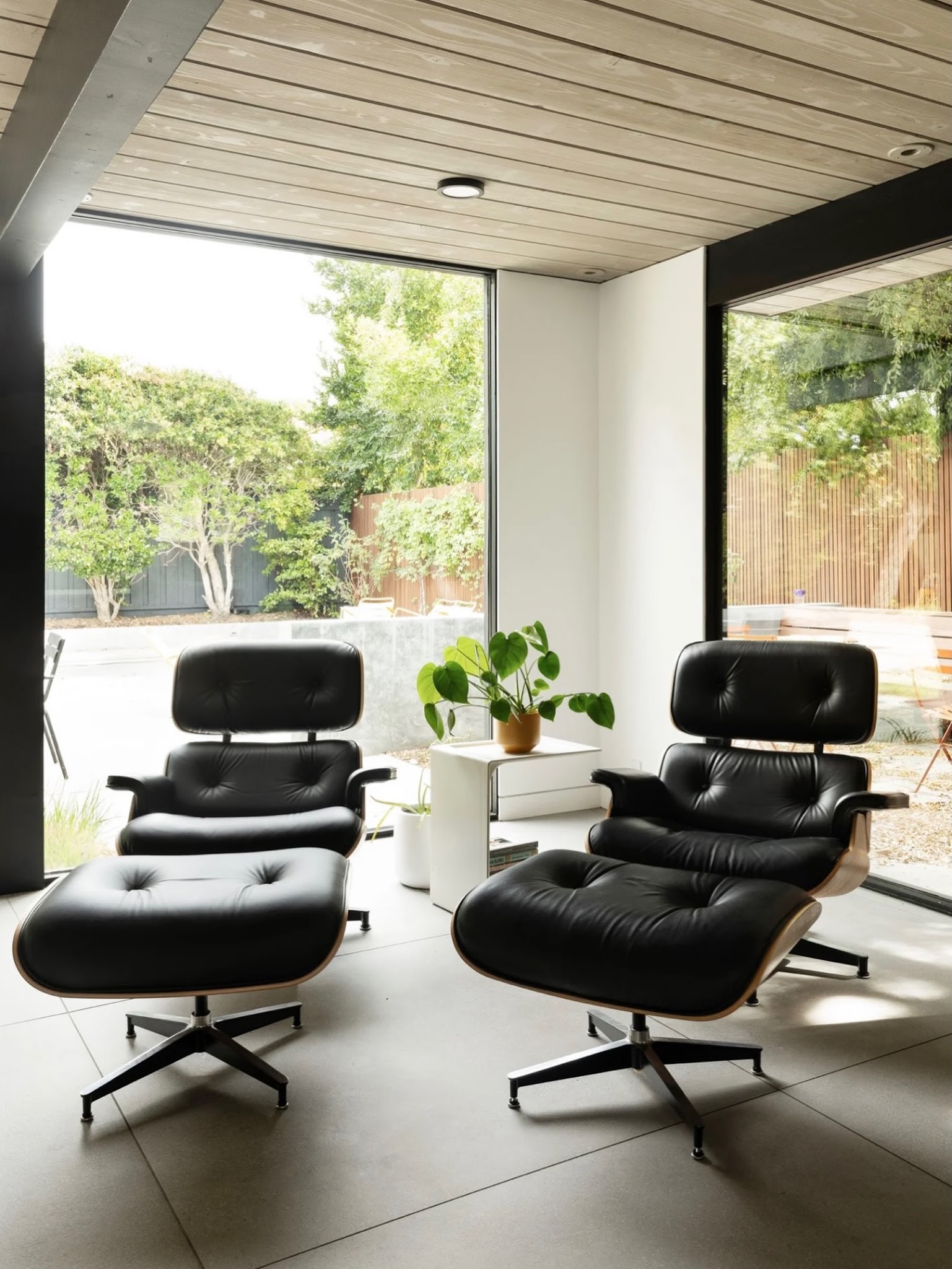
Credits: Instagram
Black leather looks lighter when the surrounding architecture gives it plenty of breathing room. This Eichler lounge places two sculptural chairs against broad windows, pale flooring, and a softly toned wood ceiling.
White walls and a slim white side table let the dark upholstery stand out without making the corner feel enclosed. Use this palette when you want the furniture silhouettes to lead.
Keep the largest surrounding architectural surfaces light, then introduce warmth through visible wood grain rather than extra bright colors. A leafy plant adds a fresh green note and connects the chairs to the garden beyond.
Repeat black in window frames or a small light fixture so the seating feels integrated with the room instead of visually isolated.
19. Pair Midnight Blue With Caramel Stripes
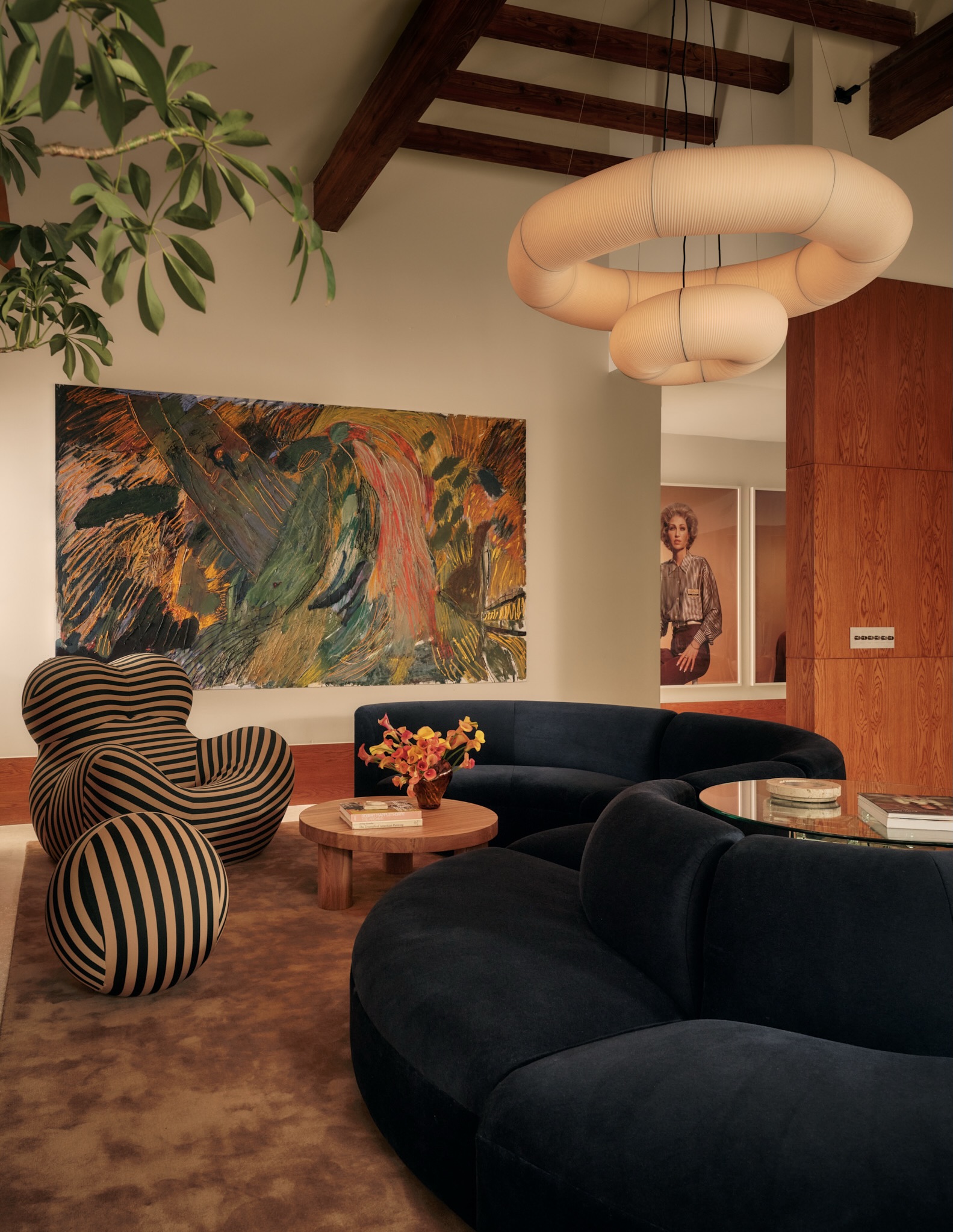
Credits: Instagram
Midnight blue upholstery gains warmth from caramel tones in this expressive living room. A striped sculptural chair repeats both colors, while the rug, wooden table, and wall paneling continue the warmer side of the scheme.
Cream walls and pale lighting provide the space needed around the bold furniture. Use a patterned accent chair to connect a dark sofa with a warm room instead of adding unrelated colors.
The stripe works especially well because its curved setting echoes the sofa's rounded shape. Keep the central tables simple and let the artwork carry smaller, more scattered green, gold, and rust notes.
This creates a varied palette with a clear foundation: dark blue for depth, caramel for warmth, and cream for breathing room.
20. Ground Cream Seating With a Moss Green Rug
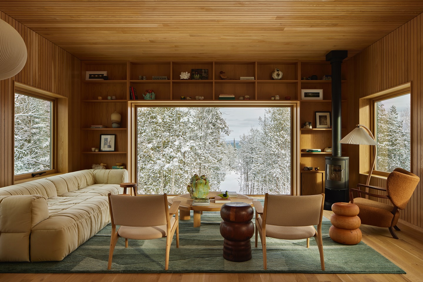
Credits: Instagram
A muted, moss green rug offers a calm resting place within this warm, wood lined living room. Cream seating keeps the furniture light, while brown and amber accents connect it to the surrounding cabinetry.
The windows supply snowy views, making the green floor covering feel particularly rich against the wintry, pale landscape. For a similar result, choose a rug large enough to bring the main seating pieces together.
Keep the upholstery lighter than the rug, then vary the wood finishes just enough to prevent a single flat tone. Small rounded tables add darker punctuation without overwhelming the space.
A restrained palette allows the sculptural furniture and wood grain to remain the focus, with green providing a calm link to nature.