
Pastel rooms feel more pulled together when soft colors have a clear point of connection, rather than competing across every surface.
The Best Pastel Living Room Ideas here show ways to create that balance, from pairing a blush sofa with an aqua armchair to using a multicolored rug to link pink, green, and blue.
You’ll also find ideas for layering pink patterns over a soft blue sofa and adding crisp contrast with blue picture frames against a blush wall.
Small choices in upholstery, textiles, and wall color can help a gentle palette feel considered and comfortable.
1. Pair a Blush Sofa With an Aqua Armchair
Credits: Instagram
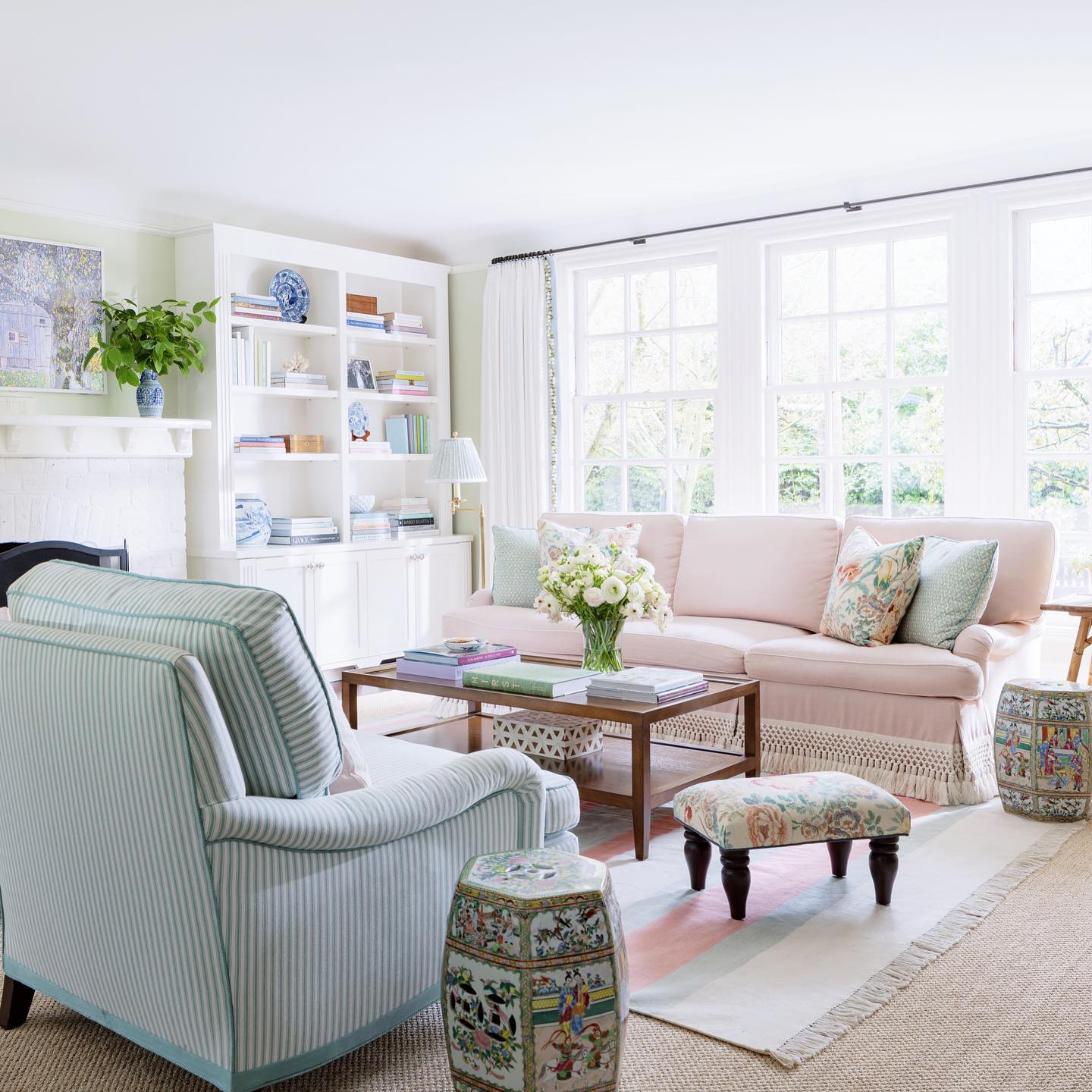
A blush sofa and striped aqua armchair share the spotlight in this living room. Floral cushions bring both colors onto the sofa, while white shelving and curtains give the upholstery room to stand out.
Try this pairing when you want pastel furniture without buying a matching suite. Choose one soft color for your largest seat and another for a single chair, then connect them with a patterned pillow or small rug.
Compare fabric samples together in your room before committing, since daylight can change how pale shades appear. The warm wooden coffee table offers a useful finishing touch.
Include a similar natural surface to break up the painted pieces and make the delicate palette feel relaxed enough for everyday use.
2. Connect Pastel Furniture With a Multicolored Rug
Credits: Instagram
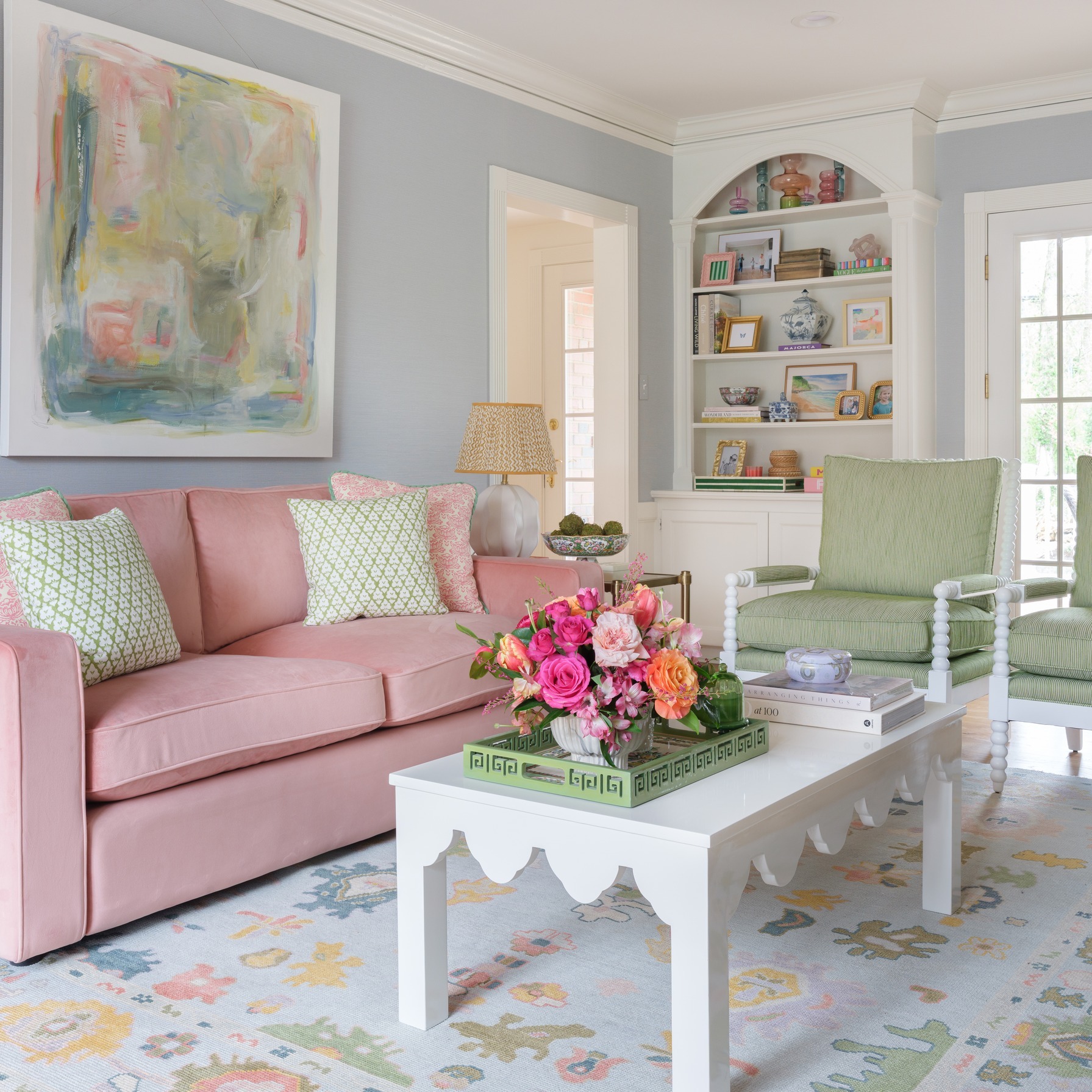
The rug gathers this room's pink sofa, green chairs, and blue walls into one pattern. Small yellow details add warmth, and the white coffee table leaves the surrounding colors easy to see.
Use a patterned rug as your starting point if combining several pastels feels difficult. Pick two or three colors from its design for larger pieces, allowing the remaining shades to appear in cushions or a lampshade.
You do not need an exact match; a related pale tone can feel more natural than identical colors everywhere. Check the pattern at full size before buying, because tiny online swatches hide its scale.
Position the rug so its colors remain visible around the coffee table and between the main seating pieces.
3. Layer Pink Patterns Over a Soft Blue Sofa
Credits: Instagram
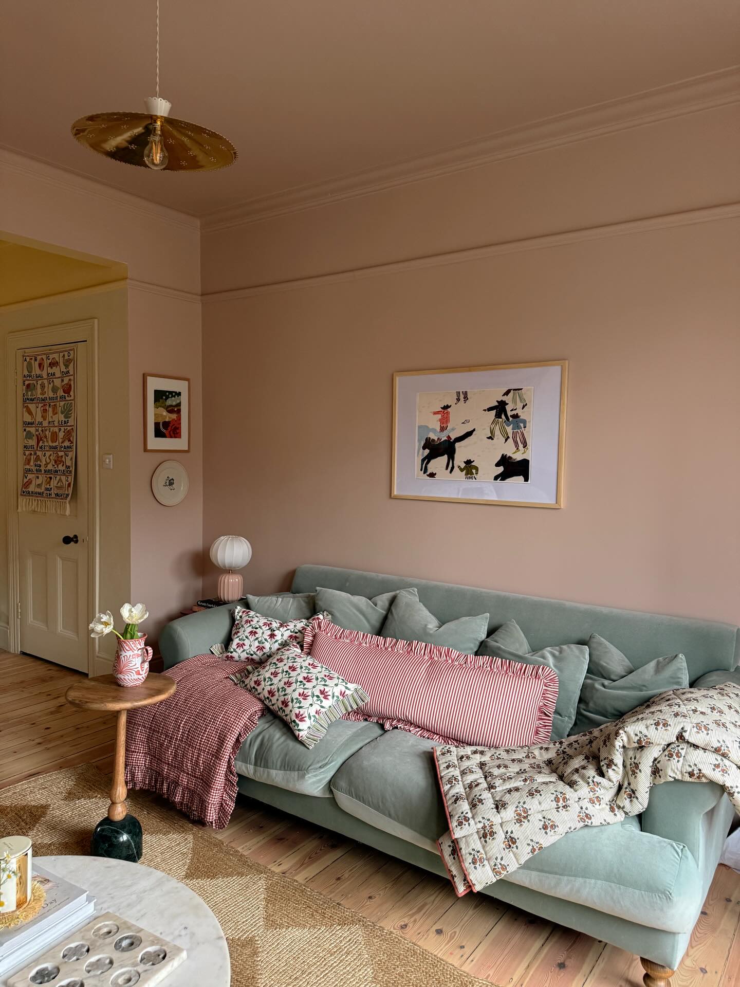
A long striped pink cushion stretches across this soft blue sofa, with floral pillows and throws adding smaller patterns around it. Blush walls extend the warm color above the seating, while the plain upholstery keeps the layers from feeling crowded.
To borrow the look, start with one oversized cushion that gives your eye a clear focal point. Add a smaller floral print using a similar pink, then vary the shapes rather than introducing another strong color.
A throw draped over one arm makes the arrangement easy to loosen for lounging. Keep enough uncovered cushion space for sitting, and choose removable covers where possible.
Lay the fabrics together before ordering so you can compare their scale, texture, and warmth in daylight.
4. Outline a Blush Wall With Blue Picture Frames
Credits: Instagram
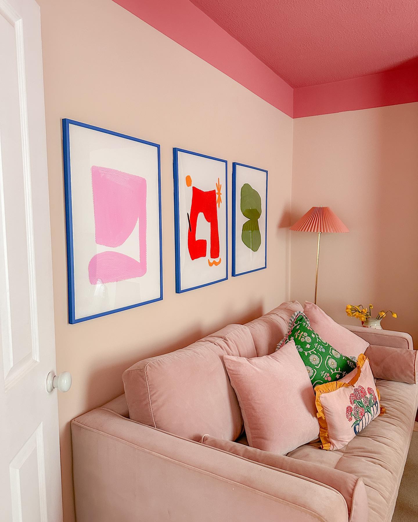
Three blue frames give this pink seating corner a crisp line of contrast. Their shared color links the different prints, while the pale sofa and walls form a soft backdrop beneath the deeper rose ceiling.
Try the framing idea if your pastel room needs more definition without another large piece of furniture. Select a narrow frame in one stronger color and repeat it across a group of artworks.
White space inside the prints helps keep the display light. Arrange paper templates above your sofa before making holes, checking the spacing from both seated and standing positions.
Keep the frame color consistent even when the pictures vary. A few bright outlines can bring structure to a room full of gentle tones.
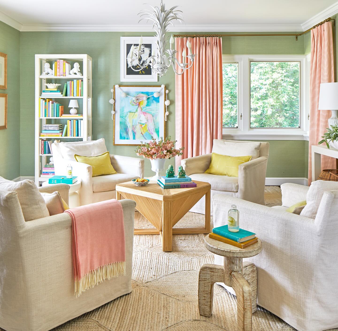
5. Warm Green Walls With Peach Curtains
Credits: Instagram
Peach curtains soften the green walls in this sitting room, with a matching throw carrying their warmth onto one cream chair. Pale yellow cushions add another sunny note without competing with the window treatment.
Borrow this balance by treating curtains as a substantial part of your color scheme. Hold a generous fabric sample against the wall and view it in daylight and lamplight before choosing a shade.
Keep the largest seats neutral if you want the green and peach pairing to stay clear. Hang curtain panels so they can pull away from the glass when open, preserving natural light.
Repeat the peach once elsewhere through a throw or cushion, then leave some cream surfaces visible for a comfortable seating area.
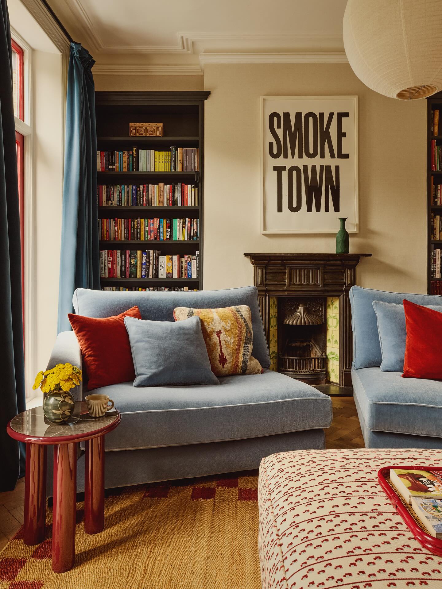
6. Set Powder Blue Seating Against Cream Walls
Credits: Instagram
Powder blue seating looks especially inviting against the cream walls of this snug. Dark shelving and the fireplace surround add depth, while red cushions give the soft upholstery a sharper accent.
Start with the blue and cream combination if you prefer pastels with a little weight. Use a warm neutral across the walls, then reserve the pale color for seating where its texture can be appreciated up close.
Deeper blue curtains can continue the color without making every surface identical. Before choosing upholstery, compare samples beside your existing woodwork and evening lighting.
Add a stronger accent in small, movable pieces, such as cushions or a tray. This lets you adjust the contrast gradually while keeping the room's main palette restrained.
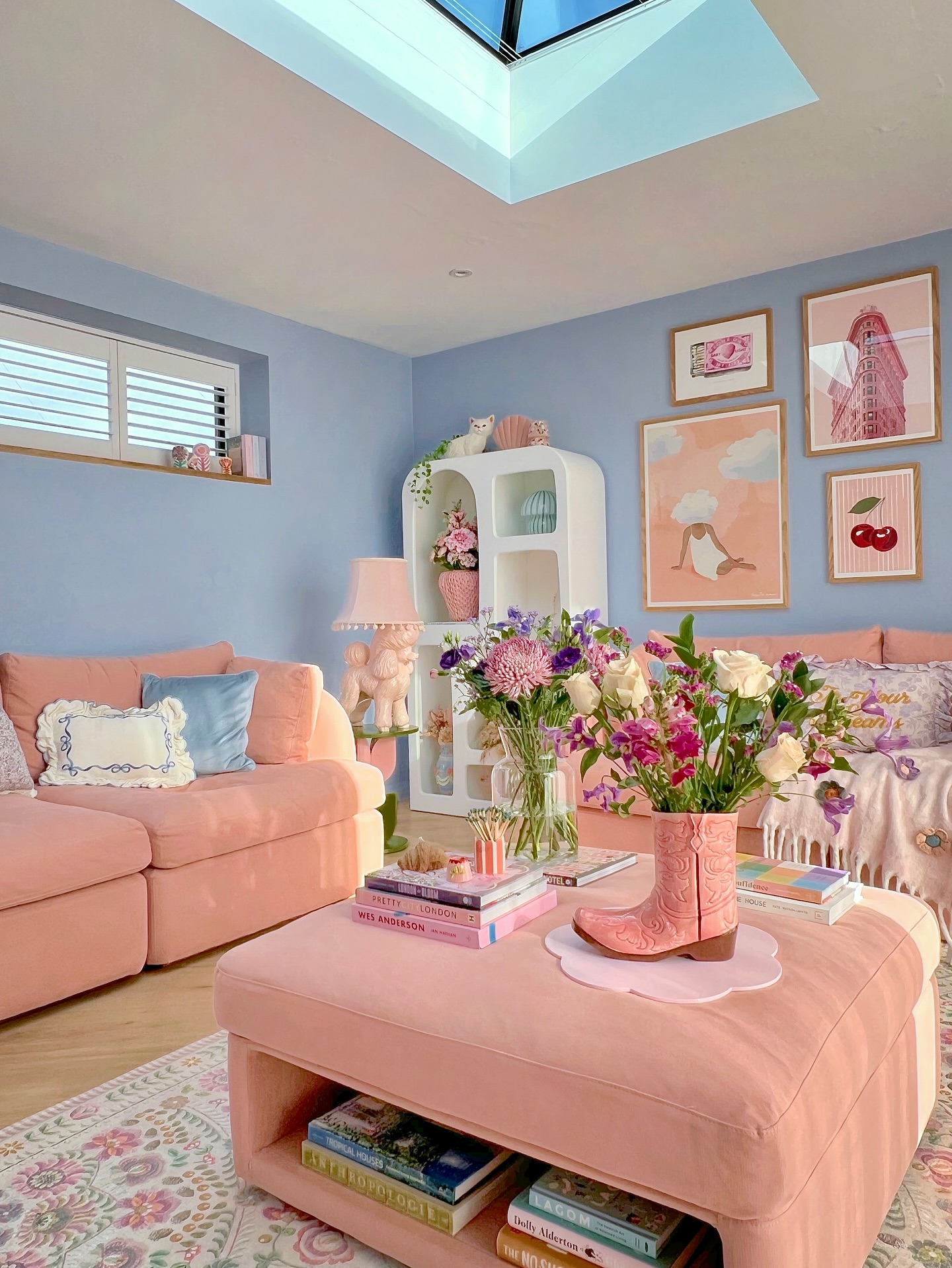
7. Repeat Peach Upholstery Around Blue Walls
Credits: Instagram
Peach sofas and an upholstered coffee table repeat the warm color across this blue living room. The matching surfaces make the seating group feel connected, while cream shelving offers a quiet pause between the pastels.
Follow the idea by repeating one upholstery shade on two pieces rather than scattering many unrelated colors around the room. If you already own a pastel sofa, try a coordinating footstool before replacing other furniture.
Keep the wall color a little cooler to maintain separation between the seats and their backdrop. A tray gives an upholstered surface a firmer spot for everyday objects; check that it sits securely before adding drinks.
Leave room around the table for movement, and keep part of its top clear.
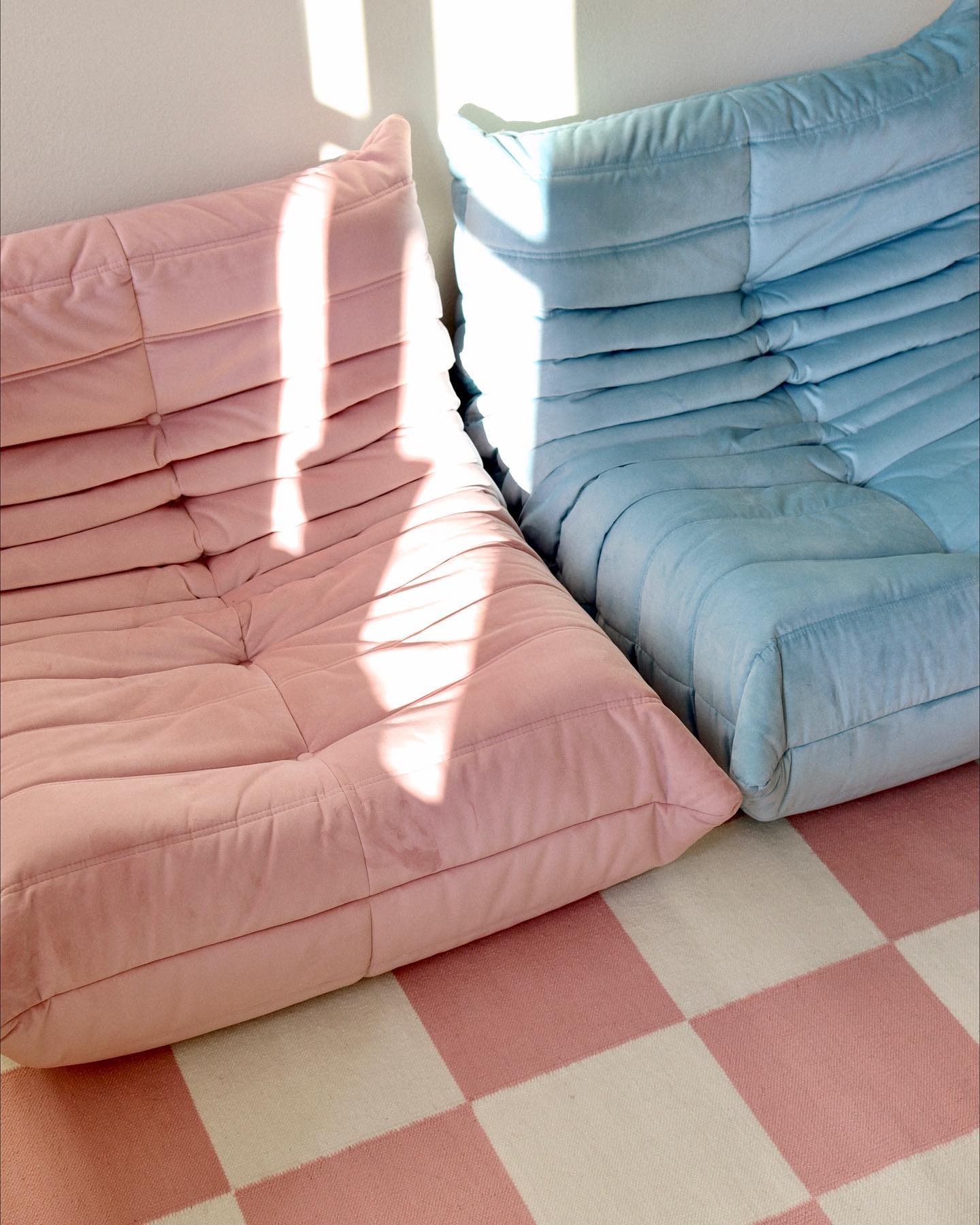
8. Pair Low Pastel Seats With a Checkerboard Rug
Credits: Instagram
Blush and powder blue lounge seats sit side by side over a pink and cream checkerboard rug. Their deep folds add texture, while the simple squares keep the pattern easy to read.
This close view offers a color combination to borrow for a casual seating corner. Choose two pastel shades of similar softness, then repeat one in the rug to connect the pieces.
Keep nearby accessories simple so the upholstery and checks remain the main features. Before choosing low seating, try the seat height and make sure getting up feels comfortable for everyone who will use it.
Measure the full depth as well as the width, since a relaxed profile can occupy more floor space than its low silhouette suggests.
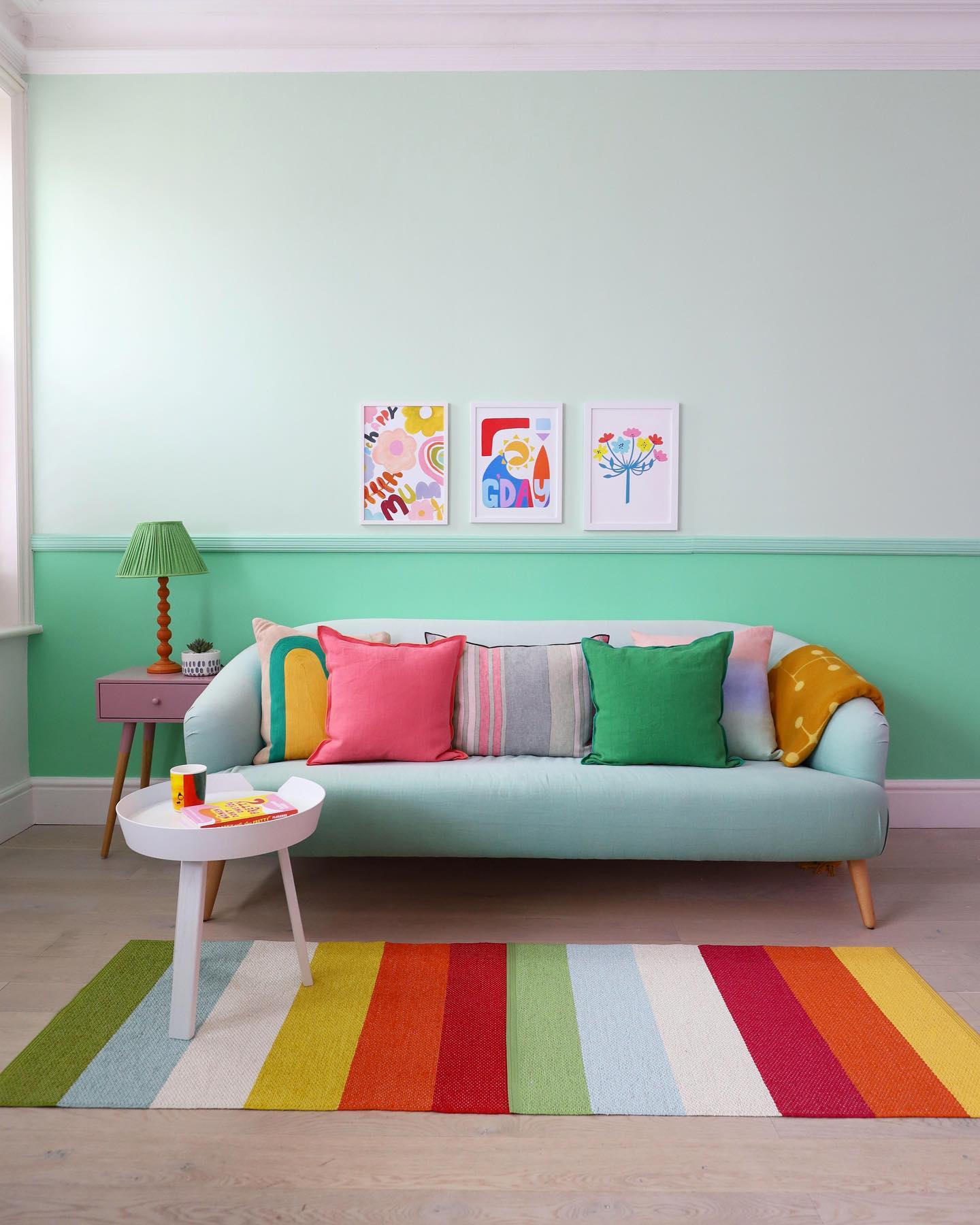
9. Divide Mint Walls With a Painted Rail
Credits: Instagram
A pale mint upper wall meets a deeper green lower section at the dado rail behind this sofa. The trim adds another narrow band, giving the wall clear layers that echo the mint upholstery.
Try this treatment when you want more depth than a single pastel wall can offer. Choose related greens, then test them together on large samples at the heights where they will appear.
Keep the lighter shade above the rail to preserve the airy effect shown here. If your room already has molding, use its edges to guide the color change.
Bright cushions and a striped rug can add energy afterward. Start with a few accent colors and repeat them so the background stays easy to appreciate.
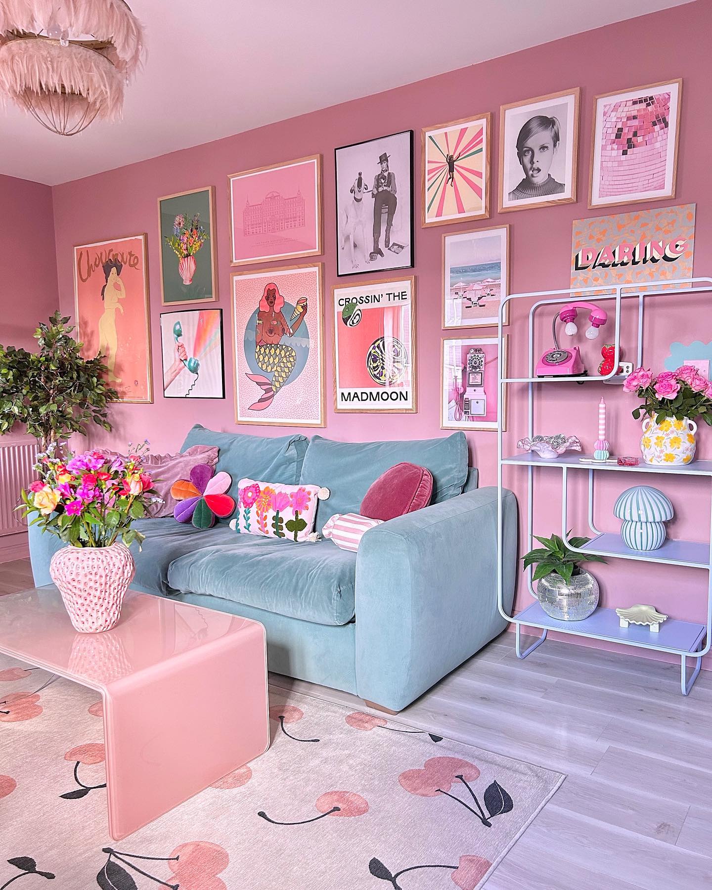
10. Add Lilac Shelves Beside a Blue Sofa
Credits: Instagram
Lilac shelves introduce a pastel beside the blue sofa in this pink living room. The open frame lets the wall color show through, so the storage feels connected to the room even with colorful objects on display.
Try a pale purple shelf unit when you want to expand a pink and blue palette in a contained way. Choose a simple shape and leave gaps between objects to keep the new color visible.
Repeat the lilac in one accessory if it needs a stronger connection. Before painting existing furniture, check its material and use suitable preparation and finishes.
Style the shelves gradually with pieces you already enjoy, balancing taller objects with lower ones and leaving space for everyday items to land.
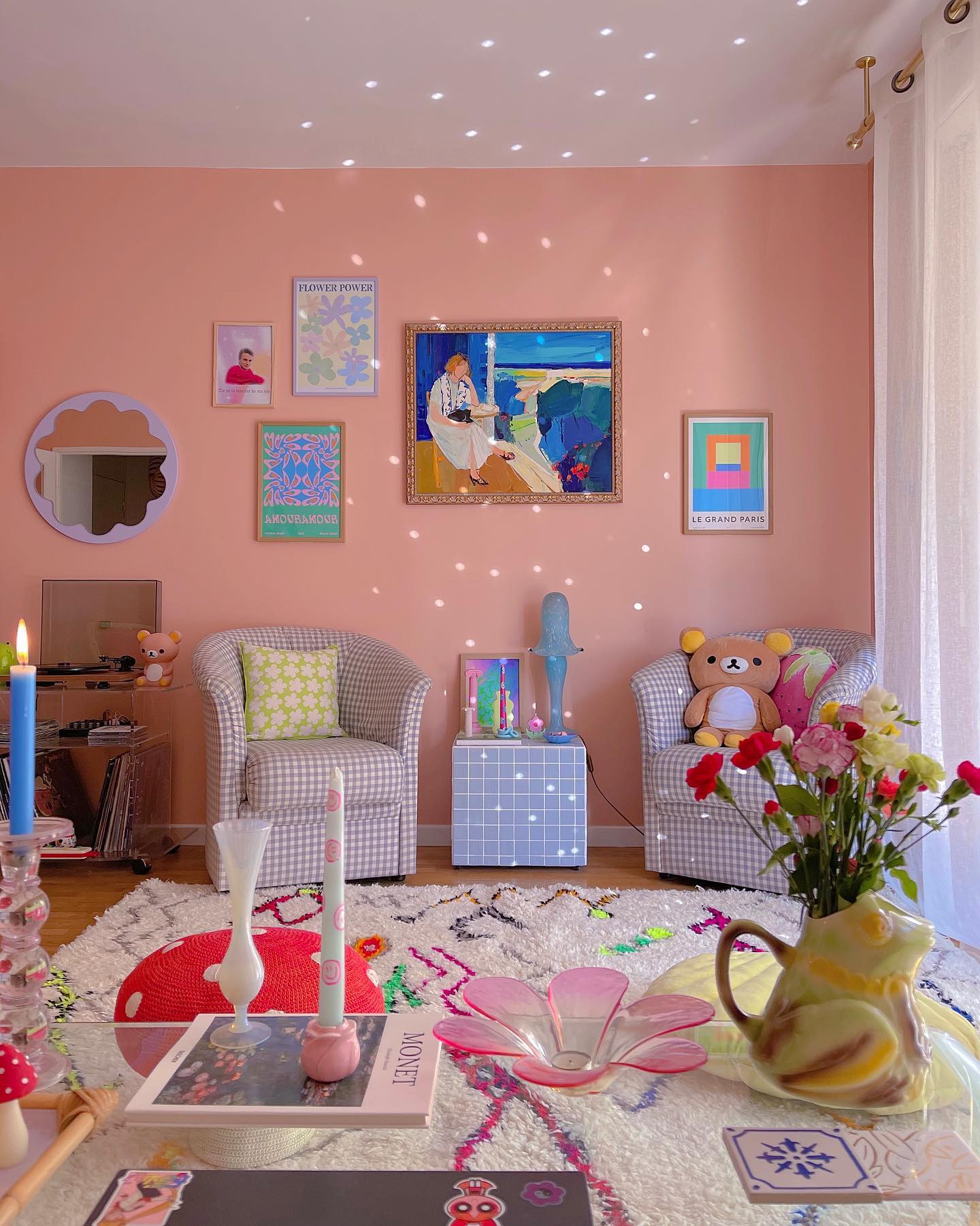
11. Pair Lilac Gingham Chairs With Peach Walls
Credits: Instagram
Lilac gingham chairs bring a fine pattern to this peach seating corner. The tiled side table repeats their cool color, while the plain wall gives the small checks room to stand out.
Borrow this combination when you want patterned upholstery without overwhelming a compact space. Choose a check with plenty of pale background, then balance it with a solid wall in a warmer pastel.
A pair of chairs can frame a shared table for drinks or books, creating a comfortable place to chat. Check the table height against the chair arms before buying.
Keep an easy route between the seats and other furniture. A few cushions with larger motifs will add variety while allowing the gingham to remain clearly visible.
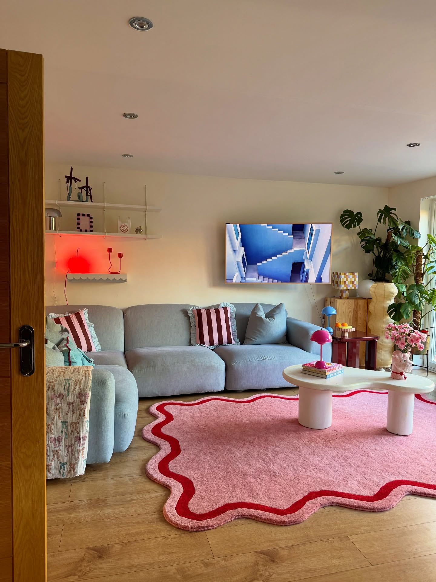
12. Soften the Seating Area With a Scalloped Pink Rug
Credits: Instagram
The scalloped pink rug gives this living room a playful outline beneath its blue sectional. A red border follows each curve, and the pale coffee table repeats the rounded shape above it.
Try a shaped rug when your seating arrangement feels too square. Leave some bare floor around the perimeter so the silhouette stays visible, especially along the side facing the doorway.
Measure the widest points before ordering; decorative edges can extend beyond the central rectangular area. A suitable rug pad helps keep the shape lying flat.
Pick a simple coffee table that leaves plenty of the rug exposed. If you choose a contrasting border, repeat that stronger color in one small accessory to connect it with the surrounding furniture.
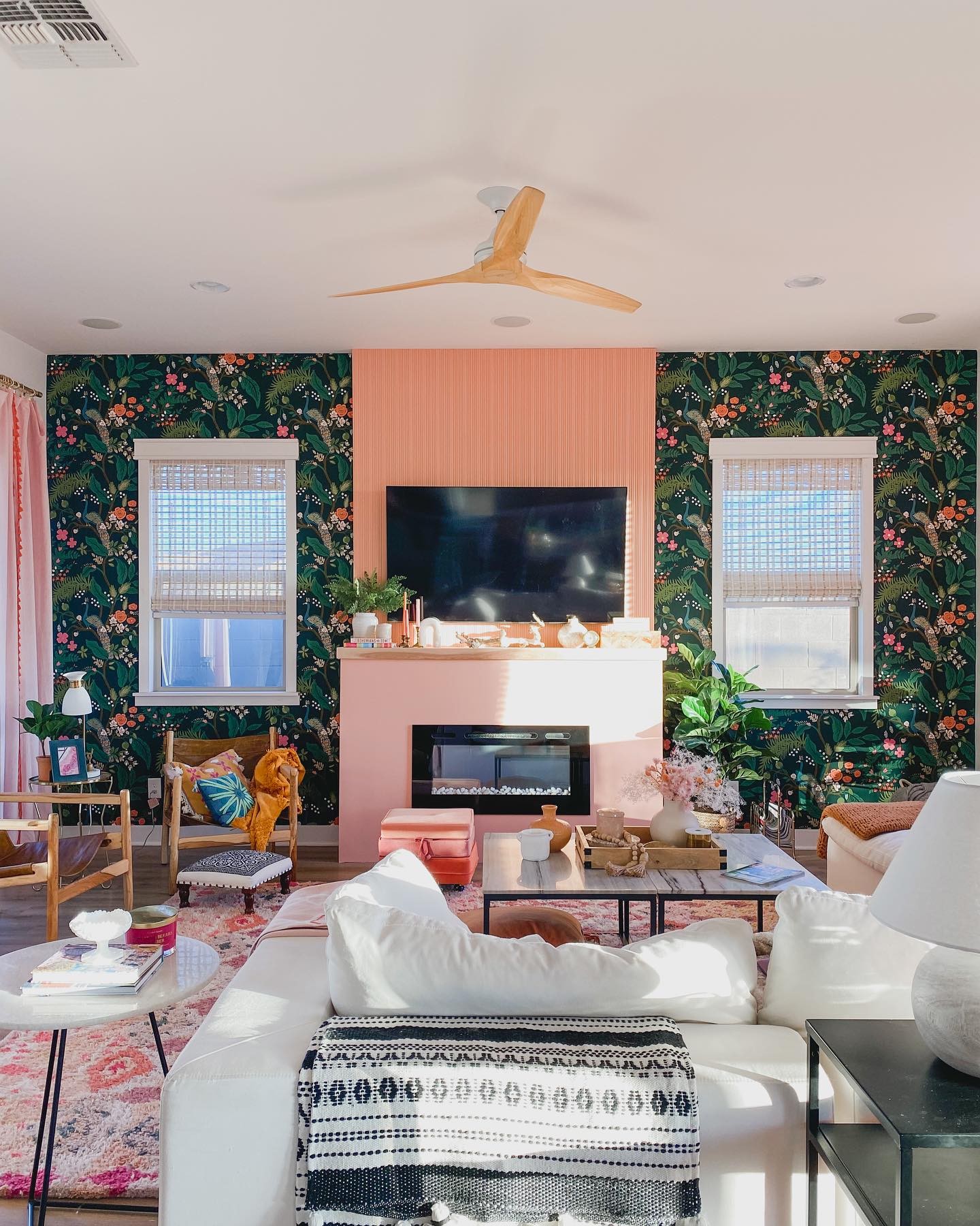
13. Frame an Apricot Fireplace Wall With Dark Wallpaper
Credits: Instagram
An apricot chimney breast and pale pink fireplace surround stand between panels of dark botanical wallpaper. The contrast draws attention to the central feature, while white seating keeps the rest of the room light.
Use this approach when you want a pastel focal point within a richer decorating scheme. Pull a warm shade from the wallpaper for the chimney breast, then test a lighter version below.
Keeping the two painted areas related helps the fireplace read as one feature. Choose finishes suitable for each surface and follow any heat clearance guidance for your appliance.
Let the wallpaper carry most of the pattern nearby. Plain upholstery and a few matching textiles can carry the soft colors into the seating area naturally.
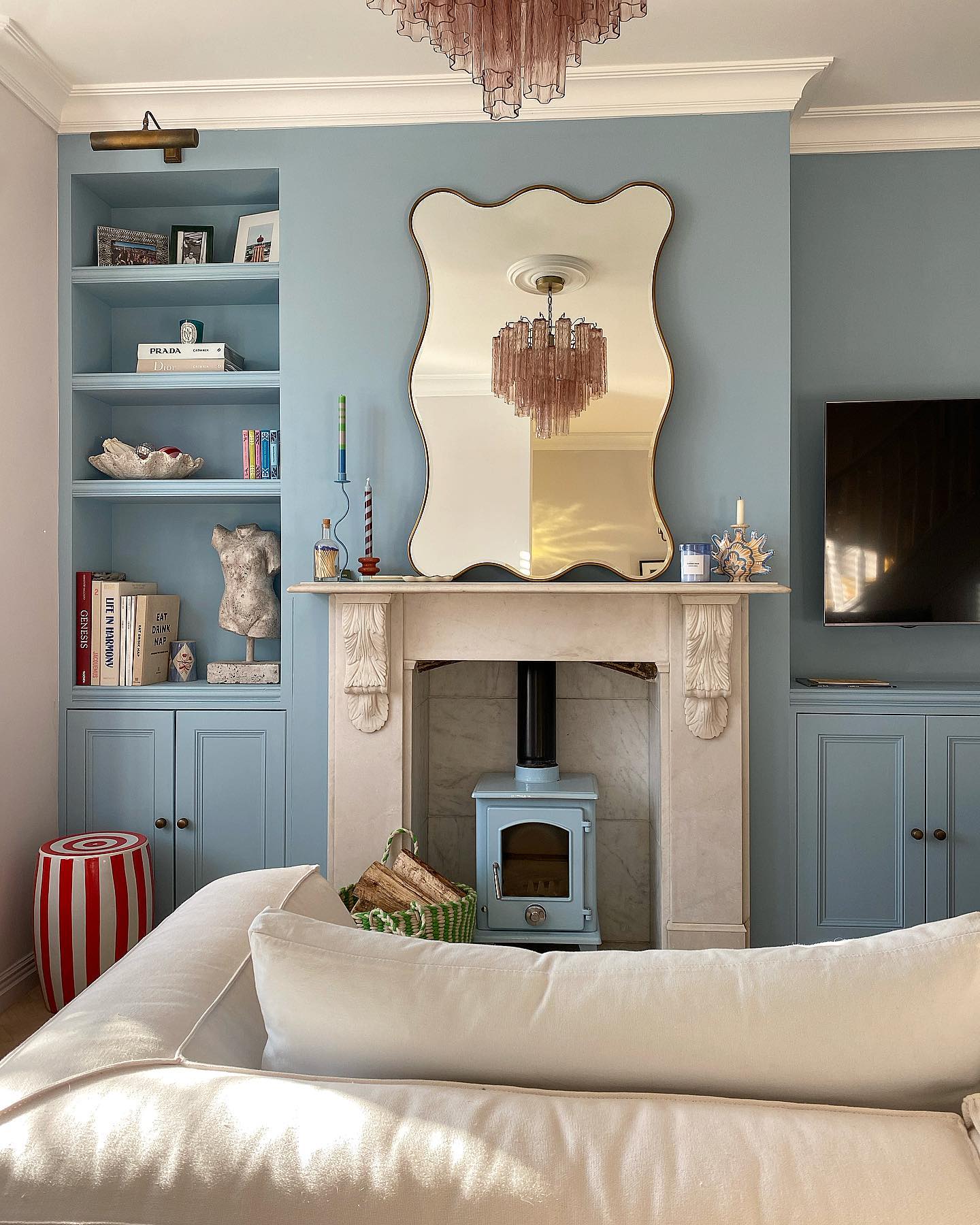
14. Unify Alcove Storage With Soft Blue Paint
Credits: Instagram
Soft blue paint connects the alcove shelves, lower cupboards, and chimney breast in this living room. The cream fireplace remains distinct, giving the broad blue feature a lighter center.
Try painting connected storage and wall surfaces in one shade when separate pieces look visually busy.
Take time to test the color inside a recessed shelf as well as on the wall, since shadows can make the same paint look different.
Use finishes suited to woodwork and plaster while keeping their tones consistent. Leave some shelf space empty so the blue remains visible behind your books and objects.
Here, the pale ceiling trim marks a clear boundary above the color. Retaining that light edge can help frame your own painted wall.
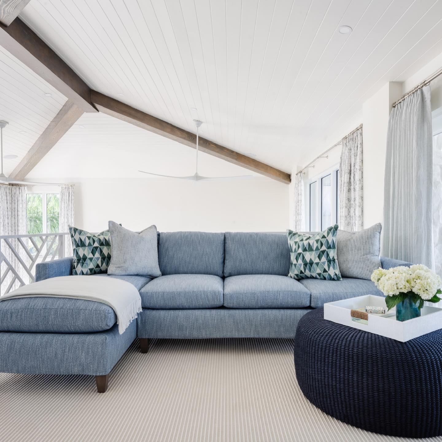
15. Make a Pale Blue Sectional the Main Lounge Seat
Credits: Instagram
A pale blue sectional provides a generous lounging spot beneath this white vaulted ceiling. The chaise extends the seating without another armchair, while the open backdrop keeps the long sofa from dominating the room.
Consider this shape when you want one large pastel piece to do most of the work. Measure the chaise projection carefully and mark it on the floor before ordering, leaving a clear route past the end.
Position small cushions at the corners rather than covering every seat. A light throw breaks up the broad blue surface and can be moved when needed.
The navy ottoman adds contrast in front. Choose a compact central piece that suits the sectional's reach while preserving comfortable space for your feet.
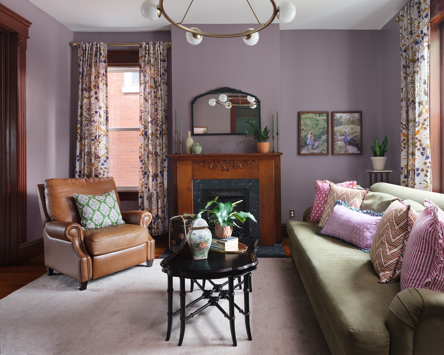
16. Soften Dark Woodwork With Muted Lavender Walls
Credits: Instagram
Muted lavender walls surround the dark wooden mantel and window trim in this sitting room. Their softness lets the carved details remain prominent, while a sage sofa brings another gentle color into the scheme.
Try a grayish lavender if you want to introduce pastels around woodwork. Place paint samples directly beside the timber to see how its warm tones affect the purple.
Check the combination in the room's darkest corner as well as near a window. Keep the ceiling and rug light to provide relief between the deeper surfaces.
Patterned curtains can connect lavender with warmer colors already present in your furniture. A tan chair, like the one shown here, adds warmth without requiring more painted or upholstered pastel pieces.
17. Balance Bright Accents With Pale Pink Walls
Credits: Instagram
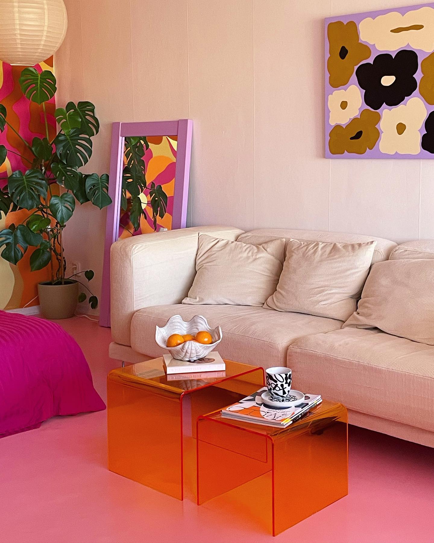
Pale pink walls and a cream sofa give the vivid accents in this seating corner a soft backdrop. Orange tables, a hot pink throw, and bold floral artwork bring stronger colors into the foreground.
Use this balance if you love pastels but also want a lively room. Keep the largest wall area quiet, then introduce a brighter shade through a smaller piece you can move or replace.
Transparent tables let the pink floor remain visible beneath them, reducing their visual weight. Try one accent and view it from the doorway before adding another.
Repeat a color from your artwork to make the combination feel connected. Leave sections of pale wall uncovered so the contrasting objects have room to stand out.
18. Pair a Cloud Ceiling With Pale Blue Walls
Credits: Instagram
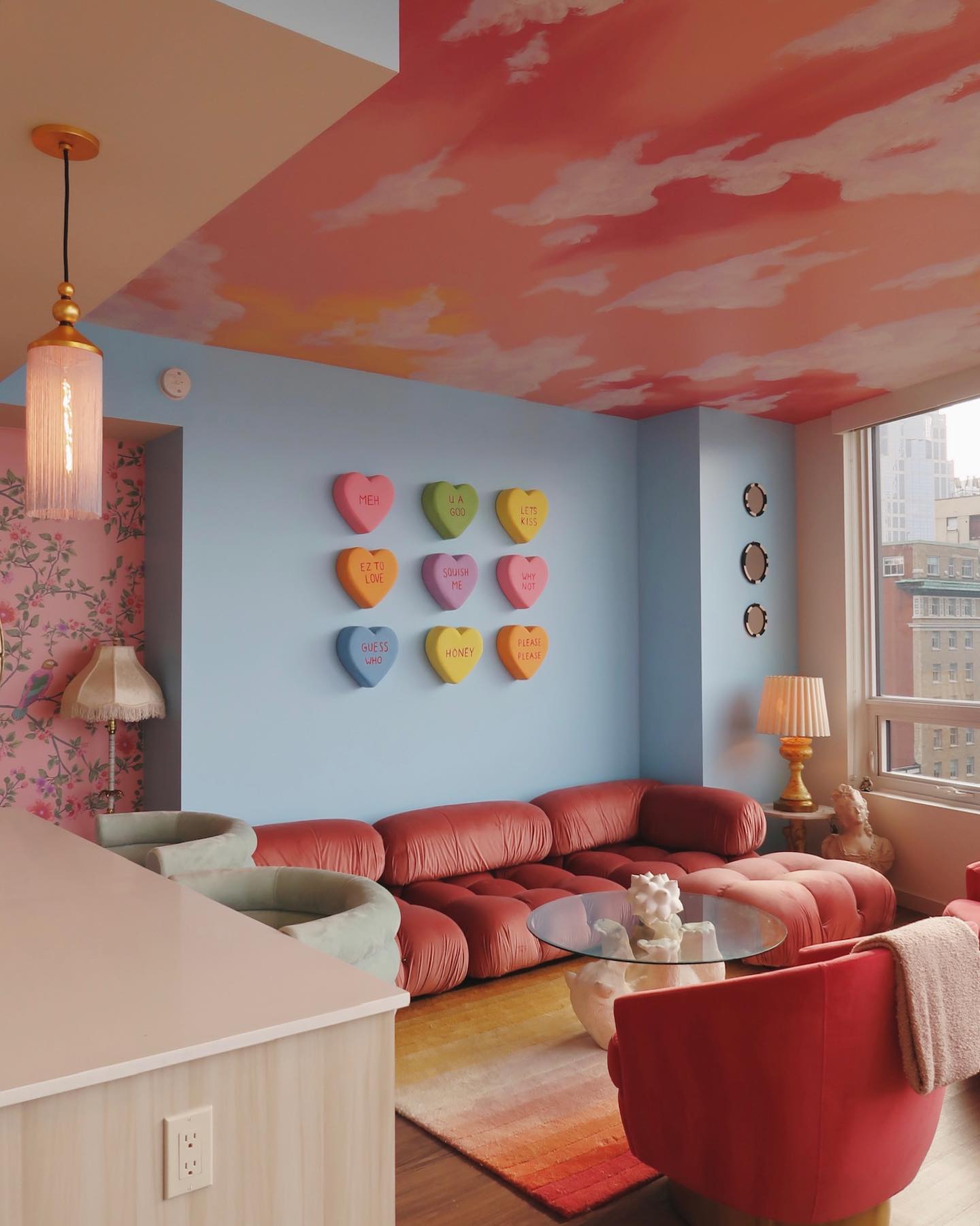
Peach and coral clouds spread across the ceiling above pale blue walls in this living room. The broad painted pattern turns the overhead surface into a feature, while the plain blue backdrop keeps the seating area readable.
Borrow the idea if your room has an uninterrupted ceiling you would like to highlight. Plan the cloud shapes on paper first, allowing areas of lighter color between them.
Test the palette beside the wall paint before starting overhead work. Keep the larger shapes loose and varied rather than repeating identical outlines.
A simpler version could use just peach and cream above blue walls. Bring one ceiling color down through a cushion or throw to connect the treatment with furniture at eye level.
19. Give Window Frames a Fresh Mint Finish
Credits: Instagram
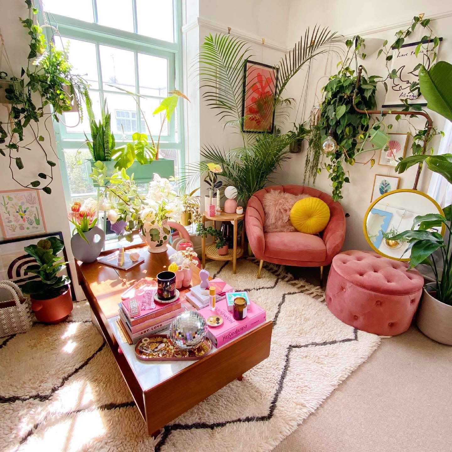
A mint window frame brings pastel color to this leafy seating corner. The matching green lamp shade repeats the hue beside dusty pink upholstery, while white walls keep the busy arrangement light.
Try colored window trim when you want a contained paint project with a noticeable effect. Compare samples against both the wall and the view outside, since greenery and daylight will influence how the shade looks.
Use preparation and paint suitable for the frame material, protecting glass and keeping moving parts clear. Carry the mint into one nearby accessory to connect it with the seating.
Leave enough space around plants for window access and watering. The pastel frame can provide a gentle outline even with fewer plants on display.
20. Add Texture With Pale Lavender Wallcovering
Credits: Instagram
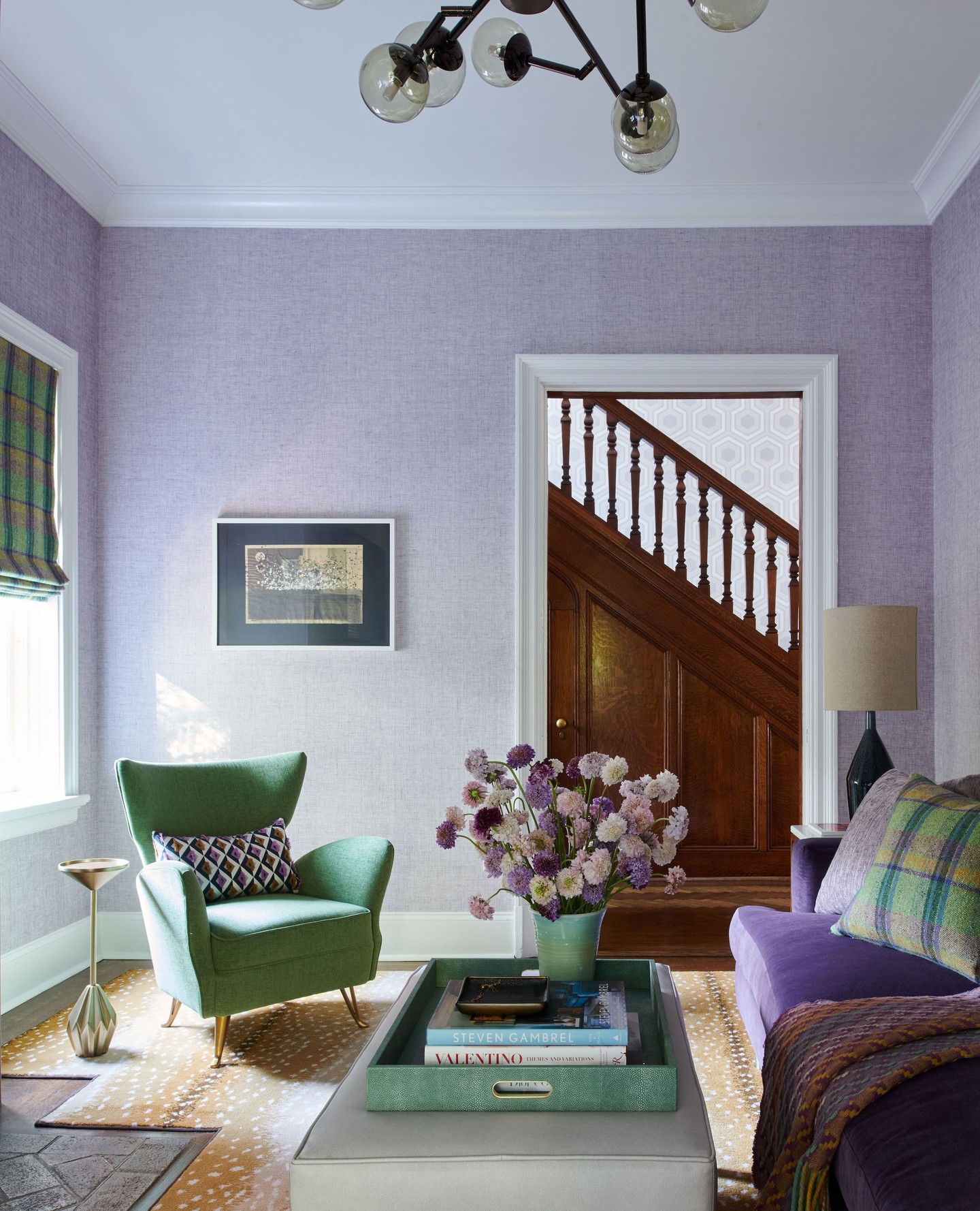
Pale lavender wallcovering adds a fine textured backdrop to this room's deeper purple sofa and green chair. White trim outlines the doors and ceiling, keeping the delicate wall color defined.
Choose a softly textured wallcovering when a flat pastel surface feels too plain. Order a sample large enough to see its texture, then move it around the room to check how daylight and lamps reveal the finish.
Look at the manufacturer's cleaning guidance before choosing a material for busy seating areas. Keep nearby patterns at a different scale so they remain distinct against the subtle background.
Here, checked cushions and a patterned blind connect the green and purple furnishings. Leaving a generous stretch of wall exposed helps its texture register.