
A bedroom’s wallpaper can do more than cover a wall—it can bring interest to the ceiling, follow an awkward dormer angle, or turn a closet into a colorful surprise.
These Bedroom Wallpaper Ideas show how patterns can fit different parts of a room, from emerald watercolor behind the bed to pale palms rising above a headboard.
You’ll also find practical ways to keep bold designs in balance, such as coordinating wallpaper colors with bedding and leaving open space around a mural.
Pay attention to pattern scale and placement so the design works with the room’s features.
1. Scatter Small Medallions Across the Ceiling
Credits: Chris Loves Julia
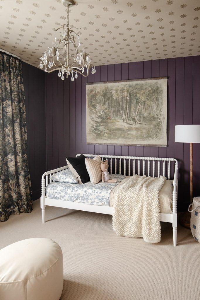
A ceiling covered in medallions gives this bedroom a decorative surface above its deep plum walls. The cream background leaves plenty of open space between motifs, so the pattern remains delicate despite spanning the room.
Below it, vertical paneling and a white spindle daybed create clearer, larger shapes. This is an appealing way to introduce wallpaper when artwork already occupies the wall behind the bed.
Compare your sample with the ceiling light on, because reflective details can become more noticeable after dark. Plan the starting line before hanging the first strip, particularly around the fixture.
Keeping the wallpaper background close to the carpet and bedding colors helps the overhead pattern belong to the room rather than feel like an afterthought.
2. Try Printed Wood Grain Overhead
Credits: Brooke Christen / Nesting With Grace
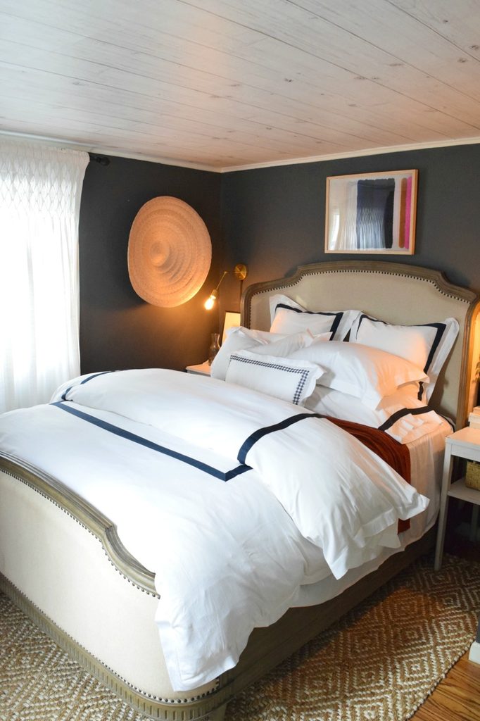
The pale ceiling in this bedroom gets its plank effect from wallpaper. Long printed boards bring a gentle directional pattern above charcoal walls, while their light color keeps the upper surface visually separate from the darker perimeter.
The upholstered bed and white linens repeat that brightness lower down. For a similar effect, study the grain and board width on a full sample before choosing a roll.
Very strong knots can create more activity overhead than expected. Decide which direction the printed boards should travel, and follow the product’s surface preparation instructions rather than treating paper like actual paneling.
A narrow light trim can make the transition tidy. Keep other wood finishes varied enough that an exact grain match is unnecessary.
3. Follow Dormer Angles With Wavy Stripes
Credits: Brooke Christen / Nesting With Grace
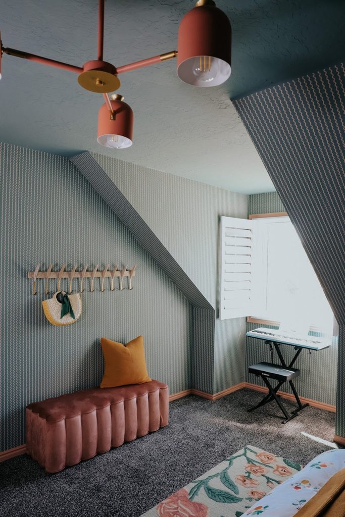
Fine wavy stripes cover the walls and sloping returns of this dormer bedroom, making an awkward corner feel decorated. The subdued green background connects with the painted ceiling, while pink baseboards outline the floor.
A scalloped bench echoes the paper’s gentle movement without repeating its tiny scale. When wallpapering a room with roof angles, map each plane separately and consider where the pattern will meet at the bends.
A small repeat can stay readable on narrow surfaces beside a window. The broad ceiling can remain painted if its texture or shape makes paper impractical.
Here, simple white shutters provide a useful visual pause. Leave the window opening clear so daylight continues to show the pattern across the adjoining angled walls.
4. Choose an Emerald Watercolor Effect
Credits: Lizzie Ravn / Emmerson and Fifteenth
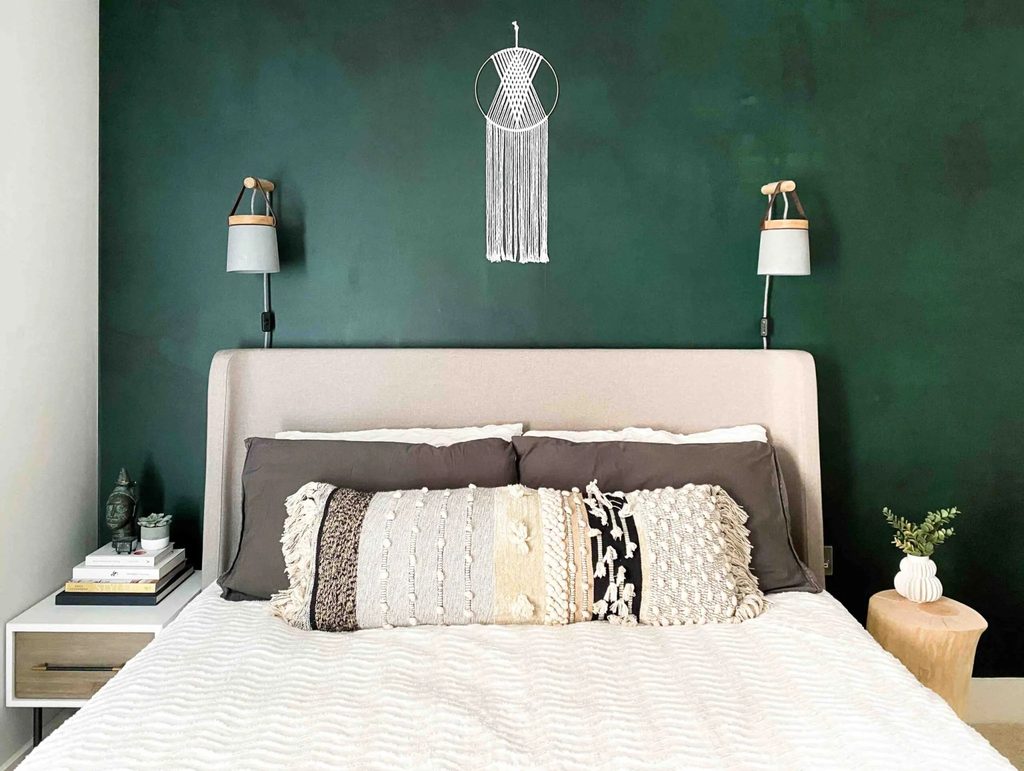
Broad washes of emerald give this wall movement without a recognizable flower, stripe, or geometric repeat. The wallpaper resembles layered watercolor, with darker areas fading into softer green behind the pale upholstered headboard.
Two compact wall lamps frame the bed while leaving most of the finish exposed. This approach works well when you want rich bedroom color and subtle variation at the same time.
Look at a large sample or the full mural layout, since a small swatch may miss the lighter and darker areas. Place the bed against the proposed composition before finalizing the panel order.
Cream bedding and textured pillows keep the foreground comfortable. A single wall hanging is enough when the color variation already supplies visual interest.
5. Let Pale Palm Silhouettes Rise Behind the Bed
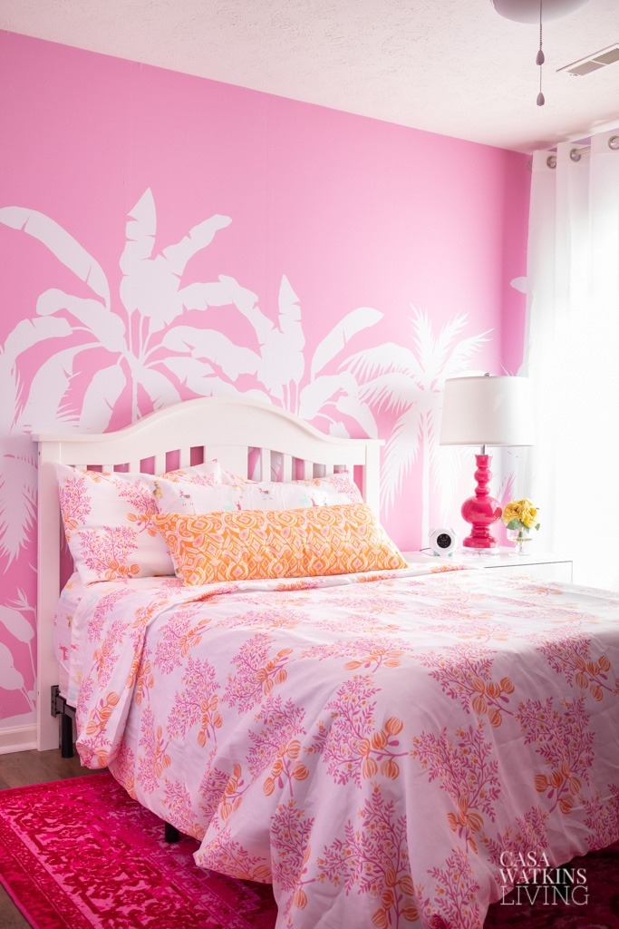
Credits: Stephanie / Casa Watkins Living
White palm silhouettes climb across a pink background in this cheerful bedroom. Their large leaves emerge above the curved headboard, leaving a generous area of plain pink near the ceiling.
That open upper zone prevents the mural from feeling equally busy everywhere. To use a similar design, check the printed leaf height against your mattress, pillows, and headboard rather than judging the wall covering alone.
You want recognizable shapes to remain visible after the bed is made. Smaller floral bedding can work alongside oversized foliage when the colors stay related.
White curtains, furniture, and lampshade repeat the palm color, helping the pattern feel integrated. A warmer accent pillow introduces contrast without requiring another strong color across an entire wall surface.
6. Hide a Bright Ikat Pattern Inside the Closet
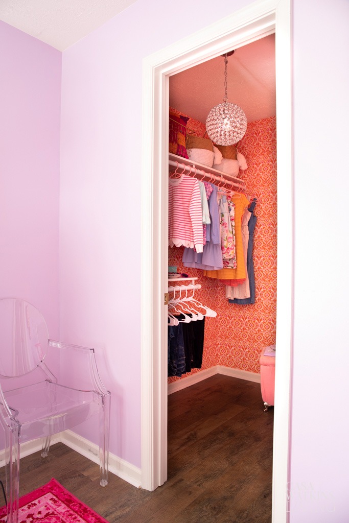
Credits: Stephanie / Casa Watkins Living
An orange ikat covering turns this bedroom closet into a colorful surprise. The pattern fills the visible back and side walls, while plain white trim separates it from the pale lavender room outside.
Because the closet is a smaller enclosure, the strong color feels contained. This can be a useful starting point if you enjoy bold wallpaper but are uncertain about a whole bedroom.
Measure the wall areas behind shelving as carefully as the open sections, and decide whether fittings need to come down for a tidy installation. Keep the hanging arrangement simple enough that some pattern remains visible between clothes.
A painted ceiling can pick up the wallpaper’s background tone, making the storage area feel finished from every angle.
7. Frame a Bed With Branches and Blossoms
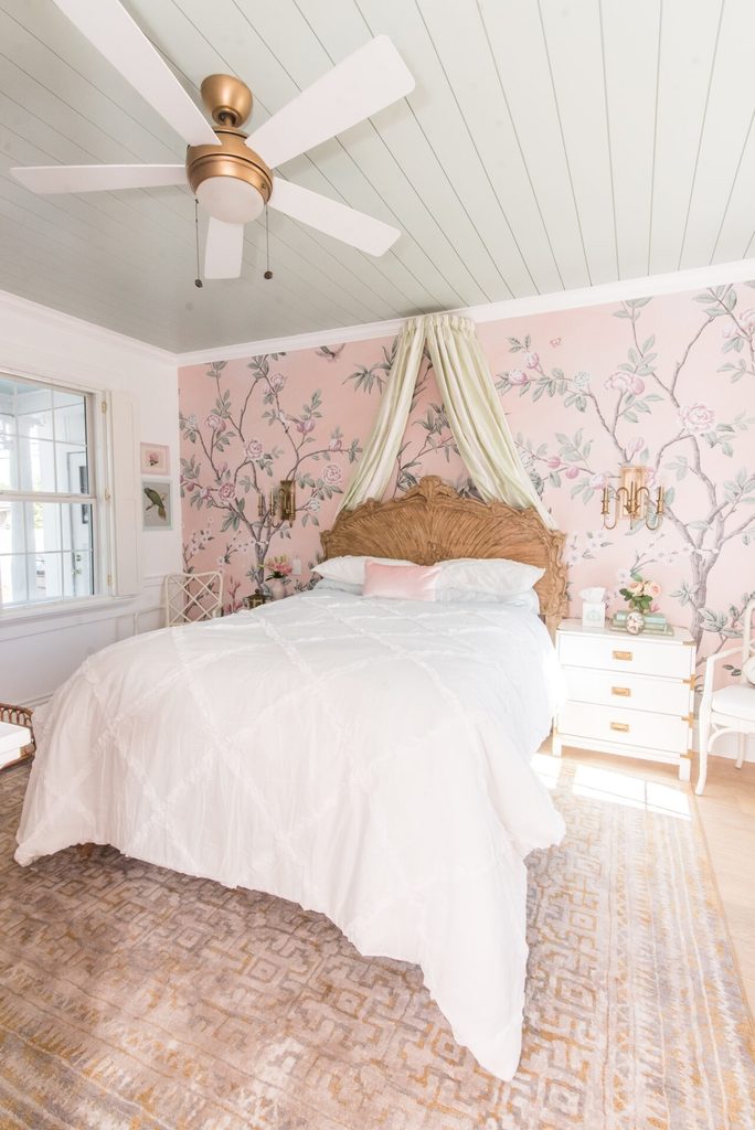
Credits: Ashley Wilson / At Home with Ashley
Pink flowering branches spread across the bed wall in this airy room, reaching around a carved wood headboard and pale canopy. The mural has enough open background for those substantial furniture details to remain distinct.
Its gray green leaves also connect naturally with the ceiling color. Before choosing a branching design, consider where the thickest trunks and largest blossoms will fall relative to the bed.
A composition that looks balanced online can lose its best parts behind a tall headboard. The generous white bedding here gives the wall a calm foreground, while matching sconces establish symmetry.
Keep adjacent walls lighter if you want the mural to remain the focus. A few pink accents can carry its color beyond the wall.
8. Plan Wall Lights Around the Printed Branches
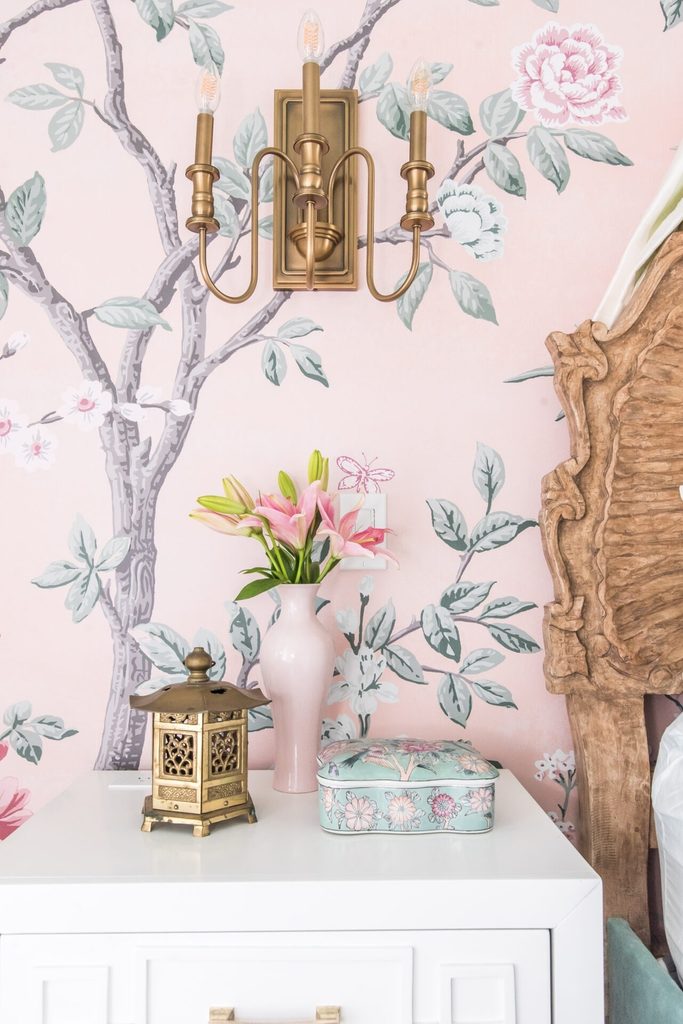
Credits: Ashley Wilson / At Home with Ashley
This bedside closeup shows how much wallpaper remains visible around a mounted light. Gray branches and soft blossoms pass behind the brass sconce, while the pink background separates its curved arms from the drawing.
The nearby carved headboard introduces another textured surface without hiding the scene. When arranging lighting over a mural, compare the fixture footprint with the full artwork layout before installation.
Avoid placing a large backplate directly over the detail you most want to preserve. Keep frequently handled switches accessible and follow the fixture’s installation requirements.
A small nightstand with a mostly clear top lets the paper continue visually toward the floor. Repeating one flower color in a vase creates a connection without needing an exact decorative match.
9. Pair Fine Woodland Lines With a Pink Headboard
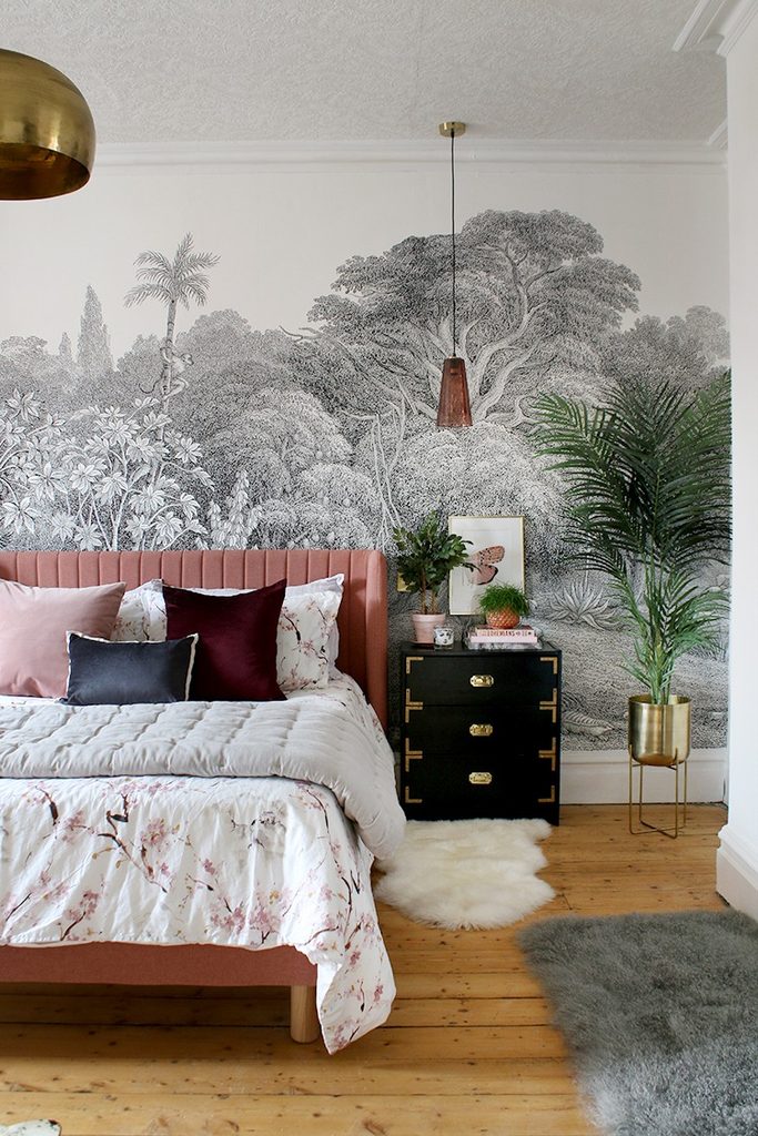
Credits: Kimberly Duran / Swoon Worthy
A detailed monochrome woodland scene rises behind the pink upholstered bed, bringing intricate drawing into a room with otherwise substantial shapes.
The dark nightstand and metal planter give the pale paper a firmer outline, while the leafy plant repeats its natural subject in three dimensions. This balance is useful when you want a scenic wall without introducing several additional colors.
Study the mural’s empty sky areas as well as its trees; the space above the canopy can keep the upper wall feeling open. A solid headboard color makes the bed easy to distinguish from the linework.
Let smaller cushions deepen that color story. Choose bedside lighting with a restrained silhouette so the illustrated foliage remains readable behind and around it.
10. Scale Giant Flowers to a Tall Bed Frame
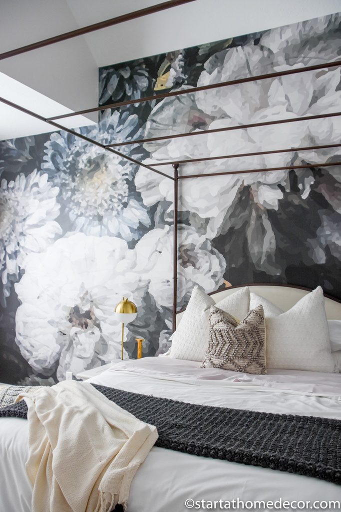
Credits: Brooke Nicole Larsen
Enormous pale flowers extend well above this bed, giving the wallpaper a scale that suits the open canopy frame. Dark gaps between the petals add depth, while the slender metal rails let the mural remain visible through the furniture.
This combination can make a tall wall feel deliberately filled without adding artwork. Review the complete mural arrangement before ordering and mark the canopy height on your wall.
Important flower centers should land where the rails and headboard will not conceal them. The simple white bedding here provides a broad quiet area below the pattern.
A charcoal throw repeats the background color in a smaller dose. Keep bedside accessories compact so the largest shapes in the room continue to be flowers.
11. Coordinate a Floral Wall With Small Floor Patterns
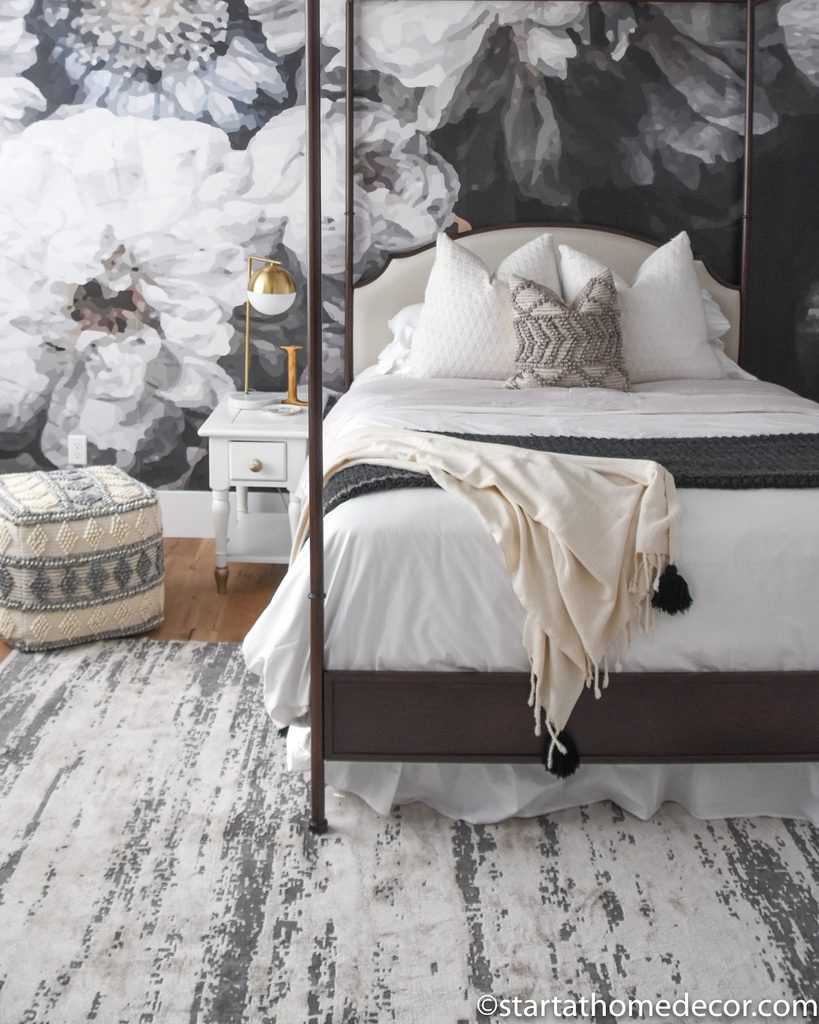
Credits: Brooke Nicole Larsen
The oversized flowers behind this bed share their charcoal and cream palette with the rug and pouf below. Those floor patterns are much smaller, creating a clear difference in scale rather than competing flower shapes.
The plain duvet separates the busy surfaces and makes the arrangement easier to read.
This is a practical way to layer wallpaper with pieces you already own: compare their colors first, then check whether their patterns operate at noticeably different sizes.
A geometric pouf can sit comfortably near a floral wall when neither copies the other’s outlines. Keep one large textile almost solid, as the bedding is here.
Let the wallpaper reach the baseboard so the flower composition feels continuous behind the bedside furniture too.
12. Wrap a Small Room in a Dense Garden Print
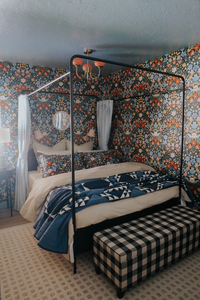
Credits: Brooke Christen / Nesting With Grace
Colorful flowers run around the corner behind this canopy bed, creating an enveloping bedroom rather than a single accent wall. The dark ground connects the blooms, while a blue painted ceiling gives the room a calmer upper boundary.
Cream bedding and a pale rug keep enough light surfaces in the foreground. If you want this immersive effect, lay several wallpaper samples beside one another to judge the repeat at room scale.
Think about the corners and door openings before deciding where installation should begin. A slim bed frame will reveal more of the print than bulky furniture.
Different geometric textiles can add variety, but keep their colors tied to the wall. The flowers should still be the main decorative theme.
13. Repeat the Wallpaper Motif in a Few Pillows
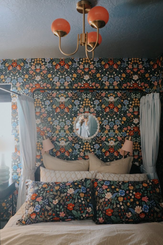
Credits: Brooke Christen / Nesting With Grace
Matching floral pillows bring this bedroom’s wallpaper onto the bed, creating an connected arrangement. The identical flowers work because pale cushions and a generous cream duvet separate the patterned layers.
Pink sconces pick up a smaller color from the print, and a round mirror interrupts the repeat with one shape.
When using coordinated wallpaper and fabric, limit the matching material to a few pieces that can be moved or changed easily. Covering every textile in the same motif could make individual furniture shapes harder to read.
Notice how the black canopy rail supplies a clean outline across the flowers. Keep bedside lighting modest in size, and leave enough uncovered paper around the mirror to preserve the pattern’s continuous garden effect.
14. Continue Floral Paper Around a Bedroom Work Corner
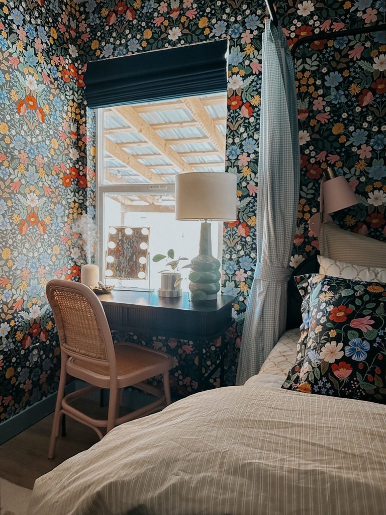
Credits: Brooke Christen / Nesting With Grace
The same floral wallpaper surrounds this window and desk, giving a practical bedroom corner equal attention to the sleeping area. Its dark background relates to the desktop and window shade, while a pink chair picks up one of the blossoms.
Because the pattern continues on both sides, the window reads as a bright opening within a decorated enclosure. Plan the wallpaper around the trim before hanging shelves or a mirror, especially when the repeat contains recognizable flowers.
A plain desk surface provides a needed pause at working height. Keep accessories grouped so the wall stays visible above and beside them.
One sculptural lamp can add dimension without introducing another printed surface into an already richly detailed corner of the room.
15. Give a Forest Mural Plenty of Pale Sky
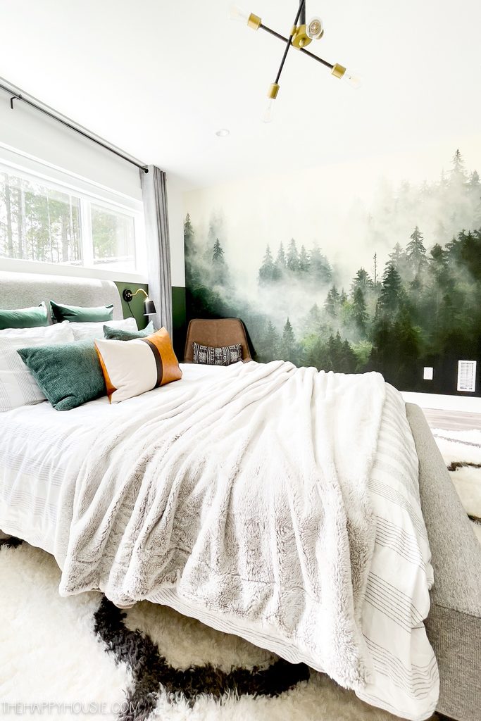
Credits: Krista / The Happy Housie
Soft mist fills the upper half of this forest mural, letting the darker evergreens gather nearer the floor. That gradual shift keeps the bedroom bright even though the lower trees have depth.
The bed sits under the adjacent window, leaving the scenic wall available for the full composition. When comparing landscape wallpapers, look for an arrangement whose horizon suits your furniture placement.
Dense trees directly behind every pillow can feel different from an open misty section above the mattress. White linens echo the pale sky, and green pillows connect with the forest below.
A simple chair occupies the corner without obscuring the tallest trees. Keep neighboring curtains restrained so the landscape remains the broadest visual statement when entering the room.
16. Use Birch Trunks as a Soft Vertical Rhythm
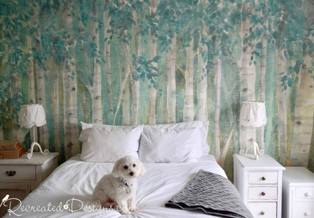
Credits: Lisa Silfwerbrand / Recreated Designs
Pale birch trunks create vertical lines across this bedroom wall, with teal leaves and washed green tones filling the spaces between them. The scene has a painterly softness that suits the white linens and lightly distressed bedside furniture.
Because the bed has little visible headboard, much of the mural remains exposed just above the pillows. This is worth considering when a wall covering contains details close to mattress height.
Test the planned composition against your everyday bedding arrangement, including the pillows you actually use. White lamps repeat the trunks without introducing a new accent color.
A gray throw adds a darker note at the foot of the bed. Let the tree pattern provide height rather than adding several tall decorations.
17. Leave Open Space Above an Etched Tree Canopy
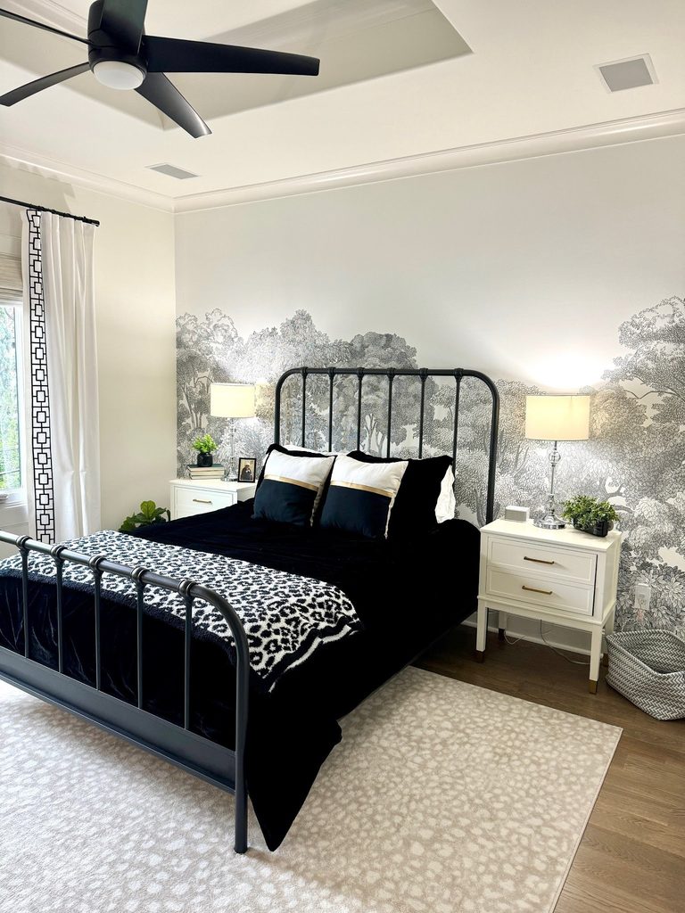
Credits: Rebecca Brittain / Every Piece Fits
The gray trees in this mural occupy the lower part of the wall, leaving a pale area beneath the crown molding. That open space makes the detailed woodland feel lighter around the black metal bed.
An airy headboard allows branches to remain visible between its bars, while white nightstands repeat the mural’s background. Choose this composition when you prefer scenic wallpaper with a quieter upper edge.
Check the supplier’s full layout rather than assuming every woodland pattern includes open sky. Position the tree canopy in relation to the headboard and lamps before confirming the final size.
Dark bedding can anchor the arrangement without requiring a dark ceiling. Clear lamp bases also preserve more of the line drawing around either nightstand.
18. Put the Landscape Beside a Windowed Headboard Wall
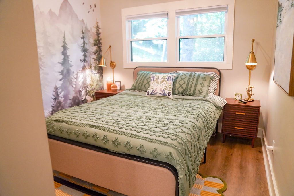
Credits: Amanda Perna
Two windows occupy the wall behind this bed, so the forest wallpaper takes the adjoining side wall instead. The tall trees and distant mountains are visible from the doorway without competing with the window trim.
Sage bedding carries a related color across the room, while wood nightstands keep the scene grounded. This layout is useful when the obvious accent wall has too many interruptions for a mural.
Look at the bedroom from its entrance and from the bed before choosing the alternative surface. Make sure the landscape’s strongest details land above furniture rather than behind it.
Leave the other walls comparatively simple. A few brass accents can supply warmth while the wallpaper provides the room’s sense of scenery and depth.
19. Give a Scenic Wall a Quiet Window Neighbor
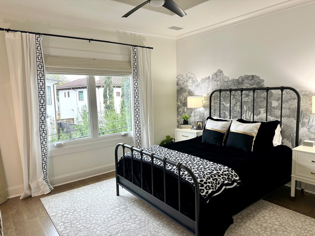
Credits: Rebecca Brittain / Every Piece Fits
White curtains beside this woodland mural keep the window wall lighter than the patterned surface behind the bed. Their narrow black edging relates to the metal frame, making the two walls feel connected without repeating the trees.
The pale rug extends that quieter area across the floor. When a scenic wallpaper ends at a corner, consider what the neighboring wall contributes to the view.
It can provide a restful interval rather than another focal point. Choose curtain colors from the mural’s background or outlines, and check the combination with the panels both open and closed.
Keep the bed frame visually simple enough that the scenery remains legible. A restrained transition often makes detailed wallpaper easier to enjoy throughout the day.
20. Mix a Soft Plaid Wall With Strong Red Accents
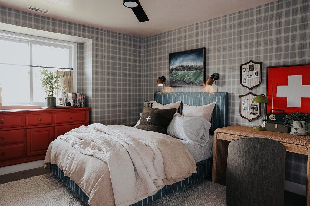
Credits: Brooke Christen / Nesting With Grace
Broad plaid wallpaper wraps this bedroom in overlapping gray, cream, and blue lines. The pattern supplies structure, while a red dresser introduces a solid color beneath the window.
A blue upholstered bed with narrower stripes shows how related linear patterns can coexist when their scales differ. For a similar mix, compare the plaid’s largest squares with the spacing on your bedding or headboard.
The differences should be clear from the doorway. Plain cream bedding creates a break between those surfaces and keeps the bed inviting.
Warm woven furniture adds texture without another printed motif. Align the wallpaper carefully around the corner and window, where horizontal lines are noticeable.
Let a few personal pictures interrupt the grid rather than crowding it.