
A blue bedroom can feel layered and inviting without turning every surface the same shade.
Blue Bedroom Ideas here show how contrast, pattern, and texture can keep the color scheme balanced, from pairing powder blue with cobalt and white linens to warming a deep blue wall with muted orange textiles.
The article also considers blue paneling and wallpaper, plus ways to carry the color overhead or into built-in storage. These approaches offer useful starting points for choosing where blue belongs and how to keep its stronger moments from competing.
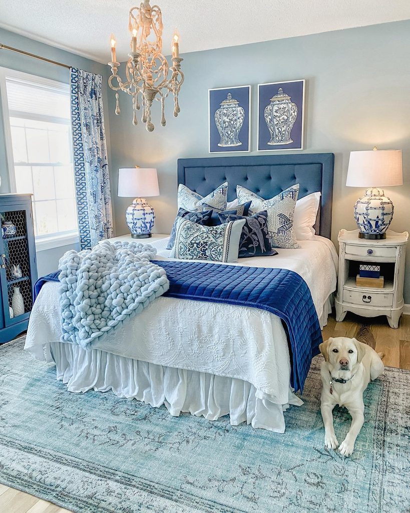
1. Layer Powder Blue and Cobalt Around White Linens
Credits: Instagram
A room can feel blue without making every surface equally dark. Here, pale walls soften the stronger upholstered headboard and cobalt bedcover, while white linens separate the layers.
Patterned pillows and blue and white lamps connect the lighter and deeper shades. The chunky pale throw introduces another texture without adding a competing color.
For a similar bedroom, choose one light blue for the background, one richer blue for the bed, and a generous amount of white between them.
Keep those choices visible in daylight before committing, since nearby fabrics influence how paint looks.
This approach gives a blue bedroom depth and definition while leaving enough contrast to appreciate the individual pieces, especially the bed at the center of the room.
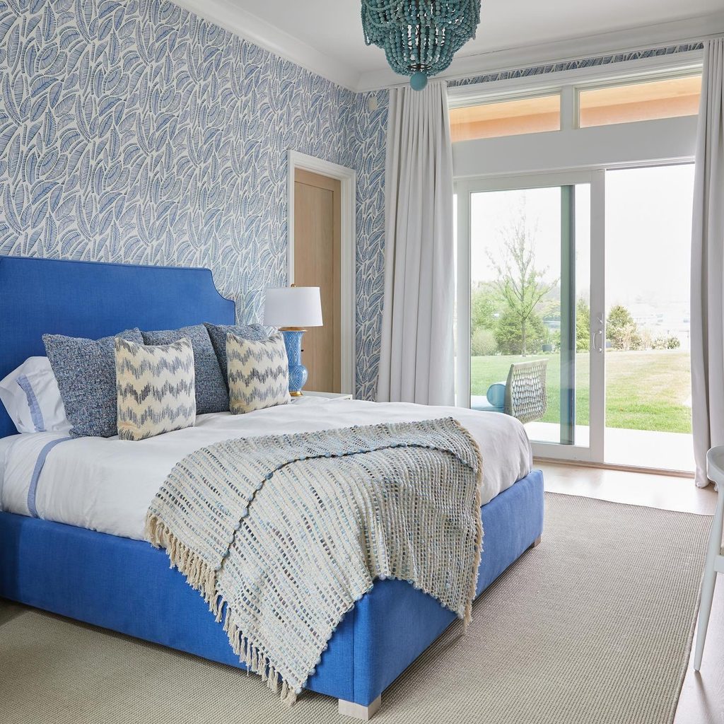
2. Let a Solid Cobalt Bed Stand Out Against Pattern
Credits: Instagram
A saturated bed frame can give a patterned bedroom a clear center. Here, cobalt upholstery outlines the headboard and base while a pale leafy wallcovering supplies finer detail behind it.
White bedding separates the large blue shape from the smaller patterns on the cushions and throw. The curved headboard corners soften the otherwise straightforward silhouette.
Consider a solid fabric when the surrounding walls already carry a busy repeat. Look at upholstery samples from across the room as well as close up, checking their relationship to the wall pattern.
Keep nearby furniture simple enough for the bed’s outline to remain readable. The contrast works through different scales of decoration, allowing strong blue to feel organized instead of competing with every surface.
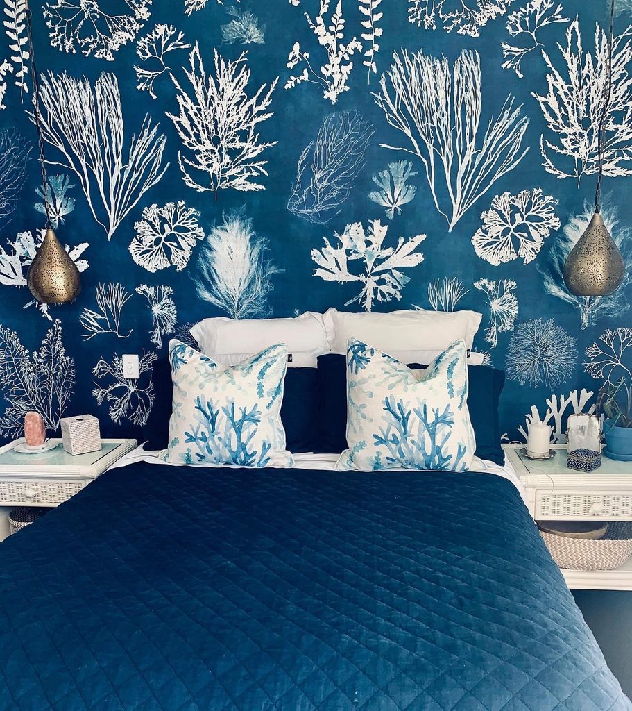
3. Make Large White Seaweed Motifs Stand Out on Blue
Credits: Instagram
Large pale motifs can make a dark blue wall feel lively without introducing another color. In this bedroom, oversized seaweed shapes spread behind the pillows, with smaller coastal patterns on the cushions continuing the theme.
Solid blue bedding gives the eye a quieter foreground, while white bedside furniture keeps the edges of the bed visible. The useful relationship is between an expressive wall and simpler large textiles.
Check a full pattern repeat before choosing wallpaper, since the scale matters more than a small sample suggests. Position the bed so important parts of the design remain visible above it.
Limit additional themed ornaments when the wall already tells the story. A restrained surrounding palette lets the bold shapes carry the room.
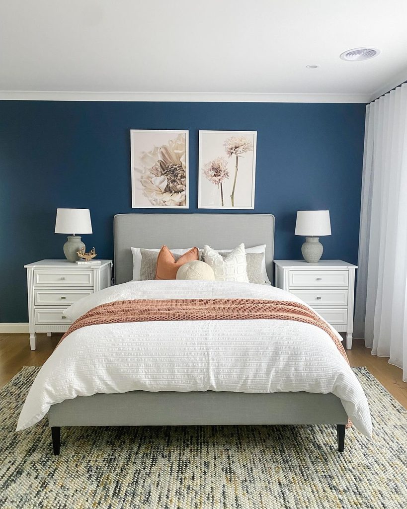
4. Warm a Deep Blue Wall With Muted Orange Textiles
Credits: Instagram
A warm accent can change how a deep blue bedroom feels. Here, a muted orange cushion and knitted throw interrupt the white bedding, with their color standing out against the blue wall behind a gray headboard.
Pale lamps and bedside chests keep the composition balanced rather than dark throughout. Try this combination through removable textiles before considering another large painted surface.
One cushion and one folded layer may be enough to establish the relationship. Compare the orange with the actual blue in your room, because a softer clay shade behaves differently from a bright citrus tone.
Leave some white or cream visible around the accents. The result is a warmer sleeping area while blue remains the room’s strongest architectural color.
5. Give a Blue Accent Wall a Broad Panel Grid
Credits: Instagram
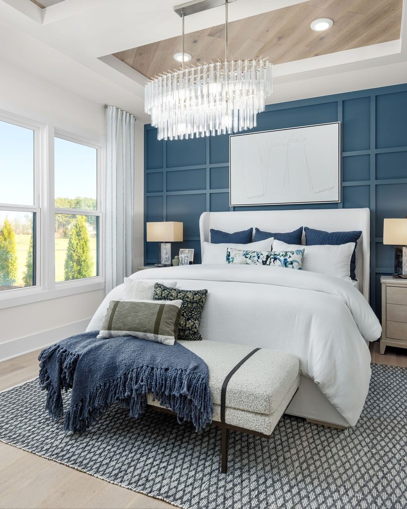
Relief can add interest to a blue wall without asking for another pattern. This bedroom uses a broad grid of painted trim behind a pale upholstered bed, with the recessed areas and raised lines sharing the same blue finish.
A large light artwork and white bedding remain clear against the textured background. Plan panel spacing around the furniture rather than treating the empty wall as a separate project.
Wider rectangles can create a calmer effect than many small divisions. Mark the proposed layout temporarily before installing anything, checking switches and light positions.
Carrying one finish across the trim keeps the result unified. The wall gains structure while familiar bedding and simple bedside pieces can continue to work within the scheme.
6. Soften Pale Blue Upholstery With a Draped Half Canopy
Credits: Instagram
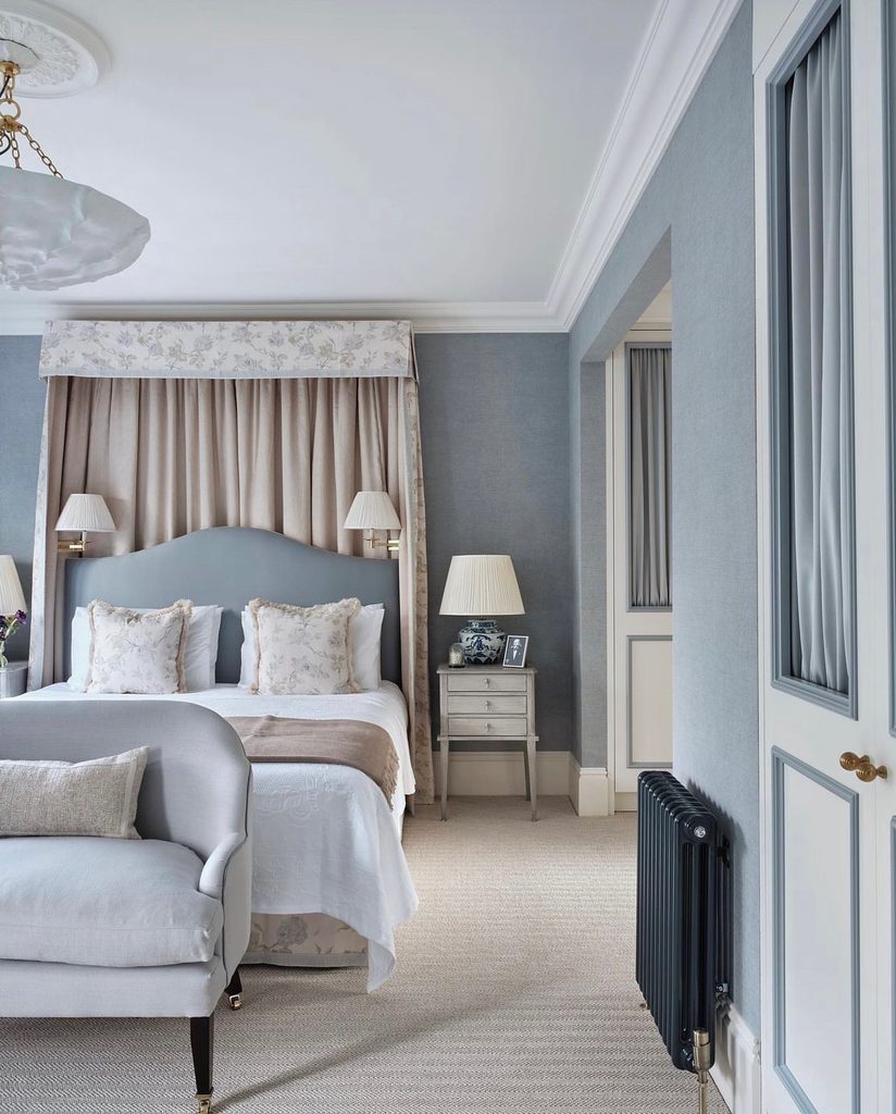
Fabric around the head of a bed can introduce softness without enclosing the entire sleeping area. Here, a draped half canopy frames a pale blue upholstered headboard, with cream folds and a floral border relating to the cushions.
Blue walls and nearby panel details keep the room’s color consistent beyond the bed. The contrast between smooth upholstery and gathered fabric supplies much of the interest.
Consider the canopy’s projection and height before adapting the idea, allowing comfortable access and suitable clearance from fixtures. Choose a support system appropriate to the fabric and wall.
Keep the surrounding bedding relatively simple so the folds remain readable. A limited blue palette can accommodate this extra texture without making the bedroom feel visually crowded.
7. Carry Blue Overhead With a Fully Painted Ceiling
Credits: Instagram
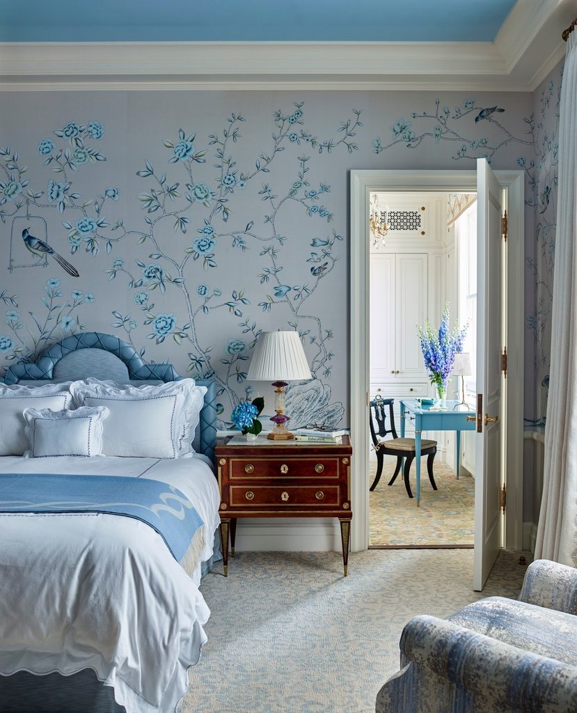
An overhead color can connect a bedroom from top to bottom. This room uses a blue ceiling above white molding, with floral wallpaper, a blue headboard, and pale bedding continuing the palette below.
The white trim provides a crisp boundary, so the ceiling reads as a deliberate surface rather than an unfinished extension of the wall. You can borrow the idea even with simpler walls and furniture.
Test the chosen blue overhead in changing light, since ceiling surfaces often read differently from vertical samples. Relate its depth to one existing textile rather than matching every item exactly.
Keep the main light fitting proportionate. A painted ceiling can make blue feel immersive while leaving the lower part of the room bright.
8. Add Blue Checks to a Mostly White Single Bed
Credits: Instagram
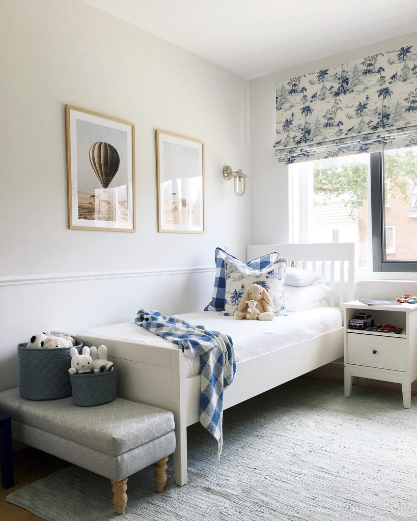
Checks offer a way to bring blue into a pale bedroom. In this single bed arrangement, a large checked cushion and a loose checked throw create a clear rhythm against white furniture and bedding.
A patterned window blind repeats blue at a different scale without covering every surface. This is useful when you want color that can change with the textiles rather than committing to paint.
Start with one check size and repeat it in a second piece, then let any additional pattern remain smaller or more open. Keep plenty of plain fabric visible between them.
Practical bedside storage and a simple bed frame provide a quiet setting. The bedroom gains character through a few coordinated layers instead of clutter.
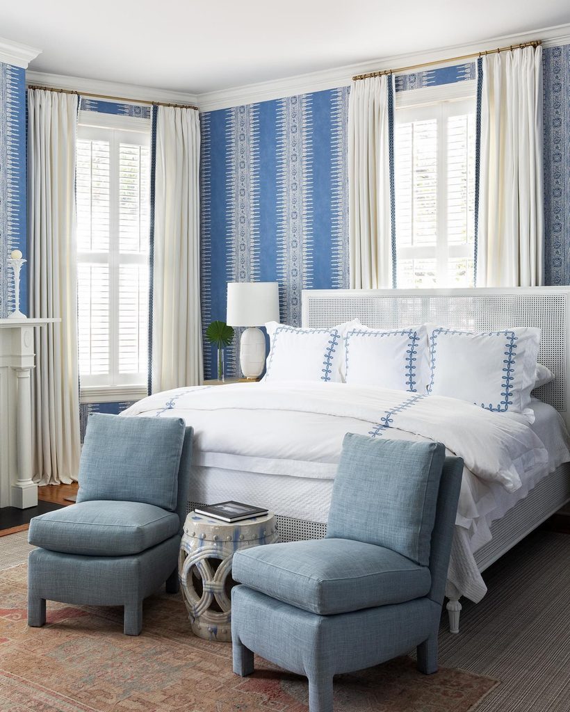
9. Balance Vertical Blue Wallpaper With White Woven Furniture
Credits: Instagram
Vertical pattern can give blue walls an orderly rhythm. This bedroom pairs narrow repeating wallpaper bands with white woven furniture, pale curtains, and restrained blue stitching on the bedding.
The furniture’s open texture brings a different kind of detail while remaining light against the wall. Soft blue chairs repeat the color lower in the room without copying the wallpaper’s pattern.
When combining these elements, compare the scale of the wall repeat with the furniture’s weave so neither becomes difficult to read. Plain curtains can provide a useful pause beside patterned walls.
Keep the larger bedding surfaces simple, allowing smaller trims to connect them to the scheme. Blue can feel richly detailed when texture and pattern each have their own role.
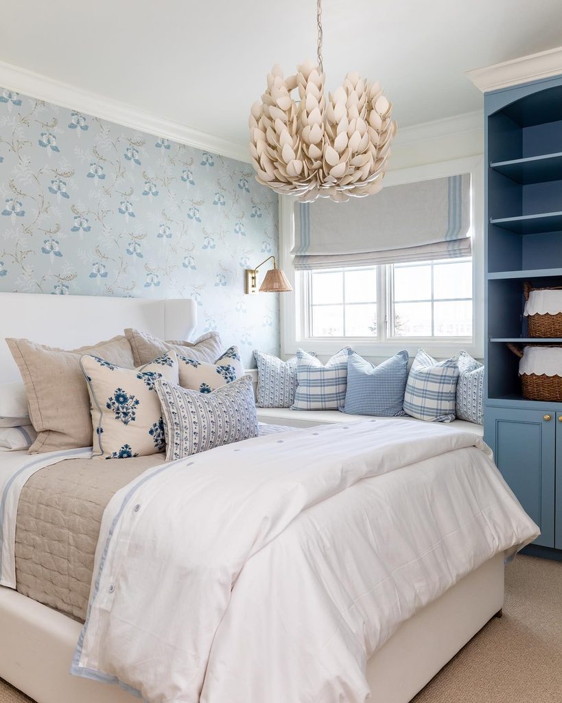
10. Connect a Window Seat With Blue Built-In Storage
Credits: Instagram
A window corner can become part of the bedroom’s blue scheme through the furniture around it. Here, blue built-in shelves and lower cupboards stand beside a pale window seat, with checked and floral cushions linking the seat to the bed.
The shelving provides a stronger block of color than the delicate wallpaper nearby. Think about the corner’s actual use before deciding how much storage to include.
Keep comfortable sitting depth and access to the window, and leave shelves useful rather than filling every opening with ornaments. Repeating blue in different cushion patterns makes the seat feel connected without requiring identical fabrics.
The combination gives a functional corner its own identity while keeping it visually related to the main sleeping area.
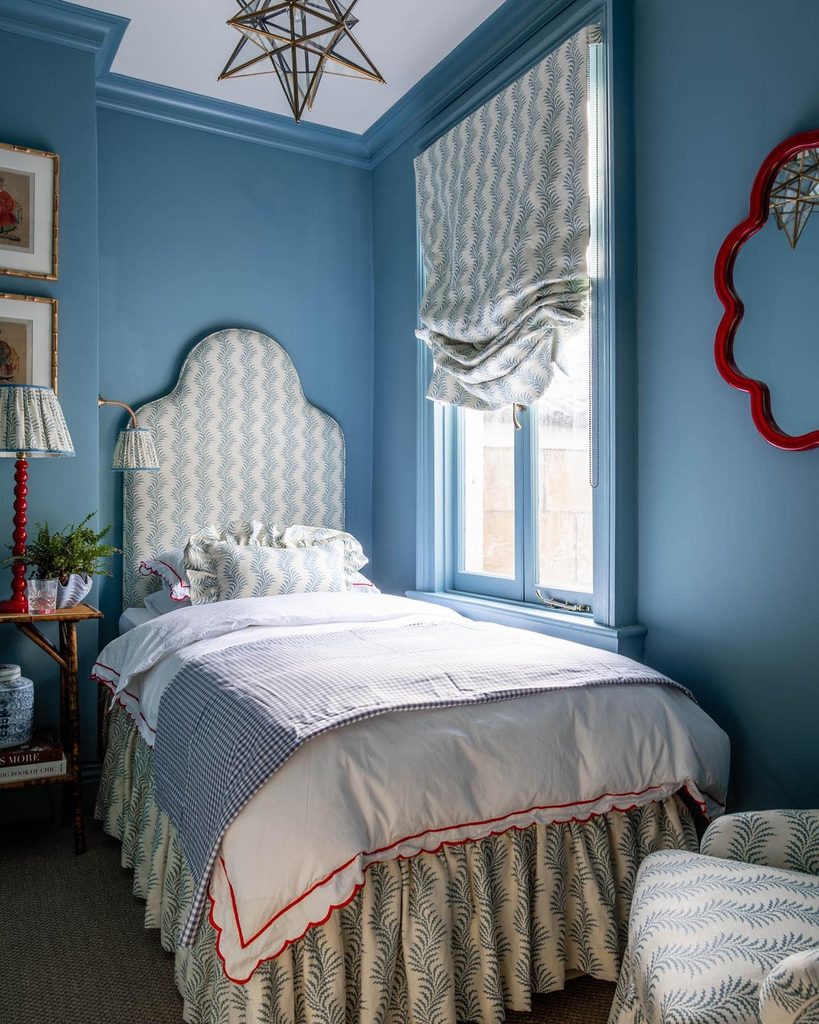
11. Repeat One Botanical Fabric on the Headboard and Blind
Credits: Instagram
Repeating a fabric can make a compact bedroom feel coordinated. This room carries the same blue botanical design across a shaped headboard, window blind, and smaller upholstered details, with solid blue walls providing a consistent backdrop.
White bedding interrupts the repeat, while small red accents add a contrasting note. Choose a pattern you enjoy at several viewing distances before using it so extensively.
Check how its repeat will fall across the headboard’s outline and the folds of the blind. A simpler coverlet can keep the bed from becoming too busy.
You do not need to cover every accessory in the matching fabric. Concentrating it on two main surfaces creates a recognizable connection while leaving space for other textures and shapes.
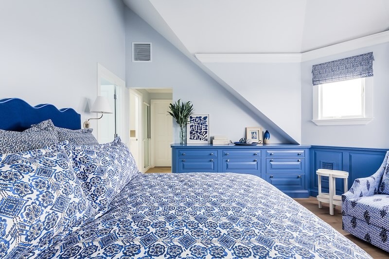
12. Fit Blue Drawers Beneath a Sloping Bedroom Wall
Credits: Instagram
A sloping roof does not have to leave the lower wall without a purpose. This bedroom fits a run of blue drawers beneath the angle, with matching lower wall panels extending the color around the corner.
Pale upper surfaces keep the changing ceiling shape clear, while blue patterned bedding connects storage and sleep. Measure the usable depth and headroom before planning furniture for an awkward roofline.
Drawers need enough space to open without blocking the bed or nearby seating. A shared paint color can make separate fronts read as one composition, even when their dimensions differ.
Keep the top useful and avoid a crowded row of decorations. Blue gives the fitted storage character while its low profile respects the architecture.
13. Keep Bold Botanical Wallpaper Above a Blue Wall Border
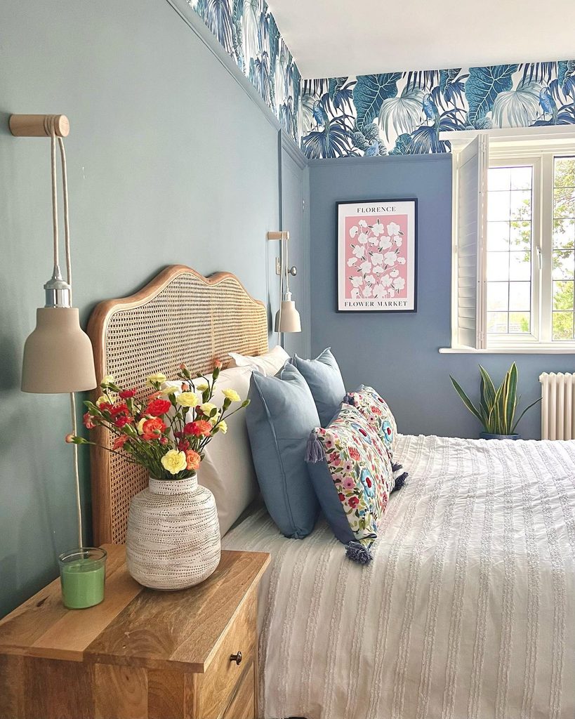
Credits: Instagram
A band of wallpaper can introduce a print without surrounding the bed at eye level. Here, bold blue botanical motifs run above a picture rail, while the larger lower walls remain a quieter blue.
A cane headboard and wooden bedside chest provide natural warmth, with white bedding giving the patterns room to breathe. Consider this division when you like an expressive print but prefer calmer surroundings close to the pillows.
Align the boundary with an existing architectural feature where possible, and compare the wallpaper’s blue with the proposed paint. The shades need to relate rather than match perfectly.
Keep other large surfaces uncomplicated. A concentrated upper border can make a bedroom distinctive while leaving furniture and everyday objects clearly visible.
14. Rest Layered Artwork on a Blue Paneling Ledge
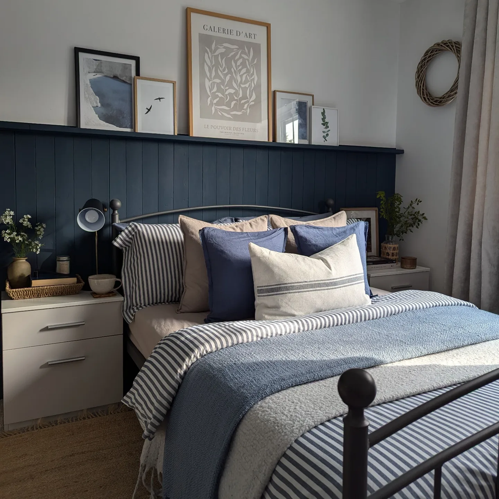
Credits: Instagram
Leaning artwork creates a flexible display above the dark blue paneling in this bedroom. The ledge is painted to match, so its horizontal line feels like part of the wall treatment.
Pale prints, mixed frame sizes, and a little overlap soften the transition to the light upper wall. Below them, striped blue and white bedding introduces a finer pattern, balanced by solid blue cushions.
A similar ledge can let you rearrange artwork without planning a new gallery layout each time. Check that its depth suits the frames and use appropriate supports for anything displayed above a bed.
Leave some space around the tallest print so the collection retains a clear outline instead of becoming a continuous band of competing frames.
15. Wrap a Blue Accent Wall Onto the Ceiling
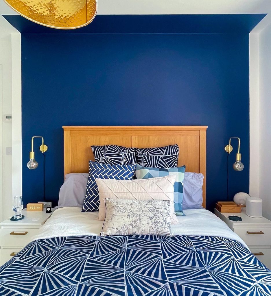
Credits: Instagram
Color reaches just beyond the wall in this sapphire-blue bedroom. A narrow strip continues across the ceiling above the bed, with small side returns completing the painted enclosure.
The white surrounding surfaces make the boundary obvious, turning an ordinary bed position into a distinct zone. A warm wood headboard stands out against the blue, while patterned blue and white bedding keeps the arrangement connected.
This idea offers a more localized use of overhead color than painting the whole ceiling. Mark the proposed edges before decorating and check their relationship to the bed, lights, and nearby openings.
A clean, consistent boundary makes the treatment read clearly. The resulting blue frame can provide architectural emphasis even when the room has little detail.
16. Set a Dark Wood Bed Against Pale Blue Grasscloth
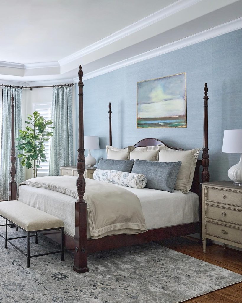
Credits: Instagram
Texture can keep a pale blue bedroom from feeling flat. In this room, textured blue wallcovering forms a background for a dark wooden four poster bed, letting the carved posts remain distinct.
Cream bedding, pale bedside furniture, and quieter blue cushions keep the large contrast from feeling harsh. The useful combination is a restrained wall color with enough surface variation to reward a closer look.
View a generous wallcovering sample beside the wood and in the room’s natural light before committing. Consider cleaning needs and the product’s installation requirements, especially where seams will be visible.
Keep the bedding less busy than the room’s architectural features. Existing dark furniture can then become an intentional part of a light blue bedroom scheme.
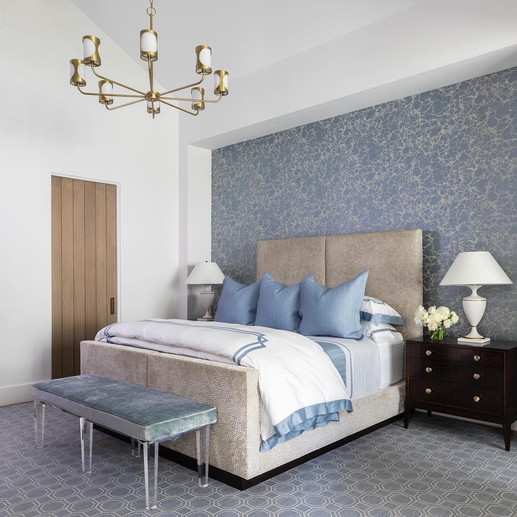
17. Frame Marbled Blue Wallpaper Inside a White Recess
Credits: Instagram
A recessed wall can give a detailed blue finish a boundary. This bedroom places marbled wallpaper behind the bed while keeping the surrounding sides and ceiling white.
Pale blue cushions and a soft blue bench bring the color forward, and darker bedside chests provide contrast near the floor. The wall treatment feels contained rather than spread across every surface.
Work with an existing recess when possible, checking the pattern’s position against the bed and lamps. A small sample may not show the full movement of a marbled design, so review a larger repeat before choosing it.
Let the white border remain clear. This approach uses architecture to organize the pattern, giving blue a defined role within a layered bedroom palette.
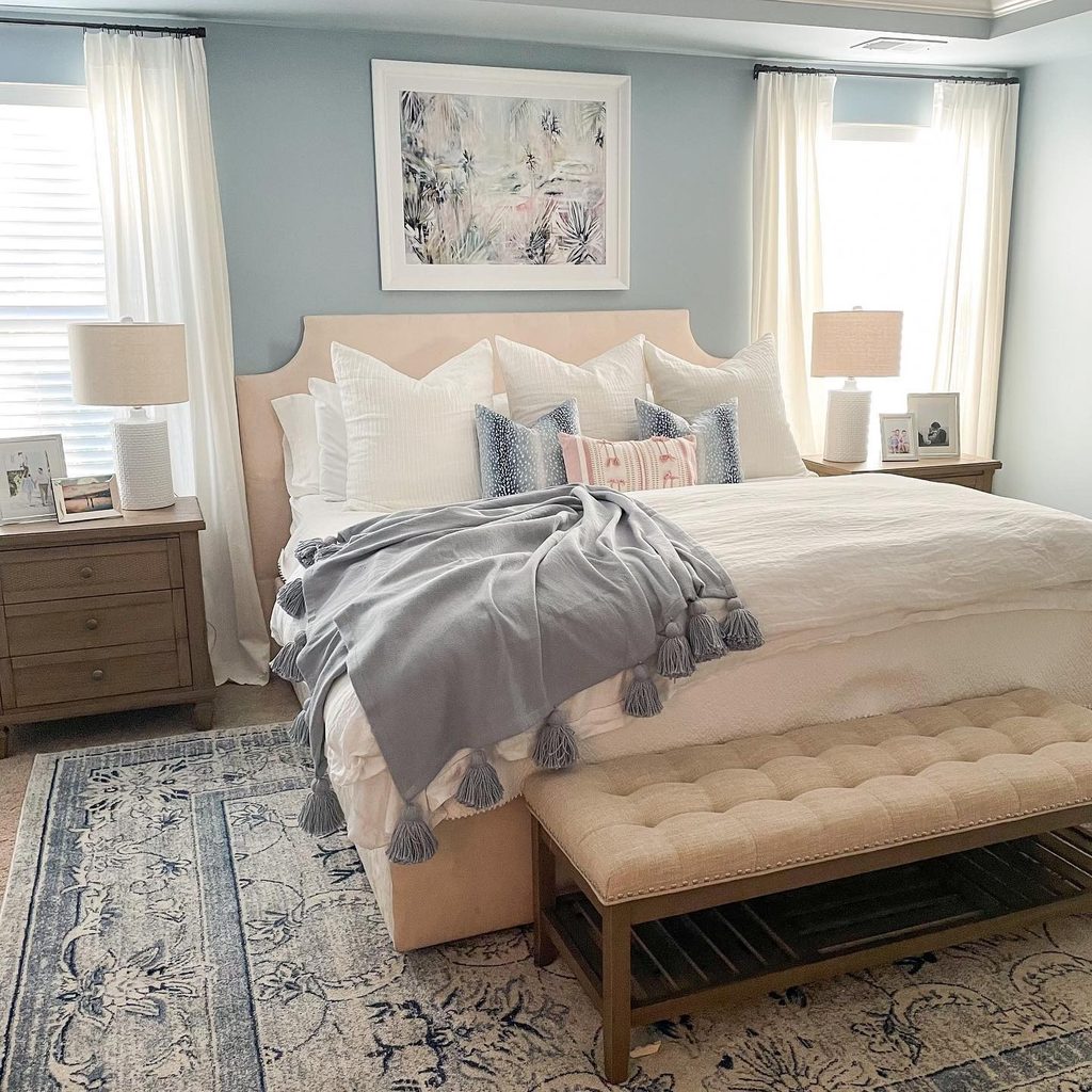
18. Ground Pale Furniture With a Blue Patterned Rug
Credits: Instagram
Blue can enter a bedroom from the floor rather than the walls or headboard. Here, a patterned blue rug extends beneath a pale upholstered bed and bench, connecting with blue cushions and a folded throw above.
The larger furniture remains neutral, so the floor pattern supplies detail without overwhelming the sleeping area. Choose a rug size around the furniture layout, leaving a landing space beside the mattress.
Check edges, door swings, and any nearby drawer openings before final placement. An appropriate nonslip layer helps keep the surface settled.
Repeat one blue tone in a small textile if the rug feels disconnected. A patterned foundation can give existing neutral pieces a clearer relationship while remaining a changeable part of the room.
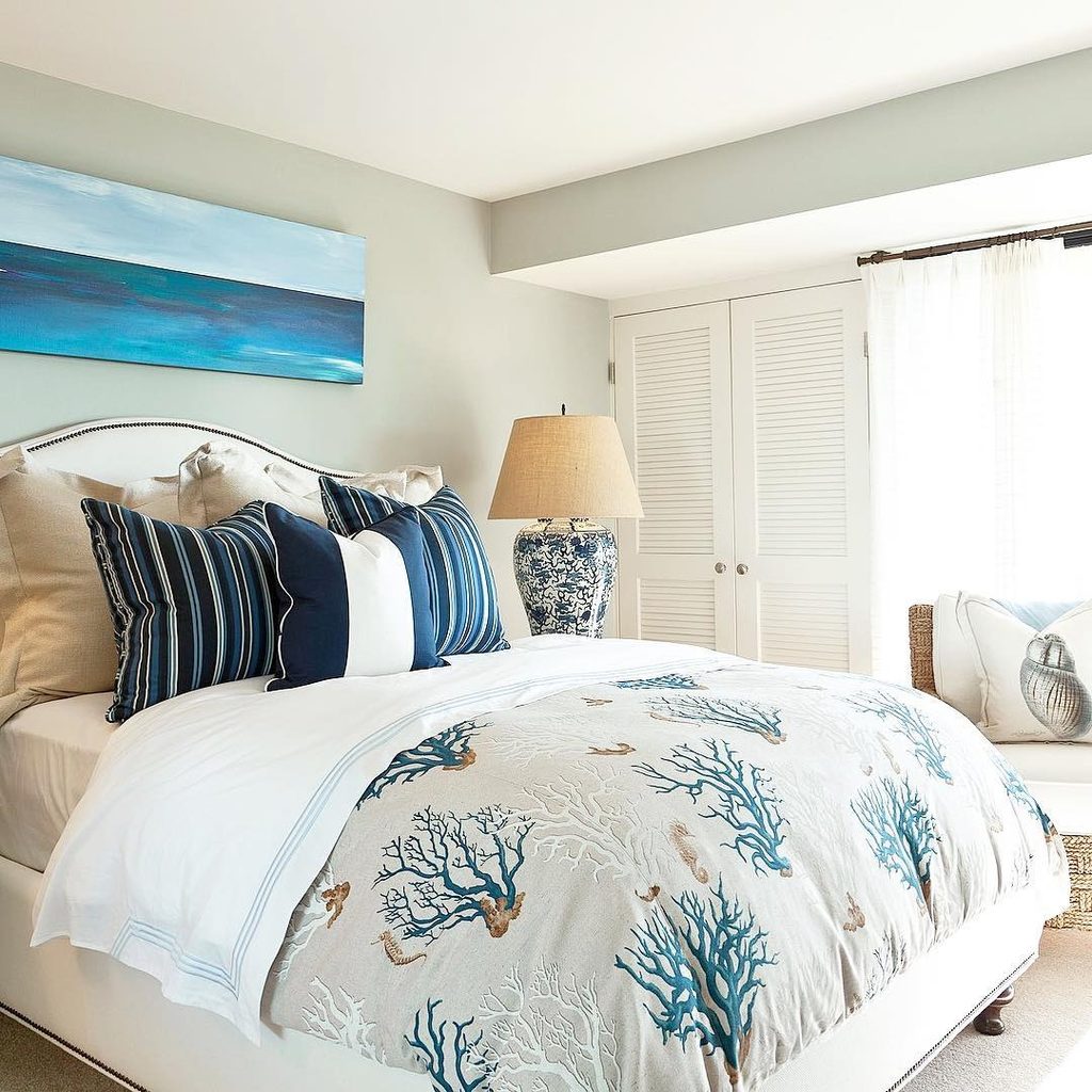
19. Give Neutral Bedding a Blue Coral Print
Credits: Instagram
A printed coverlet can establish a blue bedroom theme without changing the walls. This bed uses branching coral motifs in blue across a pale ground, with striped cushions adding a more orderly pattern near the headboard.
White sheets and neutral upholstery keep the mix from becoming heavy. The blue artwork and patterned lamp repeat the color elsewhere without requiring a matching furniture set.
When combining prints, vary their scale and structure so each remains easy to recognize. An organic motif can work beside a stripe when their colors share enough in common.
Keep the plain layers visible between them. The result is a coastal reference carried mainly by textiles, which can be adjusted as your taste or the seasons change.
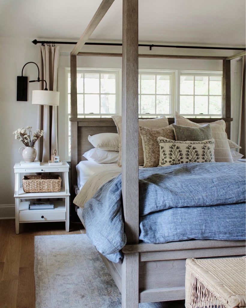
20. Soften a Wooden Canopy With Denim Blue Bedding
Credits: Instagram
A wooden canopy can look relaxed when the bedding supplies a soft counterpoint. This room pairs a timber frame with denim blue layers, cream pillows, and a botanical cushion.
Pale curtains and white bedside storage keep the wood’s outline visible without making the setting overly formal. Choose blue fabric with a texture you enjoy up close, rather than relying only on an exact shade match.
Folding one layer back lets its different surfaces and the lighter bedding show together. Keep the canopy’s surrounding space clear enough for its structure to remain legible.
A woven basket or natural accent can relate to the frame without matching it precisely. Blue then contributes comfort and color while the wood provides the room’s structure.