
Orange can feel surprisingly calm in a bedroom when it’s balanced with pale bedding, natural textures, or cooler colors.
Orange Bedroom Ideas range from a small, easy-to-change accent—such as a curved table lamp or one round cushion—to a larger statement like a terracotta wall or rust headboard.
The key is choosing how much color the room can comfortably hold and giving it space to stand out.
You’ll find ways to use peach bedding with woven textures, layer painted arches behind a bed, and repeat rust in compact bedside tables without making every surface compete.
1. Warm a Paneled Bed Wall With Soft Terracotta
Credits: Instagram
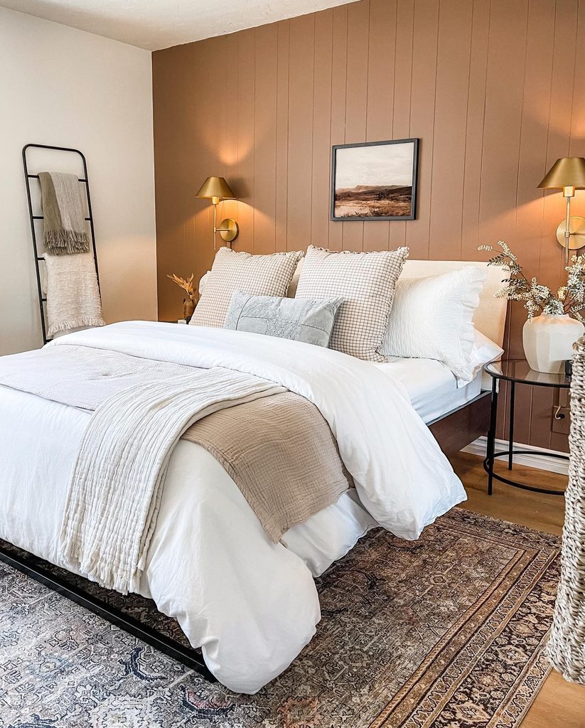
Soft terracotta gives the vertical paneling behind this bed a warm identity without making the whole bedroom orange. White bedding and a dark frame keep the painted surface easy to distinguish, while the brass toned sconces provide smaller highlights.
The color reads as an earthy backdrop rather than a bright decorative accent. For a similar result, compare several muted orange samples beside your linens and flooring.
Check them both away from the lamps and with the evening lighting on. A single wall can supply enough warmth when the surrounding room is pale.
Keep artwork relatively simple so the panel lines remain visible. The useful balance is between a substantial colored surface and generous areas of quieter fabric around the mattress.
2. Layer Terracotta Arches Behind a Corner Bed
Credits: Instagram
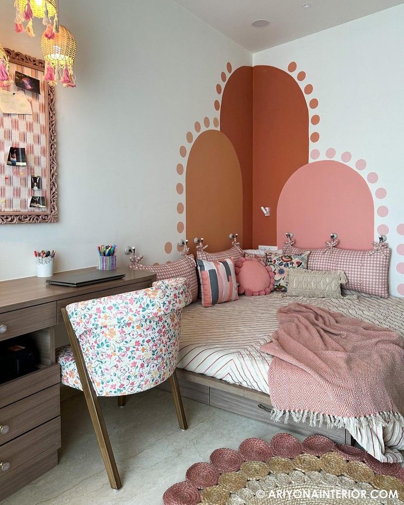
Three painted arches give this bedroom corner a warm, playful backdrop. Deep terracotta rises highest, with a lighter orange shape and a soft pink arch overlapping nearby.
Small dots follow their outlines, adding detail without another framed picture. The bedding remains quieter, allowing the shapes to organize the wall.
Before trying a similar arrangement, sketch the arches in relation to the bed, desk, and corner junction. Their heights should feel intentional from both the doorway and the sleeping area.
Test the colors together rather than selecting each in isolation. You can simplify the idea to fewer shapes if your room already has pattern.
Clear boundaries and a restrained surrounding wall help orange become a deliberate feature rather than visual clutter.
3. Introduce Orange With a Curved Table Lamp
Credits: Instagram
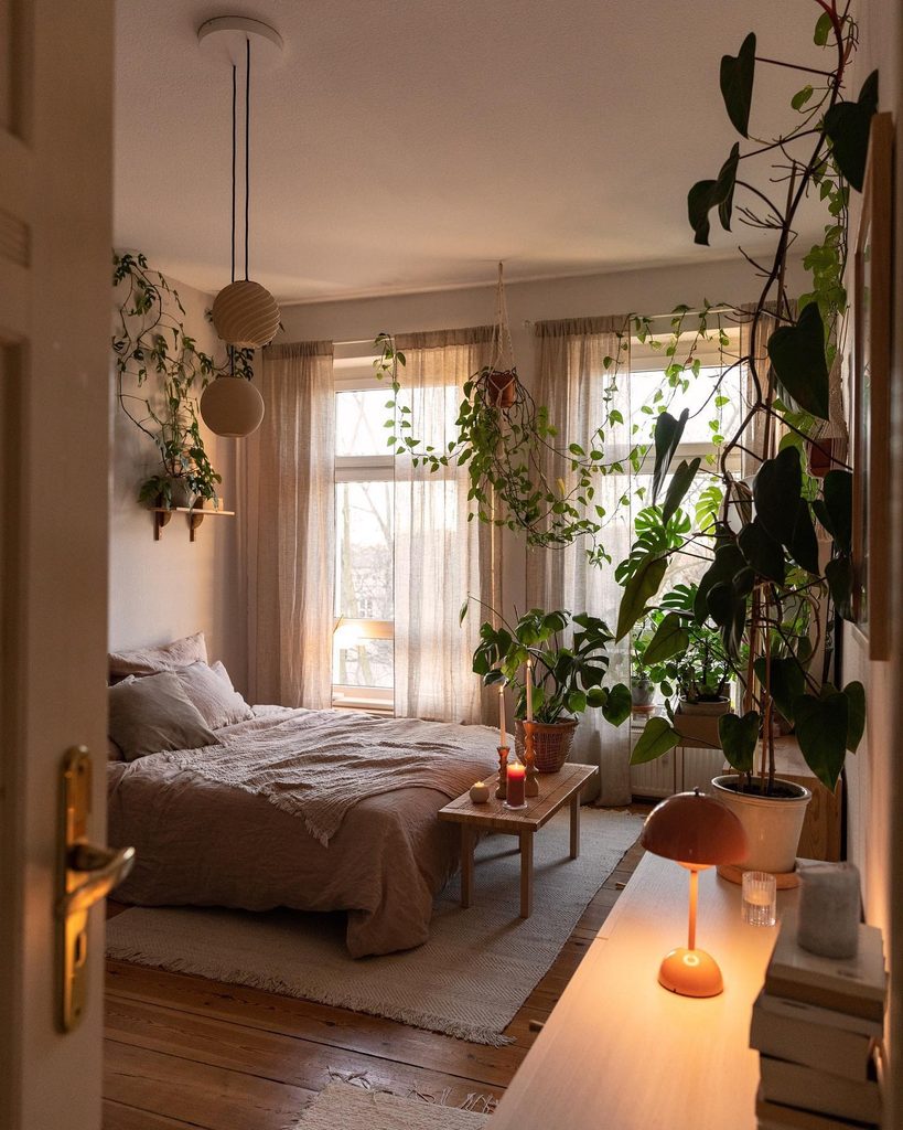
A small orange dome lamp brings a concentrated warm accent to this bedroom’s wooden tabletop. Its rounded shade and matching base stand out among pale bedding, light curtains, and abundant greenery.
Because the orange occupies one object, the room does not need matching paint or a new duvet. This is a practical starting point if you want to try the color gradually.
Choose a lamp that supplies useful light as well as an appealing silhouette. Check its brightness from the bed and keep the switch easy to reach.
Leave enough clear surface around the base for ordinary belongings. A single saturated accessory can feel intentional when its shape is simple and the surrounding materials give it space to be noticed.
4. Outline an Attic Bed With a Rust Headboard
Credits: Instagram
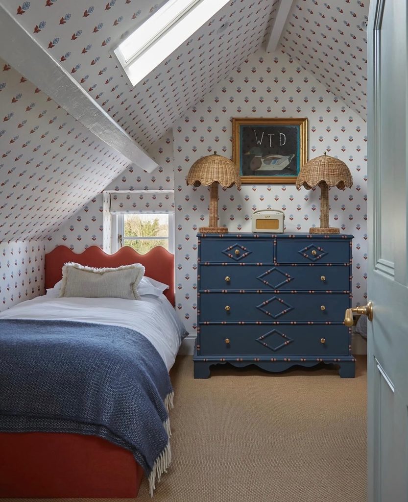
A low rust colored headboard gives this attic bed a clear warm outline beneath the sloping ceiling. Its scalloped top stays visible above white pillows, while blue bedding and a blue dresser create a cooler contrast.
The small wallpaper motifs repeat related warm notes without becoming a second solid orange surface. For a similar bedroom, choose the headboard’s height around the roofline and window rather than assuming a tall design will fit.
Compare the upholstery with the existing wall pattern before adding more textiles. Pale pillows are useful because they keep the curved edge readable.
One carefully chosen upholstered piece can introduce orange into a busy room while leaving the rest of the furniture and architecture largely as they are.
5. Combine Apricot Upholstery With a Leafy Print
Credits: Instagram
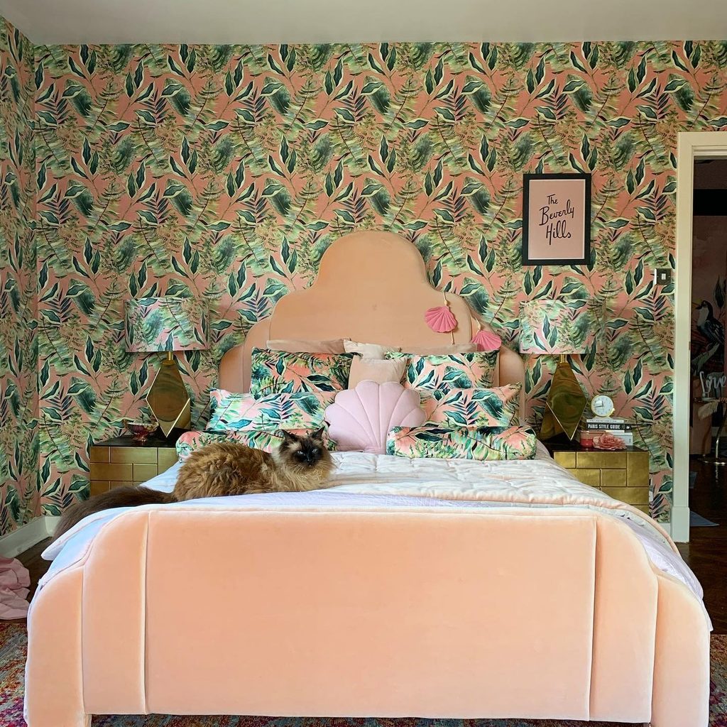
Apricot upholstery gives this bed a soft orange outline against densely patterned green and peach wallpaper. The matching leafy print appears on the lampshades and cushions, while a broad pale coverlet interrupts the pattern at the center.
Rather than adding a separate bright orange object, the room uses a gentler shade across substantial fabric surfaces. This approach suits someone who enjoys a warm bedroom but prefers pastel color to tangerine.
Compare the upholstery directly with the wallpaper background before choosing either. Leave enough plain bedding to give the repeated leaves a visual pause.
You do not need every matching accessory shown here. A headboard, one patterned cushion, and restrained linens can establish the same relationship with fewer competing decorative pieces.
6. Let Pale Peach Bedding Warm Natural Textures
Credits: Instagram
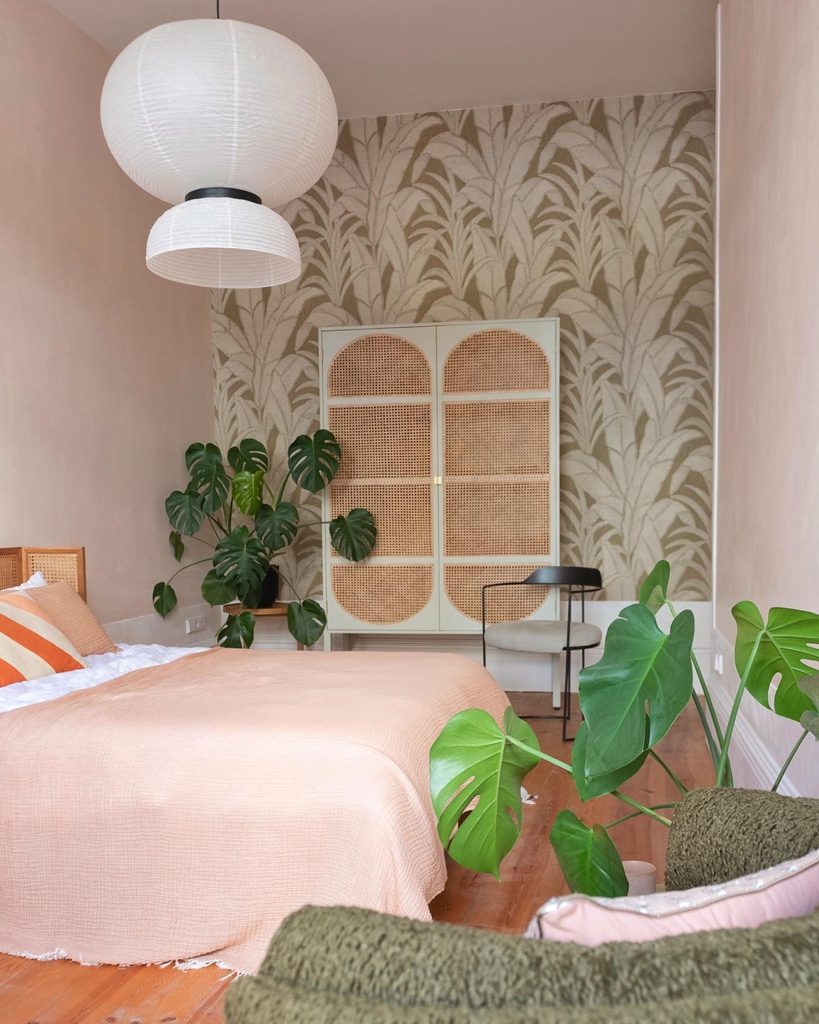
Pale peach bedding creates a broad, gentle orange surface beside woven cane furniture and leafy plants. Its quiet texture allows the warmer color to spread across the bed without competing with the botanical wallpaper at the far end.
A striped cushion introduces a stronger orange note in a much smaller amount. This is useful when you want warmth but find a vivid duvet overwhelming.
Start with the largest textile and compare it with wood, rattan, and other materials already in your room. A little brighter orange can then sharpen the palette if it feels too subdued.
Keep neighboring bedding layers simple. The combination works through differences in intensity, letting soft peach provide the background and a smaller accent supply definition.
7. Repeat Rust in Compact Bedside Tables
Credits: Instagram
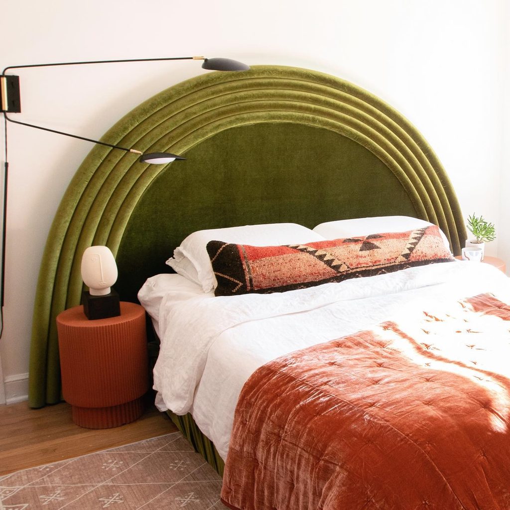
Two rust orange cylindrical tables repeat the warmth of this bed’s coverlet beside a green upholstered headboard.
Their color and ribbed surfaces give the orange a place beyond the bedding, making the combination feel connected even when the bed is rearranged. Small pale lamps and white linens prevent the warm pieces from merging into one block.
You could try the same idea with one bedside table if the room is asymmetrical. Check its height against the mattress and reserve enough top space for everyday essentials.
Compare paint or finish samples with the duvet before choosing a match. Related shades do not need to be identical.
A useful furniture piece can carry color more consistently than an changing collection of accessories.
8. Try One Round Orange Cushion Among Cool Layers
Credits: Instagram
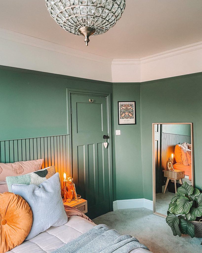
One round orange cushion adds a warm shape among this bed’s pale blue and pink pillows. Its gathered surface contrasts with the smoother square layers, while the deep green wall gives the orange a clear background.
The smaller amount of color makes the combination easy to test without replacing the main bedding. Begin with a cover or cushion whose size feels useful on your own bed.
Look at it against the pillows you already keep, rather than judging the orange on its own. A circular outline can provide enough variety without introducing another print.
Leave some quieter fabric around it so the accent remains distinct. The aim is a comfortable color experiment that can change easily as your preferences develop.
9. Bring Orange Into a Bedroom Through the Rug
Credits: Instagram
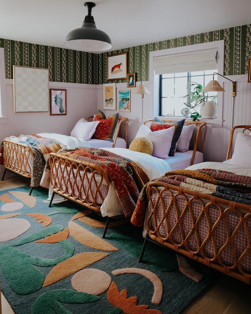
Orange shapes are woven into the rug beneath these beds, giving the room warm accents at floor level. The pattern also contains green, pale blue, and cream, which helps the orange connect with the surrounding layered textiles.
Because the rug remains visible between and beyond the furniture, its design has room to register. This is an alternative to placing all your color on the duvet.
Before choosing a patterned rug, mark its edges on the floor and check how much will remain exposed. Pull just one or two colors into smaller bedroom accessories.
The photograph shows a richly collected room, but the same floor treatment can work with plainer bedding. Let the rug supply the main pattern in your version.
10. Carry an Orange Paint Band Around the Bedroom
Credits: Instagram
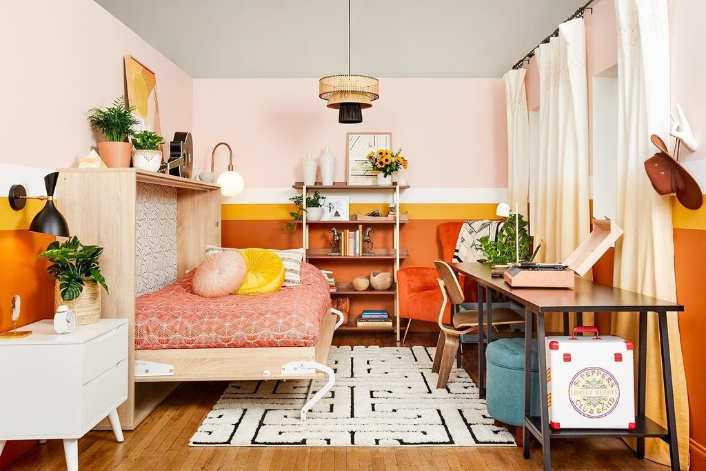
A strong orange band wraps the lower walls of this compact bedroom, with a narrower yellow stripe marking its upper edge. Pale pink above keeps the room lighter overhead, and the continuous line connects the bed, shelves, and work area.
An orange chair repeats the paint in a separate upholstered shape. When adapting this idea, choose the boundary in relation to furniture and existing trim instead of using an arbitrary height.
Check the line around every corner before painting. The broad orange area can provide enough color without matching every object on the desk.
Keep the upper wall quieter if you want the lower band to read clearly. A continuous treatment can bring separate activities together within one small room.
11. Break Up White Bedding With a Muted Rust Stripe
Credits: Instagram
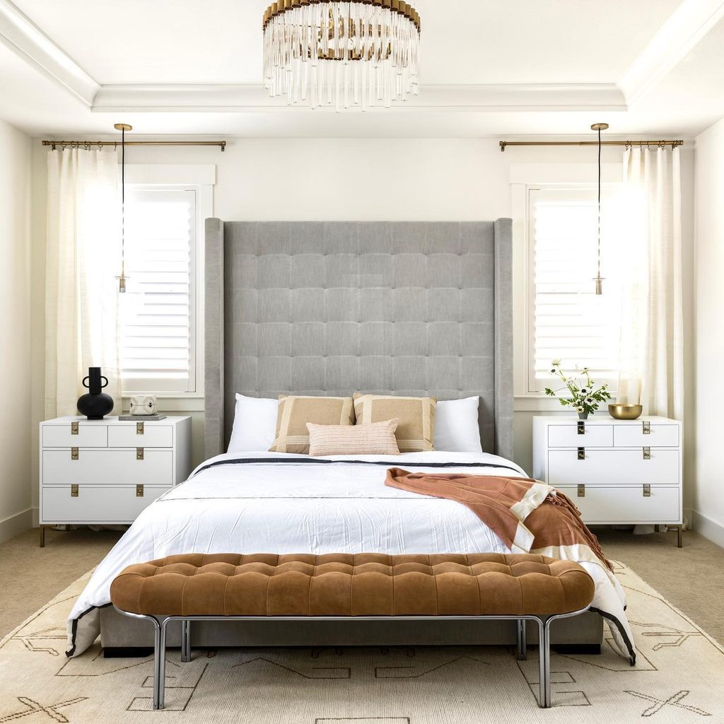
A muted rust throw creates a warm diagonal across this otherwise pale bed. Its cream stripe links it to the white duvet, while a brown upholstered bench provides another earthy surface nearby.
The orange remains a small, movable accent rather than the room’s dominant color. This is useful when your bedroom already has substantial neutral furniture and needs only a little warmth.
Try the throw in different folds before buying additional cushions. Leaving the stripe visible helps the textile connect with the lighter bedding instead of appearing as an isolated patch.
Check that its weight and care requirements suit regular use. A simple woven layer can refresh the arrangement while remaining easy to remove when the room feels warm enough.
12. Add a Terracotta Note With a Bedside Plant Pot
Credits: Instagram
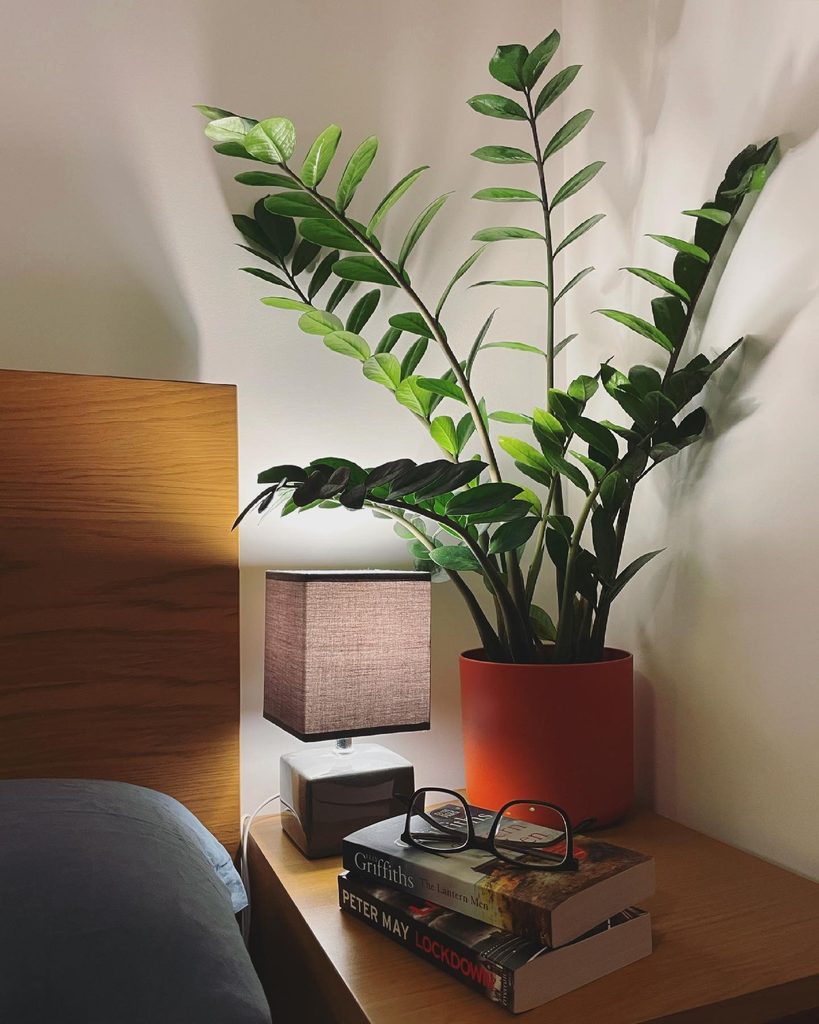
A terracotta colored pot introduces a modest orange accent beside this wooden headboard. The plant’s glossy green leaves make the warm container easier to notice, while the gray lampshade and blue bedding keep nearby colors restrained.
This is a small scale option when you want to test orange without changing furniture or paint. Choose a pot that fits the plant’s needs and protect the nightstand from water.
Leave enough clear surface for the lamp and your usual bedside essentials rather than filling the whole tabletop. The exact plant is less important than matching it to the room’s light and your care routine.
A useful container can supply color while giving an existing plant a more deliberate place in the bedroom.
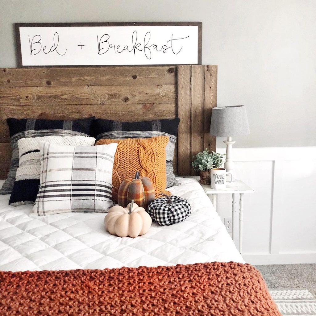
13. Bring Autumn Texture With a Chunky Orange Throw
Credits: Instagram
Chunky stitches make a rust-orange throw feel substantial in a small dose. Laid across the foot of this white bed, it warms the scene without covering the quilt’s geometric texture.
Black and cream plaid cushions add structure, while a mustard knitted pillow keeps the autumn colors related. The broad wooden headboard gives all those soft layers a firm visual anchor.
This is an approachable seasonal update because the orange piece can be removed without changing the room’s permanent finishes. Limit decorative extras if you want the look to work beyond fall.
The throw, one warm cushion, and the existing neutral bedding are enough. Try a loose fold that shows the stitch pattern clearly instead of tucking the blanket away tightly.
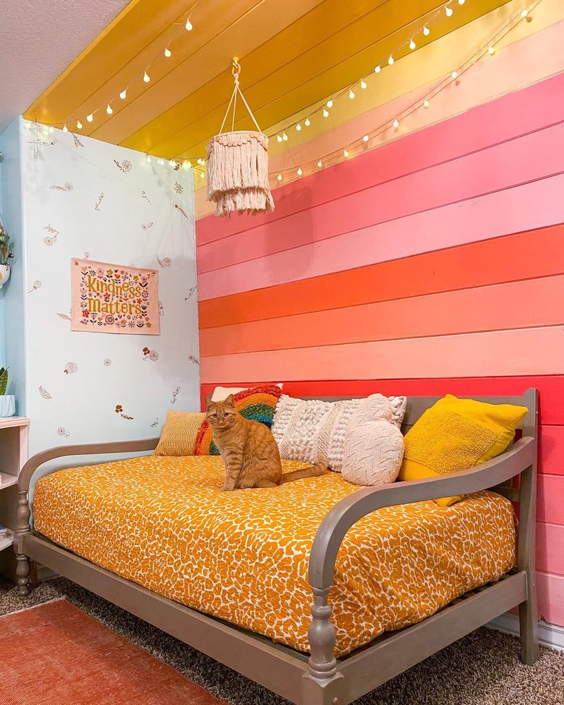
14. Mix Orange With Pink in Broad Wall Stripes
Credits: Instagram
An orange plank sits among coral, pink, peach, and yellow bands behind this daybed. The separate horizontal boards give each color a clear boundary, while the gray frame provides a quieter outline below.
Warm patterned bedding continues the palette without copying the wall exactly. This is a lively orange bedroom idea for someone who wants paint to do more than create a single plain feature wall.
Plan the complete sequence of colors before starting, comparing samples side by side in the room. Keep nearby furniture relatively simple so the stripes remain readable.
You can use fewer shades for a calmer version. Clean boundaries and generous areas of each color will usually communicate the idea better than many narrow, unrelated bands.
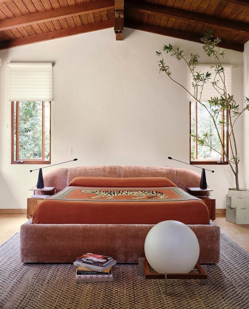
15. Connect Rust Bedding With an Exposed Wood Ceiling
Credits: Instagram
Rust orange bedding brings the warmth of this timber ceiling down to the mattress. Pale walls and restrained window shades separate the large wooden overhead surface from the upholstered bed below.
A single animal motif textile adds concentrated detail without covering every layer in pattern. The useful relationship is between warm architecture and a warm fabric, rather than an exact color match.
If your bedroom already has exposed wood, compare several orange samples beneath it before choosing a duvet. A deep rust may feel more settled than a clear tangerine.
Keep some surrounding surfaces light so the grain and bedding remain distinct. Dark, slim bedside lamps can provide definition without adding another large visual feature to an already characterful room.
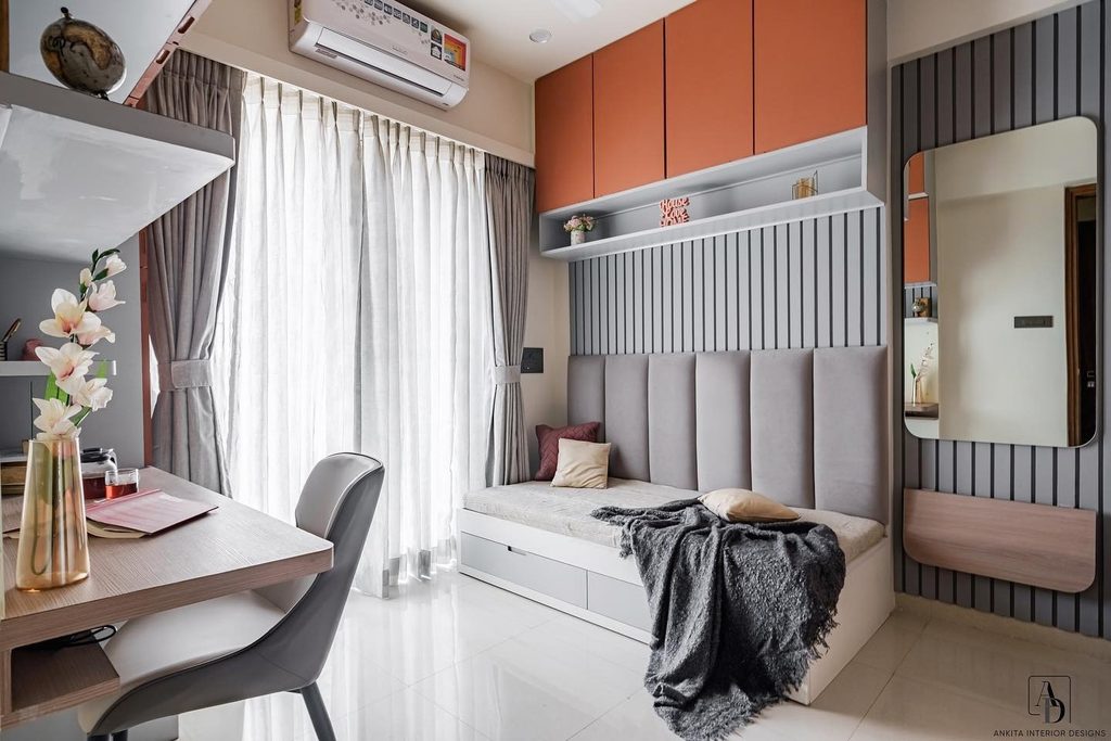
16. Give Upper Bedroom Storage an Orange Finish
Credits: Instagram
Orange cabinet fronts create a warm band above the gray upholstered bed in this compact room. The color stays concentrated on the upper storage, while striped wall panels and pale curtains organize the larger backdrop.
This makes practical cabinetry part of the decoration without requiring orange across the bedding as well. For a similar treatment, consider which storage surfaces are visible from the doorway and pillow.
A limited set of fronts can be enough to establish the accent. Compare the finish with the room’s wood and gray tones before committing.
Keep handles and opening clearances practical. The photograph offers a color placement idea, not instructions for mounting overhead cabinets; any fitted installation needs support and planning appropriate to its structure.
17. Place a Rust Sofa at the Foot of the Bed
Credits: Instagram
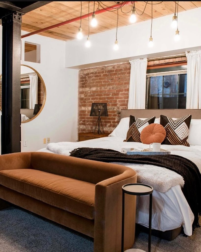
A rust toned sofa gives this industrial bedroom a warm upholstered foreground. Its rounded back contrasts with the exposed brick, dark column, and angular patterned pillows behind it.
A smaller orange cushion on the bed links the sitting piece with the sleeping area without repeating the color everywhere. This works best when the room has enough space for a usable seat.
Measure the walking route and the clearance needed to sit down before choosing a sofa for the bed’s foot. Keep nearby furniture lighter in scale if the upholstery is substantial.
You can borrow the color relationship with a smaller chair when space is tight. The orange piece should support everyday comfort as well as introduce a strong warm accent.
18. Warm Blue Walls With Coral Orange Curtains
Credits: Instagram
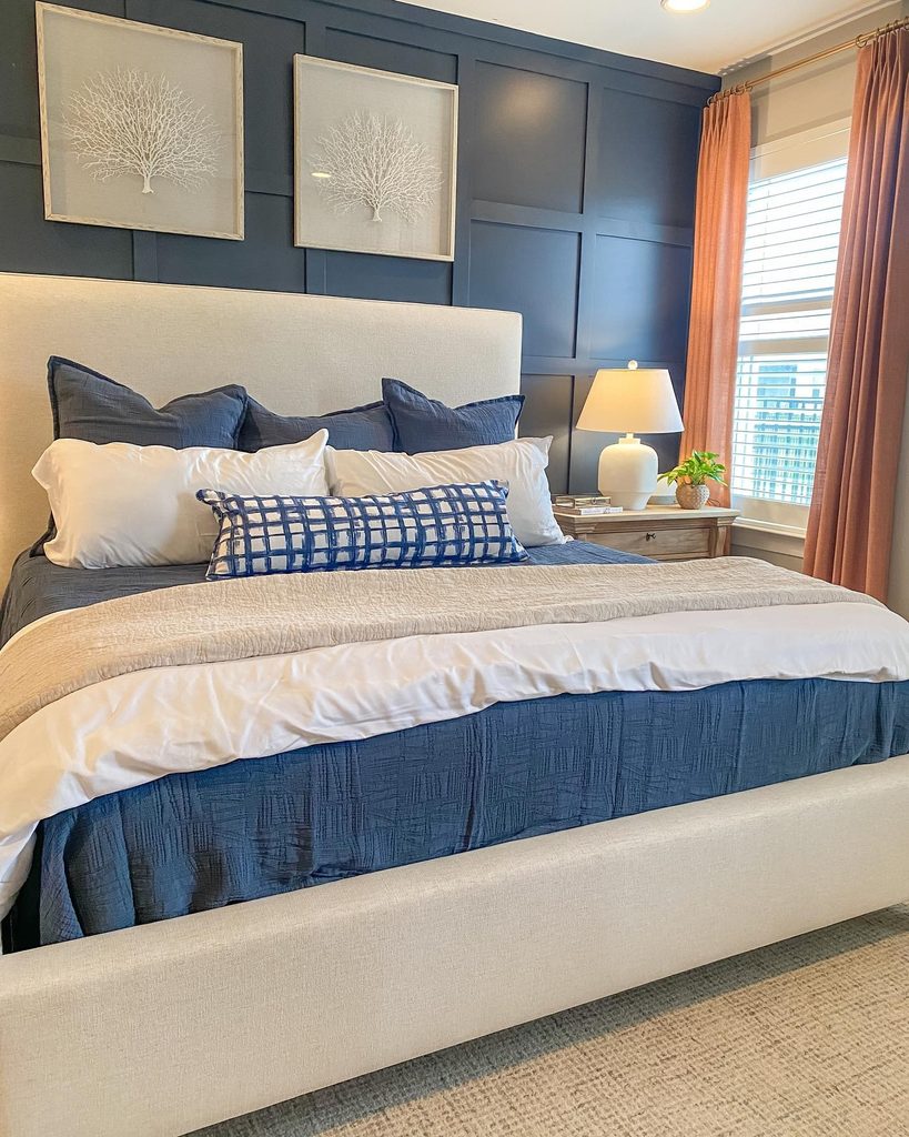
Coral orange curtains add a warm vertical accent beside the blue paneled wall in this bedroom. Cream bedding and a light upholstered headboard provide space between the two stronger colors, while the curtain folds keep the orange visibly textured.
This is a useful way to update a blue room without repainting it or replacing the largest furniture. Compare fabric samples directly against the existing wall, checking them in daylight and under your lamps.
A muted coral will create a different relationship from a bright clear orange. Consider the lining and how the panels will gather when open as well as their color.
Keeping other accessories restrained allows the blue and orange pairing to remain easy to understand throughout the room.
19. Make a Corner Nook With a Peach Canopy
Credits: Instagram
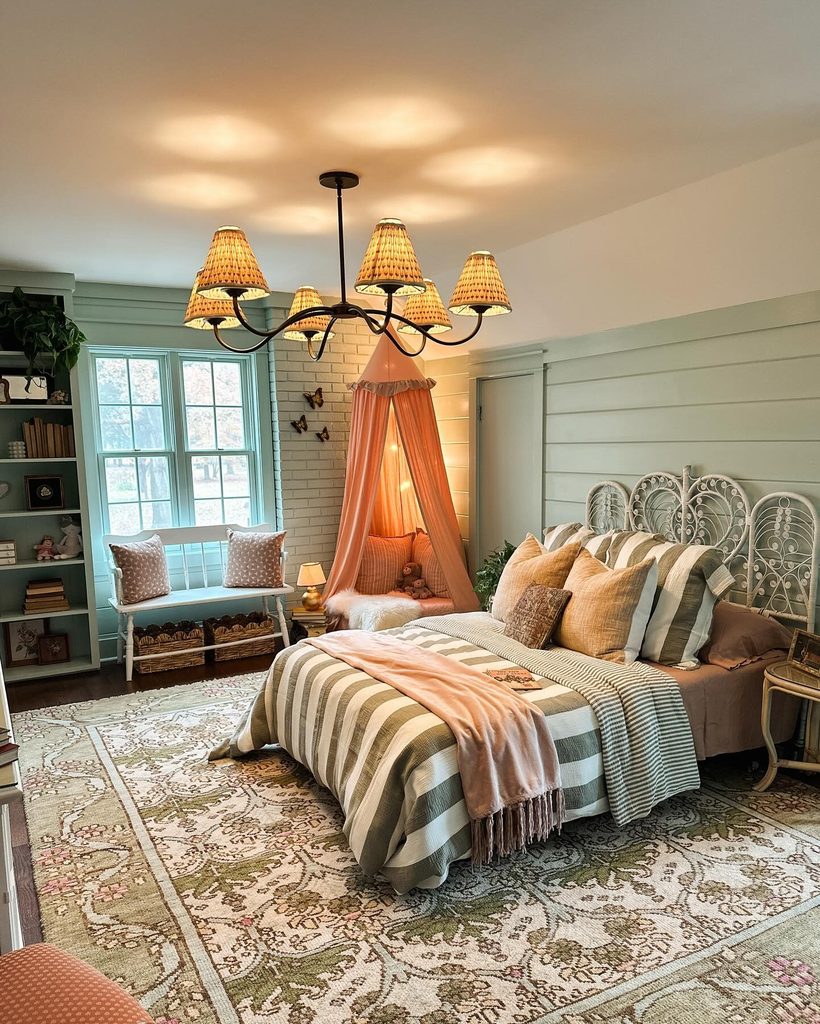
A peach canopy marks a sitting nook beside this bed, adding a softer orange note to the green paneled room. Its gathered fabric creates a distinct enclosure, while peach bedding accents help connect the corner with the sleeping area.
The idea is useful when you want color in one sheltered spot rather than on every wall. Plan the canopy around sitting space and comfortable access before choosing its proportions.
Use secure supports suited to the installation and keep fabric away from lamps, heaters, and moving parts. The photograph includes decorative lighting, but your arrangement should follow the requirements of the fixtures you choose.
A simple cushion and a quiet surrounding palette can let the canopy remain the nook’s main feature.
20. Use Orange Artwork Beside Purple Bedding
Credits: Instagram
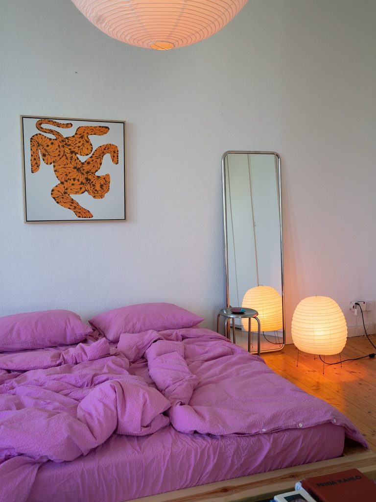
An orange tiger shaped print provides a strong warm accent above the purple bedding in this room.
Its pale background keeps the artwork distinct from the white wall, while the darker pattern inside the orange adds detail without another framed piece.
The purple and orange relationship is concentrated in two clear areas rather than spread across every object. You can borrow the pairing with artwork you already enjoy, choosing a print that contains enough orange to remain visible from the doorway.
Keep the frame quiet if the image is bold. Test its position against the bed before fixing it securely.
Plain bedding makes the artwork easier to appreciate, allowing a lively color combination to feel deliberate rather than visually crowded.