
In a pale bedroom, small differences in color and texture can keep the space from feeling flat.
Cream And White Bedroom Ideas show how a warmer wall, a patterned rug, or a fringed throw can add definition without introducing a bold palette.
The key is to compare cream tones with your bedding in the room’s light, since nearby whites can make them look cooler or more yellow.
You’ll also find ways to use stripes, decorative edges, and warm bedside lamps while keeping the overall look soft and restrained.
Break Up Cream Walls With Soft Dots
Credits: Instagram
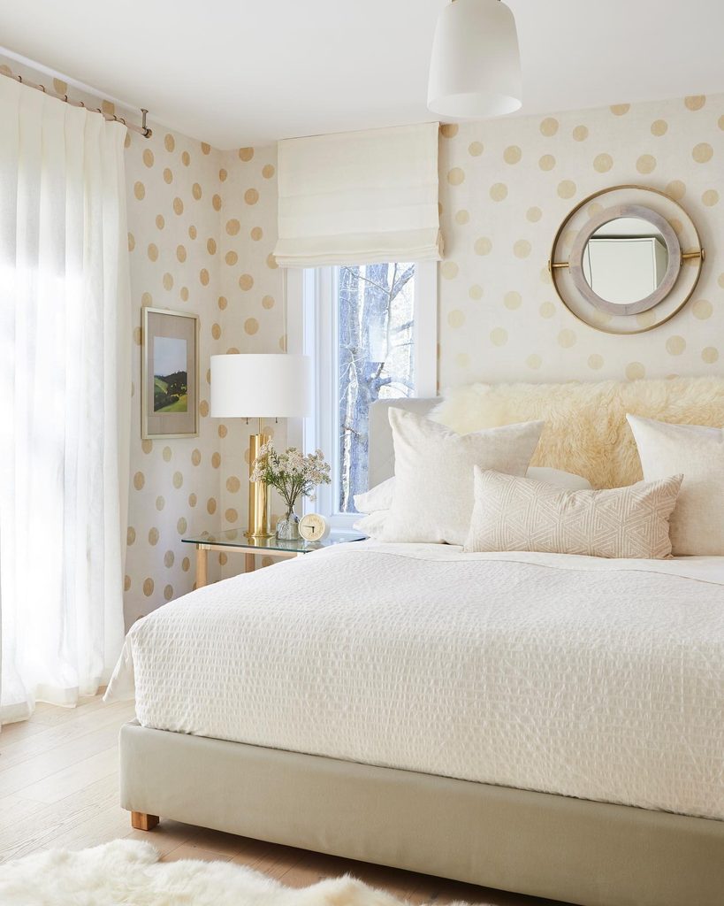
A patterned backdrop gives this room personality while keeping its palette gentle and restrained. The wallpaper combines warm cream markings with a pale background, while white bedding keeps the bed looking fresh.
A round mirror repeats the gentle shapes above the headboard. When choosing a similar paper, compare the sample with your actual sheets rather than another paint swatch.
The difference between cream and white should feel deliberate. Keep the largest textile surfaces plain so the dots remain readable across the room.
If you want a quieter version, use the pattern on the bed wall and coordinate the remaining walls with its background. A simple white lampshade and curtain can provide useful visual pauses around a wallcovering with repeating motifs.
Warm a White Room With a Curved Cream Sofa
Credits: Instagram
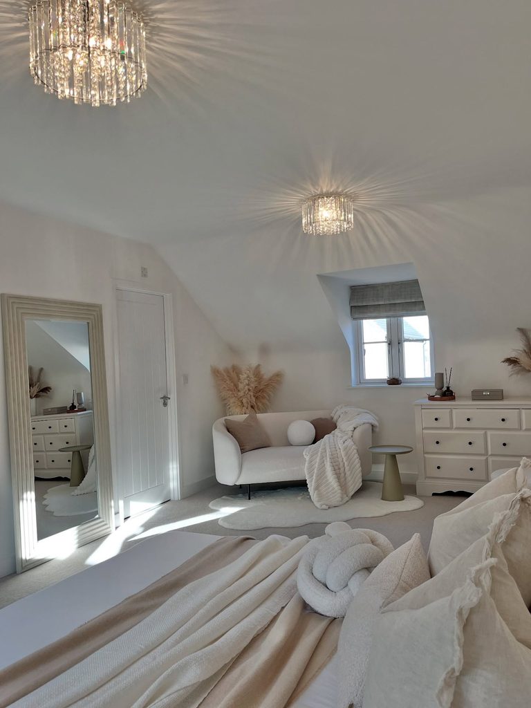
A compact sofa makes the far end of this bedroom useful beyond sleeping. Its rounded cream upholstery softens the white walls, while a pale throw links the seating area with the layers on the bed.
The arrangement shows how furniture can warm an existing white room without repainting it. Before adding a sofa, measure the route to the dresser and leave space for its drawers to open.
A small chair may suit a tighter layout better. Compare upholstery samples against your bedding in daylight, because a creamy shade can look surprisingly yellow beside a cooler white.
Keep nearby accessories restrained and give the seat a practical purpose, whether you use it for reading, putting on shoes, or folding clean laundry.
Outline a White Bed Against Cream Walls
Credits: Instagram
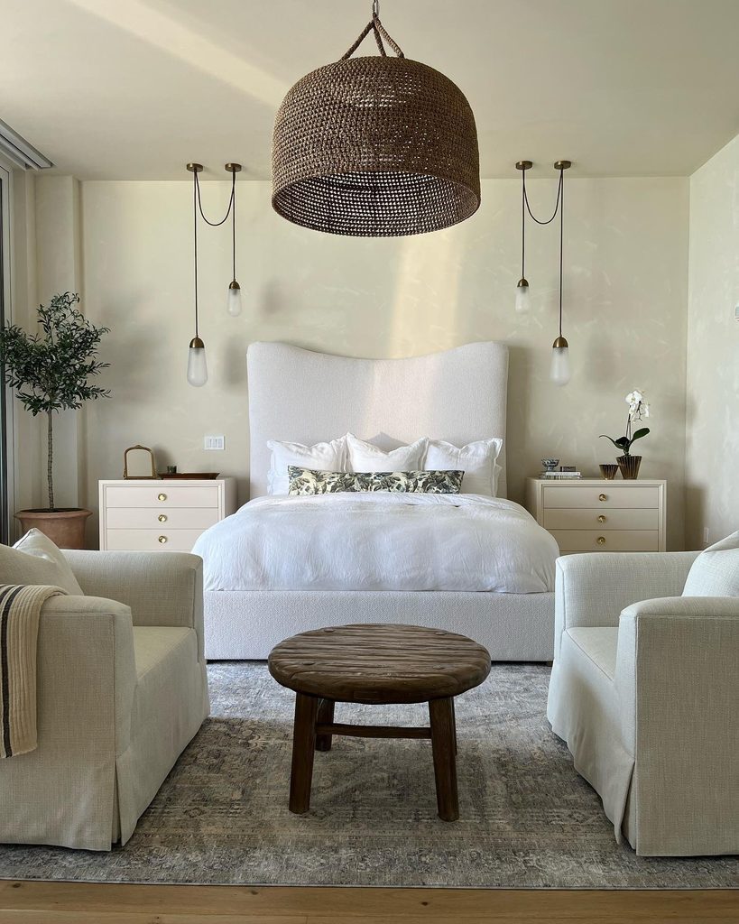
The curved silhouette of this upholstered bed stays visible because the wall behind it is warmer. White bedding and upholstery sit against a pale cream backdrop, creating definition through color temperature rather than a dark accent wall.
Matching bedside drawers continue the gentle palette without competing with the bed. To adapt the idea, choose your largest white textile first, then compare cream paint samples beside it.
Look at the combination in morning light and with your bedside lamps switched on. A warm wall should complement the fabric instead of making it appear blue.
Keep the headboard shape simple enough to read clearly. One darker woven light or wooden table can provide an anchor while preserving the room’s pale overall character.
Frame the Bed With Cream and White Stripes
Credits: Instagram
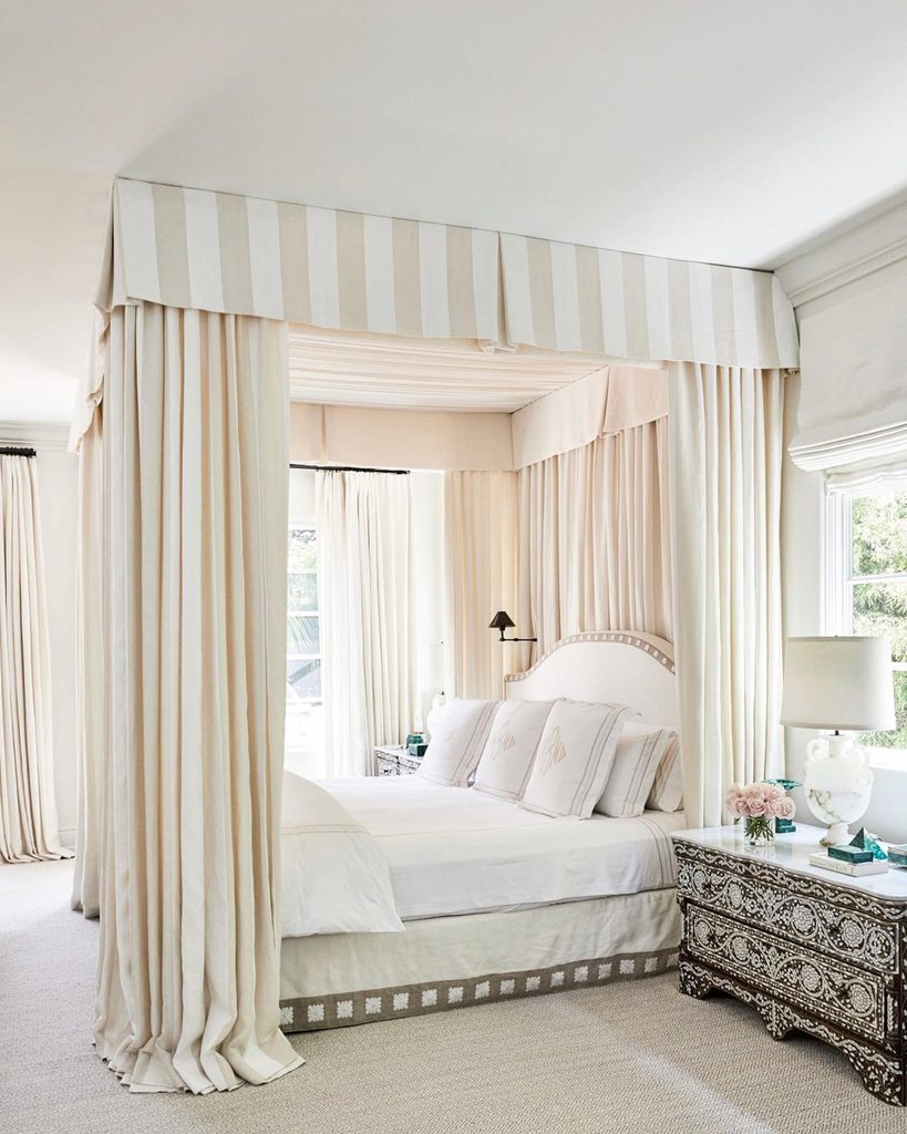
Look upward and the bedroom’s defining feature is immediately clear: a striped canopy. Cream and white alternate across the valance and hanging panels, framing a bed dressed mostly in white.
The limited palette lets the generous amount of fabric feel coordinated rather than busy. This treatment needs careful planning and measuring around ceiling height, window access, and nearby lighting.
If a full canopy would crowd your bedroom, consider borrowing the stripe for a single window treatment instead.
Check the pattern at its intended scale before committing; a small sample cannot show how wide stripes will look across a large surface.
Keep bedding comparatively plain and choose a washable or professionally cleanable fabric suited to the way you maintain your room.
Let a Raised Rug Pattern Add Quiet Contrast
Credits: Instagram
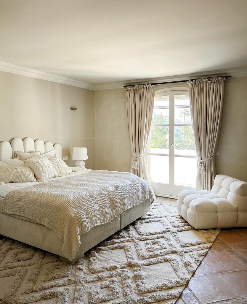
Relief can do the work of a contrasting color. Beneath this bed, a pale rug uses raised geometric lines to bring pattern into a cream and white room.
The texture connects with the cushions and rounded chair, while the warmer floor remains visible around its edges. When selecting a similar rug, look at pile height as carefully as color.
A pronounced pattern may feel soft underfoot, but it also needs to work with doors, furniture legs, and your vacuum. Measure how much rug will show beside the bed so its design does not disappear underneath it.
A restrained pattern is helpful when curtains and bedding already have texture. Keep its undertone close to your cream fabrics for a consistent effect.
Give White Bedding Definition With Decorative Edges
Credits: Instagram
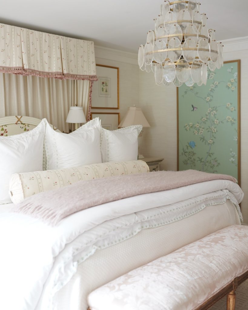
Fine edging makes these white layers easier to distinguish from one another. The pillows and bedding have delicate borders, with a cream floral bolster adding a warmer note across the front.
Pale walls and canopy fabric support the contrast, while small blush accents keep the room personal. You can borrow this approach without matching every piece.
Choose one decorative edge, such as a narrow ruffle or stitched border, and repeat it sparingly. Compare the whites together before purchasing, since several slightly different cool shades can look accidental.
Use the cream element to make the variation intentional. Check care instructions for detailed trims and avoid overcrowding the bed with cushions that make your evening routine harder than it needs to be.
Soften a White Quilt With a Cream Fringed Throw
Credits: Instagram
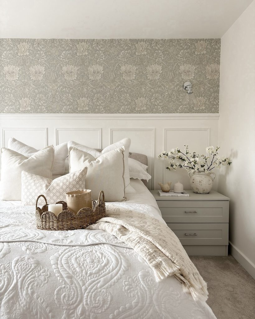
The palest bedding benefits from one warmer layer. A fringed cream throw lies over this white quilt, making its stitched pattern and folds more noticeable without changing the room’s calm character.
White wall paneling reinforces the bright foundation, while the wallpaper stays a separate muted accent. Try laying a throw diagonally along one side instead of covering the entire foot of the bed.
That leaves more of the quilt visible and makes the two colors easier to compare. Choose a texture that differs from the main cover, but check that both pieces suit your washing routine.
When the room already contains pattern, a plain cream throw can supply warmth without another print. Fold it nearby when you need fewer layers.
Reflect Pale Layers in an Arched Floor Mirror
Credits: Instagram
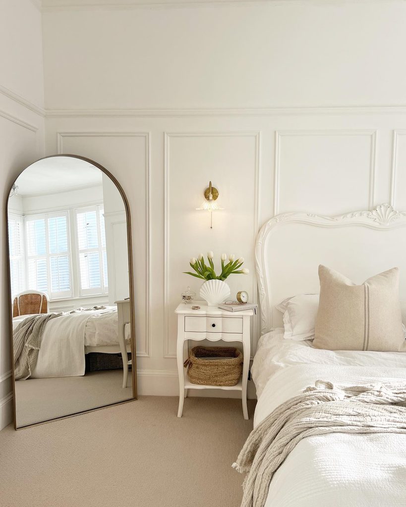
Another perspective makes this softly layered bedroom feel more open. The mirror reflects the bright window and white bedding, while creamy walls and a warm cushion keep the palette from feeling flat.
Its tall outline also balances the lower bedside furniture. Place a similar mirror where the reflection contributes something useful, such as daylight or an uncluttered part of the room.
Avoid positioning it solely to fill an empty corner. Check the view from the bed as well as the doorway before deciding on its location.
A leaning style still needs secure anchoring according to the manufacturer’s guidance. Choose a frame that relates to your other finishes, then leave enough space around it for the curved shape to remain visible.
Give Cream Bedding Room Against Plain White Walls
Credits: Instagram
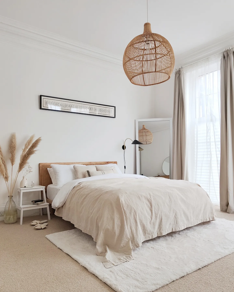
A large area of plain wall gives the softer furnishings room to stand out. Here, warm ivory bedding sits against white walls, with a turned-down white sheet making the difference in tone clear.
The woven bed and pendant introduce texture without filling every surface. This approach works best when each visible item has a purpose.
Start with the bed, lighting, and a useful bedside surface, then assess whether additional decoration is needed. Artwork should relate to the width and position of the bed rather than simply occupy the center of a wall.
Try a paper template before hanging anything. Keeping some space empty can make a modest cream and white bedroom look balanced, especially when the textiles already provide interest.
Keep Sloped Paneling White Above Cream Textiles
Credits: Instagram
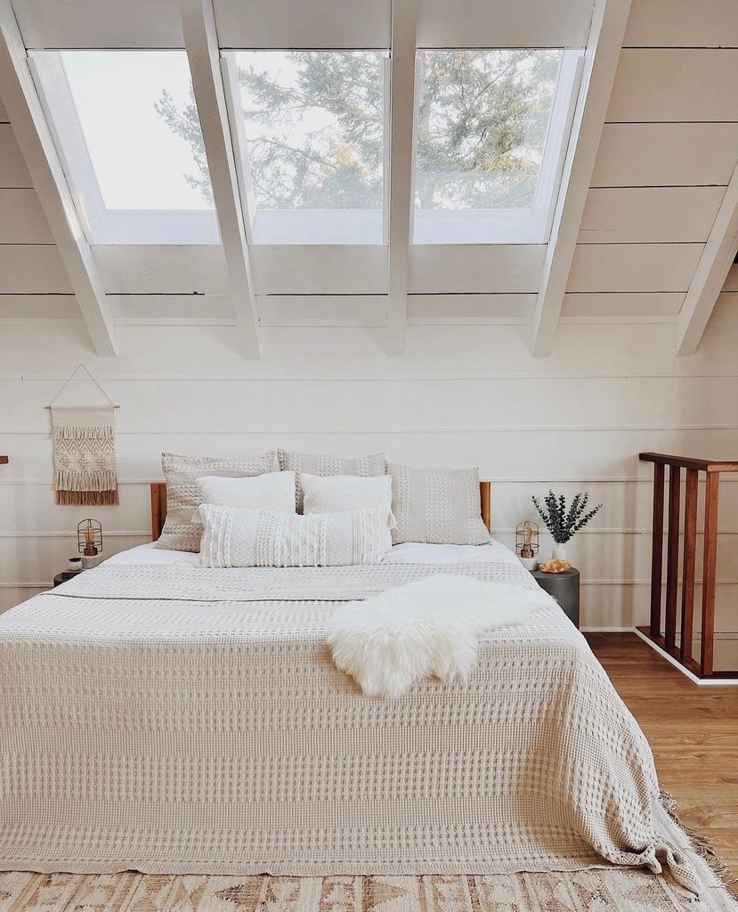
Daylight draws attention to the contrast between smooth architecture and textured bedding. White planks follow this room’s roofline, while a creamy coverlet gives the bed a warmer, more substantial presence.
Brighter pillows and a small white throw prevent the layers from merging into one shade. In a sloped bedroom, carrying white across the ceiling and structural ribs can keep the angles visually connected.
Bring cream into movable textiles so you can adjust the balance without repainting difficult surfaces. Check how direct overhead light affects the fabric before choosing it.
A texture that looks subtle in a store may cast stronger shadows beneath a skylight. Keep nearby wall decoration modest so the roof shape and layered bed remain easy to read.
Outline Cream Walls With Narrow Molding
Credits: Instagram
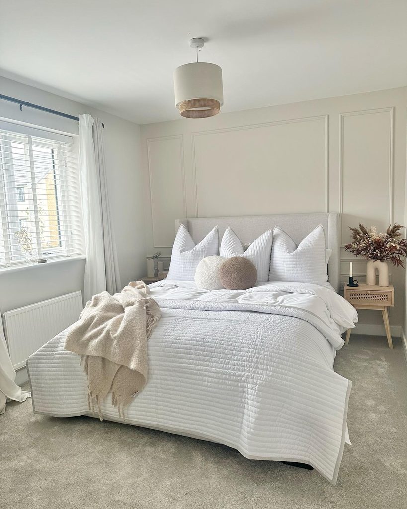
Thin rectangular borders give this pale wall definition without a contrasting paint color. The molding and wall share a warm cream finish, while white bedding supplies the brighter layer in front.
A simple pendant echoes the wall’s warmth above the bed. If you want a similar treatment, plan the rectangles around the furniture before deciding their proportions.
The headboard should not conceal the detail you most want to see. Mark the arrangement temporarily and view it from the doorway as well as beside the bed.
Keep outlets, switches, and light fixtures clear. Using one color across the wall and molding makes the effect quieter than outlining every panel in white. Let the bedding provide that contrast through a simpler surface.
Anchor Pale Layers With an Open Metal Bed
Credits: Instagram
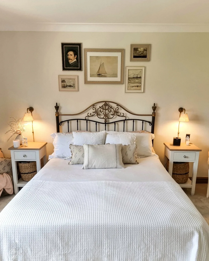
Dark outlines can sharpen a room without overwhelming its pale palette. This open metal headboard lets the cream wall remain clearly visible between its rails, while white bedding keeps the largest surface bright.
The curved detail adds character without the visual weight of a solid dark headboard. To try this balance, consider the frame from the doorway before choosing its height and ornament.
A simple rail design may suit a smaller room, while a taller curve needs breathing room above it. Repeat the darker finish sparingly in picture frames or lighting.
Keep bedside furniture light if you want the bed to remain the main outline. Cream walls and white textiles will still carry the scheme when the contrast stays limited.
Warm the Bedside With Amber Lamps
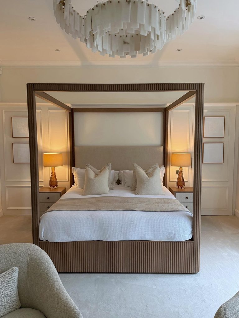
Credits: Instagram
Pools of warm light make the bedside feel separate from the rest of this large room. Amber lamp bases sit beside white bedding and cream wall panels, bringing a deeper tone into the pale scheme.
The matching pair also helps frame the bed. When choosing lamps, consider the shade as well as the base: its lining and density affect how much light reaches the room.
Test the effect beside your cream fabrics, especially if they already have a yellow undertone. Keep enough clear surface for a glass of water and other essentials.
A matching pair is useful for balance, but both people should be able to reach their controls comfortably. Decorative warmth should still come with practical light for reading.
Try a Small Print on a Cream Lampshade
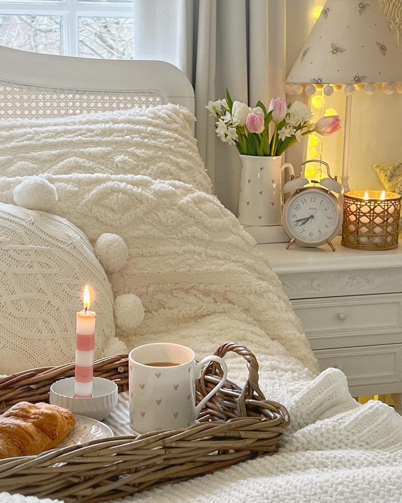
Credits: Instagram
A tiny motif adds interest where a large pattern might feel intrusive. This bedside lamp has a cream shade with delicate decoration, set among white painted furniture and soft, warmer cushions.
The detail gives the corner character without needing another bright color. To borrow the idea, choose a print small enough to read as texture from across the room.
Check the shade on the actual lamp before deciding, since illumination can make both its color and pattern look stronger. Match the fitting and recommended bulb requirements, and keep the shade clear of nearby curtains.
A simple white lamp base or nightstand gives the pattern space. Let this detail stand on its own instead of repeating it across every textile nearby.
Fit Narrow White Basket Storage Beside the Bed
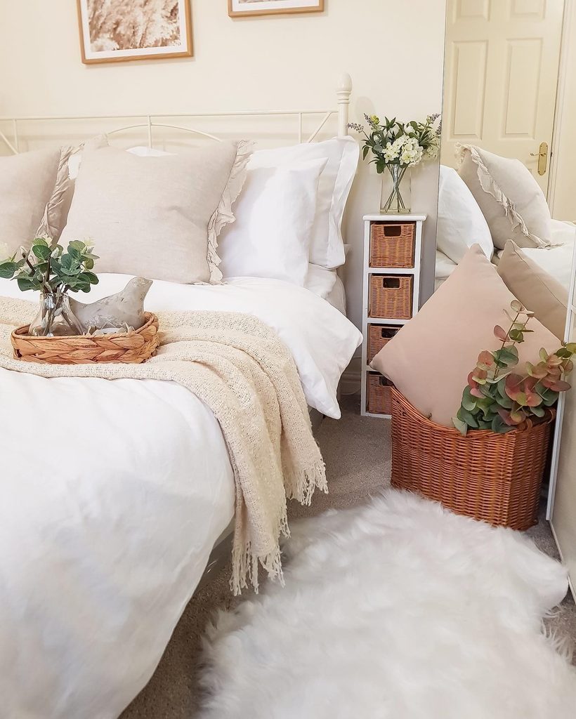
Credits: Instagram
A small gap beside the mattress can still hold useful storage. Here, a slim white frame contains woven baskets, keeping the bedside light while adding warmth near cream pillows and a throw.
Its narrow proportions suit the compact space better than a wide chest would. Measure both the available floor area and the distance needed to pull a basket out.
Check that the top sits at a convenient height for anything you reach from bed. Use separate baskets for small categories so they do not become mixed catchalls.
Smooth liners can help protect delicate items from rough weave. Repeating white on the frame keeps the storage connected to the bedding, while the baskets introduce contrast without another painted furniture color.
Brighten Cream Layers With White Floorboards
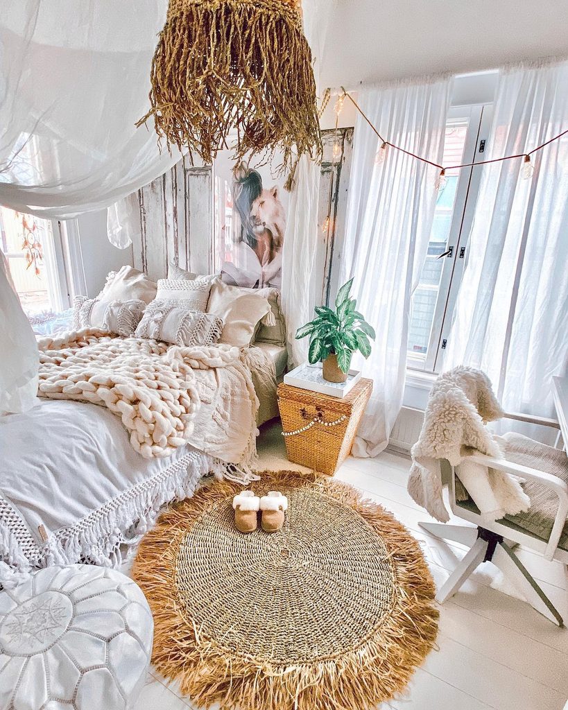
Credits: Instagram
A pale floor can change how all the layers above it read. In this room, white floorboards give cream blankets and cushions a brighter foundation, with a woven rug adding a concentrated patch of warmth.
The visible boards around the rug keep the room from looking crowded despite its many textures. If you are considering a painted floor, first establish whether the existing surface and finish are suitable for that treatment.
Choose a floor-specific system and follow its preparation and curing guidance. Think about maintenance, too: a white surface makes grit easy to spot.
Keep enough flooring exposed for the color to register. One rug under the area you use most can provide comfort while preserving that lighter overall effect.
Keep a Low Cream Platform Visually Light

Credits: Instagram
The wide upholstered frame gives this bed a generous outline close to the floor. Its creamy finish sits beside white sheets and a full-height white curtain, while warmer beige bedding adds a separate accent.
The low silhouette leaves the wall above feeling open. Before choosing a platform like this, measure the frame itself rather than relying on the mattress dimensions.
Broad upholstered edges can take up more walking space than expected. Check whether the seat height works comfortably for getting in and out of bed.
Keep nearby tables proportionate and easy to reach. A washable white sheet or pillowcase provides a clear contrast with the cream upholstery, helping the bed look layered without relying on many cushions or decorative objects.
Set Carved Cream Furniture Against Crisp White Linens
Credits: Instagram
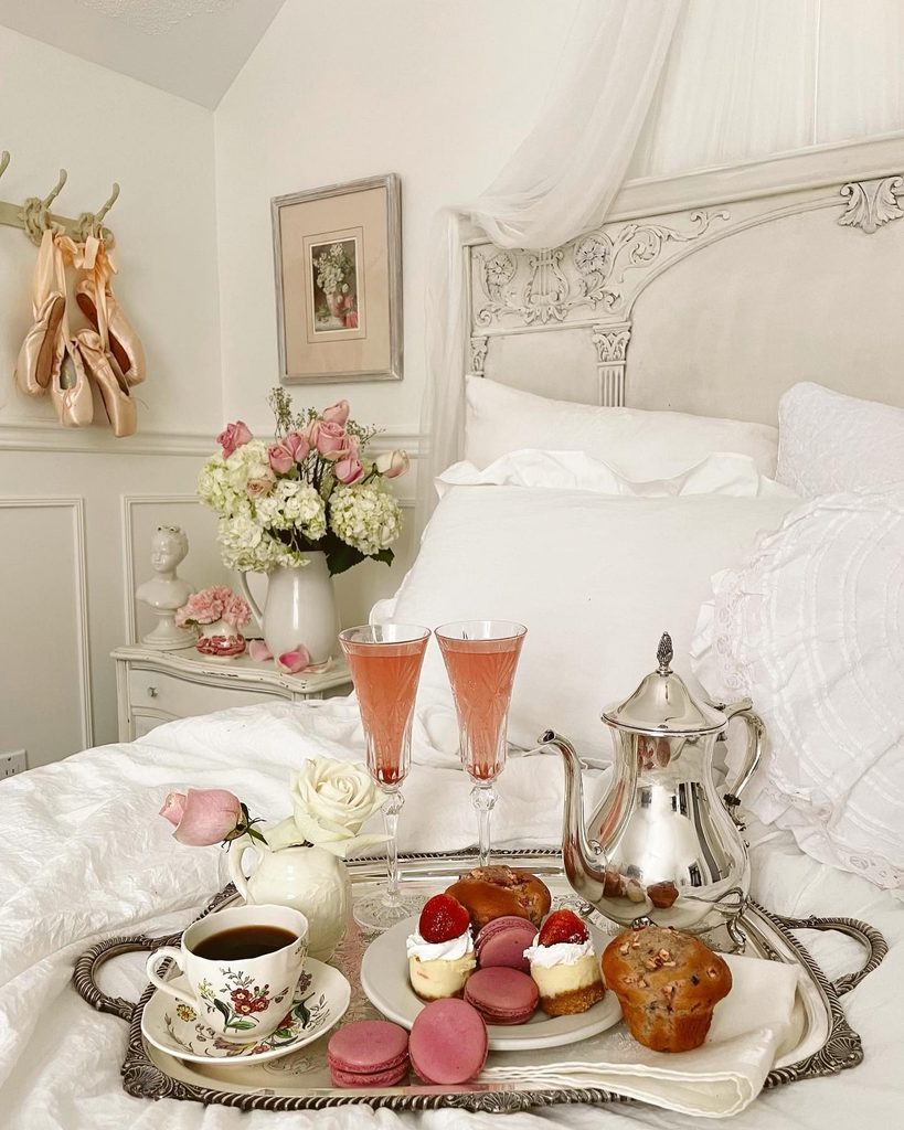
Pale linens allow the furniture’s intricate details to stand out against a simpler background. This headboard has a warm cream finish, with darker recesses tracing its ornament against white pillows.
The contrast gives the furniture character while keeping the bedroom light. If you own a decorative bed already, start by changing the bedding before considering a new finish.
A plain white sheet or duvet can reveal details that a busy print conceals. Choose one cream accent nearby to connect the bed with the rest of the room.
Keep wall decorations spaced far enough away that their outlines do not merge with the carving. You can enjoy an ornate piece without filling every surface with equally elaborate accessories or matching furniture.
Add a Tufted Cream Bench at the Foot
Credits: Instagram
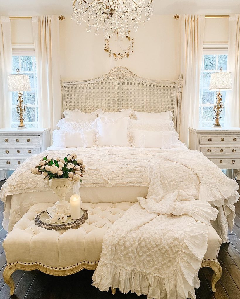
An upholstered seat brings a warmer tone to this bedroom, contrasting with the bright white bedding just behind it. Its tufting adds depth, while the curved frame gives the bedroom a more decorative finish.
The difference in color prevents it from disappearing into the bedding behind it. When choosing a bench, leave a clear route around the foot of the bed and check nearby drawer openings.
Consider whether you want a firm place to sit or a softer upholstered surface for folded clothes. Keep most of the seat available rather than covering it permanently with accessories.
A smaller bench can still provide the same practical benefit. Match its undertone to another cream element, while allowing white linens to remain brighter.
Keep Window Shutters Crisp White
Credits: Instagram
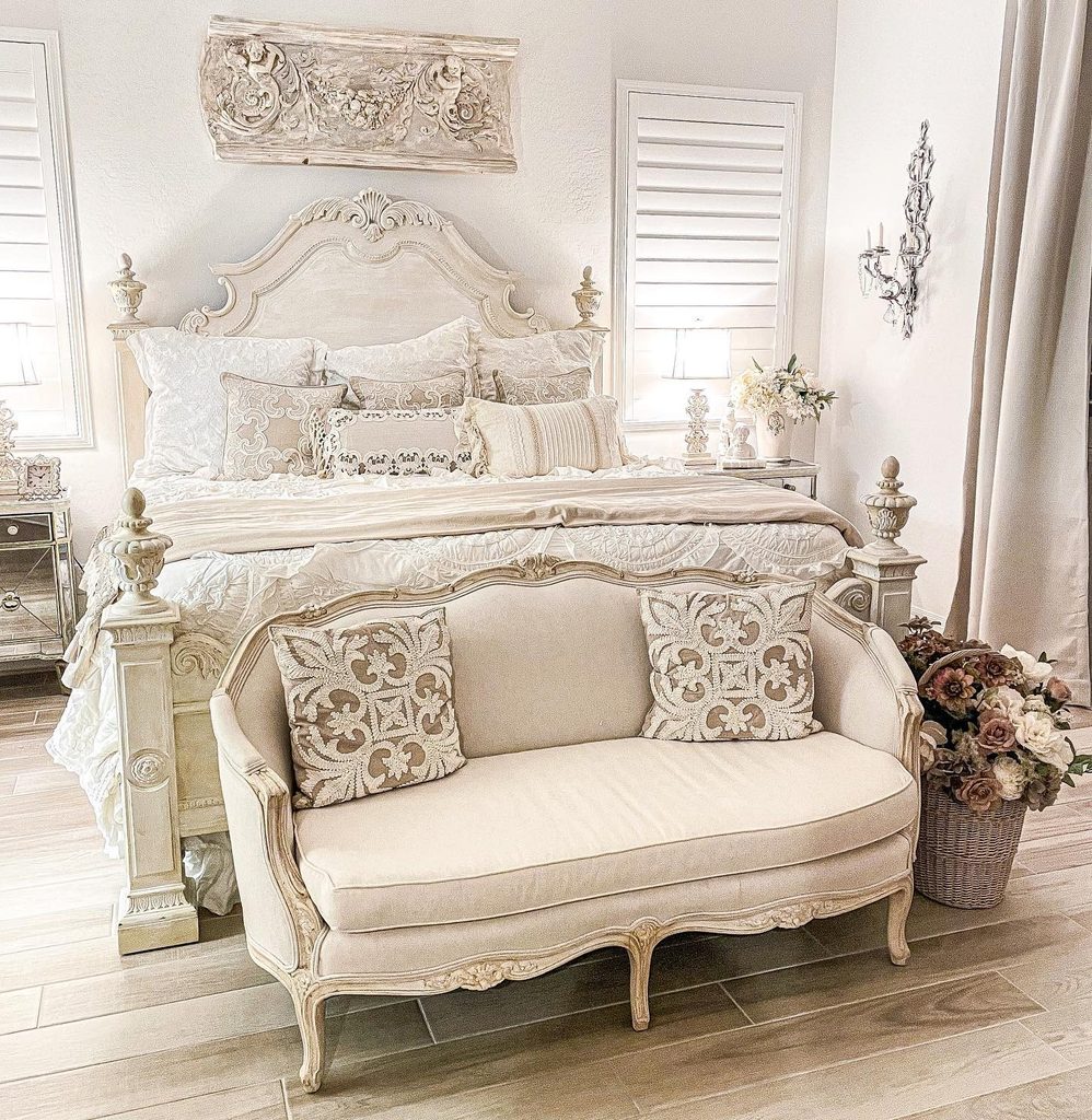
Clean window lines help balance the decorative furniture in this bedroom. White shutters flank the cream bed, giving the eye a simpler surface beside carved details and patterned cushions.
Their adjustable slats also offer more control than an uncovered window. If you are considering shutters, check how the panels open around the bed and bedside furniture before choosing a configuration.
You should be able to operate them without moving a lamp or climbing across the mattress. Compare the white finish with your trim and bedding so it feels connected to the room.
Keep cream in softer pieces nearby to maintain warmth. A window treatment can support the palette and daily routine equally well when its operation receives attention during planning.