
A neutral bedroom can feel flat when every surface has the same pale color and smooth finish. Neutral Bedroom Ideas work best when small contrasts bring the room to life without making it feel busy.
A pale wood-look ceiling can warm up a dark space, while dark door and window frames give pale walls definition. Elsewhere, a softly varied beige finish or a brown faux fur throw adds depth through texture rather than bold color.
These examples show how to layer gentle patterns, natural tones, and tactile details while keeping the overall look calm.
1. Warm a Dark Bedroom With a Pale Wood Look Ceiling
Credits: Brooke Christen / Nesting With Grace
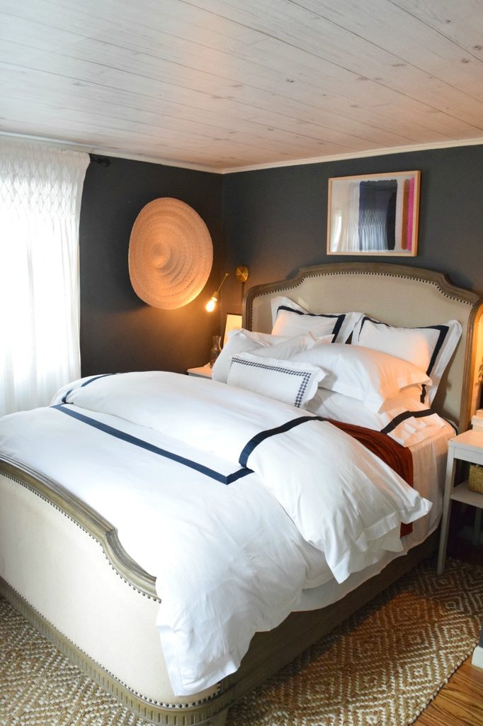
A pale ceiling keeps this charcoal bedroom from feeling enclosed, while its plank pattern adds a warm note above the white bed.
The homeowner identifies the treatment as wood look wallpaper, so the photograph illustrates a decorative effect rather than exposed structural timber. Repeating the light tone in curtains and upholstery connects the overhead surface with the furniture below.
Consider the ceiling when a neutral room needs interest but its walls already feel complete. View wallpaper samples beside the wall paint in both daylight and lamplight, and check that the product suits overhead installation.
Keep the pattern subtle enough that it does not compete with bedding. Here, narrow dark borders on white linens provide a crisp link to the walls.
2. Define Pale Walls With Dark Door and Window Frames
Credits: 136home
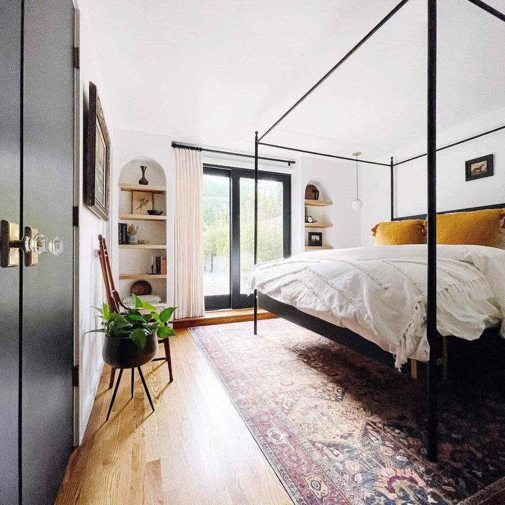
Dark frames give the glazed doors a clear outline against this bedroom’s pale walls. The nearby painted door, curtain rod, and slender bed rails repeat that depth, creating connections without covering large surfaces in black.
Warm floorboards and cream curtains prevent the contrast from becoming severe. If your room already has dark architectural details, work with them before introducing another accent finish.
Repeat their tone in one or two smaller objects, then keep the largest textile areas light. Test paint against the existing trim and choose a finish appropriate to its material.
A neutral foundation can still accommodate small personal accents, as the patterned rug and golden cushions demonstrate. The main balance comes from generous pale areas surrounding darker outlines.
3. Give Beige Walls a Softly Varied Finish
Credits: Manda / The Merrythought
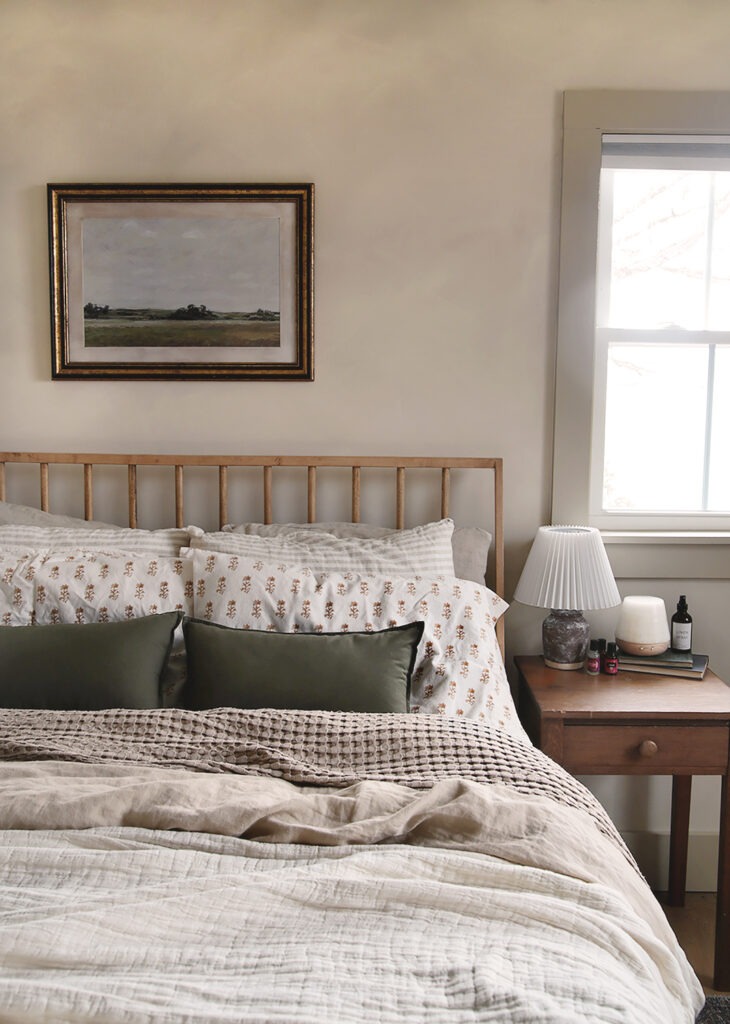
A gently mottled wall brings depth to this bedroom’s beige palette without adding a strong print. The homeowner describes the treatment as faux limewash, and its cloudy variation sits comfortably behind the simple wooden headboard.
Rumpled pale bedding continues that relaxed character, while a small framed landscape adds one darker rectangle. Test any decorative finish on a large sample board before applying it throughout a bedroom.
Look at the sample from different distances, since subtle marks can merge or become more prominent across a broad surface. Keep the contrast restrained if you want this quiet effect.
The wall should still work with existing textiles and furniture. A few visible natural textures are enough to make the whole arrangement feel considered.
4. Deepen White Bedding With a Brown Faux Fur Throw
Credits: Brittany Stager
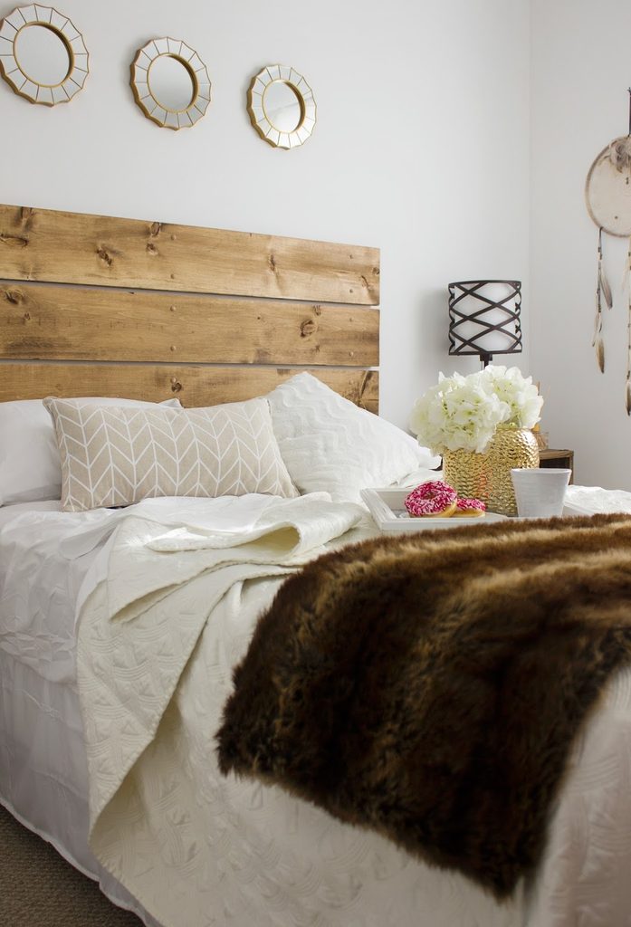
A brown faux fur throw gives this white bed a substantial patch of warmth. Its darker fibers contrast with the lighter quilt and pillows, while the wooden headboard makes the color feel connected to the room.
The effect comes from placing unlike textures together rather than matching every fabric. Start with a throw sized for how you will actually use it, checking its care instructions and weight before buying.
Fold it across the lower bed or let one edge fall naturally, leaving enough white fabric visible around it. Pale patterned cushions can add another quiet layer without overwhelming the darker accent.
Keep nearby accessories simple so the tactile contrast remains easy to notice from the doorway and beside the bed.
5. Hang a Neutral Textile Against a Deeper Wall
Credits: Brittany Stager
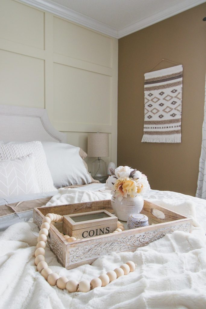
A woven wall hanging adds pattern to the taupe wall beside this bed without introducing a new color family. Its cream fringe and brown geometric marks echo the bedding, while the soft surface contrasts with the neat painted molding nearby.
This is a useful option when framed artwork feels too formal for the room. Choose a textile whose scale suits the available wall, allowing clear space around its edges so the outline remains visible.
Hang it securely using hardware appropriate to its weight and the wall material. Keep it away from lamps, heaters, and places where it could catch on furniture.
The surrounding pale upholstery gives this small patterned piece enough contrast to register without becoming the bedroom’s dominant feature.
6. Mix Quiet Florals With Tactile Geometric Cushions
Credits: Instagram
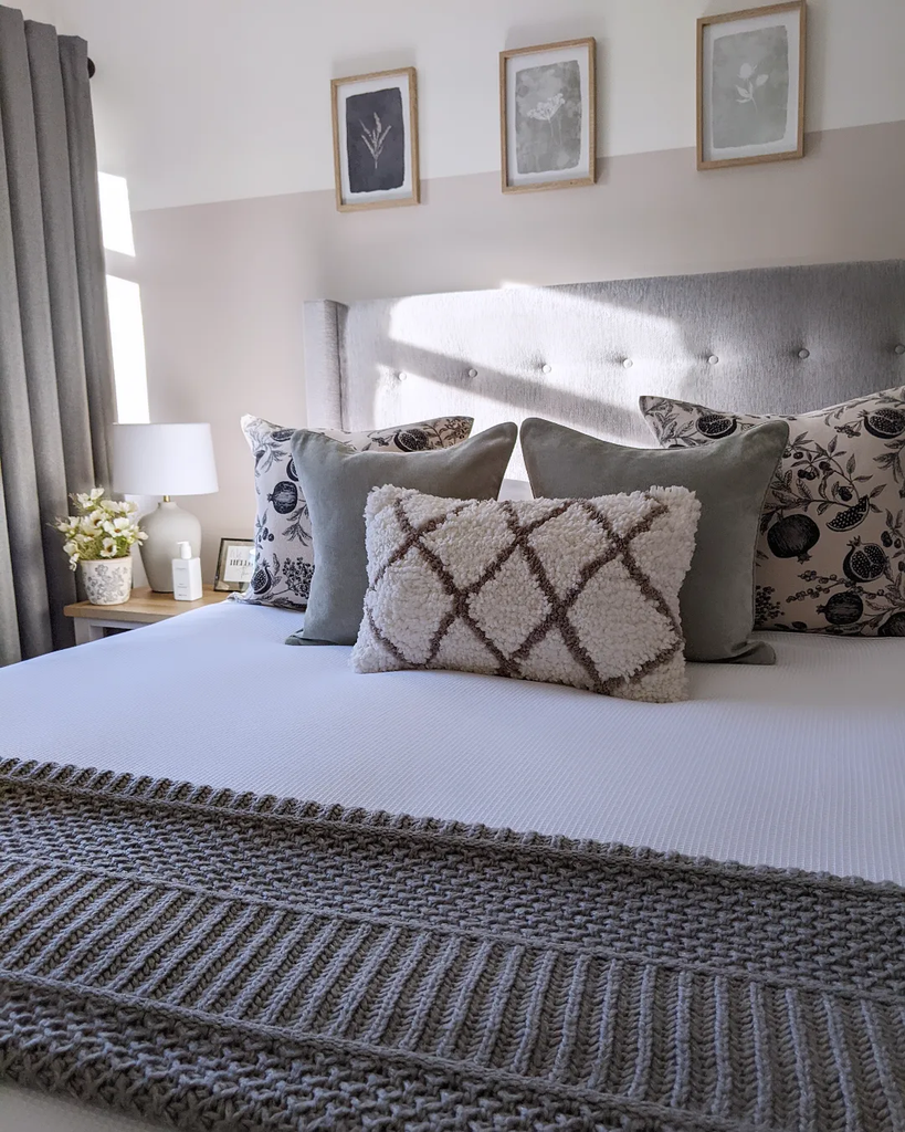
Botanical cushions, shaggy diamonds, and a ribbed throw bring several kinds of detail to this pale bed. Their shared gray, ivory, and muted beige tones keep the combination from feeling fragmented.
The long textured cushion sits in front of quieter squares, making its raised pattern easy to see. Try combining one delicate print with one larger geometric texture, then use plain fabric between them.
You do not need every cushion shown to borrow the relationship. Consider how many pieces you are willing to remove each evening, and keep the arrangement convenient to remake each morning.
The botanical pictures above reinforce the softer pattern without matching it literally. Consistent undertones do more work here than buying accessories from a single collection.
7. Pair White Brick With Soft Oatmeal Textiles
Credits: Jordyn / Our PNW Home
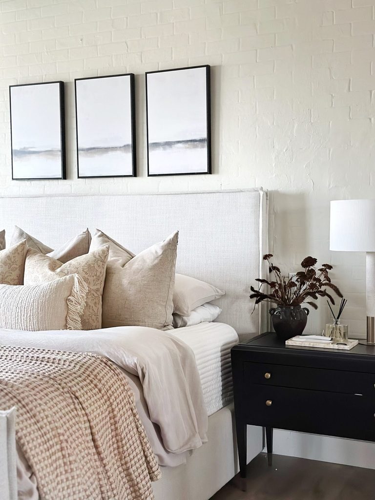
White paint allows the brick wall’s uneven surface to remain noticeable while keeping this bedroom’s palette restrained. Oatmeal cushions and a loosely woven throw soften the backdrop, with a dark bedside chest giving the pale arrangement definition.
Three slim frames repeat that darker line without concealing much masonry. If your bedroom already has exposed brick, consider its condition and the consequences of painting before making changes.
Suitable preparation and coatings depend on the existing surface. You can borrow the balance of rough and soft textures without copying the construction itself.
Leave enough wall visible above the bed for its character to show. A limited range of warm whites and beige tones helps these different materials feel related rather than competing.
8. Put a Soft Gray Bench at the Foot of the Bed
Credits: Brittany Stager
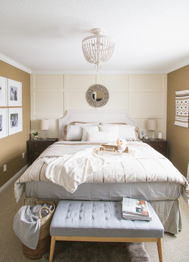
A compact upholstered bench adds a useful lower layer to this bedroom’s cream and taupe scheme. Its soft gray seat relates to the bedding, while pale wooden legs keep it from looking like a heavy block.
Button tufting supplies detail without another printed pattern. Measure the walkway beyond the bed before choosing a similar piece, and check that its intended use suits sitting or holding belongings.
Keep the seat easy to clear rather than treating it as permanent display storage. The nearby woven basket offers a separate place for an extra throw.
Because the bench is lower than the mattress, it leaves the bed’s shape visible and gives the room a finished edge without filling the remaining open floor space.
9. Soften a Bed Alcove With Sheer Cream Curtains
Credits: Liz Fourez / Love Grows Wild
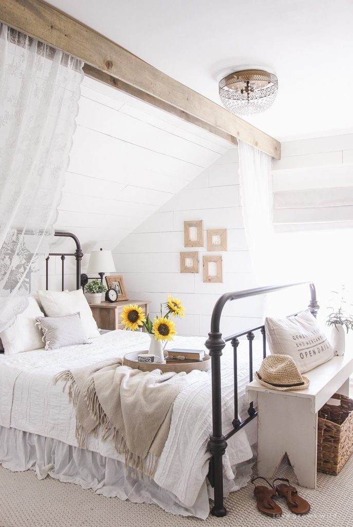
Light curtains hang from a wood look beam across this bedroom’s sleeping area, making a soft boundary around the iron bed. Their translucent fabric adds a different kind of texture beside the horizontal white boards and pale bedding.
The homeowner describes the beam as a decorative construction, so the image should not be read as evidence of a structural timber. Consider a similar fabric division only where the room has enough space and suitable secure fixings.
Keep curtains clear of lights, heaters, and circulation routes, and choose a practical length. Opening the panels preserves the view into the bed area.
A restrained cream tone lets the fabric provide gentle enclosure while the darker bed frame remains clearly visible within it.
10. Let a Wooden Bed Supply the Main Warm Tone
Credits: Henry / Plank and Pillow
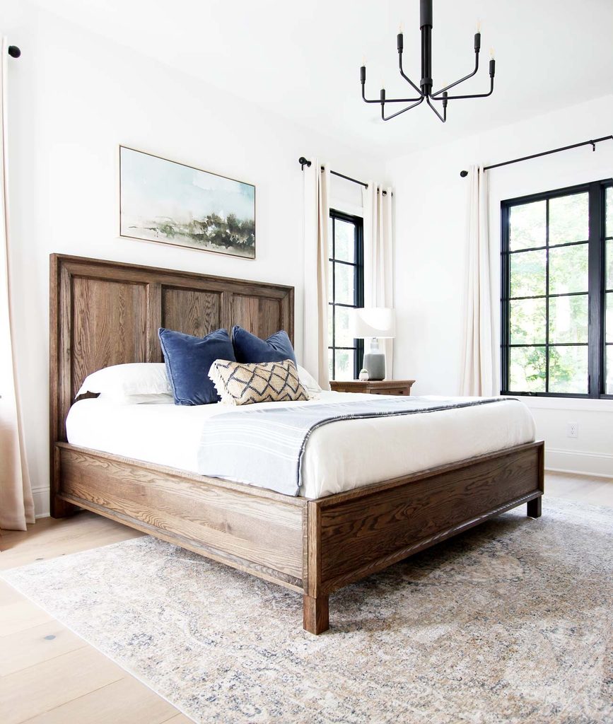
Pronounced wood grain gives this otherwise pale bedroom a strong, warm center. The bed’s broad panels remain visible around white linens, allowing the finish to contribute more than a small decorative accent would.
Light curtains and a muted rug keep the substantial frame from dominating every surface. When choosing a wooden bed, compare its tone with existing floors and nearby furniture in natural light.
Related warmth can be enough; the finishes do not have to match exactly. Leave some of the footboard exposed rather than hiding the whole frame behind oversized bedding.
Small colored cushions are easy to change later, while the wood and white foundation remains useful. The strongest impression comes from balanced proportions and clearly separated material textures.
11. Gather Small Neutral Accessories on a Wooden Tray
Credits: Brittany Stager
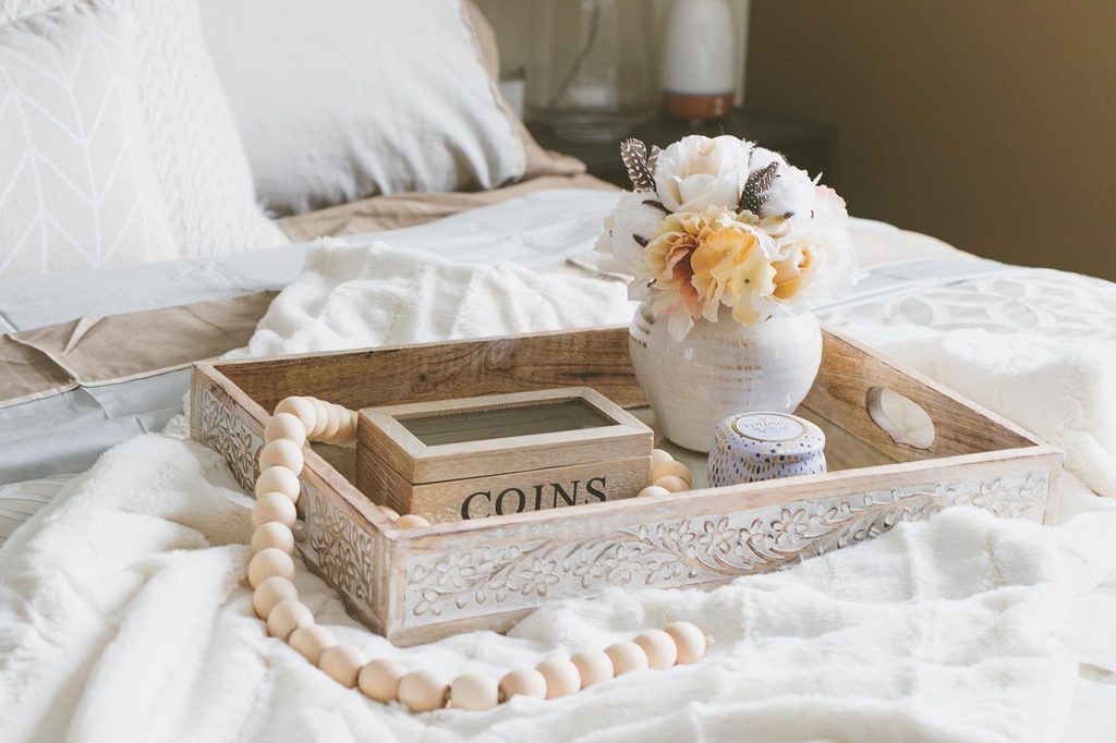
A shallow wooden tray gives the accessories on this pale bed a single, contained outline. Its carved sides add detail, while a cream vase and rounded wooden beads introduce softer shapes inside and around the rectangle.
Keeping the materials close in tone lets their different surfaces supply the interest. Use a tray where it supports an actual routine, and move it to a stable surface before sleeping or sitting down.
Avoid placing water, hot drinks, or lit candles directly on soft bedding. A small box can hold loose items without scattering them across the room.
Leave gaps between objects so each shape remains visible. The result feels more deliberate when the tray contains a modest selection rather than every accessory.
12. Repeat White in Different Bedside Shapes
Credits: Casey Finn / The DIY Playbook
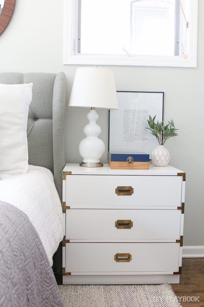
A white nightstand, sculptural lamp, and small patterned vase share a color while keeping distinct outlines. The lamp’s rounded sections soften the cabinet’s straight drawers, and metallic handles add a little definition without a large new color area.
Beside them, pale gray upholstery keeps the transition to the bed gentle. This is an easy approach when a bedroom needs quieter accessories but an entirely matching set would feel flat.
Compare finishes in person if possible, since glossy ceramic and painted wood reflect light differently. Choose the lamp for bedside illumination as well as its shape.
Keep the front of the tabletop available for everyday essentials. One slim dark picture frame can provide enough contrast to make the lighter objects legible.
13. Continue Pale Wood Into Integrated Bedside Shelves
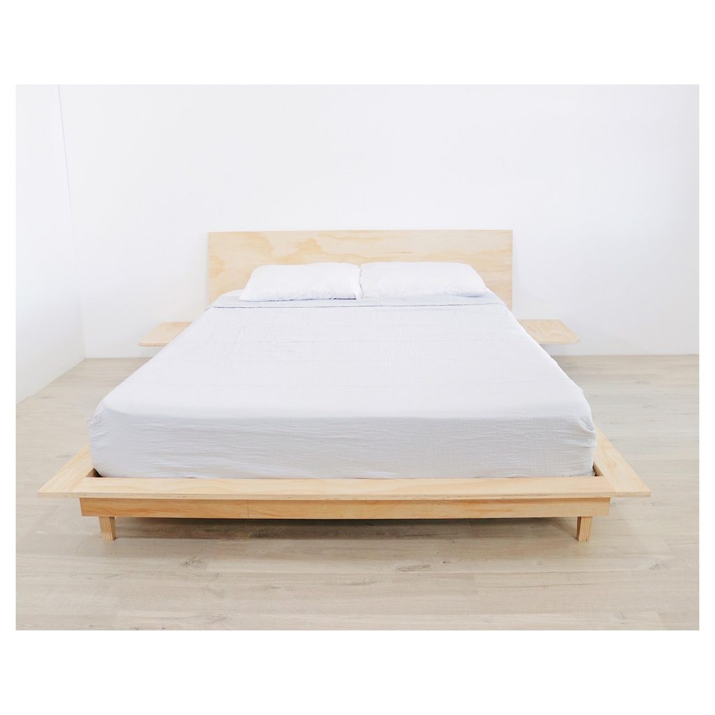
Credits: Mike Montgomery / Modern Builds
Small shelves extend from this plywood bed, giving the sleeping area a unified horizontal outline. The pale timber continues through the headboard and lower frame, while simple white bedding leaves its grain easy to see.
Integrated surfaces can reduce the number of separate furniture shapes in a compact neutral bedroom, but their dimensions need to suit real use. Check the shelf height against the mattress and allow enough space for anything you need beside you.
Consider safe access to lighting and outlets before committing to a fixed design. The photograph shows a creator’s completed build rather than a guarantee that its measurements suit another room.
Borrow the quiet relationship between light wood and white fabric while planning practical clearances carefully.
14. Make One Monochrome Landscape the Focal Point
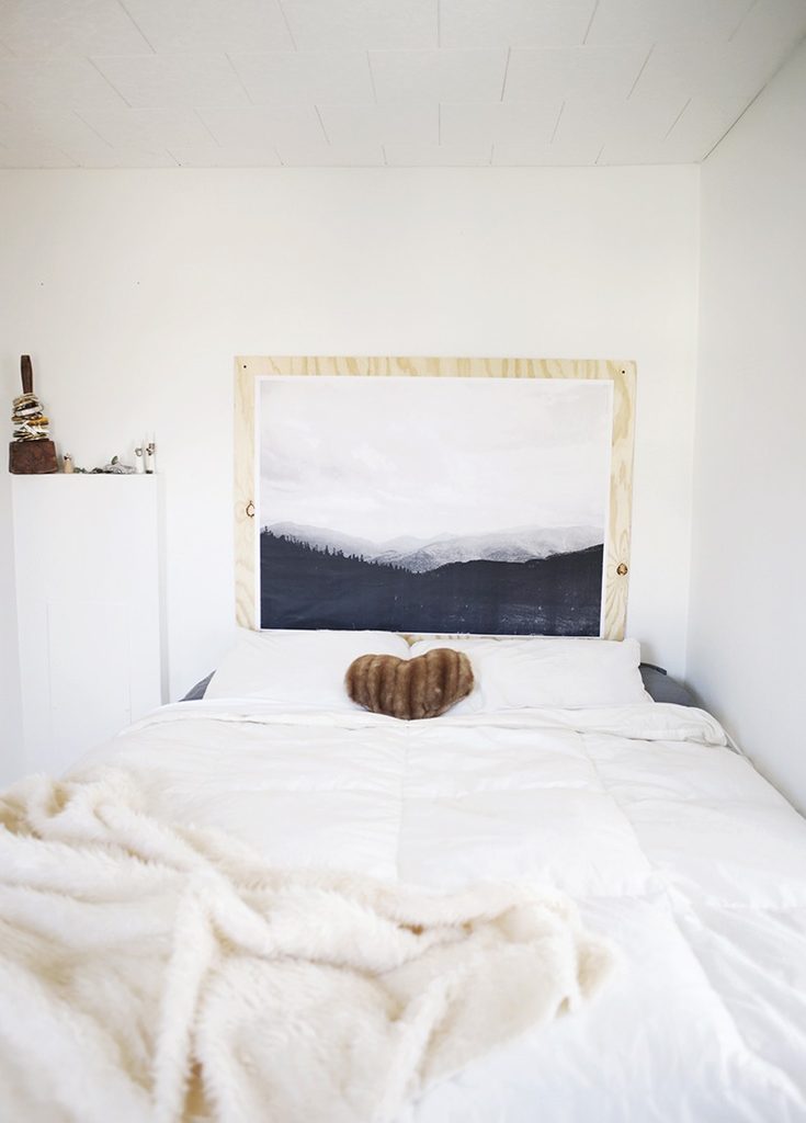
Credits: Caitlin / The Merrythought
A large landscape print brings a broad band of dark tone into this white bedroom. Its mountains and trees provide depth, while the pale plywood border connects the artwork with the room’s simple natural materials.
Keeping the surrounding walls relatively clear gives the image room to work without a competing gallery. Choose a picture you enjoy looking at from both the doorway and the bed, then check its proportions against the mattress width.
Mount artwork securely with suitable hardware, especially above a sleeping area. White linens and a soft throw keep the lower half of the room quiet.
A single brown cushion adds warmth without weakening the print’s role. This approach lets one meaningful image carry much of the decoration.
15. Give Gray Bedding a Clear Black Canopy Outline
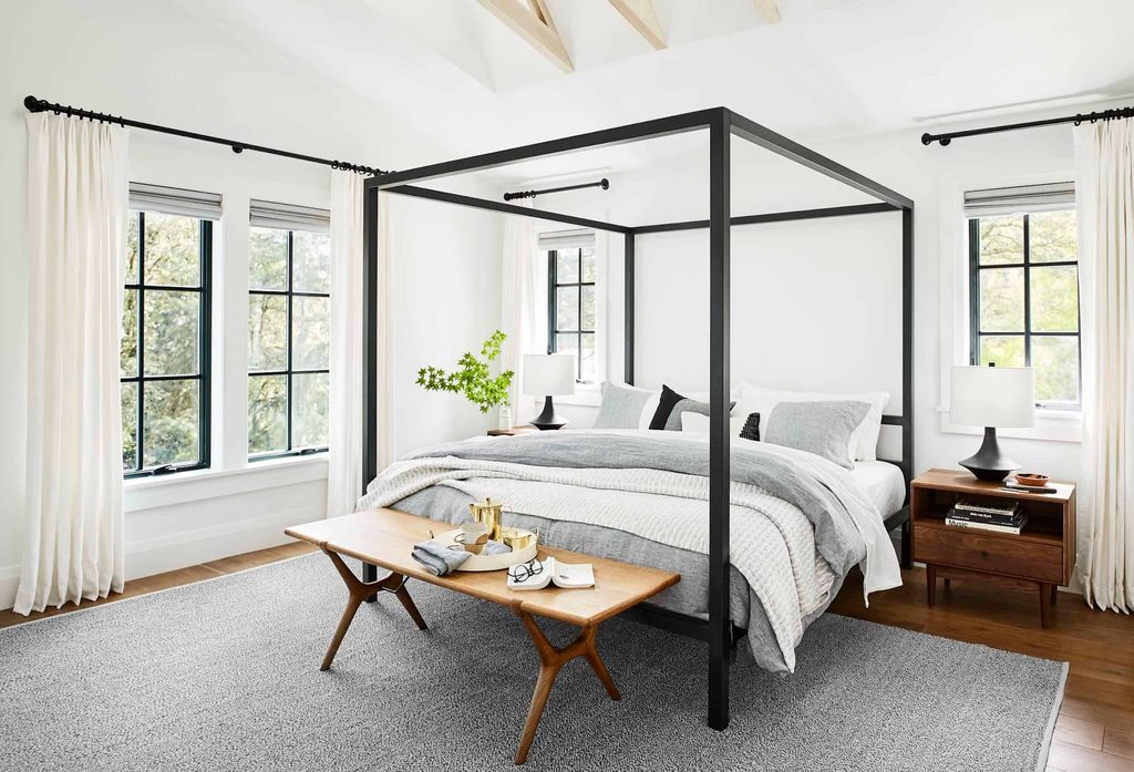
Credits: Sara Tramp / Emily Henderson
The black canopy creates a strong rectangular outline around soft gray bedding in this bright bedroom. Because its upper rails remain uncovered, the frame stays visually open and allows the surrounding windows to remain part of the composition.
Pale curtains soften the room’s edges, and warm wooden bedside furniture prevents the gray palette from feeling chilly. Check ceiling height and the bed’s full outer dimensions before choosing a similar frame.
A canopy needs comfortable space around its posts as well as room for the mattress. Keep nearby patterns restrained so the outline remains readable.
Repeating black in lamps and curtain rods distributes the darker tone, while generous areas of white preserve the room’s overall lightness and its calm everyday character.
16. Mix Woven Storage With Smooth Bedside Surfaces
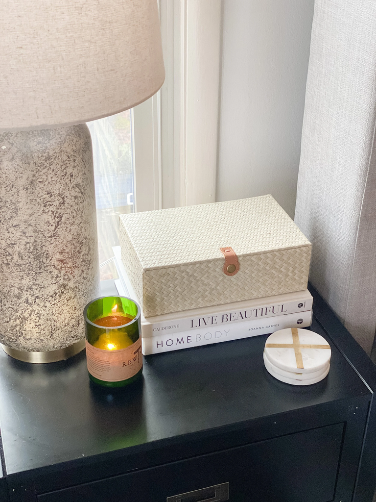
Credits: Emily Schmidt / Gathered Living
A cream woven box adds texture above a short stack of pale books on this dark nightstand. Its small tan fastening introduces warmth, while the stone look lamp and smooth round coasters offer contrasting surfaces within a restrained palette.
The box also gives loose bedside belongings somewhere to go, making the arrangement useful beyond its appearance. Choose a size that leaves clear space for a phone, glasses, or a drink, and keep frequently used objects easy to reach.
Store cords unplugged rather than charging devices inside a closed container. Use an unlit or battery candle near books, fabric, and woven materials.
A few differences in texture can give a neutral bedside corner interest without requiring a large collection of ornaments.
17. Keep the Bed Low Beneath Detailed Windows
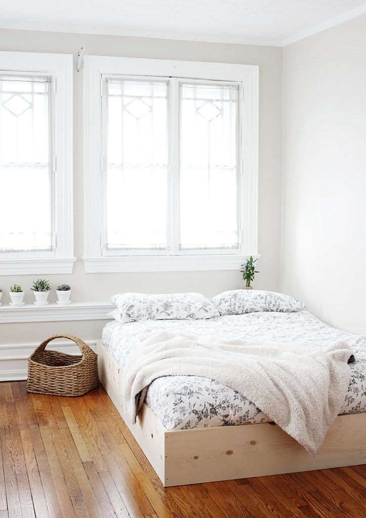
Credits: Caitlin McGrath / The Merrythought
A low wooden bed surround leaves the decorative windows fully visible in this pale bedroom. Without a tall headboard, the window trim becomes an important part of the composition, and the bedding can remain soft and uncomplicated.
Warm floorboards and a woven basket keep the white surfaces from feeling stark. If you place a bed near windows, consider ventilation, privacy, access, and any required exit route before settling the layout.
Keep pillows and fabric clear of moving fittings. The source project is a wooden surround for an existing bed foundation, so do not assume the pictured construction independently supports a mattress.
Its useful design lesson is the modest height and simple outline, which allow the room’s architectural details to lead.
18. Add Warm Metal Beside Charcoal Paint
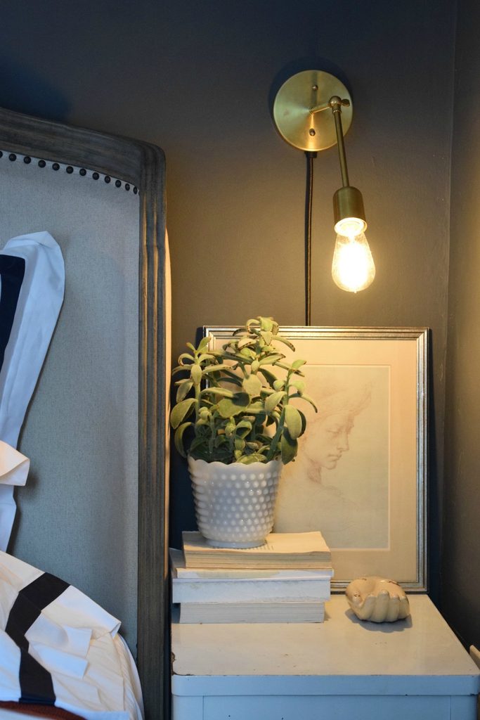
Credits: Brooke Christen / Nesting With Grace
A brass wall light stands out against the deep charcoal paint beside this upholstered bed. Its warm finish relates to the nearby picture frame, creating a small connection without making every accessory metallic.
The pale nightstand, books, and textured planter keep the corner balanced. A wall mounted light can also free useful tabletop space, but its position needs to suit your normal reading posture.
Check reach, glare, bulb clearance, and the manufacturer’s installation instructions before choosing a fitting. Use a qualified electrician where required.
Keep cords secure and avoid placing fabric or plants against a hot bulb. One warm metal accent can give a dark neutral corner definition while the larger furniture and bedding continue to feel soft and understated.
19. Warm Gray Bedding With Tan Leather Accents
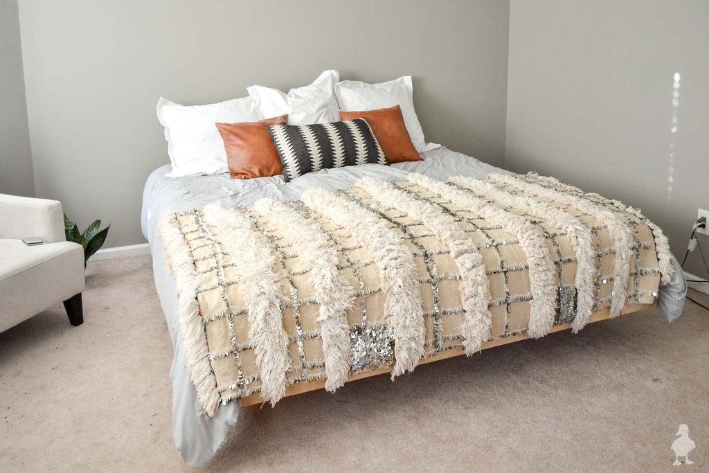
Credits: Sarah / Ugly Duckling House
Two tan leather cushions bring warmth to this gray bedroom without changing its larger surfaces. Their smooth finish contrasts with the heavily textured cream throw, while a small dark patterned cushion connects the warmer accents to the pale bedding.
This is a manageable way to test a warmer neutral palette before replacing furniture or repainting. Compare a leather or leather look sample with the existing duvet in daylight, and choose a material whose care requirements suit everyday use.
Keep the number of decorative pillows practical so making the bed remains simple. The throw supplies most of the pattern, allowing the tan cushions to stay plain.
Warm and cool neutrals feel more balanced when each has enough space to remain visible.
20. Use a Fine Grid to Give White Bedding Definition
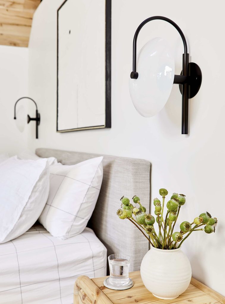
Credits: Sara Ligorria-Tramp / Emily Henderson
Thin gray lines give this white bedding a little structure without creating a heavy patterned surface.
The generous spacing of the grid allows the pale fabric to remain dominant, and the upholstered headboard adds a softer, closely related texture behind it.
A cream vase and light wooden nightstand keep the corner warm. When choosing checked bedding, look at the whole repeat rather than judging from a tiny product sample.
Compare the line weight with any nearby patterns so they do not all demand equal attention. Plain pillows can provide useful breathing space.
The dark wall light supplies a stronger outline above, letting the bedding pattern stay delicate. A simple grid works best here as quiet support for the room’s materials.