
A patterned wall can feel like too much until it has a clear partner, such as oversized art, pale upholstery, or a mirror that gives the eye a place to rest.
These Living Room Wallpaper Ideas show how scale, color, and placement can help wallpaper feel at home rather than crowded.
See how small florals work with bold artwork, faux wood warms coffered ceiling panels, and woven paper adds depth behind built-in shelves.
Other examples carry scenic murals between connected spaces or frame botanical prints inside painted molding, offering ways to suit different features and layouts.
1. Balance Small Florals With Oversized Art
Credits: Instagram
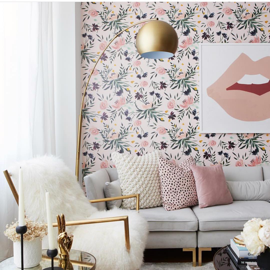
A delicate floral wallpaper gives this seating area color without overwhelming the pale sofa. Pink blossoms, dark leaves, and tiny yellow accents offer a ready palette for pillows, while the oversized lip print introduces a much simpler shape.
That difference in scale makes both patterns easier to enjoy. Try a small floral repeat behind your sofa, then hang one large artwork with generous blank space.
Choose upholstery that relates to the wallpaper background, and repeat only two accent colors in accessories. Here, a curved gold floor lamp and an open armchair frame keep the arrangement feeling light.
Before ordering, place a large sample behind your actual pillows to check whether the leaf color reads too dark in your own room.
2. Warm Ceiling Coffers With Faux Wood Wallpaper
Credits: Instagram
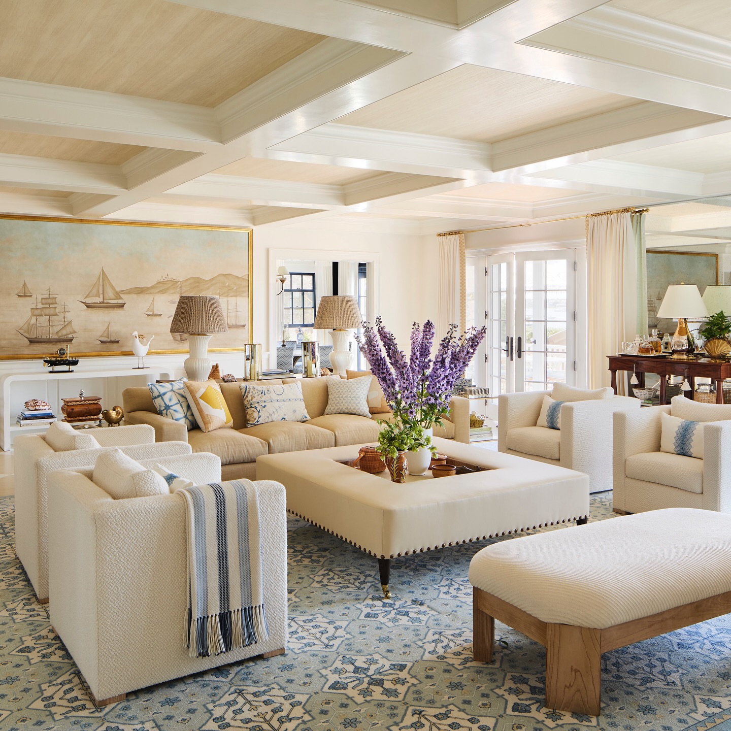
Wallpaper fills the recessed ceiling panels in this bright living room, adding a subtle wood grain above the cream seating.
The white beams remain visible, so the architecture feels crisp while the warmer inserts connect with the bench and woven lampshades below. Use this idea when a coffered ceiling looks unfinished or overly stark.
Choose a restrained grain with little contrast, and keep its grain direction consistent across adjoining panels. Measure each recess separately before calculating the paper quantity; small differences can affect installation.
The room also shows why a quiet ceiling works with a detailed rug and scenic wall panel. Let those surfaces carry the stronger imagery, and use the overhead paper primarily to introduce gentle warmth and texture.
3. Preserve Wallpaper Fragments as Living Room Art
Credits: Instagram
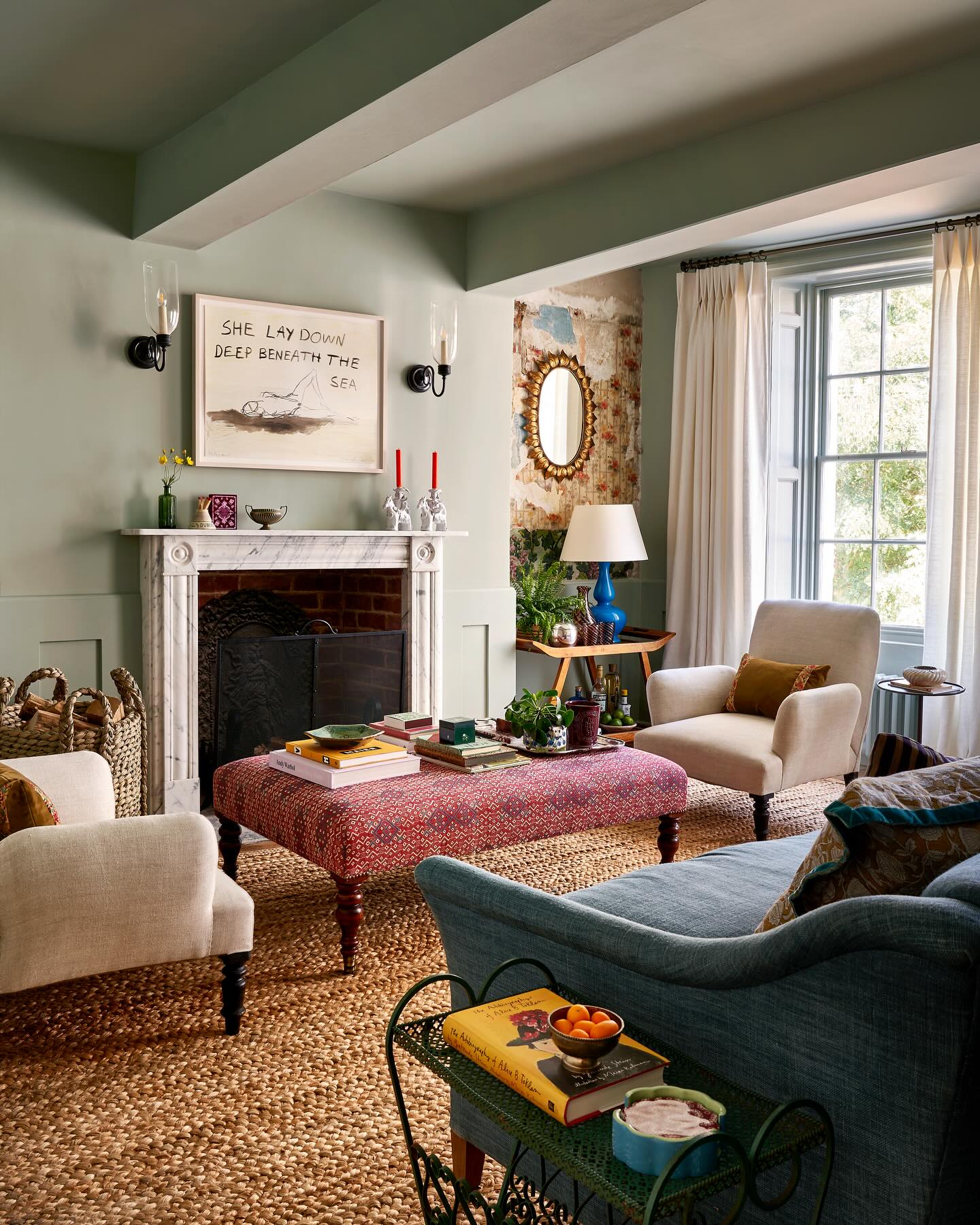
The exposed wallpaper beside this fireplace brings history into an otherwise softly painted room. Its uneven edges and faded patches remain visible around a small gold mirror, giving the alcove a character that a new feature wall could not replicate.
If a renovation reveals an older paper, assess its condition before removing more surrounding layers. A sound fragment can become a focal point when nearby paint picks up one of its quieter colors.
Here, muted green walls and beams support the weathered pattern, while cream chairs and a woven rug keep the seating area relaxed. Avoid crowding the fragment with a large gallery arrangement.
A single mirror or modest picture leaves enough of the original surface visible to appreciate it.
4. Carry a Scenic Mural Through Connected Spaces
Credits: Instagram
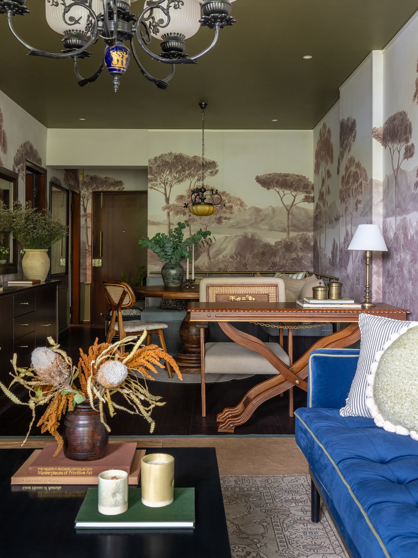
A sepia landscape runs from this blue sofa toward the dining nook, linking two functions within one long room. Tall trees provide rhythm, while their muted colors let the darker ceiling and warm wooden furniture remain part of the composition.
Consider a continuous scenic wallpaper when your living and dining areas share several visible walls. Map the main tree groups against doorways and tall furnishings before ordering so important details remain readable.
Keep the largest furniture pieces below the most interesting part of the scene whenever possible. The blue upholstery adds a distinct accent without interrupting the soft background.
Repeat smaller touches of the mural's brown tones through tables, frames, and lamps to help the connected spaces feel deliberately coordinated.
5. Layer Chinoiserie With a Large Gold Mirror
Credits: Instagram
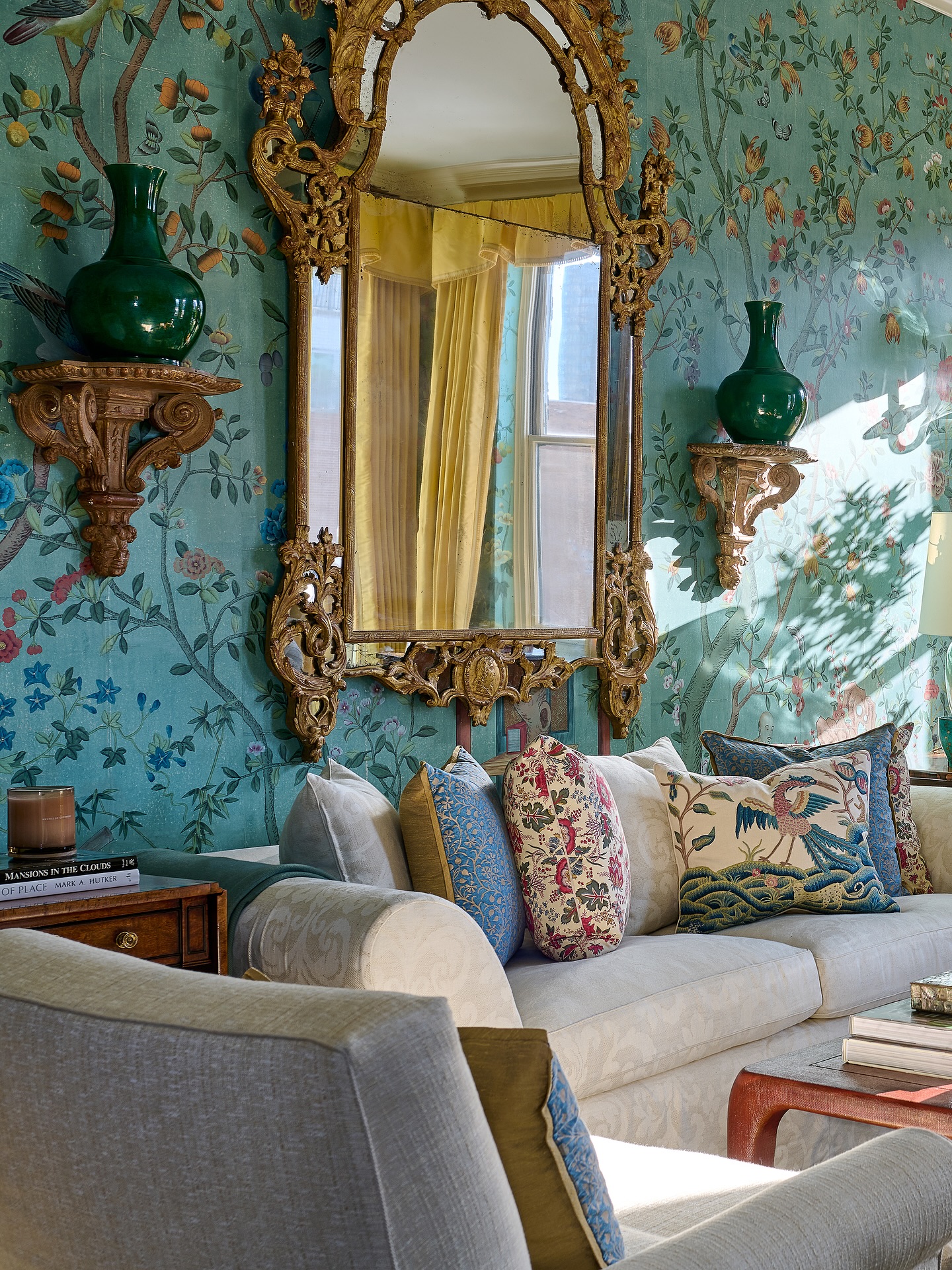
Birds and flowering branches spread across turquoise wallpaper behind this pale sofa. A tall gold mirror interrupts the intricate scene with a bright, reflective center, while matching wall brackets bring a sense of balance.
This approach suits a room where you want richly detailed wallpaper and a clear focal point. Choose the mirror location before installation, leaving attractive branches visible around its outline.
Keep the main upholstery light so the wall remains easy to read. The pillows repeat blue, green, and muted red from the paper, connecting their different patterns to the background.
You can simplify the idea with fewer cushions and one pair of matching objects. Test the wallpaper beside existing wood finishes before committing to its overall color.
6. Line Built In Shelves With Woven Wallpaper
Credits: Instagram
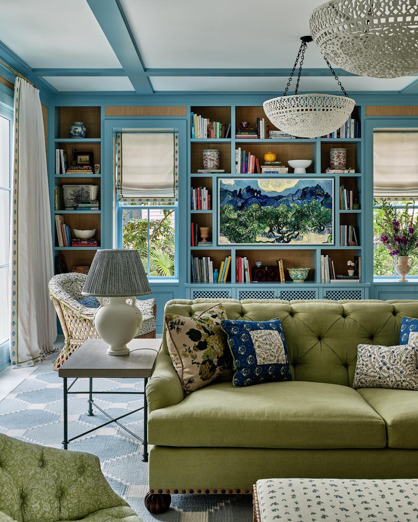
Warm woven wallpaper fills the backs of these blue shelves, making each compartment feel deeper and more considered. The textured surface also links the painted cabinetry with the wicker chair and natural tones around the room.
Try this treatment when a full wall of shelving feels visually flat. Remove the shelf contents first, then measure every opening and label the wallpaper pieces before installation.
A subtle natural color gives books, white pottery, and darker objects a consistent background. Leave some empty space around individual pieces so the texture stays visible.
In this room, blue framing repeats across the ceiling, while a green sofa softens the overall palette. Use one continuous paper throughout the shelving to keep the finished arrangement coherent.
7. Pair Watercolor Walls With Crisp Striped Chairs
Credits: Instagram
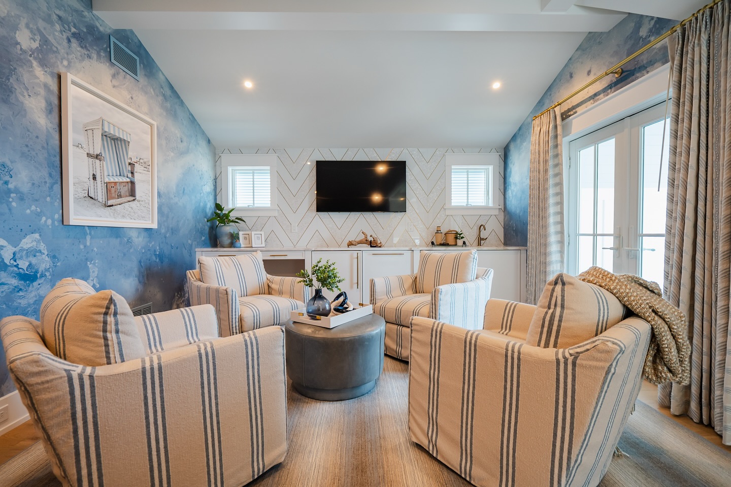
Cloudlike blue wallpaper surrounds this conversation area with a loose, flowing pattern. The chairs answer it with neat vertical stripes, creating a useful contrast between soft movement and clear lines.
A pale ceiling, light rug, and white cabinet wall prevent the blue from taking over every surface. For a similar effect, choose a watercolor design whose lightest shade relates to your existing trim.
Carry one of its blues into a stripe or narrow woven pattern on seating. Keep the center simple with a round ottoman and one tray, leaving room for people to move between chairs.
View the wallpaper sample from across the room as well as close up; its larger color shifts matter more than tiny details when installed.
8. Finish Tall Paneling With a Botanical Band
Credits: Instagram
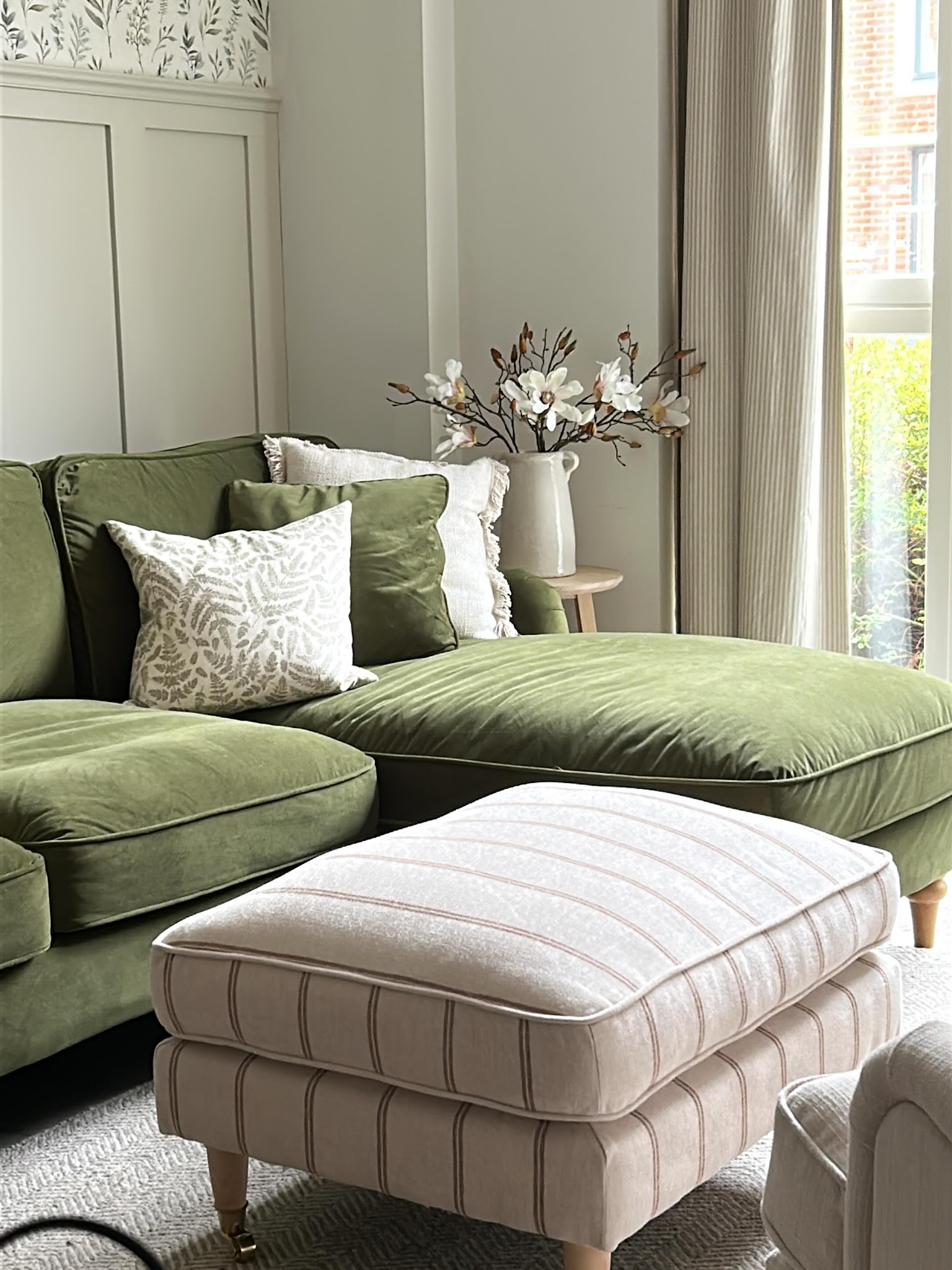
A narrow strip of leafy wallpaper above tall paneling gives this living room a measured dose of pattern. Most of the wall remains a quiet gray green, allowing the olive sofa and striped ottoman to take up more visual space.
This is a useful compromise when you enjoy botanical prints but want a calm seating area. Choose a repeat that still reads clearly within the shallow exposed band, then check where its stems will meet the top molding.
Keep nearby curtains simple so their folds do not compete with the leaves. A botanical pillow carries the theme down to the sofa at a smaller scale.
Sample the paper against both your paneling paint and upholstery before choosing the final combination.
9. Wrap a Vaulted Room in an Abstract Mural
Credits: Instagram
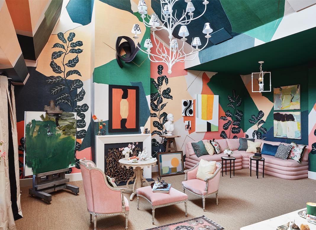
Oversized blocks of green, peach, cream, and black travel across the walls and sloping ceiling in this dramatic sitting area. Leaf silhouettes add another layer, while pale pink seating gives the eye a softer place to rest.
A continuous mural can make irregular architecture feel intentional, especially when its shapes extend over beams and changes in height. Plan the layout across every visible surface before installation so the largest color fields land where you want them.
Keep most furniture in a small group of related colors. Here, the artwork echoes the mural's geometric shapes, and white lighting stands out against the deeper background.
Use a restrained floor covering to balance the busy upper surfaces and keep the seating group readable.
10. Soften Formal Symmetry With Green Grasscloth
Credits: Instagram
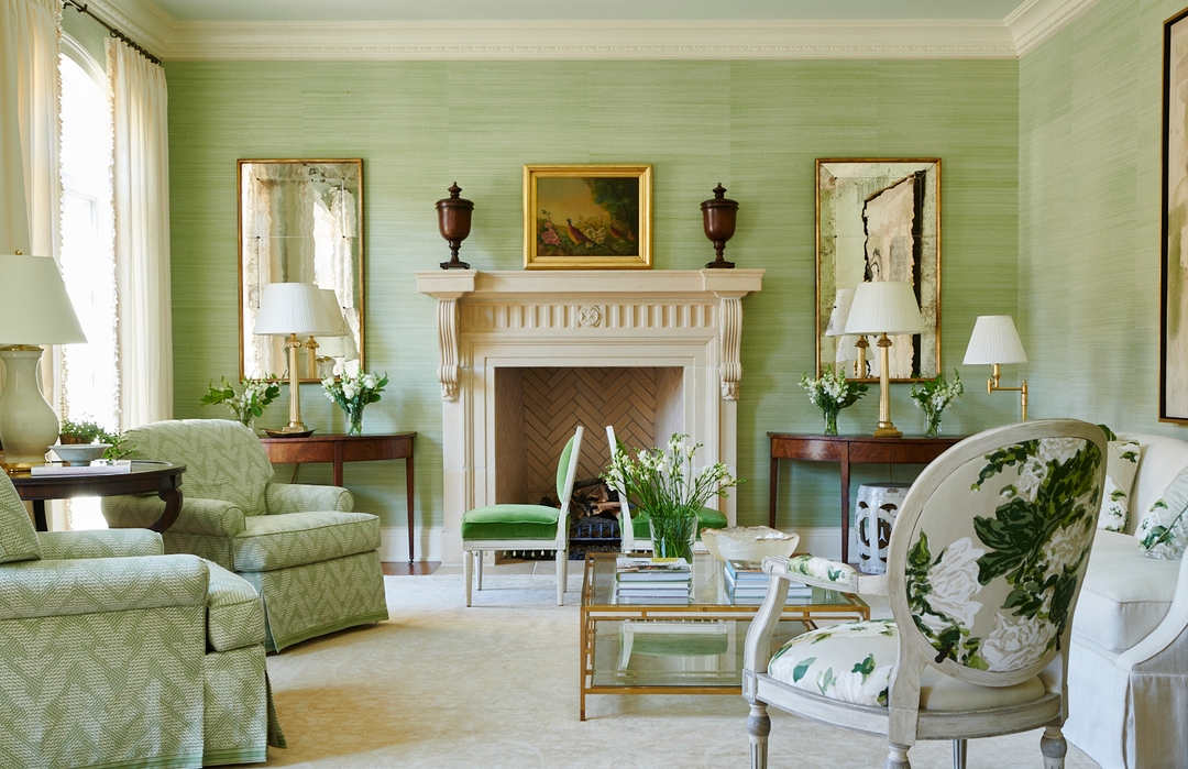
Pale green grasscloth wraps this living room in fine horizontal texture. Matching mirrors, tables, and lamps create a formal arrangement around the fireplace, but the irregular woven surface keeps the setting from feeling rigid.
Choose a quiet grasscloth when you want depth without a strong printed motif. Its natural variation works especially well beside painted trim and traditional furniture.
Here, the cream mantel and rug give the green walls breathing room, while patterned chairs repeat the same color family. Expect visible differences between panels with natural woven papers; review several samples together before ordering.
Keep artwork and mirrors large enough to read clearly against the texture. A few darker wood pieces add definition without breaking the room's gentle overall palette.
11. Give an Awkward Recess Bold Vertical Stripes
Credits: Instagram
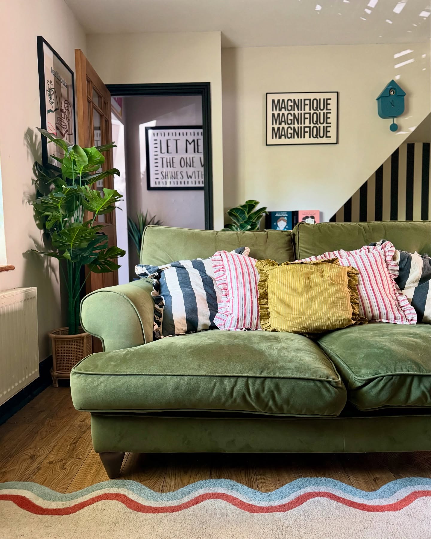
Black and cream stripes turn the angled recess behind this sofa into a deliberate design feature. The surrounding pale walls keep the graphic area contained, while striped pillows repeat its rhythm in softer colors.
This is a useful way to give an awkward corner a purpose without adding bulky furniture. Measure the available section carefully and consider how the stripes will end against its sloping edge.
A fairly simple repeat makes those boundaries easier to appreciate. Here, black door trim and picture frames carry the dark lines into the rest of the room.
The green sofa and wavy rug then introduce gentler shapes. Keep nearby wall decorations modest so the little wallpaper feature remains clear from across the seating area.
12. Repeat One Geometric Pattern Around an Attic Lounge
Credits: Instagram
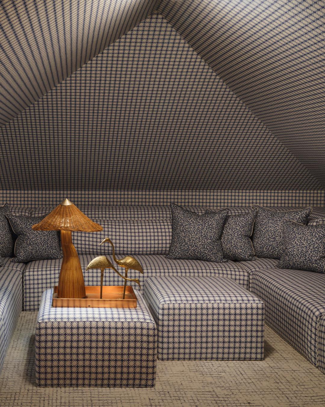
The same small geometric pattern covers the sloping walls, built in seating, and ottomans in this attic lounge. Repeating it so thoroughly makes the unusual roofline feel like part of one continuous enclosure.
If you love a cocooning room, look for a wallpaper with a coordinating upholstery fabric and order samples of both together. Their colors should work under the lighting you plan to use.
Let the pattern do most of the decorating, then choose a few objects with simple silhouettes. Here, a woven lamp, gold birds, and a rectangular tray stand out clearly against the blue and cream repeat.
A lighter floor covering gives the eye a pause and makes the low seating easier to distinguish from its surroundings.
13. Let a Crane Print Set a Playful Palette
Credits: Instagram
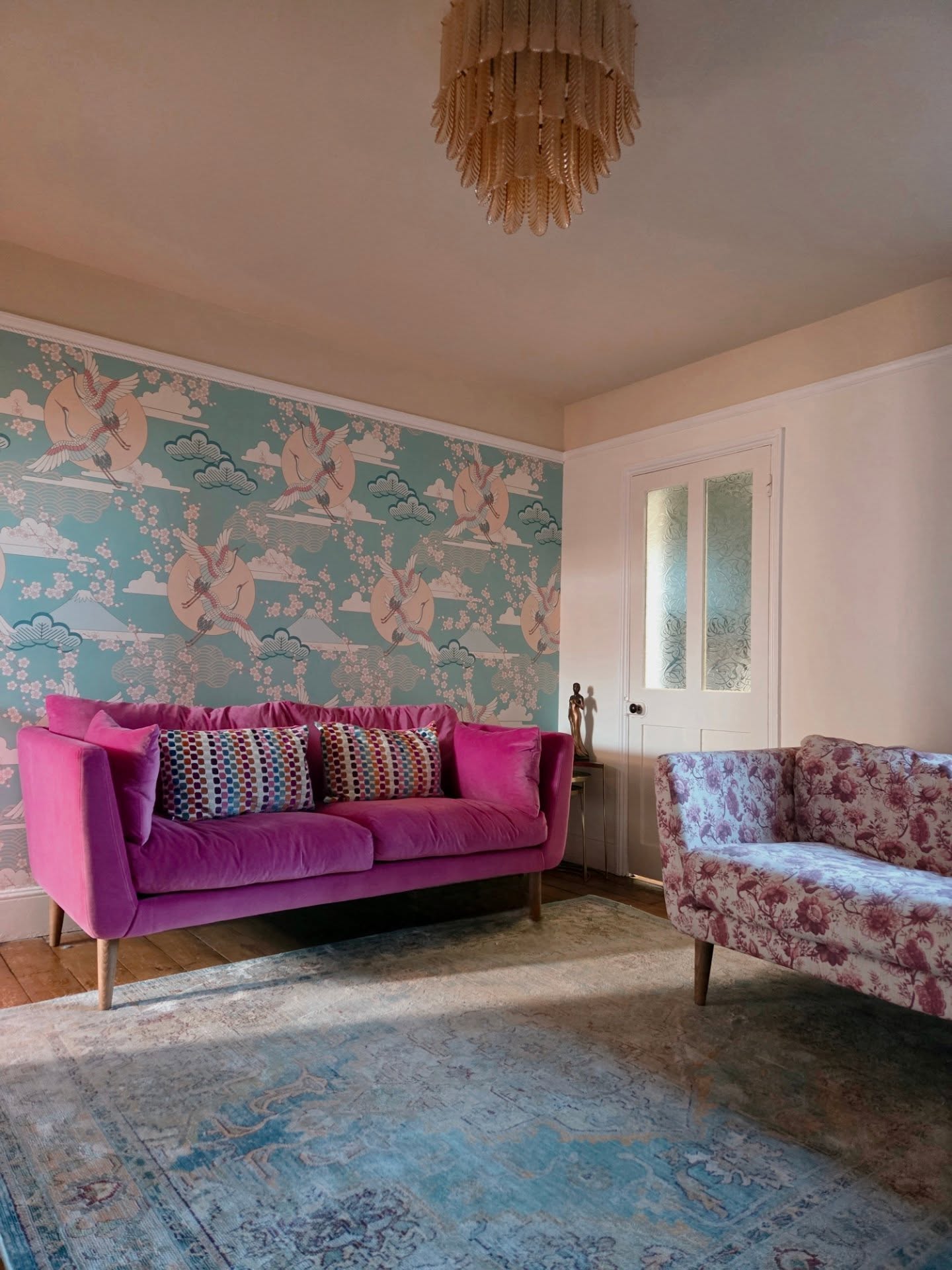
Cranes, clouds, and round peach shapes spread across the blue wallpaper behind this bright pink sofa. The wall provides a decorative scene on its own, so it needs no additional framed artwork.
This is a practical approach when a sofa wall feels empty but a gallery arrangement would create too many separate pieces. Choose a wallpaper with larger motifs that remain recognizable above the sofa back.
Pull one stronger color into upholstery, then let the ceiling and neighboring wall carry a quieter shade. Here, the pale doorway and muted rug give the pink seating room to stand out.
A floral loveseat adds another pattern at a different scale. Test all the fabrics beside the paper before making your final choices.
14. Frame Floral Wallpaper Inside Painted Molding
Credits: Instagram
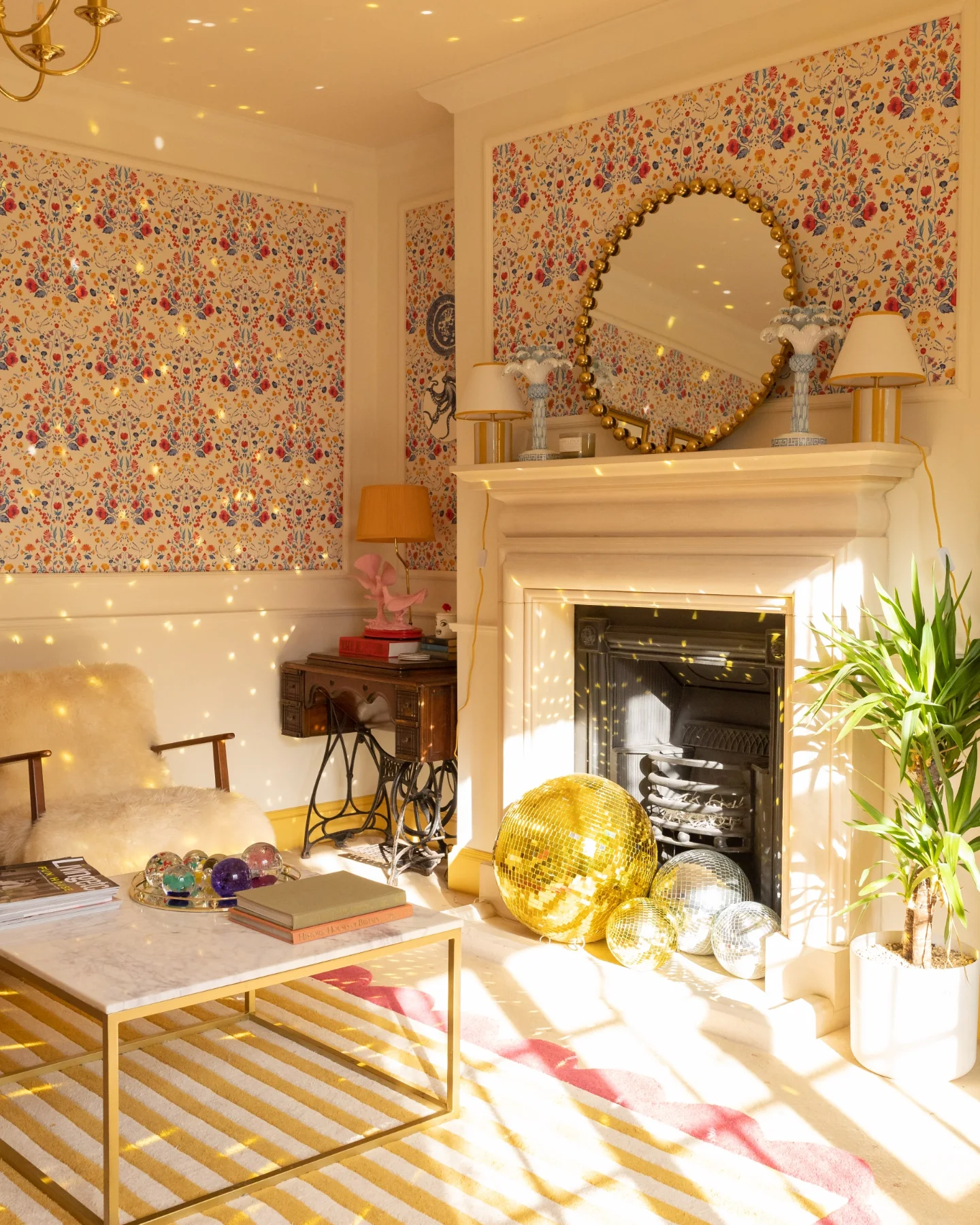
Cream molding divides this cheerful floral wallpaper into generous panels, giving the busy repeat a clear boundary.
The plain lower walls and fireplace surround make the small flowers easier to enjoy, while a round mirror provides a simple shape at the center.
Use this treatment when you want decorative walls with some architectural order. Plan the panel sizes around existing doors, windows, and the mantel before choosing where each paper section will start.
Keep the molding close to the wallpaper's background color for a softer result. The striped rug introduces a larger, simpler pattern below, and gold accents pick up the warm flower tones.
Leave enough clear wall around the panels so their framed edges remain part of the design.
15. Use Tonal Dots Behind Collected Objects
Credits: Instagram
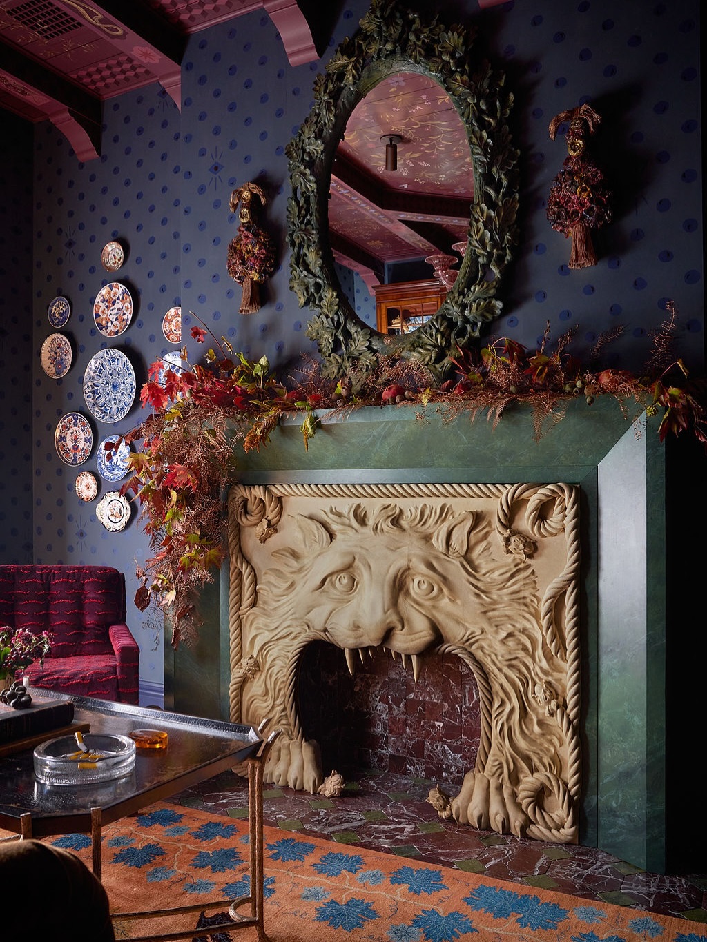
Small dark dots give these midnight blue walls a gentle rhythm behind a much more elaborate fireplace and mirror. Because the dots stay close to the background color, they add interest without competing strongly with the plates and sculptural details.
Try a tonal dotted wallpaper when your living room already contains distinctive objects. Choose a sample with enough contrast to remain visible in evening light, but keep its scale smaller than the artwork or decorations you will hang.
Here, burgundy ceiling details and upholstery bring warmth to the blue, while the pale fireplace becomes the main focal point.
You can borrow the balance with simpler furnishings: one substantial mirror, a small plate grouping, and limited accessories across the mantel shelf.
16. Echo Leafy Wallpaper With a Soft Green Sofa
Credits: Instagram
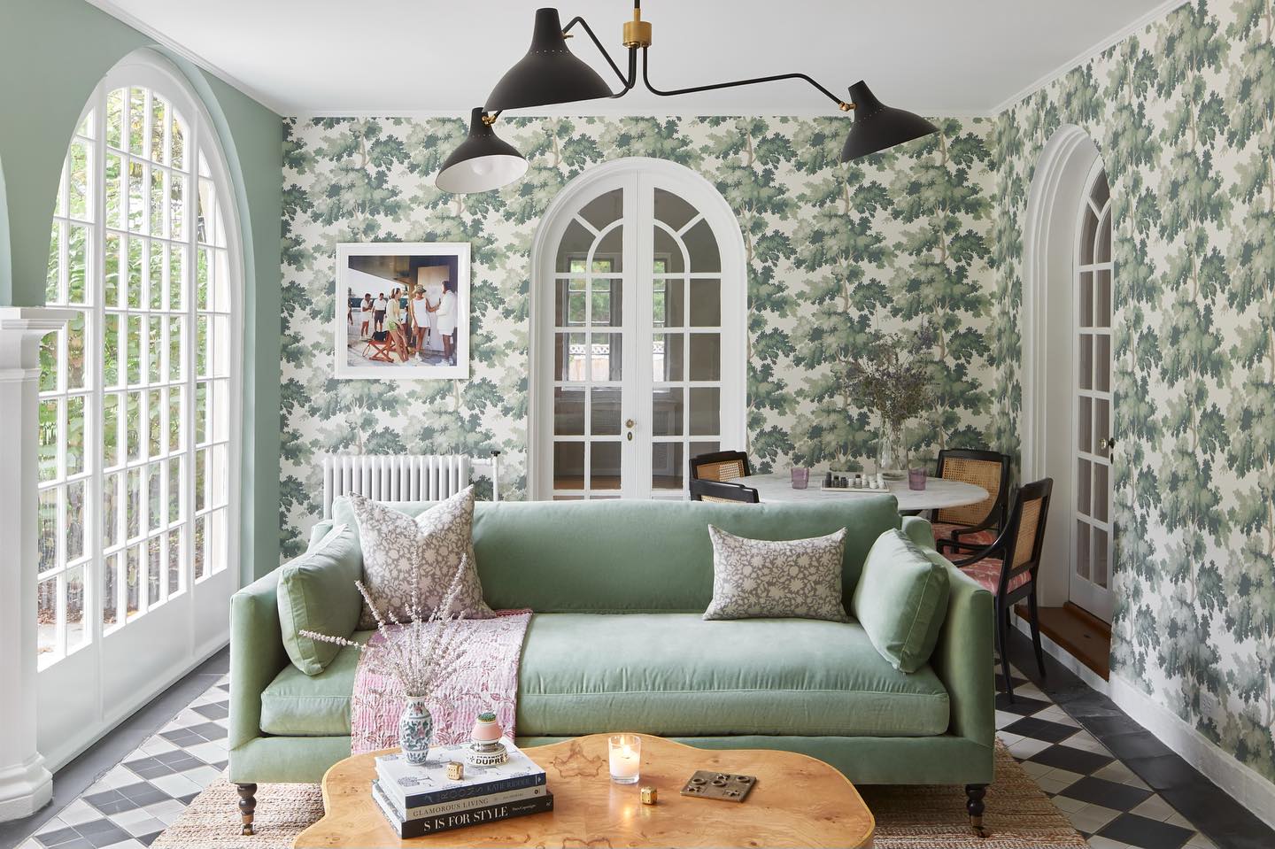
A leafy green wallpaper wraps the walls around this sitting area, while a softly colored sofa repeats its quieter shades. The arched doors stay white, giving the repeated leaves a crisp architectural outline.
Use this pairing when you want a room to feel coordinated without matching every fabric to the wall. Start with the wallpaper, then choose plain upholstery from one of its lighter colors.
Keep patterned pillows smaller in scale, as they are here, so the sofa remains easy to read. A warm wooden coffee table and woven rug balance the cooler greens.
The checked floor adds structure beneath the organic pattern. Leave the ceiling simple and pale to give all those different surfaces a calm place to meet.
17. Echo a Fan Print With Angular Lighting
Credits: Instagram
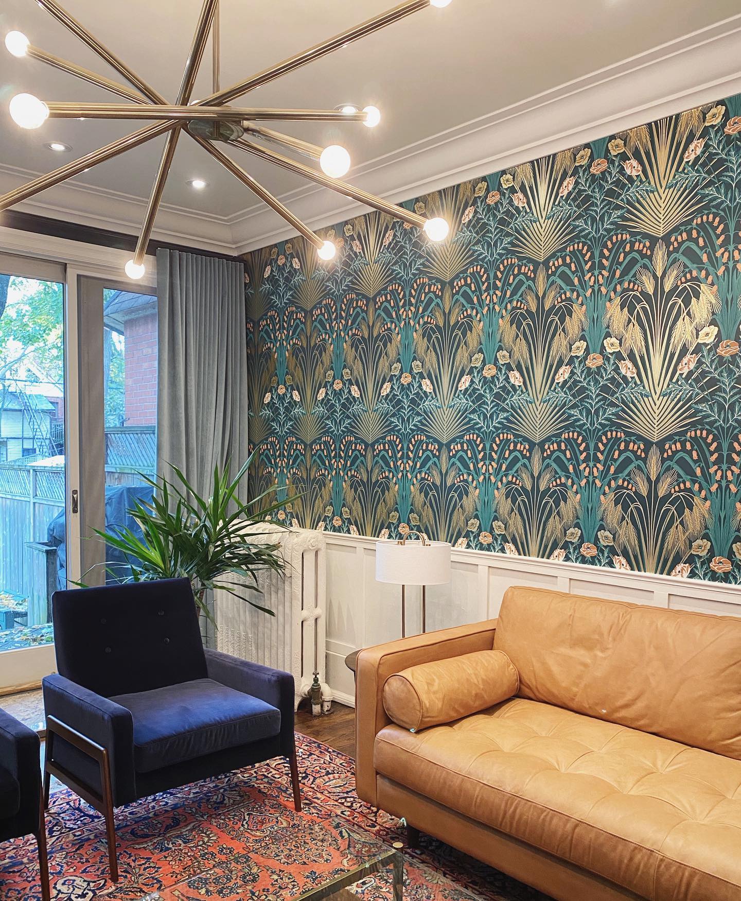
Fine golden lines fan outward across this teal wallpaper, and the branching ceiling light repeats their spreading shape. That connection makes the fixture feel especially suited to the wall even though the two patterns are quite different.
Look for a lighting silhouette that relates to one movement in your chosen paper, whether it is radiating lines, rounded petals, or vertical stems. Keep the fixture open enough that plenty of wallpaper remains visible behind it.
Here, white paneling and ceiling trim create a clean frame, while a tan sofa balances the cooler blue chair and curtains. The patterned rug brings in warmer red tones.
Choose plain upholstery for the largest seat so the wallpaper and light remain the room's strongest features.
18. Use Botanical Paper Beside Built In Bookcases
Credits: Instagram
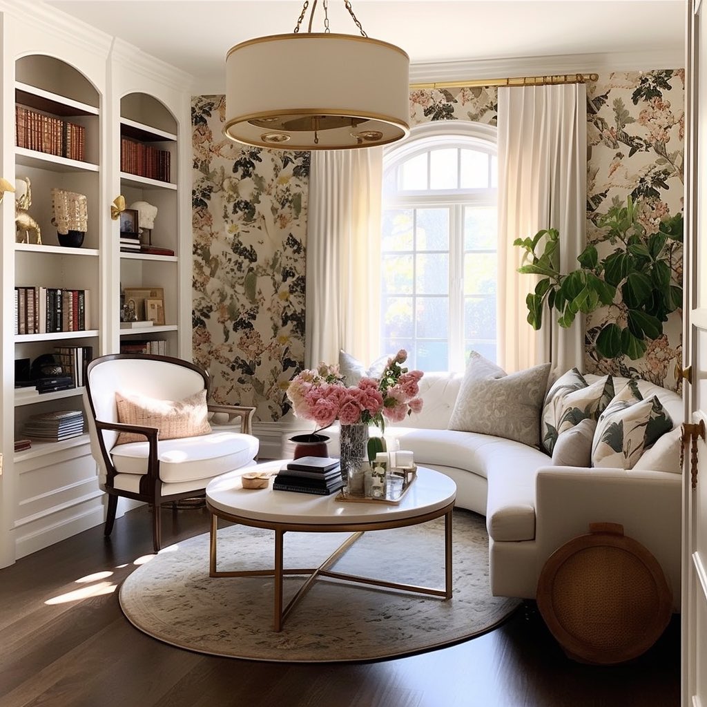
Botanical wallpaper softens the wall beside these tall white bookcases, turning a compact lounge into a welcoming reading spot. Its creamy background relates to the shelving and curved sofa, while darker leaves connect with the wooden chair and floor.
This approach works well when storage already occupies one side of a room. Paper the remaining visible wall instead of adding another busy display of objects.
Hang plain curtains so they frame the window without interrupting the botanical design. Here, a round coffee table and circular rug keep the seating arrangement visually gentle.
Limit the accessories to a tray, books, and flowers, leaving useful surface space. Choose a wallpaper sample large enough to judge how its branches sit beside the shelving.
19. Define a Change in Floor Level With Geometry
Credits: Instagram
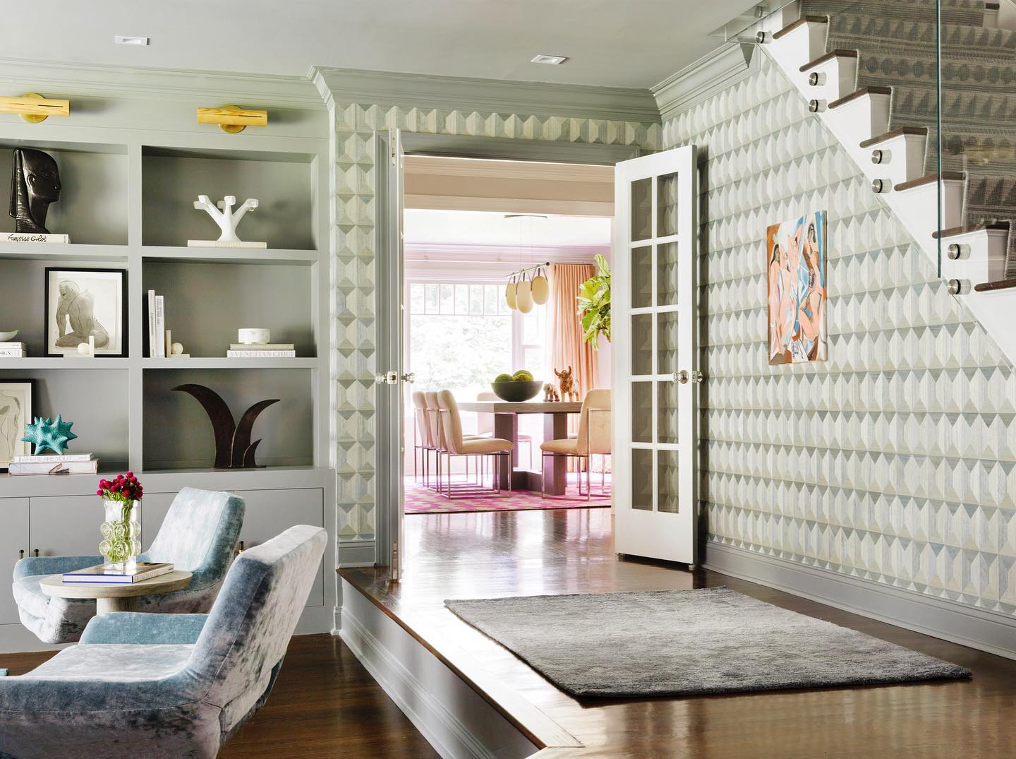
A geometric wallpaper marks the raised passage beside this sunken sitting area. Its pale green tones relate to the built in shelving, making the patterned wall feel connected to the seats below.
Use wallpaper to clarify an architectural transition when an open layout contains steps, recesses, or adjoining circulation space. Choose a repeat that looks orderly around door casings and other interruptions.
Here, the white door and muted trim create clear edges, while a plain gray rug leaves the wall as the main patterned surface. Upholstered chairs soften the geometry at the lower level.
Repeat one wallpaper color on nearby cabinetry or a small furniture piece, and keep the walking route clear so the visual division also supports everyday movement.
20. Ground Colorful Wallpaper With an Animal Print Rug
Credits: Instagram
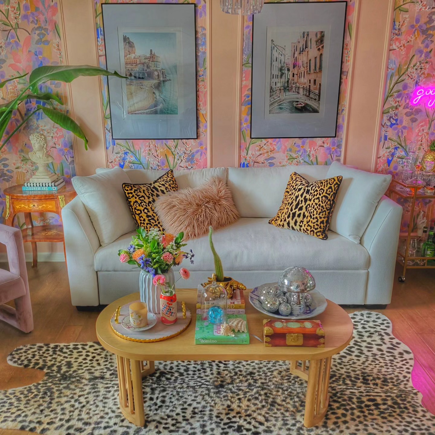
Pink, yellow, and lavender strokes fill the wallpaper panels behind this pale sofa. A large animal print rug gives the bright wall a grounded companion, while matching spotted pillows repeat its darker marks at seat height.
Try combining an expressive floral or abstract paper with a familiar animal pattern when you want a layered room. Keep the main sofa plain so there is a resting place between the two.
Here, pink molding separates the wallpaper into sections, and large framed pictures make the wall arrangement feel organized. The rounded wooden coffee table adds another quiet material among the colorful accessories.
Start with the wallpaper and rug samples together, then remove any extra accent colors that do not help connect them.