
A living room can feel thoughtfully finished without filling every surface or matching every accessory.
Living Room Decor Ideas in this roundup focus on small choices that connect the space, such as repeating colors from artwork around the seating area, mixing pillow textures within a quiet palette, and defining the seating zone with a large rug.
You’ll also find practical ways to balance a fireplace wall, organize a TV console with matching baskets, and keep an ottoman useful with a tray.
Together, these details offer inspiration for adding character while keeping the room comfortable and composed.
1. Repeat Two Artwork Colors Around the Seating
Credits: Instagram
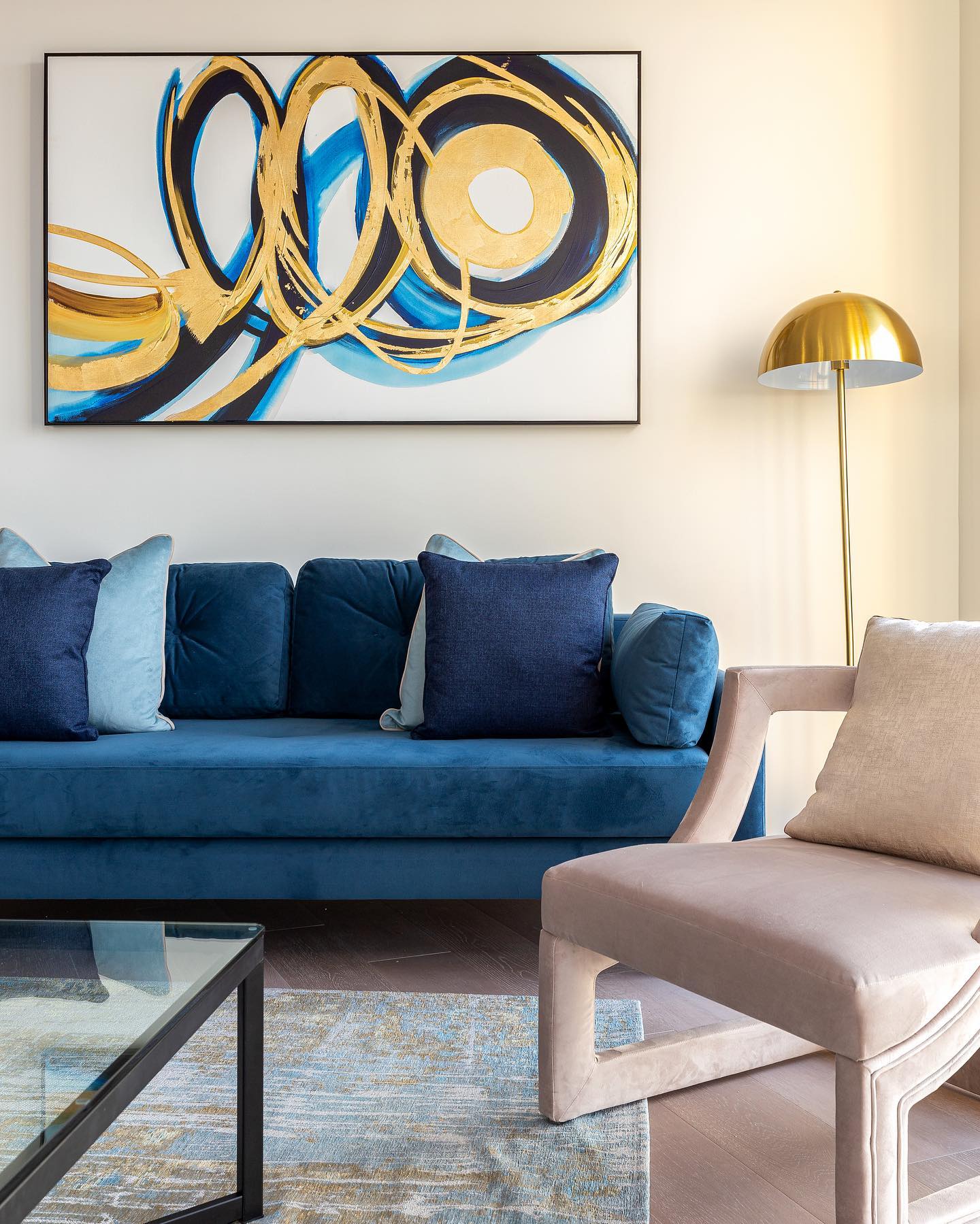
Blue and gold move from the large abstract painting into the furniture below, giving this seating area a clear color connection. The blue sofa carries the strongest hue, while a gold dome lamp repeats the artwork’s warmer strokes.
Start with a picture you enjoy, then choose one main color and one smaller accent to echo elsewhere. You do not need an exact match: the dark and pale blue pillows show how related shades can add depth.
Keep surrounding pieces quieter so the repeated colors remain easy to notice. Here, cream walls and a pale upholstered chair provide that balance.
A rug with softer blue and gold markings extends the palette toward the floor without adding another equally bold focal point.
2. Soften a Fireplace Wall With a Round Mirror
Credits: Instagram
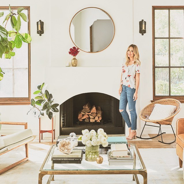
A round mirror softens the straight lines of this fireplace wall without adding another color. Its thin warm frame connects with the wood window trim and the golden coffee table, while the curved outline echoes the arched firebox below.
To adapt the idea, center a mirror over a simple mantel and leave enough blank wall around it for the shape to register. Keep nearby decorations low so they do not cover the mirror’s edge.
Here, one vase is enough, and paired wall sconces provide balance. A woven rocking chair introduces texture beside the smooth plaster and glass.
Repeat that contrast with one tactile accent chair, then keep the surrounding furnishings light enough to let the fireplace remain the focal point.
3. Mix Pillow Textures Within a Quiet Palette
Credits: Instagram
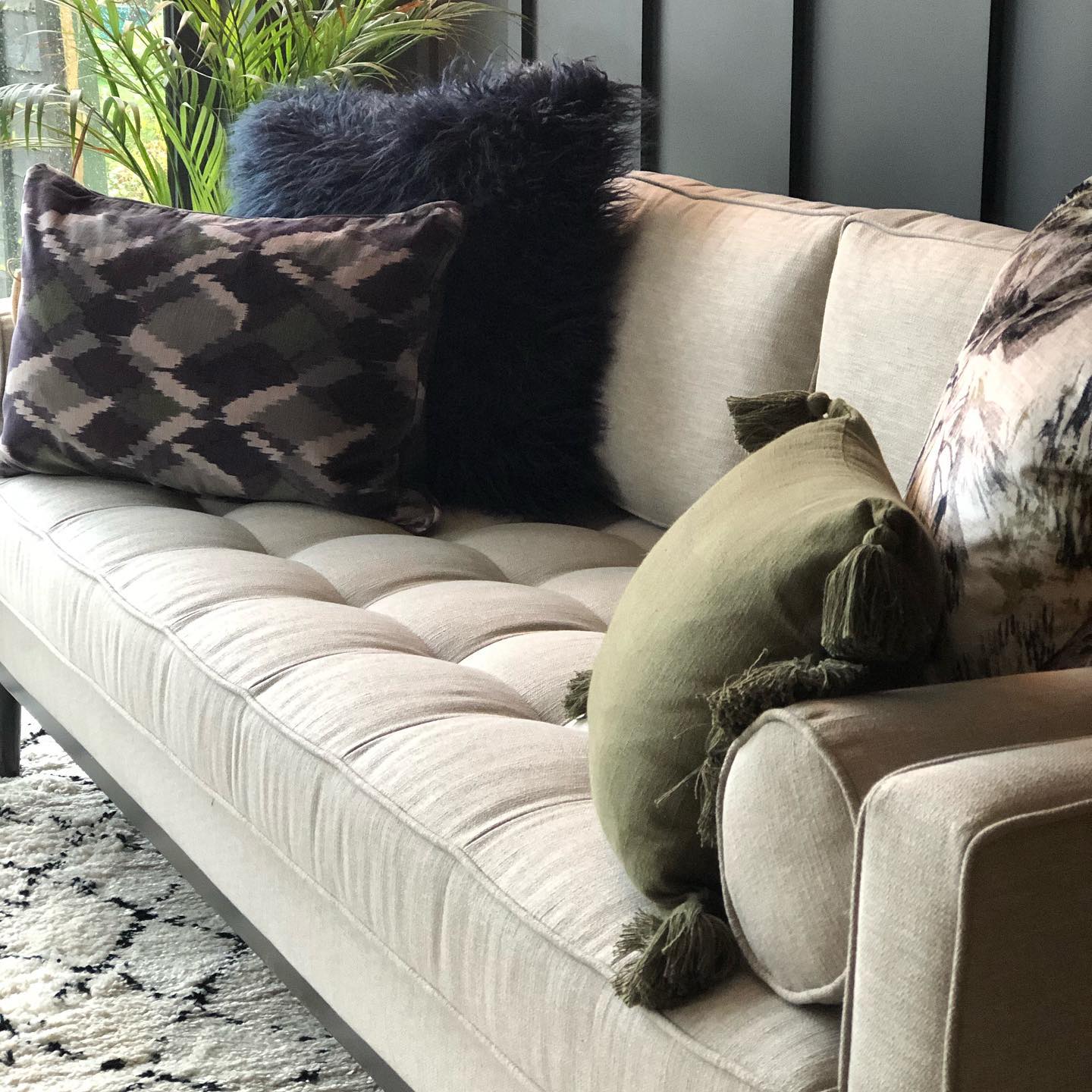
In Lizzie’s living room, patterned square pillows, a shaggy black pillow, and an olive lumbar pillow give the pale sofa several layers of interest.
Their differences feel intentional because the colors stay close to the dark wall, green foliage, and neutral upholstery. Start with one patterned pillow that includes your main colors, then add a solid version of one shade.
Change the texture next: a long pile surface creates a stronger contrast than another smooth cover. A smaller rectangular pillow can sit in front without hiding the larger pattern.
Leave part of the sofa uncovered so the arrangement feels inviting and usable. The cream rug with black lines carries the same restrained palette onto the floor without matching every motif.
4. Frame a Gallery Wall With Matching Sconces
Credits: Instagram
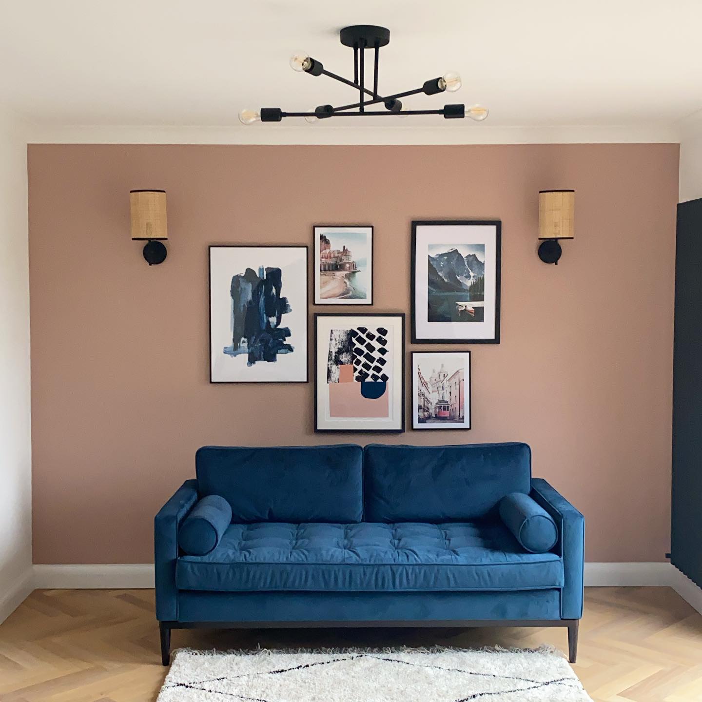
Two matching sconces give Laura Crombie’s mixed-size gallery wall a clear outer boundary. The five black frames vary in height and width, but the repeated frame color keeps the arrangement connected above the blue sofa.
Try placing your largest artwork first, then fit smaller pieces around it with similar gaps. Here, the lights sit outside the picture group at matching heights, adding balance without making the artwork symmetrical.
Paper templates help you judge spacing before hanging anything. Leave room between the frames and shades so neither looks crowded.
The black ceiling fixture repeats the same finish, while the dusty pink wall lets the dark outlines stand out. Keep the sofa styling simple when the wall already supplies plenty of detail.
5. Layer Two Coastal Prints Above the Fireplace
Credits: Instagram
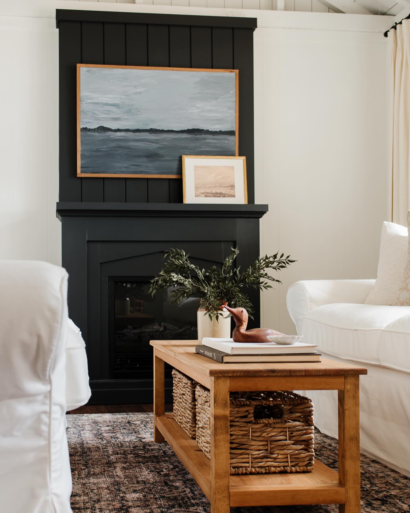
Two coastal prints create depth against the dark fireplace surround without filling the mantel with small objects. The larger seascape establishes the main shape, while a smaller picture overlaps its lower corner and brings a lighter tone into the grouping.
Try combining one dominant frame with a second that is clearly smaller, keeping enough of both images visible. Choose related subjects or colors so the overlap feels connected.
Leave the remaining mantel space open to emphasize the pair. Below, a wooden coffee table and large woven basket add warmth beside the white seating.
Use a lower shelf for a basket that fits neatly, then keep tabletop accessories to a compact group so the art remains the room’s strongest decorative focus.
6. Give a Textured Ottoman a Useful Tray
Credits: Instagram
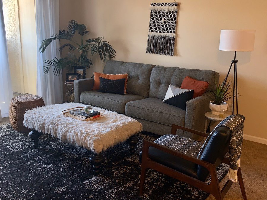
A cream ottoman with a shaggy surface becomes the center of Wesley James’s comfortable seating area, adding a soft contrast to the gray sofa and dark patterned rug.
A small tray gathers books and a decorative object, leaving most of the texture visible. To borrow the idea, choose an ottoman broad enough for a tray while keeping clear walking space around its edges.
Check that the tray sits securely before using it for drinks; a nearby side table can handle anything that needs a firmer surface. Here, dark turned legs connect the ottoman to the black accents, while rust pillows add warmth.
Keep accessories low so the central piece supports conversation and the surrounding chair and sofa remain visually connected.
7. Make a Divided Mirror Part of the Pattern
Credits: Instagram
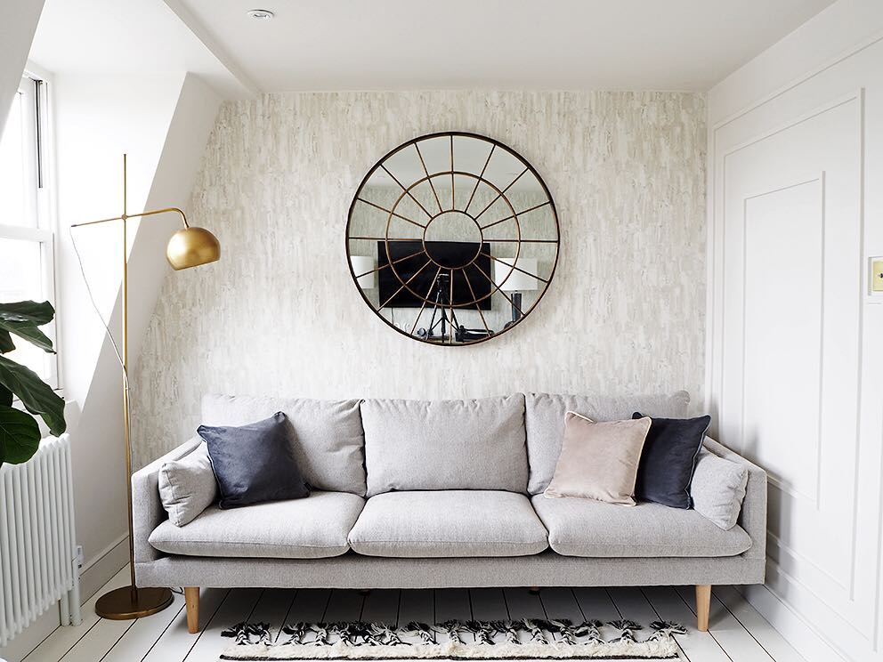
A divided mirror turns the wall above Bianca Hall’s sofa into a graphic focal point. Its concentric circles and radial bars add pattern while the pale sofa and restrained pillows keep the seating simple.
Choose a frame design that feels interesting before you consider what it reflects. Leave visible wall around the mirror so the outline remains clear, and center it in relation to the sofa rather than filling every available inch.
The slender floor lamp adds another sculptural line without crowding the wall. Before hanging a mirror, check its reflection from the doorway and seating positions, especially when a television sits opposite.
A patterned frame can decorate a room, but reflected everyday objects still become part of the composition.
8. Add a Pair of Shelves Beside the Fireplace
Credits: Instagram
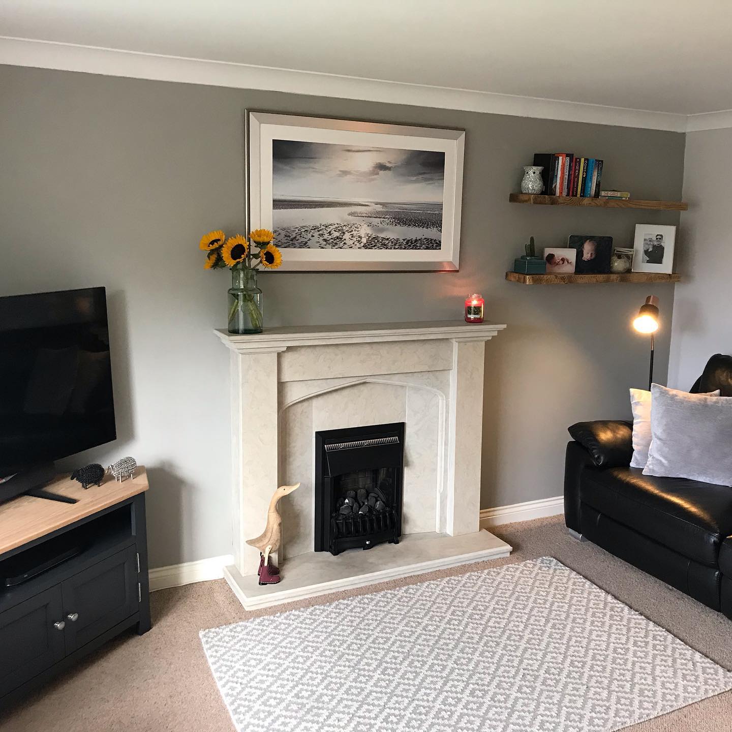
Two wood shelves give the space beside Charlotte’s fireplace a useful display area without adding another floor cabinet. Their warm grain contrasts with the gray wall and pale fireplace surround, while the simple horizontal lines keep the corner orderly.
Put taller books or an upright object on the upper shelf, then use the lower one for smaller framed pictures you want to see from the sofa.
Leave some shelf visible so the arrangement does not become a solid strip of objects. Keeping the shelves similar in length makes the pair read as one feature.
Here, the nearby floor lamp adds a separate vertical line. Before installing shelves, check the wall construction and choose fasteners rated for the total intended load.
9. Use Matching Baskets to Organize the TV Console
Credits: Instagram
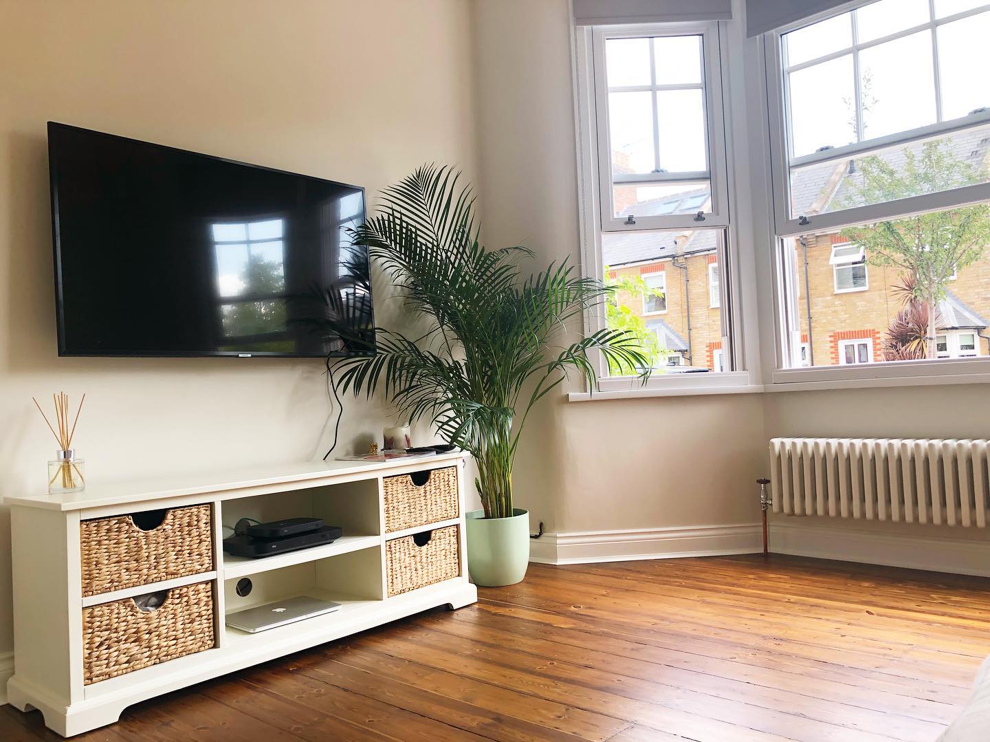
Four matching woven baskets give this white TV console a tidy rhythm while adding texture to the cream room. The open center shelves leave space for electronics, creating a mix of concealed and accessible storage.
Try this arrangement when a television corner collects small everyday items: measure each opening before buying baskets, including the depth and space needed to pull them out.
Choose handles that are easy to grip, and keep devices on open shelves with appropriate ventilation. A mostly clear console top prevents the screen area from feeling crowded.
Here, the tall palm softens the television’s rectangular outline, while the baskets connect visually with the warm wood floor. Repeat their tone elsewhere to make storage feel like intentional decor.
10. Stop Wall Color at the Picture Rail
Credits: Instagram
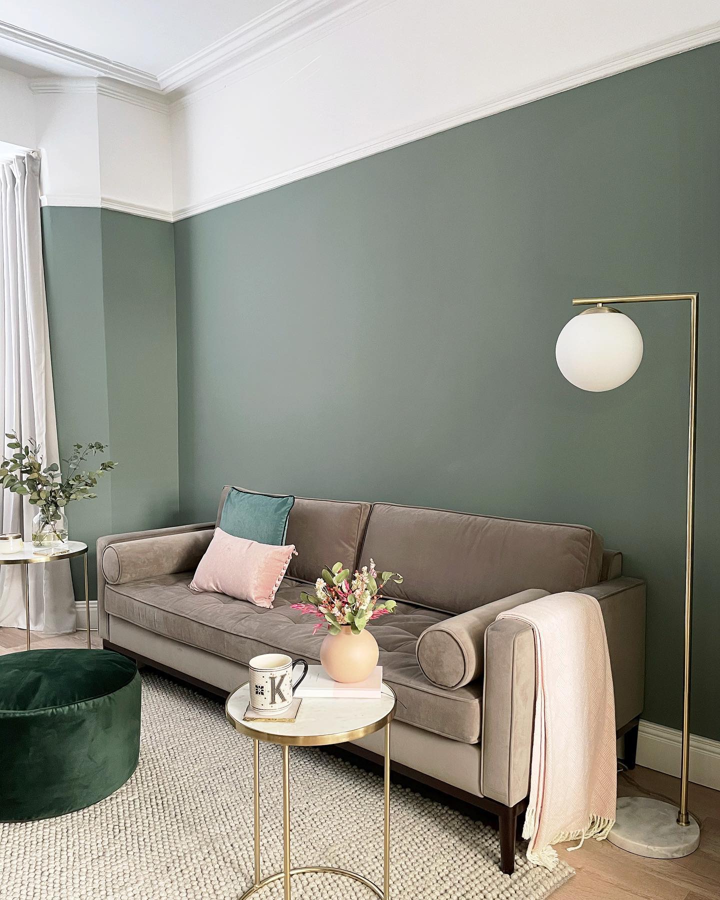
Green paint stops at the picture rail in Kirsty’s living room, leaving the upper wall and ceiling white. That trim creates a crisp boundary and makes the color treatment feel connected to the room’s architecture.
If your room has a picture rail, use it as a natural stopping point rather than choosing an arbitrary line across the wall.
Keep the rail and the area above it the same light color for a continuous band around the room. Here, white curtains echo that upper section, while a taupe sofa gives the green a quiet companion.
Test paint samples beside your upholstery before committing. A small pink accent, like the pillow shown here, can soften the palette without competing with the wall.
11. Leave One End of a Corner Sofa Open
Credits: Instagram
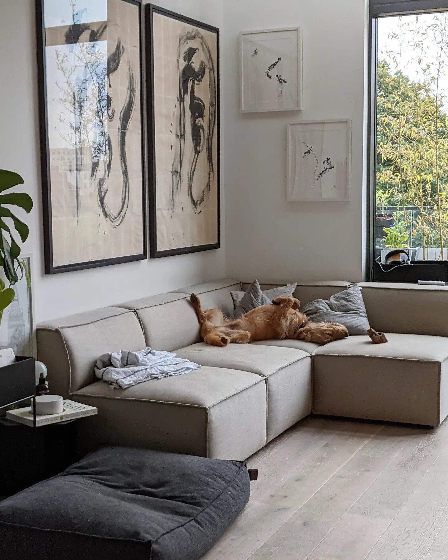
An armless end keeps this corner sofa visually open, letting the seating meet the room without another tall upholstered side. The low back continues beneath the window, while the larger artwork fills the wall above.
Try this arrangement in a corner where a bulky arm would interrupt the view or crowd the approach. Before choosing modules, mark their combined footprint on the floor and check that doors, drawers, and everyday routes still work.
Keep nearby tables compact and within reach of the end seat. Here, pale upholstery and floorboards make the furniture feel connected, while black picture frames add definition.
The separate pet bed also shows why a seating plan should leave room for the household’s habits, including its pets.
12. Bring a Table Lamp Within Reach
Credits: Instagram
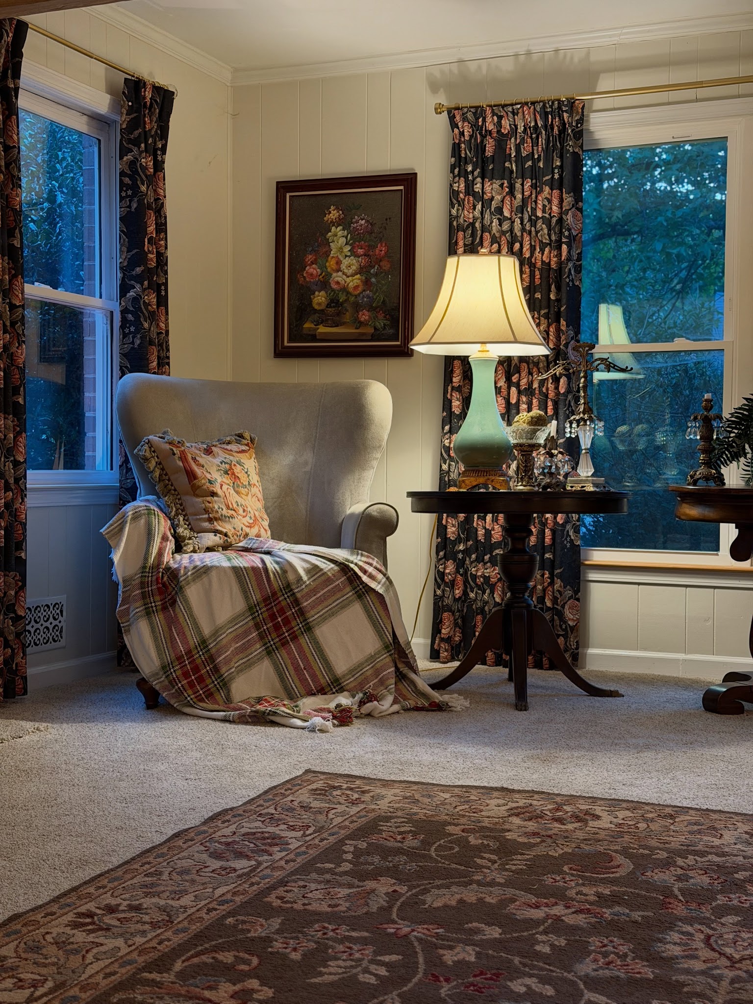
A table lamp turns this wingback chair into an inviting evening reading corner. Its pale shade lights the seat and nearby wall, while the green base picks up colors in the surrounding florals.
Start with the chair’s position, then choose a side table that keeps the lamp stable and its switch easy to reach.
Sit down before deciding on the final arrangement: the shade should shield the bulb from your eyes while directing useful light toward your book. Leave some tabletop clear for a drink or reading glasses.
Here, cream upholstery gives the patterned curtains and plaid throw room to stand out. Repeat that balance with a plain chair, one generous table lamp, and textiles that share a few colors.
13. Mix Found Objects Into a Gallery Wall
Credits: Instagram
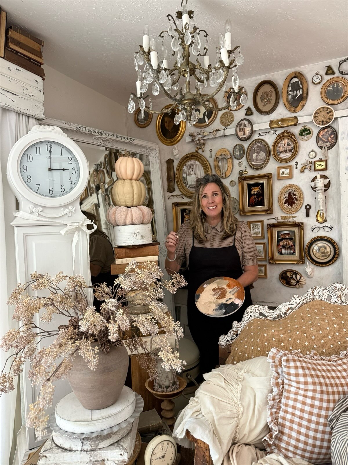
Jules’s gallery wall combines oval portraits, rectangular pictures, small clocks, and found objects in warm brown and gold tones. The repeated colors connect pieces that vary in shape and size.
To build a similar display, begin with one substantial frame, then arrange smaller pieces around it before filling selected gaps with objects. Paper templates let you test the grouping without committing to every nail position.
Keep enough space around each outline for its shape to remain visible, especially beside an ornate frame. A quiet wall color helps the collection stand out.
Here, the white clock and mirror frame echo the pale sofa trim beside the gallery. Collect gradually, choosing pieces you enjoy rather than buying everything to fill the wall.
14. Let a Framed TV Join the Decor
Credits: Instagram
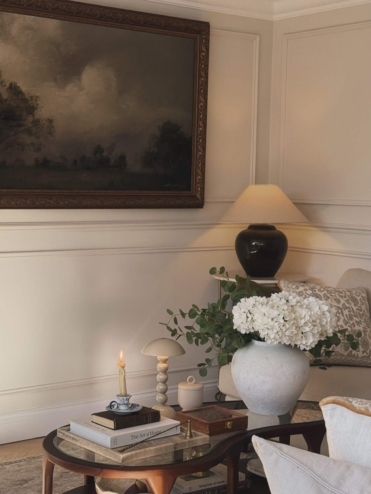
The landscape on Nisha’s paneled wall is actually her television, as she explains in the caption. An ornate dark frame helps it join the room’s traditional details, while the muted image echoes the brown and cream furnishings below.
For a similar effect, choose screen artwork with colors already present in your seating area. Keep the surrounding wall treatment simple enough that the frame remains readable; here, pale rectangular molding provides structure without another competing pattern.
Test the screen’s position from your usual seat before fixing its height. A nearby shaded lamp and rounded vase soften the arrangement, but leave the viewing area clear.
This approach lets everyday technology participate in the decor when you are not watching a favorite program.
15. Define the Seating Area With a Large Rug
Credits: Instagram
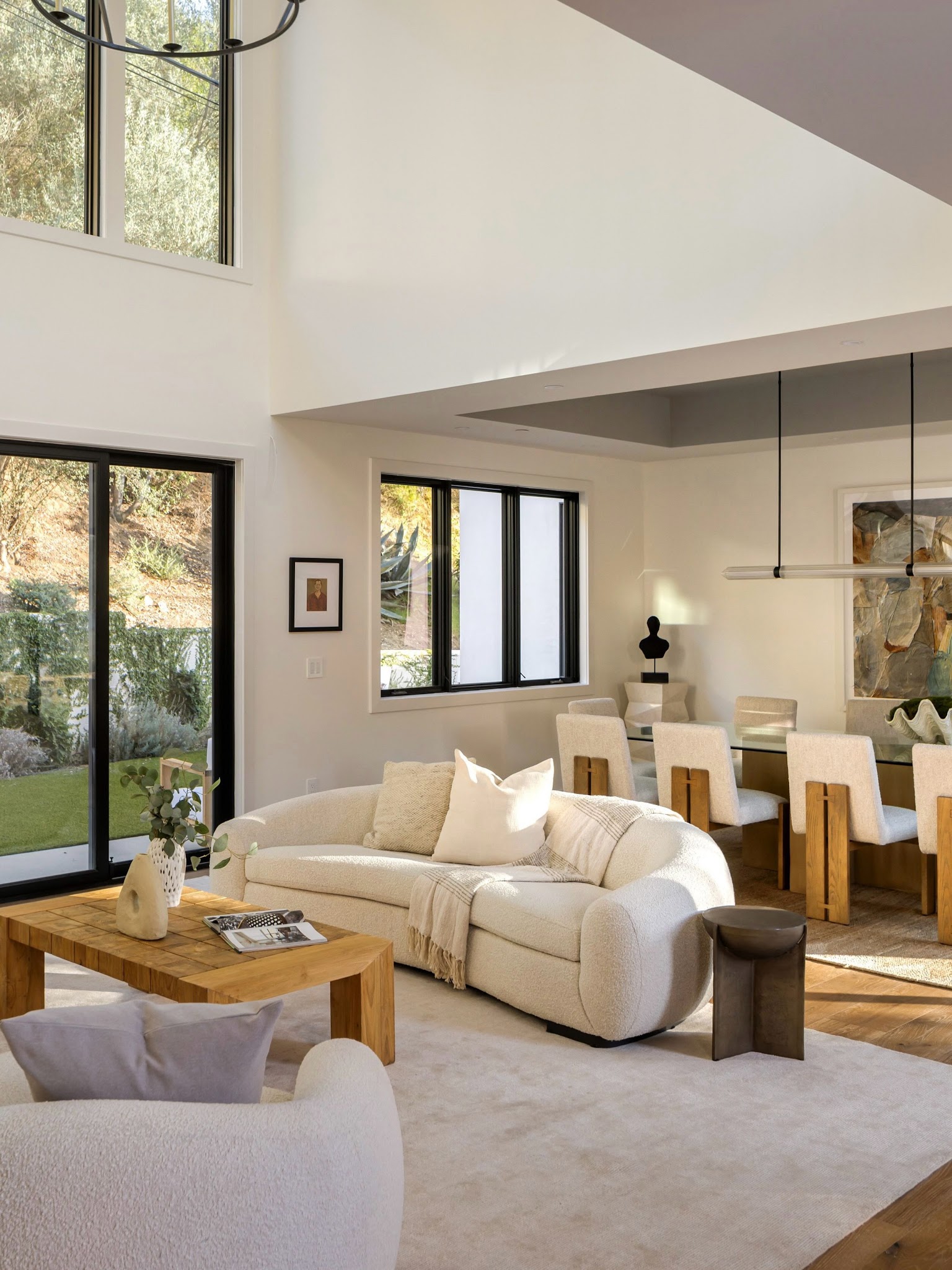
A large pale rug gathers the curved sofa, coffee table, and foreground seating into one seating area, even with dining immediately behind it. The visible wood floor around the edges helps the two arrangements read separately.
Use this approach when one room needs to support several activities without adding a divider. Measure the whole seating group before choosing a rug, allowing the furniture to connect with its surface rather than surrounding a small isolated rectangle.
Then check the space beyond the rug for comfortable walking and dining chair movement. Here, cream upholstery links both zones, while wood appears in the coffee table and dining chairs.
Repeating those finishes keeps the adjoining areas related, even though each has its own purpose.
16. Spread Low Book Stacks Across the Coffee Table
Credits: Instagram
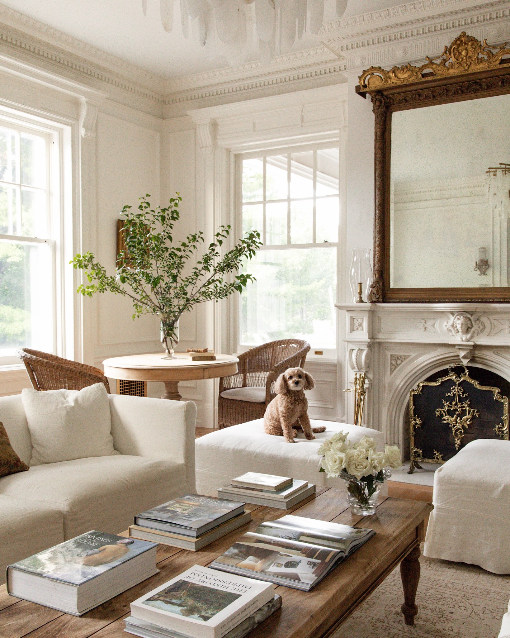
Low stacks of books spread across this long coffee table give the seating area a personal, lived-in focus. Their rectangular shapes repeat along the tabletop, while a small vase of white flowers adds one softer outline.
Try arranging books in several modest groups instead of building a single tall pile in the center. Vary the number in each stack and turn a few covers toward nearby seats so they invite browsing.
Leave open patches for everyday use, and check that every seat still has somewhere convenient to set a cup. Here, pale covers connect with the cream upholstery while the brown tabletop keeps the display grounded.
Choose books you actually enjoy opening, then rotate a few as your interests change.
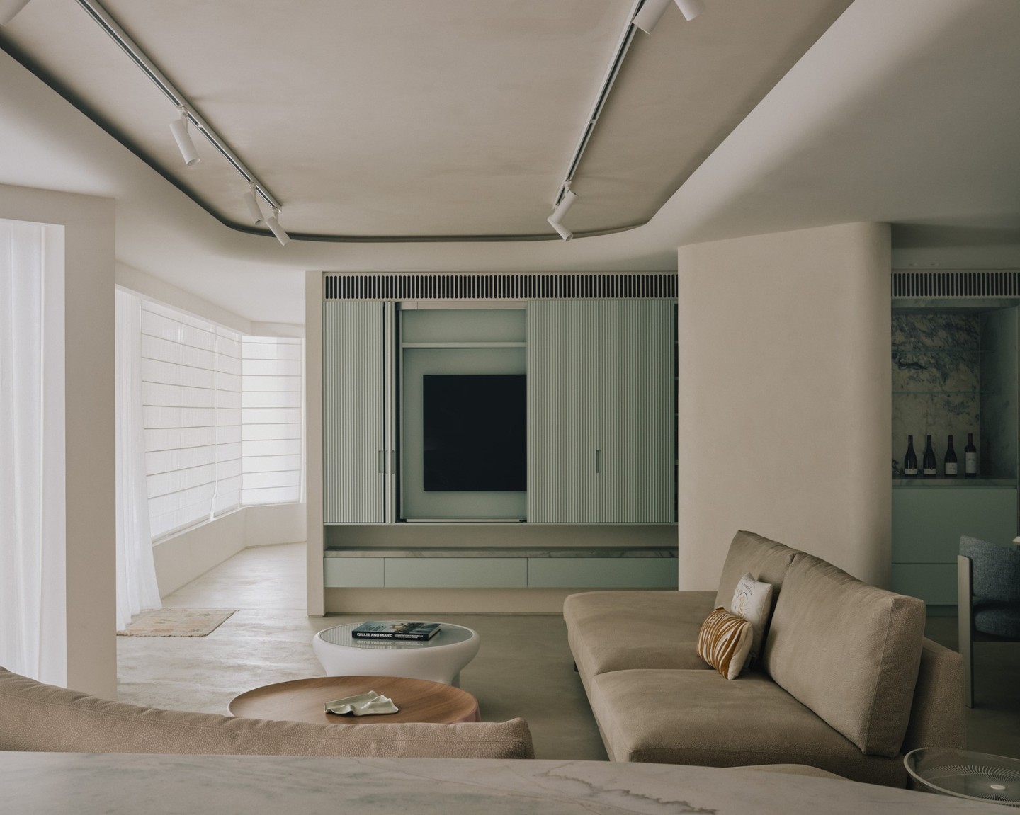
17. Make Ribbed Cabinet Fronts Part of the Decor
Credits: Instagram
Muted green cabinet fronts give this living room a decorative surface without relying on more pictures or accessories. Their narrow vertical ribs introduce a fine rhythm beside the smooth pale walls and relaxed upholstery.
To borrow the idea, choose one subdued color for a storage unit and let its surface texture provide the detail. Repeat that color on nearby drawers so the separate components feel connected.
Check a sample from your usual seat and in changing daylight, since the grooves create shadows that affect its appearance. Here, small matching handles keep the pattern readable, while the low ledge adds a clear horizontal line.
Keep surrounding styling restrained so the cabinet texture remains a noticeable part of the room’s overall composition.
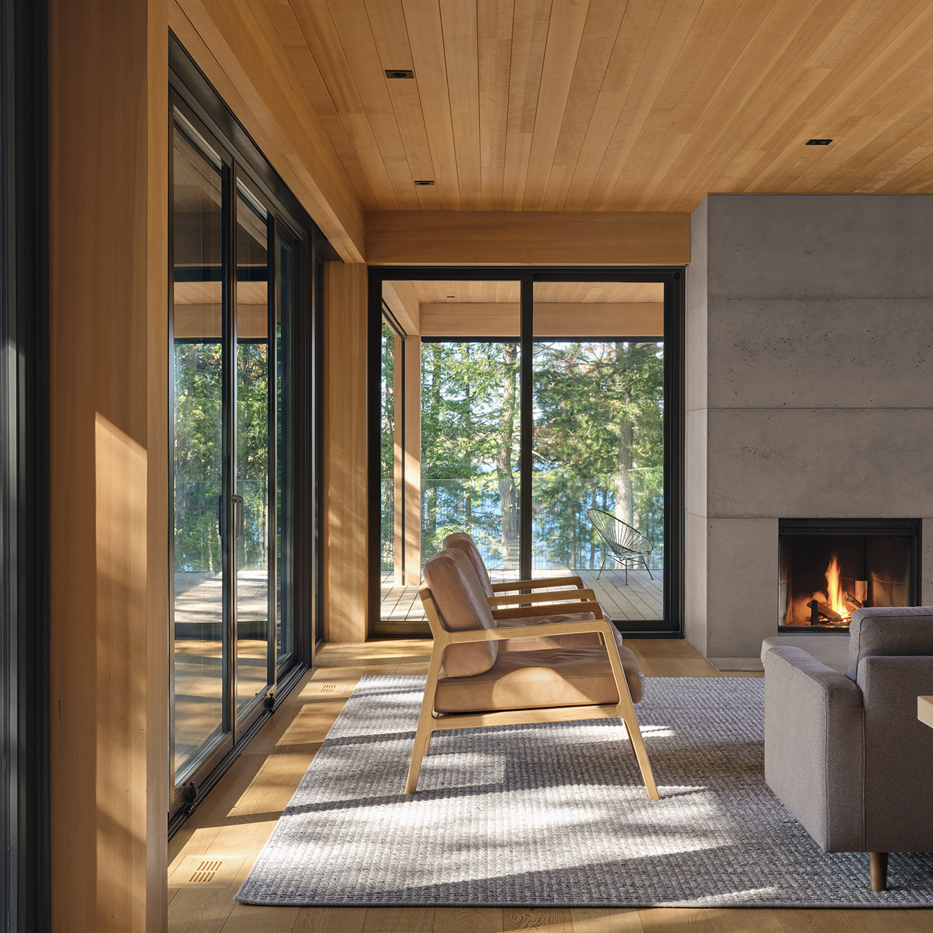
18. Keep Window-Side Seating Visually Open
Credits: Instagram
Two chairs with open wood frames keep this window-lined seating area feeling light. Their narrow arms and raised seats leave the floor and parts of the view visible, while tan cushions bring softness to the angular room.
Try this approach when adding seats beside large windows: compare the silhouette, including the back, rather than judging only the upholstery. Leave space behind the chairs to reach doors and move around the group.
Here, the pale frames relate to the wood ceiling and floor, while the gray sofa provides a quieter contrast. Position a matching pair together for a deliberate arrangement, then check the view from your sofa.
Lower, open furniture can preserve sightlines without leaving that side of the room empty.
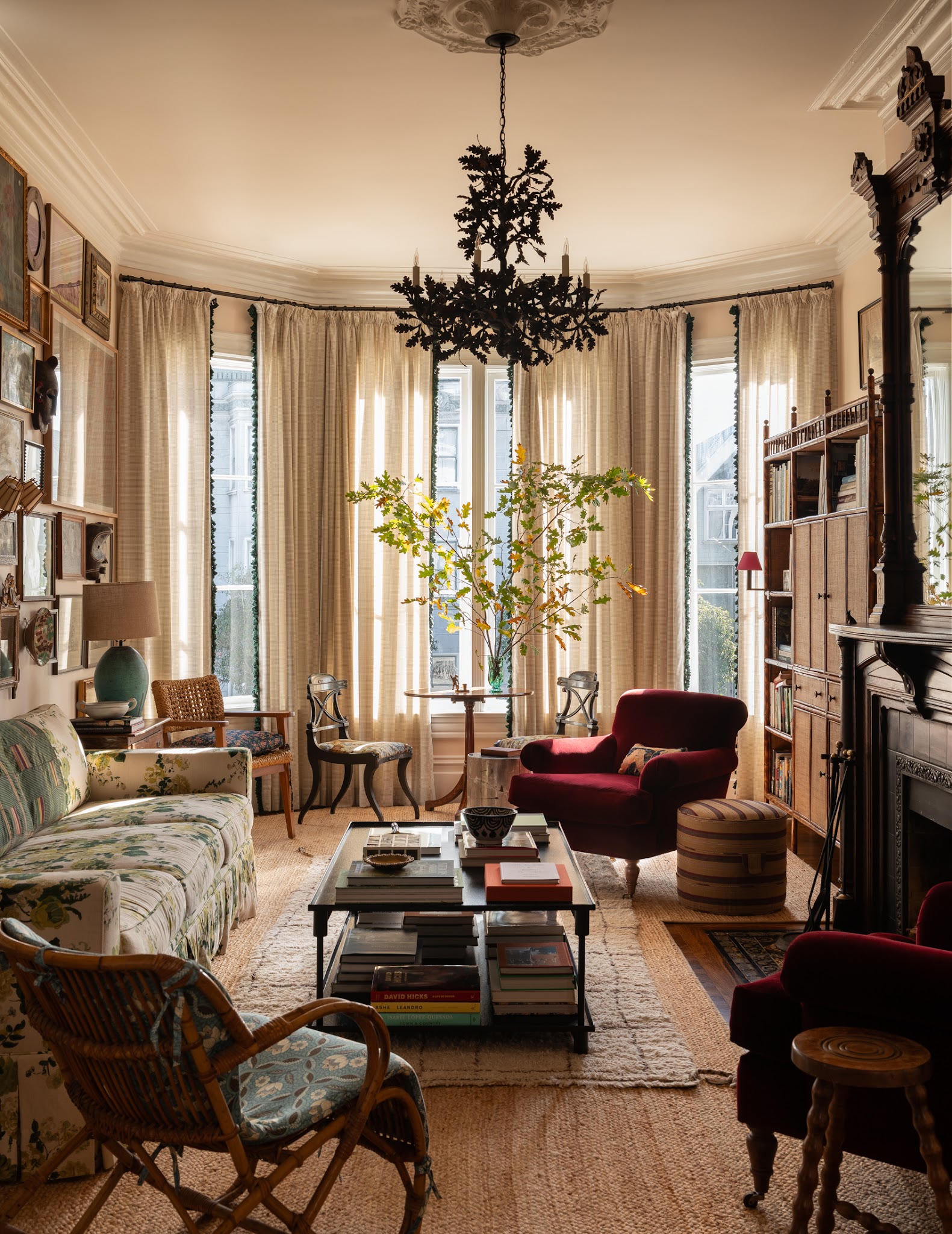
19. Balance a Floral Sofa With Solid Armchairs
Credits: Instagram
A floral sofa brings movement to Heidi Caillier’s living room, while solid burgundy armchairs provide generous areas of uninterrupted color. That balance lets the printed upholstery remain a feature within a richly layered setting.
If you love a patterned sofa, compare it with plain fabrics for the neighboring chairs before adding more prints.
Choose a solid with enough depth to hold its own beside the pattern, then view the samples together in your room’s daylight. Here, cream curtains and pale rugs give the arrangement a lighter backdrop.
Smaller patterned seats and a striped stool add variety at a different scale. Keep the largest fabric choices clear in your plan first; accessories can follow once those main surfaces feel comfortable together.
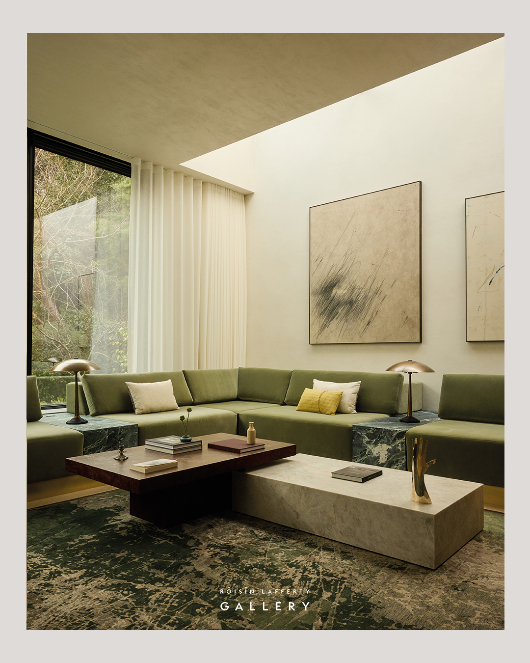
20. Pair Coffee Tables at Different Heights
Credits: Instagram
Two rectangular coffee tables create a layered center for the green seating in this room. A dark tabletop sits above a pale, veined block, giving the arrangement contrast without introducing another shape.
Try pairing tables with a shared outline but different heights and finishes. Check that their dimensions allow the intended overlap, and leave enough clear space around the combination to reach each seat comfortably.
Here, the long horizontal surfaces suit the wraparound sofa, while the darker table connects with the deep green blocks between seats. Keep accessories low and selective so both tabletops remain visible.
A few books and small objects are enough. Test the arrangement with your existing furniture before deciding whether one table or two works better.