
A room can feel lively without every surface competing for attention. Colorful Living Room Ideas work best when a few shades repeat across artwork, upholstery, rugs, and smaller accents, creating connection even when patterns are bold.
Try building a palette from a gallery wall, warming deep teal with coral, or pulling softer colors from a floral rug. Other approaches include draping a colorful quilt over a sofa or using dark paint to frame a pink chair.
These ideas make color feel considered while leaving room to mix patterns and personal favorites.
1. Build Color Around a Gallery Wall
Credits: Instagram
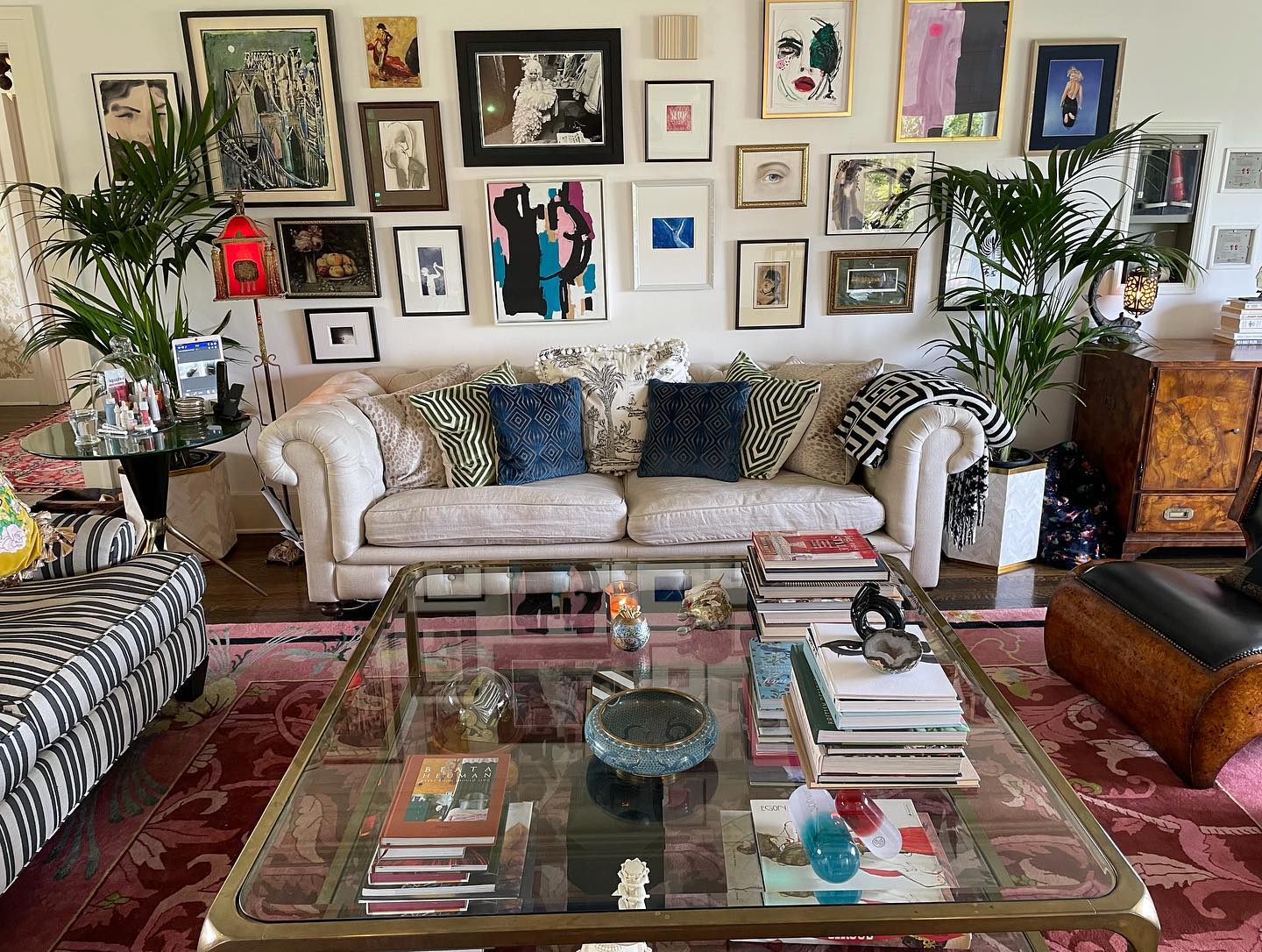
A neutral sofa gives this exuberant gallery wall room to shine. Pink, blue, and green appear in the artwork, then return in the rug, pillows, and tall plants.
Borrow that approach by choosing two or three colors from pieces you already love before shopping for accessories. Mix frame sizes and finishes, but leave visible wall space between them so each picture remains readable.
Below, striped upholstery and geometric pillows add structure to the looser arrangement overhead. A transparent coffee table keeps the pink rug visible through the center of the room.
Start your own display with the largest frame, arrange smaller works around it, and test the composition with paper templates before making holes in the wall behind your sofa.
2. Frame a Pink Chair With Dark Paint
Credits: Instagram
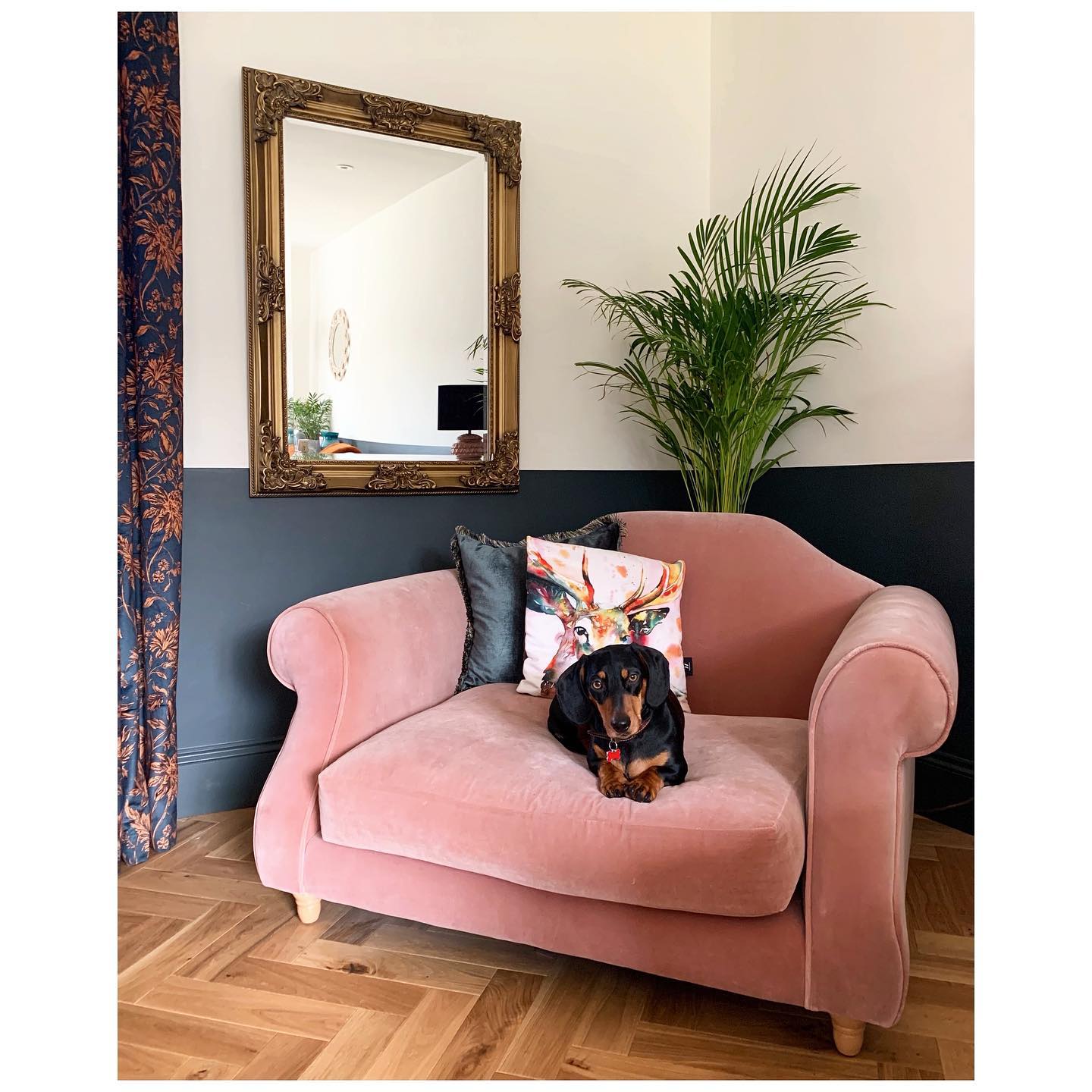
This blush chair stands out against a deep green lower wall, while the pale upper half keeps the corner feeling bright. A horizontal paint division is a useful way to introduce a strong color without covering every surface.
Position the line above your chair back so the darker shade frames the upholstery. The botanical curtain picks up warm pink tones, and a dark pillow connects the seat to its surroundings.
An ornate gold mirror adds another warm note without introducing a competing paint color. For a similar corner, choose one generous chair, one patterned pillow, and a tall plant.
Check the paint boundary from across the room before taping, especially where it turns the corner or meets existing window trim.
3. Warm Deep Teal With Coral Accents
Credits: Instagram
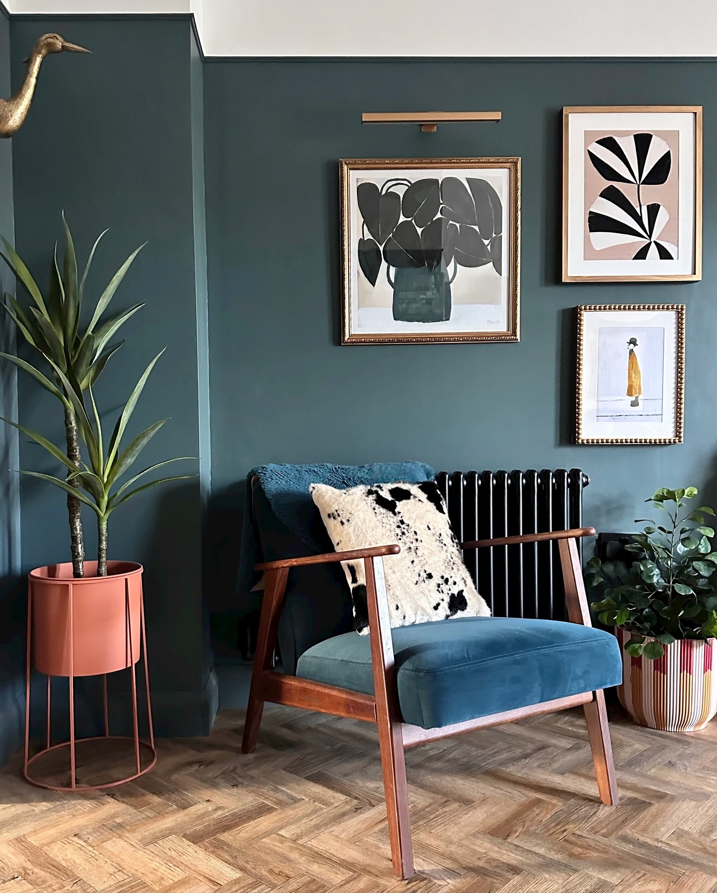
Deep teal walls and a blue upholstered chair create a quiet color connection in this seating nook. The coral plant stand supplies the warm contrast that makes those cool shades feel more lively.
Try the pairing in a small area first: a painted wall, a favorite chair, and one colorful planter can establish the scheme. Here, black and white artwork and a spotted pillow introduce crisp shapes without multiplying the palette.
Gold picture frames and warm brown furniture tones add further variation. Hang a compact group of pictures above the chair, leaving enough space around the arrangement to appreciate the wall color.
Raise one plant and keep another low to soften the furniture outline at different heights throughout the corner.
4. Refresh a Sofa With a Colorful Quilt
Credits: Instagram
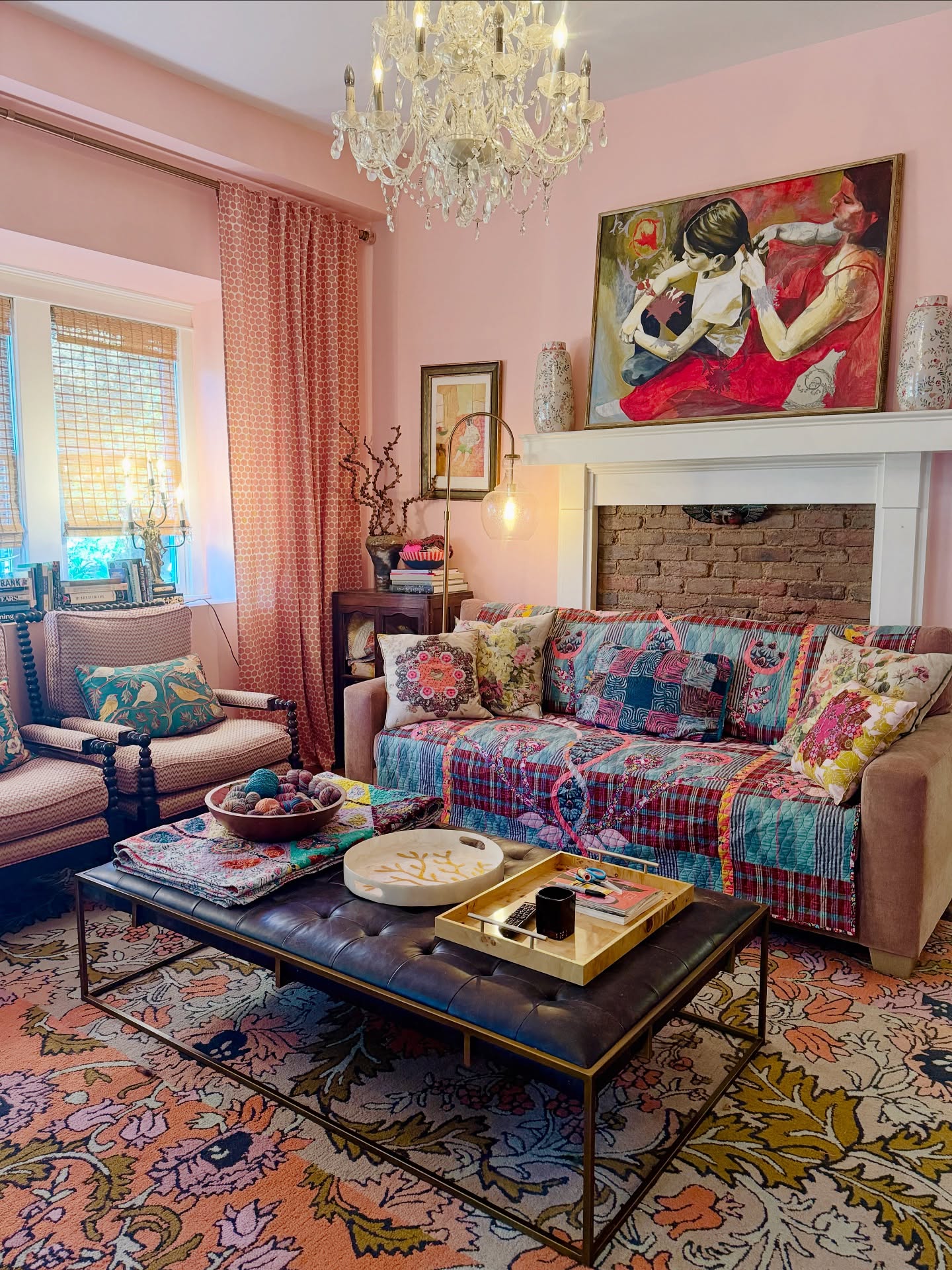
A bright quilt turns this sofa into the room's colorful centerpiece, bringing turquoise, pink, and red into a soft pink setting. Draping a patterned textile over existing upholstery offers an approachable way to test a bolder palette.
Choose one large enough to cover the seat comfortably, then tuck it securely where cushions meet. The floral pillows echo colors in the quilt, while smaller patterns on the chairs and curtains keep the combination varied.
A dark upholstered table gives the busy textiles a solid visual pause. Use a tray on a similar surface to hold everyday essentials together.
Keep a little of the sofa's plain upholstery exposed at the arms so the layered fabrics have a clean edge around their color.
5. Pull a Soft Palette From a Floral Rug
Credits: Instagram
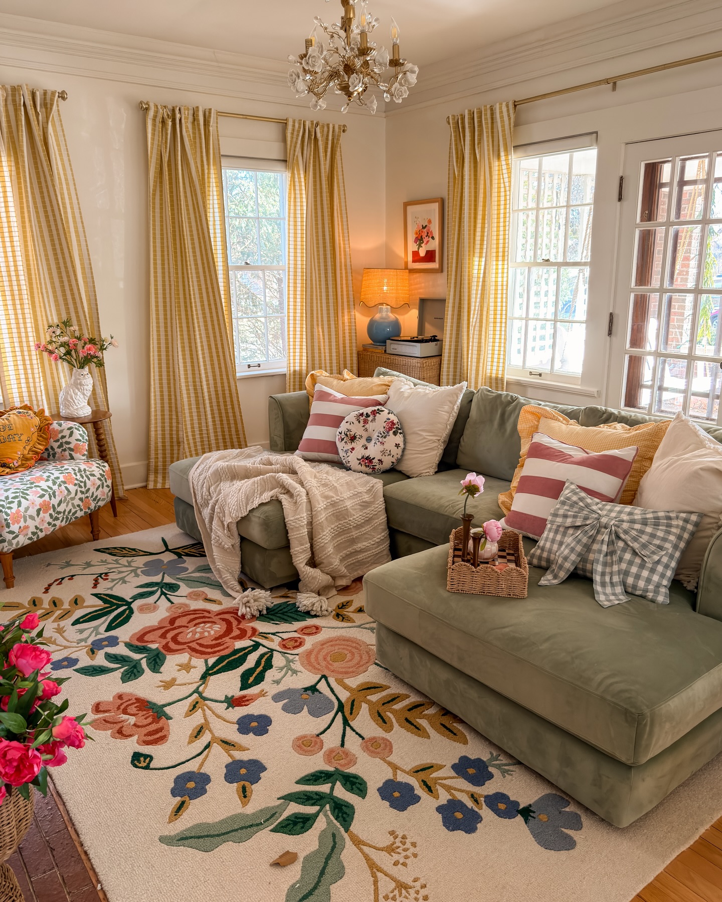
The oversized flowers on this rug provide a ready palette for the seating area. Their leafy greens connect with the sage sectional, while warm yellow curtains and pink striped pillows repeat smaller notes underfoot.
When a rug contains several colors, choose a quieter shade for the largest upholstered piece and save brighter accents for textiles you can change easily.
White pillows and a cream throw create breathing room among the florals, stripes, and checks. Notice how the blue lamp adds another rug color at eye level.
Before buying accessories, photograph your rug in daylight and compare samples beside it. Keep curtain patterns simple enough to read from across the room, particularly when the floor already features a large floral design.
6. Mix Bold Patterns at Different Scales
Credits: Instagram
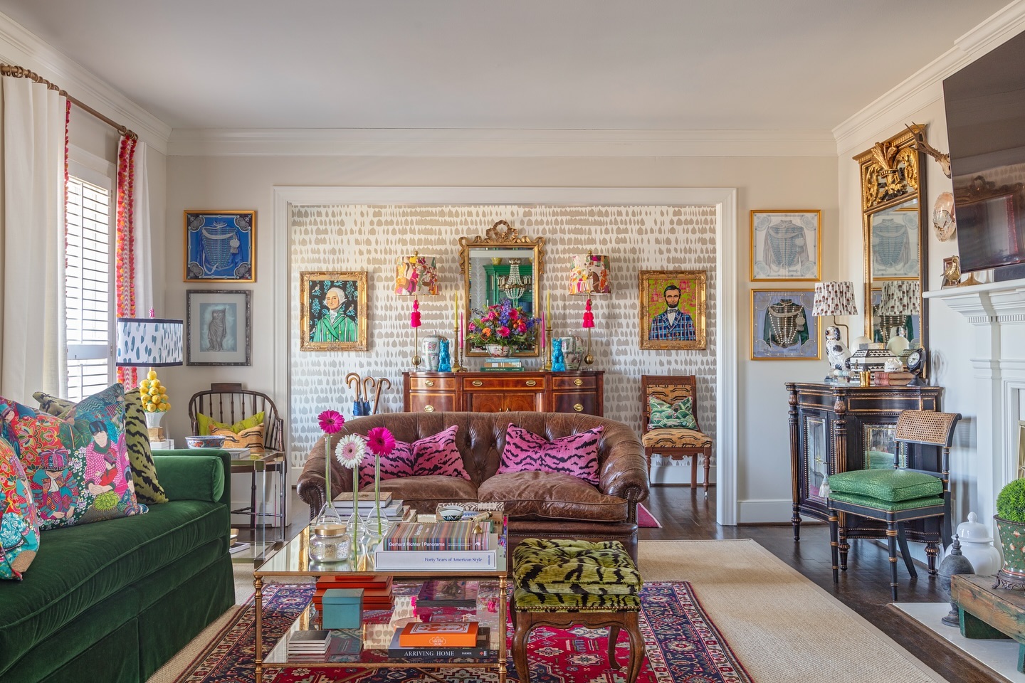
Pink animal print pillows, a red patterned rug, and an emerald sofa bring color to this layered living room. The combination works because the patterns vary in size and occupy separate surfaces.
Smaller marks on the rear wall provide texture behind larger portraits, while the solid brown sofa gives the eye somewhere quieter to settle.
To try this mix, start with one patterned rug and one solid sofa, then introduce pillows that repeat a color already present. The green chair across the room extends the sofa's color beyond the main seating group.
Keep larger furniture silhouettes easy to distinguish, and distribute your strongest accents across the space. A few pink flowers can connect distant pieces without requiring another furniture purchase.
7. Repeat Artwork Colors in Your Seating
Credits: Instagram
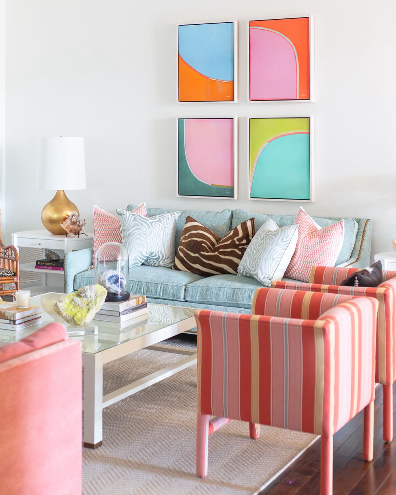
Four bright abstract paintings set the direction for this living room, combining pink, orange, turquoise, and green within a tidy grid. Their simple arrangement gives the strong colors a sense of order.
Below, a pale blue sofa and coral striped chairs translate the artwork into larger, softer surfaces. You can borrow the idea with a coordinated print series or pieces that share a few hues.
Keep frame sizes and spacing consistent, then choose upholstery from the calmer colors in the art. White walls, pale furniture, and a light rug preserve plenty of visual breathing room.
A brown striped pillow introduces a deeper note at the center of the sofa, helping the pastel seating feel grounded beside the brighter framed shapes.
8. Turn the Fireplace Into a Color Feature
Credits: Instagram
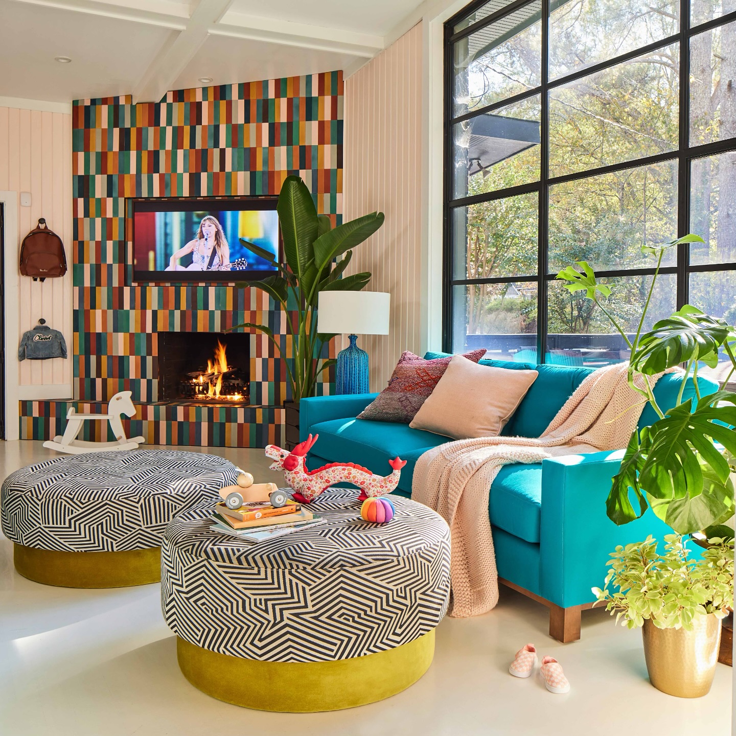
Narrow tiles in teal, orange, yellow, pink, and darker shades transform this fireplace wall into a focal point. The turquoise sofa repeats one of those hues, while pale walls and flooring keep the surrounding space open and bright.
For a similar project, lay out tile samples together before installation so you can judge the balance of light and dark colors. Carrying the pattern onto the hearth makes the feature feel continuous.
Black and white patterned ottomans introduce another graphic element without adding more competing hues. Their rounded shapes also soften the many straight lines around the fireplace and windows.
If permanent tile feels like a large commitment, begin by echoing this palette through removable textiles and artwork near your fireplace.
9. Pair Pale Yellow With Powder Blue
Credits: Instagram
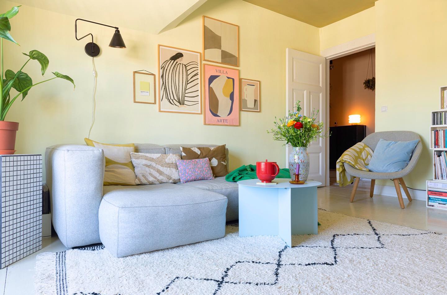
Soft yellow walls give this living room a sunny backdrop without overwhelming its pale gray seating.
A powder blue coffee table and matching chair pillow add a gentle cool contrast, while a red mug and green throw provide concentrated flashes of brighter color.
This is a useful approach when you want a colorful room with calm furniture. Choose two pale shades for the broadest surfaces, then introduce stronger accents in smaller, movable pieces.
The framed prints connect pink, yellow, and muted earthy tones above the sofa. Keep their spacing generous enough to show the wall color between them.
A mostly light rug with thin dark lines helps define the seating area while allowing the table and accessories to hold attention.
10. Brighten a Neutral Sofa With Yellow
Credits: Instagram
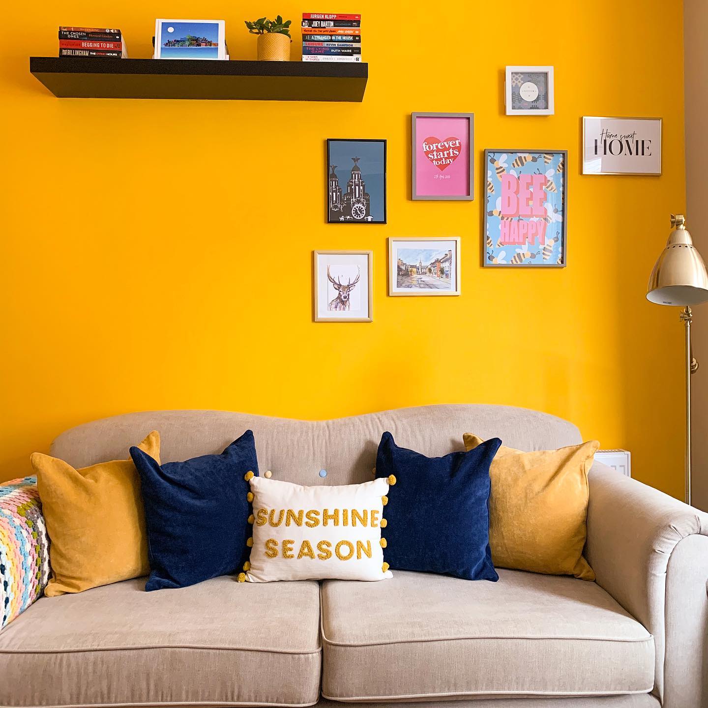
A saturated yellow wall brings energy to this otherwise simple sofa arrangement. Navy pillows provide a strong counterpoint, and mustard pillows repeat the wall color in a softer shade.
Keeping the sofa pale allows both colors to stand out clearly. Try this scheme on the wall behind your main seating, testing a generous paint sample under daylight and evening lighting before committing.
The black floating shelf creates a firm horizontal line, while a loose cluster of framed prints adds pink and blue details. Leave some yellow wall exposed around the display so it remains part of the design.
A multicolored throw at one arm offers an easy way to introduce extra shades without changing the central navy and yellow pairing.
11. Let a Floral Rug Show Through a Clear Table
Credits: Instagram
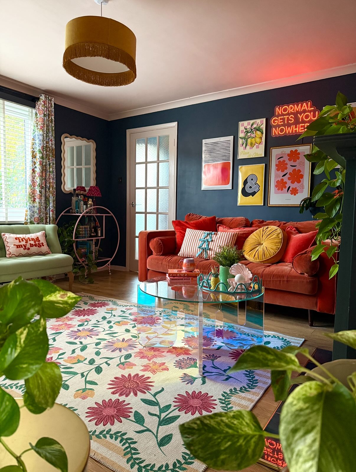
A floral rug spreads pink, yellow, green, and purple across this living room, while a transparent coffee table keeps the pattern visible. The red sofa and dark blue walls provide substantial blocks of color above it.
Borrow this approach when a rug is the piece you most want to show off. Choose a table with a clear top or open base, then keep its styling compact enough to see the design underneath.
Pull two rug colors into pillows before adding more accessories. Clear furniture still needs careful placement, especially along walking routes, so check where its edges meet the seating.
A few leafy plants connect the floral pattern to the rest of the room without requiring another large furniture purchase.
12. Carry Pink From Built-Ins to the Ceiling
Credits: Instagram
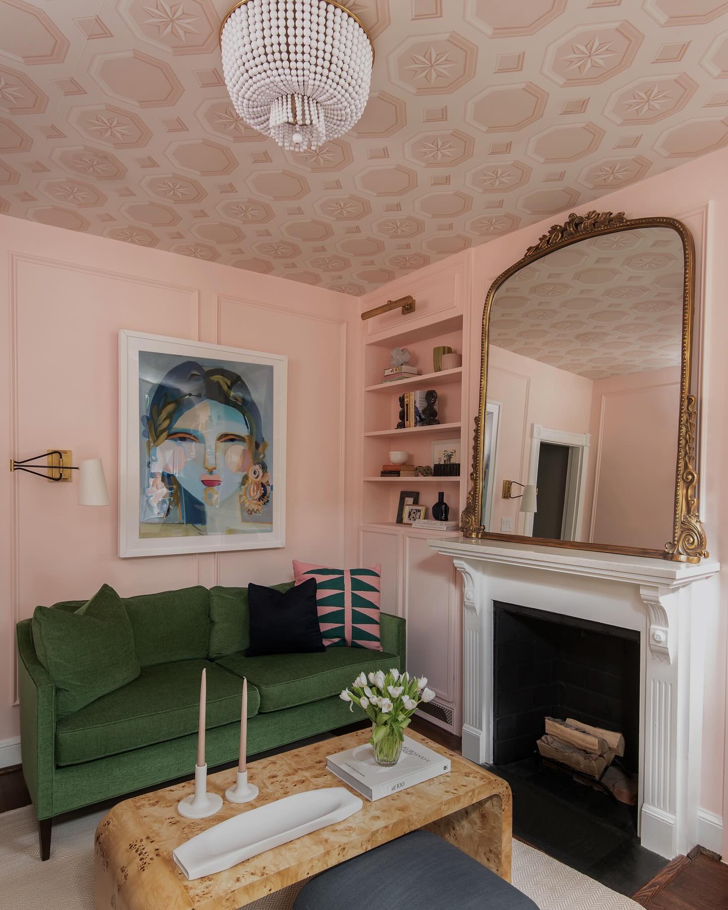
Pink walls and matching built-ins wrap this small sitting room, while pale patterned ceiling paper draws attention above the green sofa. The white fireplace offers a pause between those layers.
For a similar effect, paint shelving and surrounding walls the same shade so storage feels integrated instead of added on. Choose ceiling paper with a background related to the wall color, then test a generous sample overhead before ordering.
Patterns look different viewed horizontally, particularly around lights and molding. Keep the main seat in one contrasting color and let smaller textiles repeat both shades.
The room also shows how low tables and tucked-away stools preserve useful space in a compact layout, allowing decorative surfaces to provide most of the personality.
13. Use Patterned Curtains to Connect the Palette
Credits: Instagram
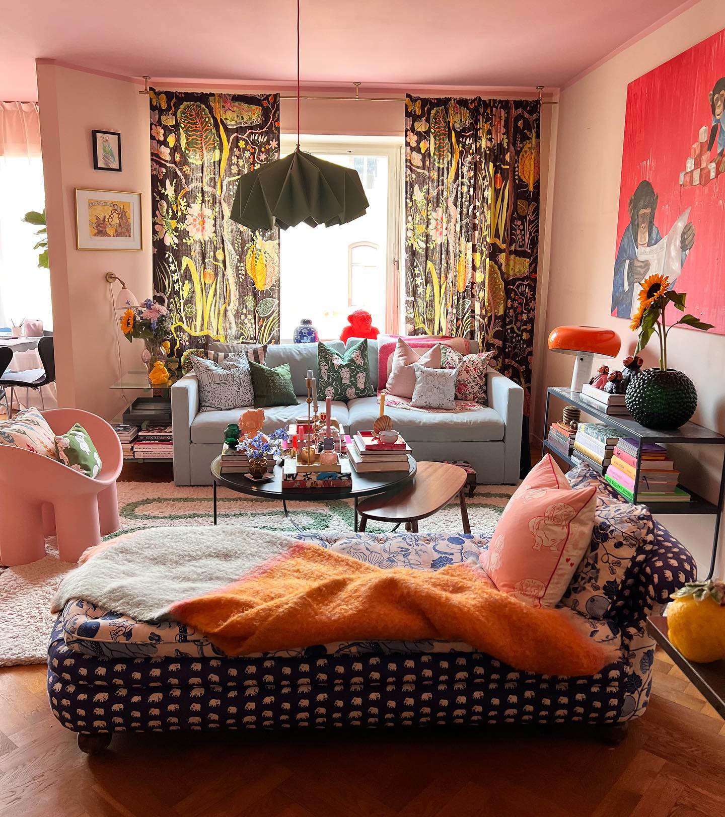
Tall patterned curtains bring yellow, pink, and green into this room, connecting the pink ceiling with the colorful seating and oversized red artwork. Their dark background gives all those warmer shades definition.
Treat curtains as a palette guide when your furniture already mixes several colors. Look for fabric that repeats two existing shades rather than trying to match every object.
Hang the panels high and leave room for them to stack beside the glass, keeping daylight available when they are open. Order a fabric sample large enough to judge the full repeat.
With expressive curtains in place, a quieter sofa gives the eye a resting spot, while a smaller patterned seat can add another layer without taking over the room.
14. Give Dark Walls an Oversized Pink Accent
Credits: Instagram
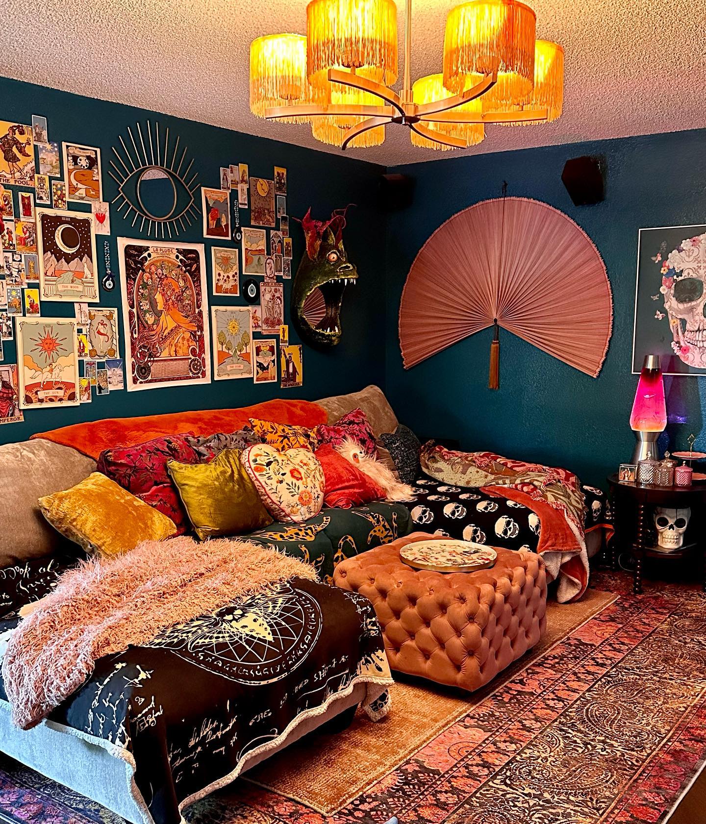
An oversized pink fan creates a clear focal point on the dark blue wall in this living room. Its simple silhouette balances the detailed artwork and patterned textiles nearby.
Consider one large, colorful wall object when a small collection of accessories would disappear against saturated paint. A fabric panel, woven piece, or sculptural decoration can provide the same broad area of color.
Measure the wall and make a paper template before choosing the size, leaving space around switches and adjacent furniture. Repeat a little of the accent shade in a pillow so the object feels connected to the seating.
Keep its mounting appropriate for the weight and wall type, particularly above a place where people will sit or stretch out.
15. Warm Dark Walls With Rust and Gold
Credits: Instagram
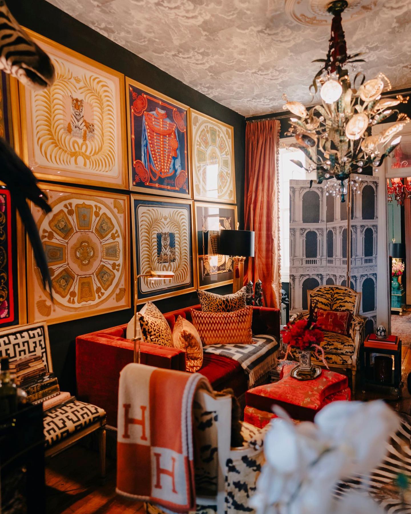
Rust upholstery, warm curtains, and golden picture frames brighten this densely layered living room without requiring pale walls. The dark background makes those warm elements read as a connected group.
Use this idea to bring color into a room that already has charcoal or deep green paint. Begin with one rust chair, then repeat its warmth in a curtain, pillow, or lampshade on the opposite side.
Gold-toned frames can connect varied artworks, even when the pictures themselves have different palettes. Keep pathways clear around extra seating and select small tables that are easy to reach.
Before buying a large textile, hold the sample beside your wall after sunset, when warm bulbs can make orange and gold appear considerably stronger together.
16. Repeat Botanical Wallpaper on a Small Surface
Credits: Instagram
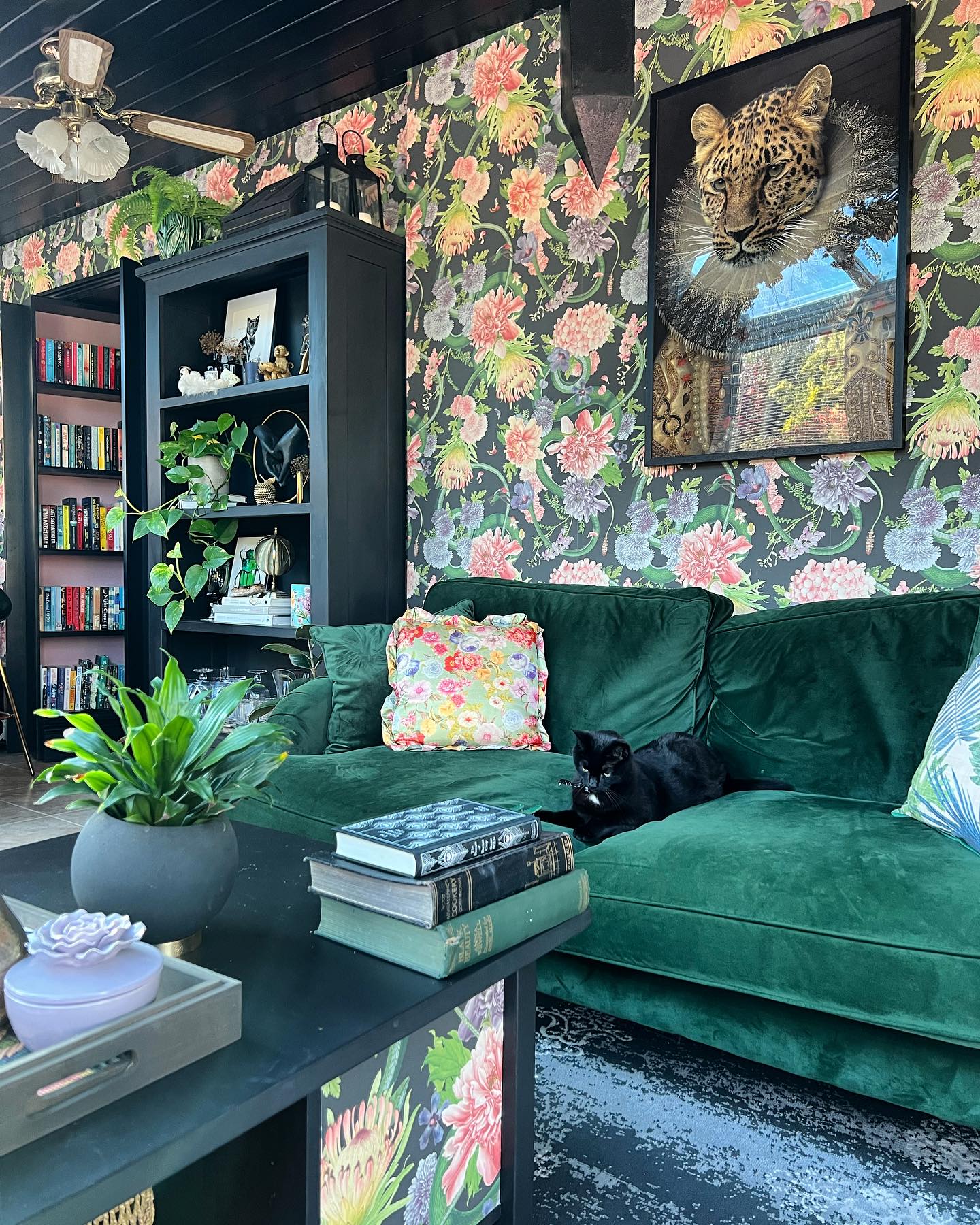
Floral wallpaper supplies the pink, yellow, and green accents in this living room, while a matching panel on the coffee table brings the pattern lower.
Deep green seating and dark shelving keep the surrounding furniture coordinated. Repeating a wall pattern on one smaller surface can make an ambitious print feel intentional.
Try a removable panel, tray liner, or furniture insert before covering an entire piece. Choose a surface that will not interfere with drawers, hinges, or everyday cleaning, and protect paper wherever moisture or wear is likely.
Echo one flower color in a pillow, then let the larger upholstery stay solid. Real plants reinforce the botanical theme, but leaving some shelf space open keeps their leaves distinct from the wallpaper.
17. Pair an Orange Sofa With Blue Walls
Credits: Instagram
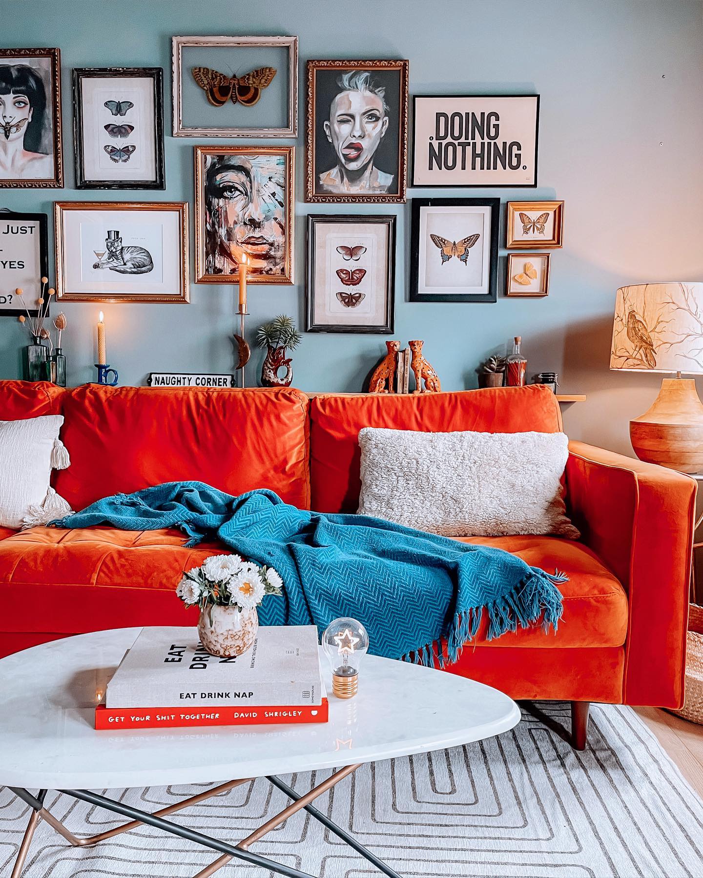
An orange sofa stands out against the blue wall in this living room, and a blue throw carries the cooler color onto the seat. White pillows and a light coffee table soften the strong contrast.
For a straightforward colorful scheme, choose two contrasting colors and decide which will cover the largest area. If the sofa is already orange, test several blue paint samples beside it in daylight and lamplight.
Avoid choosing from a screen alone, since undertones can change the result noticeably. Repeat each color once beyond its main surface, then use lighter neutrals for the remaining large pieces.
Artwork can introduce smaller variations while keeping the room focused, particularly when frames stay within a limited range of finishes throughout.
18. Build on Two Shades of Green
Credits: Instagram
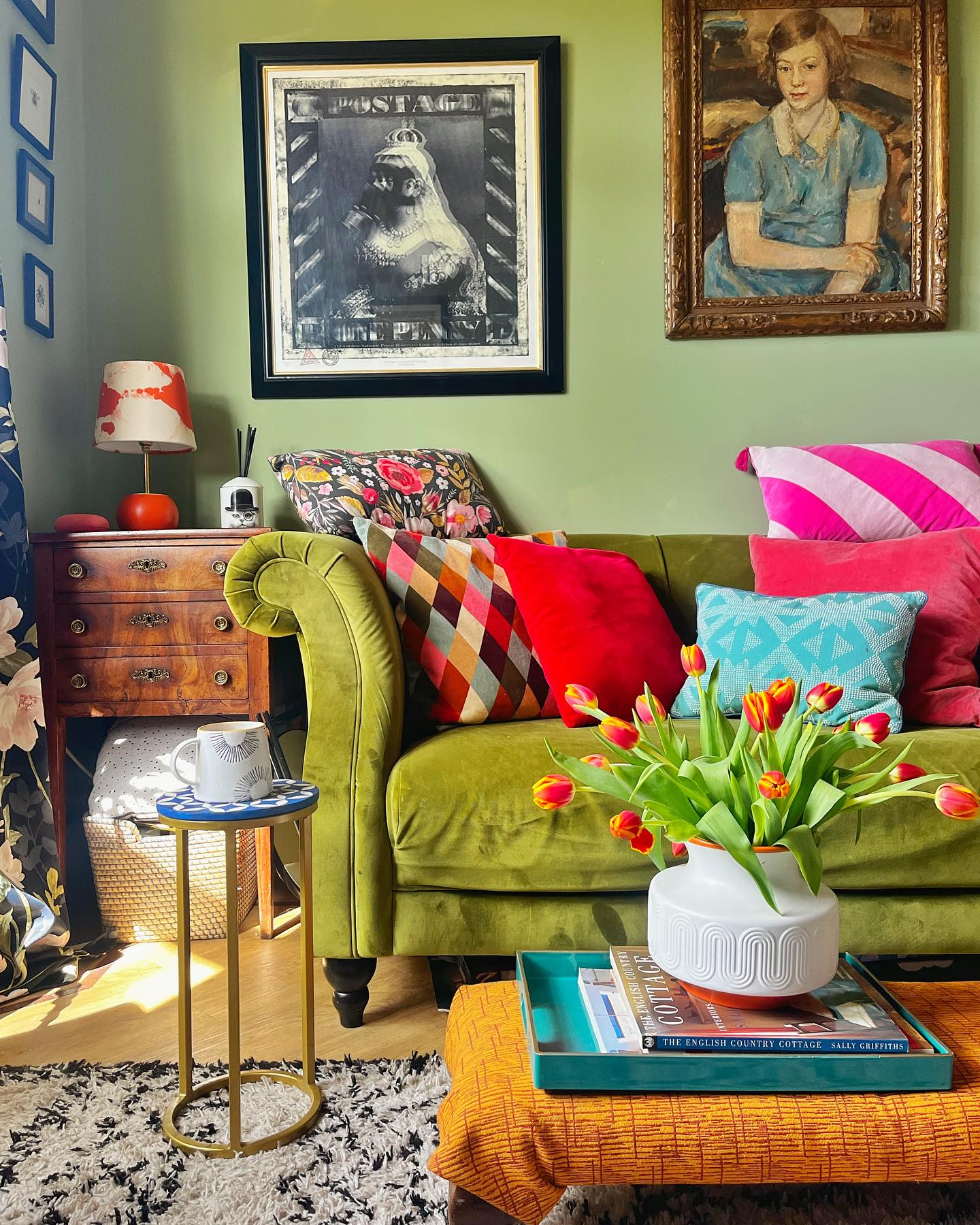
The green sofa and green wall make a generous backdrop for pink, red, and turquoise pillows in this living room. A mustard ottoman adds another warm note without competing with the seating's scale.
Use related greens for the larger surfaces, then introduce brighter colors through pieces that are easy to change. Combine a bold stripe, a smaller geometric, and a solid pillow so each pattern has room to register.
Check that the inserts leave enough space for someone to sit comfortably rather than lining the entire sofa with cushions. Repeat one accent in flowers or a small tray, keeping the surrounding wood furniture visible.
This balance lets a lively collection of textiles feel anchored by the larger, steadier green areas.
19. Arrange a Color Sequence Along a Sectional
Credits: Instagram
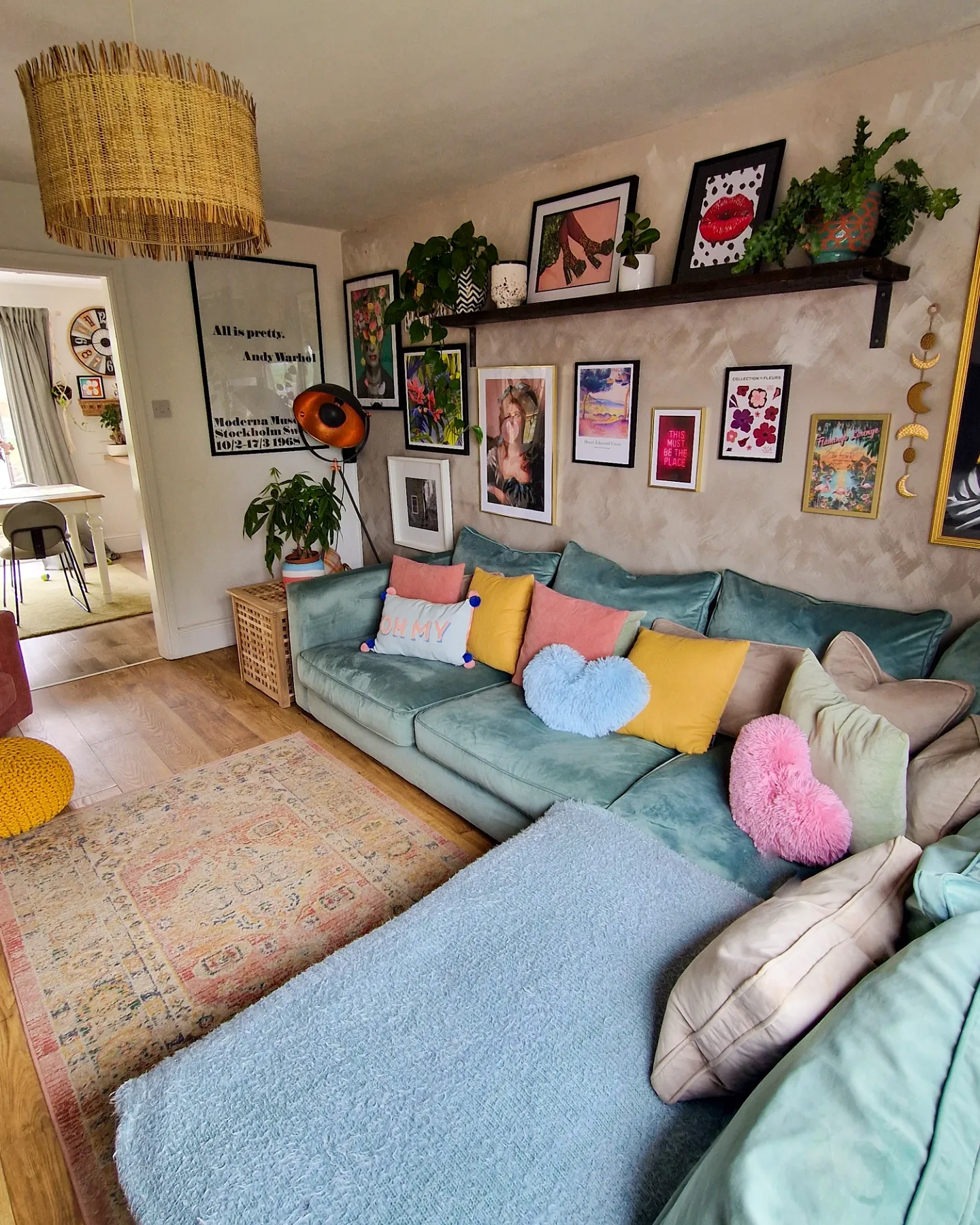
Pink, yellow, pale blue, and sage pillows brighten the long blue-green sectional in this living room. Their spread across the corner gives the large sofa a gentle rhythm rather than one crowded accent cluster.
Try arranging pillow colors in a loose sequence, repeating a shade near each end to connect the full seat. Mix ordinary square covers with one or two shaped cushions if you enjoy a playful touch.
Keep enough uncovered upholstery for daily lounging, and test the arrangement from the room's entrance instead of only standing beside it. The pale rug and light walls keep the palette soft, while framed artwork extends the color upward.
This is a practical starting point when painting or replacing furniture is unnecessary.
20. Balance a Teal Sofa With Coral Curtains
Credits: Instagram
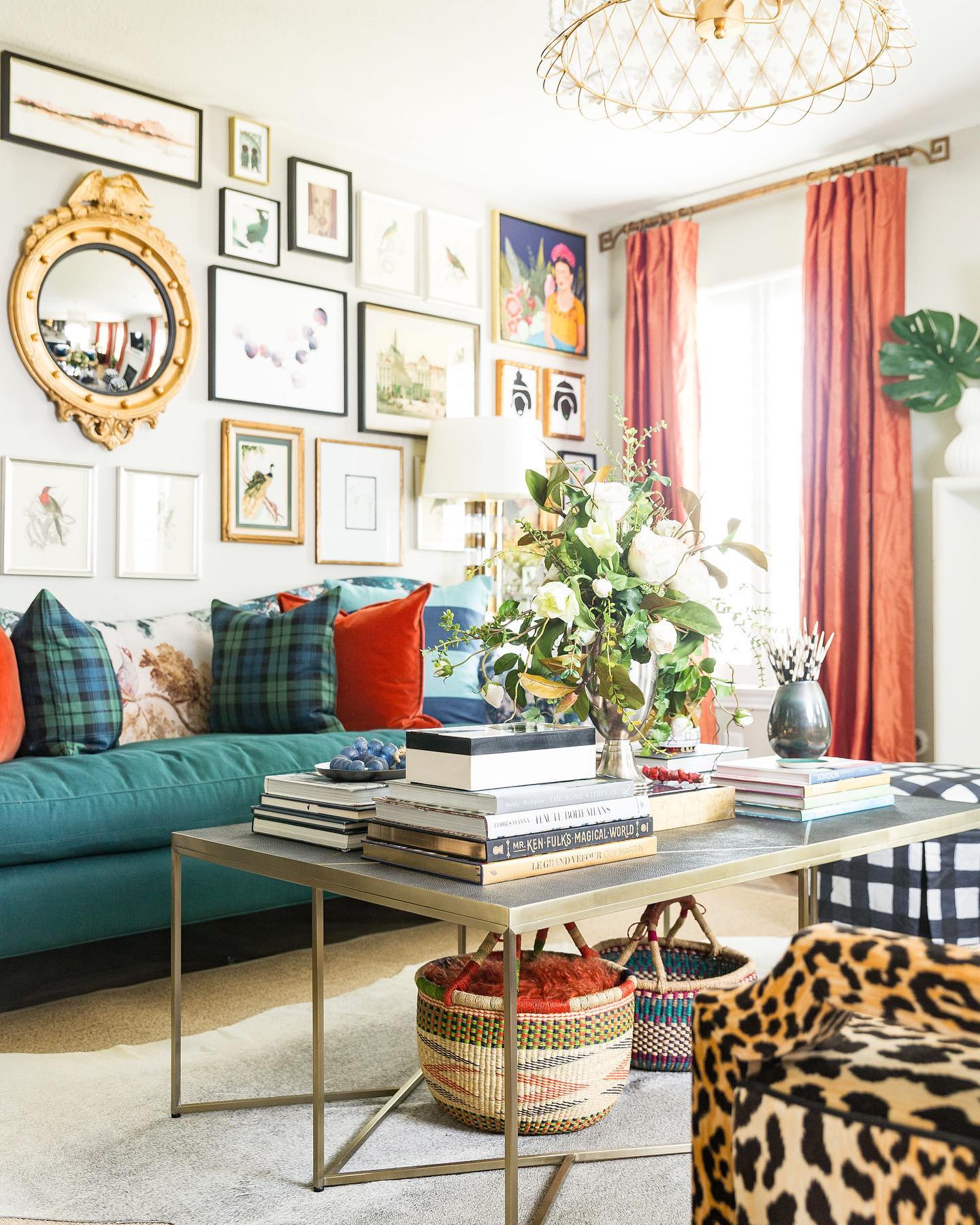
Coral curtains bring warmth to the teal sofa in this living room. White walls, a pale rug, and a slim coffee table leave breathing room around both colors, while plaid pillows and a patterned chair add smaller details.
Use curtains as the second major color when a statement sofa already anchors your space. Choose a warm shade with a similar depth to the upholstery, then compare fabric samples together beside the window.
Panels should remain easy to open fully, especially where the seating sits close to the glass. Repeat a little coral in a pillow or artwork to connect the window with the sofa.
Keeping the main background light makes it easier to enjoy contrasting colors without filling every surface.