
Dark walls can make a living room feel cozy, but they also make contrast and texture matter more.
The Best Dark Living Room Ideas show how warm neutrals can soften navy, a pale ceiling can frame charcoal walls, and artwork can stand out against a deep backdrop.
You’ll also find ways to balance bold color with varied wood finishes, reflective accents, open furniture frames, and breathing room on shelves.
These practical combinations help dark paint feel considered rather than crowded, while making the most of pieces and finishes you may already have.
Warm Green Walls with Mixed Wood Finishes
Credits: Instagram
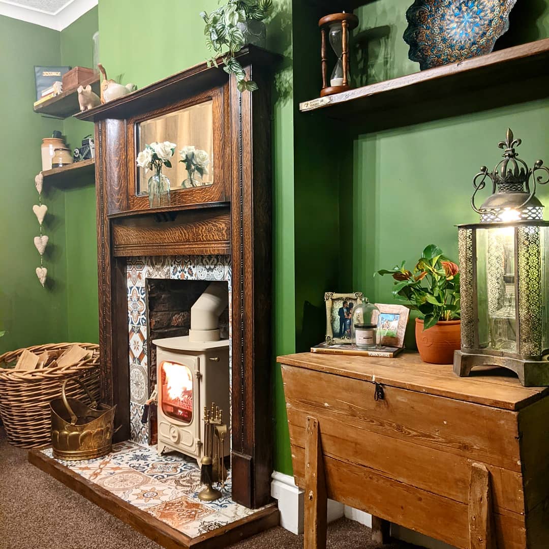
The dark wooden mantel gives this green room a strong center, while a lighter cabinet and open shelves keep the wood from feeling too uniform.
Their different brown tones bring out the warmth in the paint. Patterned fireplace tiles add detail between those larger surfaces, so the shelves can stay fairly simple.
Try this approach with wood furniture you already own before buying matching pieces. Repeat one warm tone in two places, then let the other finishes vary.
A few pale flowers or ceramics will show up clearly against the green.
Leave visible wall around each shelf arrangement; filling every gap would hide the color and make this already detailed fireplace corner feel crowded, especially beside a substantial carved mantel.
Layer Warm Neutrals Against Navy Walls
Credits: Instagram
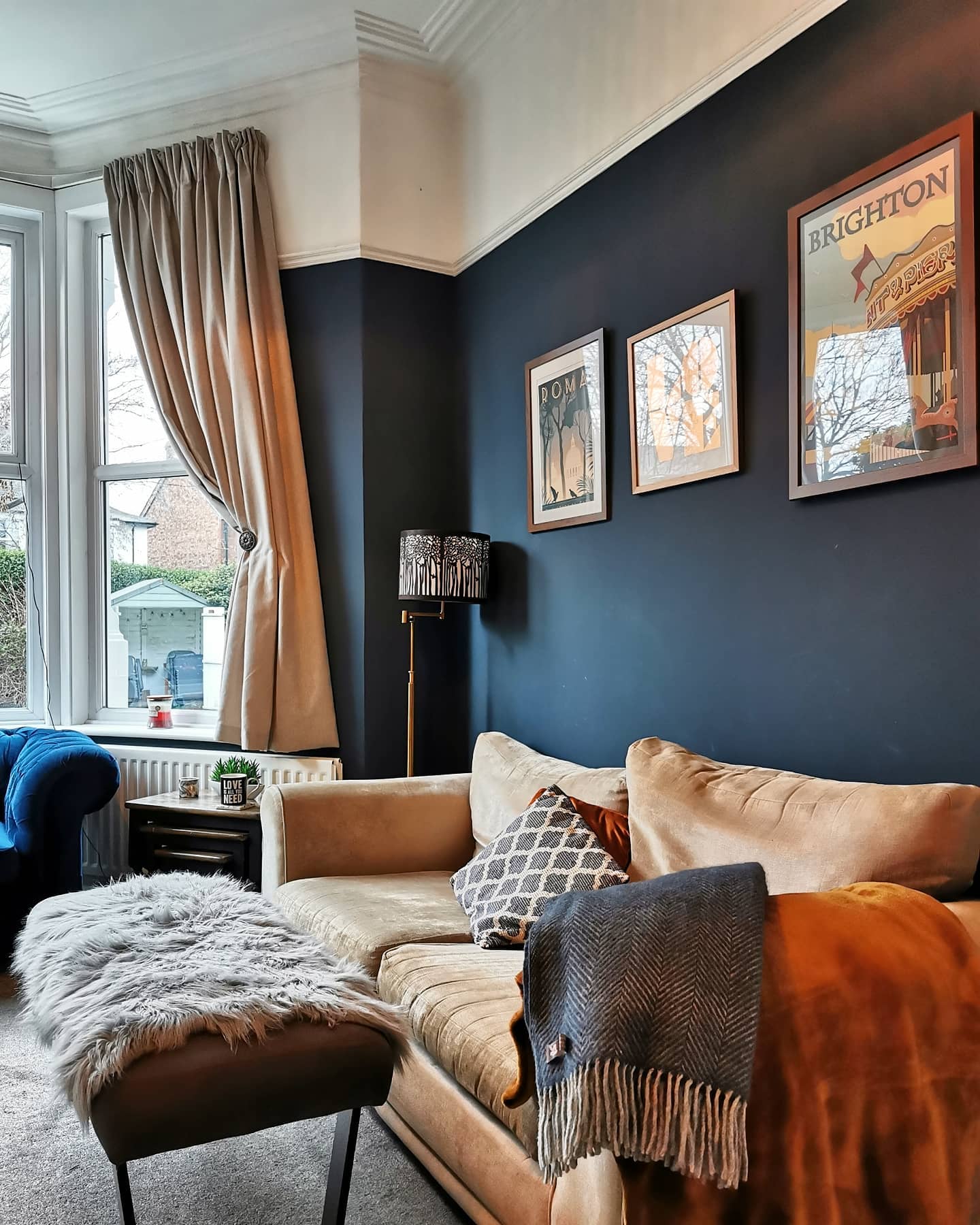
A pale tan sofa stands out against this navy wall without creating the sharp contrast of bright white.
Beige curtains carry that warmth upward, while rust cushions, a gray fringed throw, and a fluffy footstool cover make the seating feel inviting. The colors stay related, but the surfaces vary enough to keep the arrangement interesting.
Start with the largest fabric you plan to keep, then compare curtain and pillow samples beside it in daylight and lamplight. Choose one deeper accent, such as the rust shown here, rather than adding several competing colors.
Keep a section of the sofa uncovered so its shape remains clear. Too many throws can swallow a small seat and turn comfortable layering into constant daily rearranging.
Keep the Ceiling Light Above Charcoal Walls
Credits: Instagram
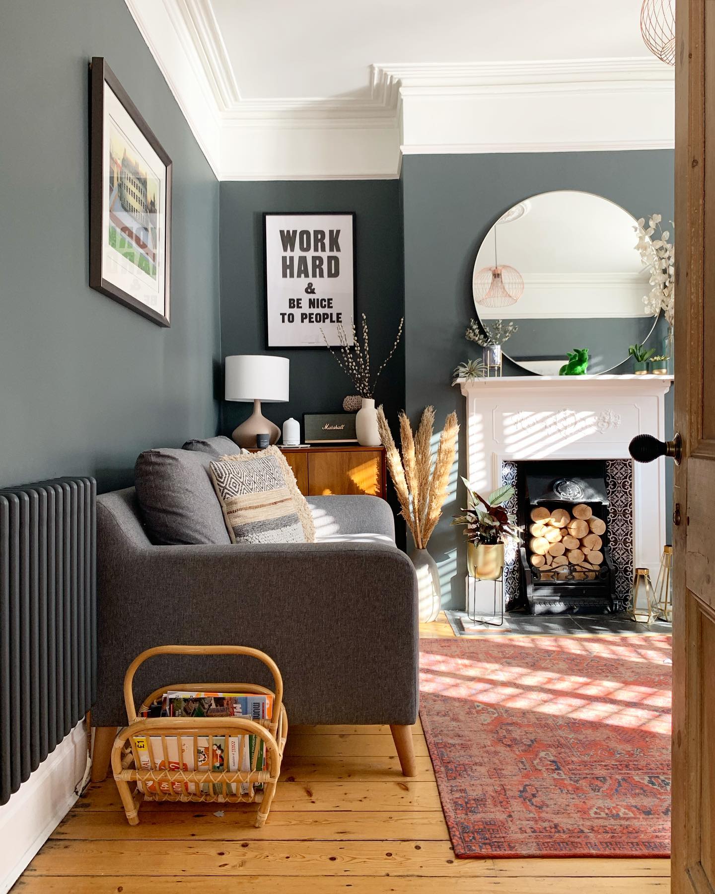
The pale ceiling and broad crown molding form a bright border above these charcoal gray walls. That clear edge draws attention to the room's height, while the white fireplace repeats the lighter color farther down.
A round mirror reflects part of the ceiling, helping the contrast appear on another surface. For a similar result, keep the ceiling, molding, and upper trim in closely related whites, then test your wall color directly beneath them.
A stark white can look noticeably cooler beside a warm gray. Take time with the paint line because this contrast makes uneven edges easy to see.
Use a small brush around molding details, and check the boundary from the doorway before putting your furniture and artwork back.
Arrange Varied Artwork on a Dark Backdrop
Credits: Instagram
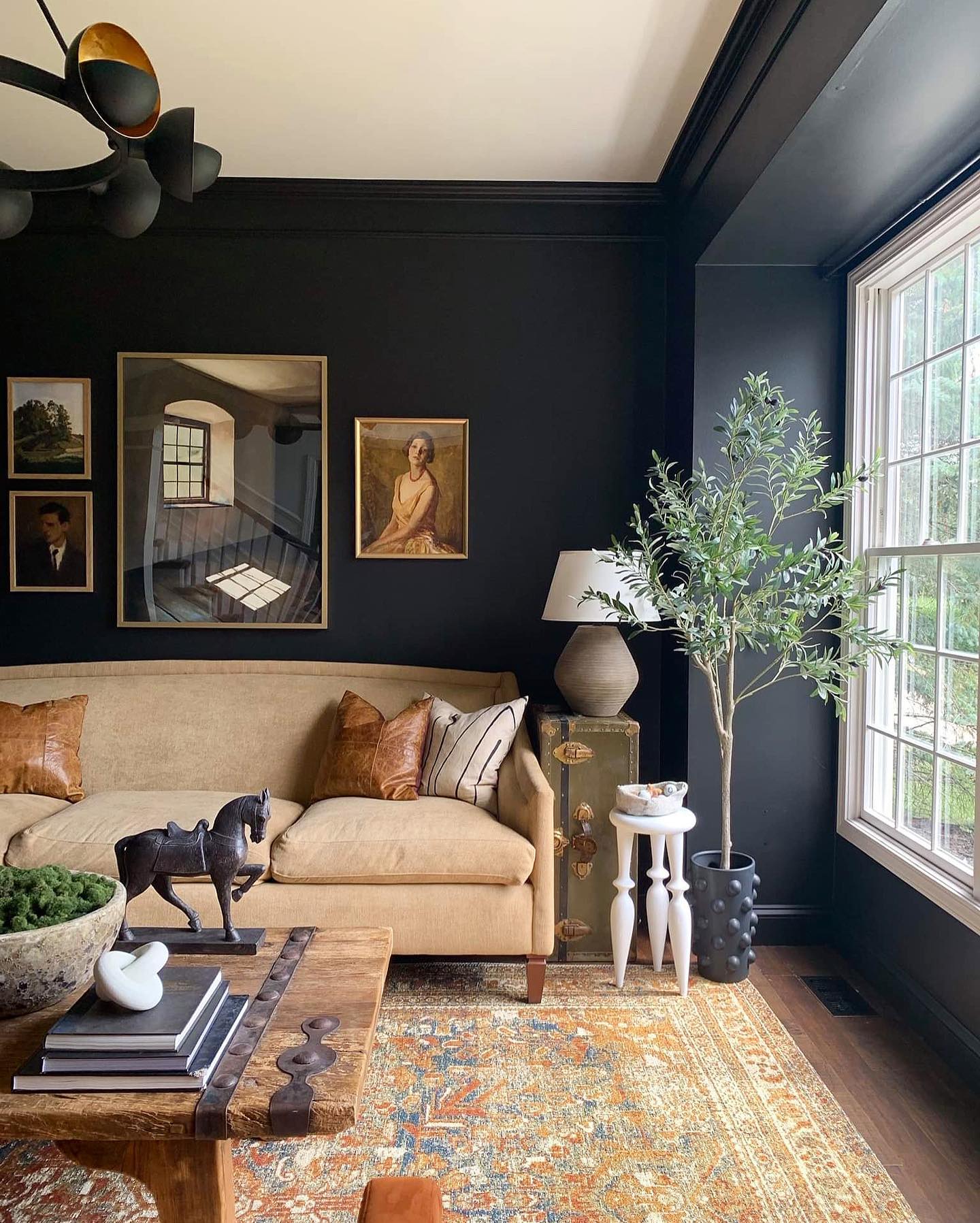
Four pictures above the sofa give this nearly black wall a clear focal point. The largest piece anchors the arrangement, with two smaller pictures stacked on one side and a portrait balancing the other.
Warm frames separate the artwork from the dark paint without requiring identical sizes or subjects. Lay your selection on the floor first, starting with the biggest piece.
Keep the gaps reasonably consistent and check the overall width against the furniture below. Here, generous empty wall above the frames keeps the grouping from competing with the crown molding.
Dark paint makes pale images especially noticeable, so balance the lightest pictures across the arrangement. Paper templates help test the layout before making holes in a freshly painted wall.
Put the Boldest Pattern on the Ceiling
Credits: Instagram
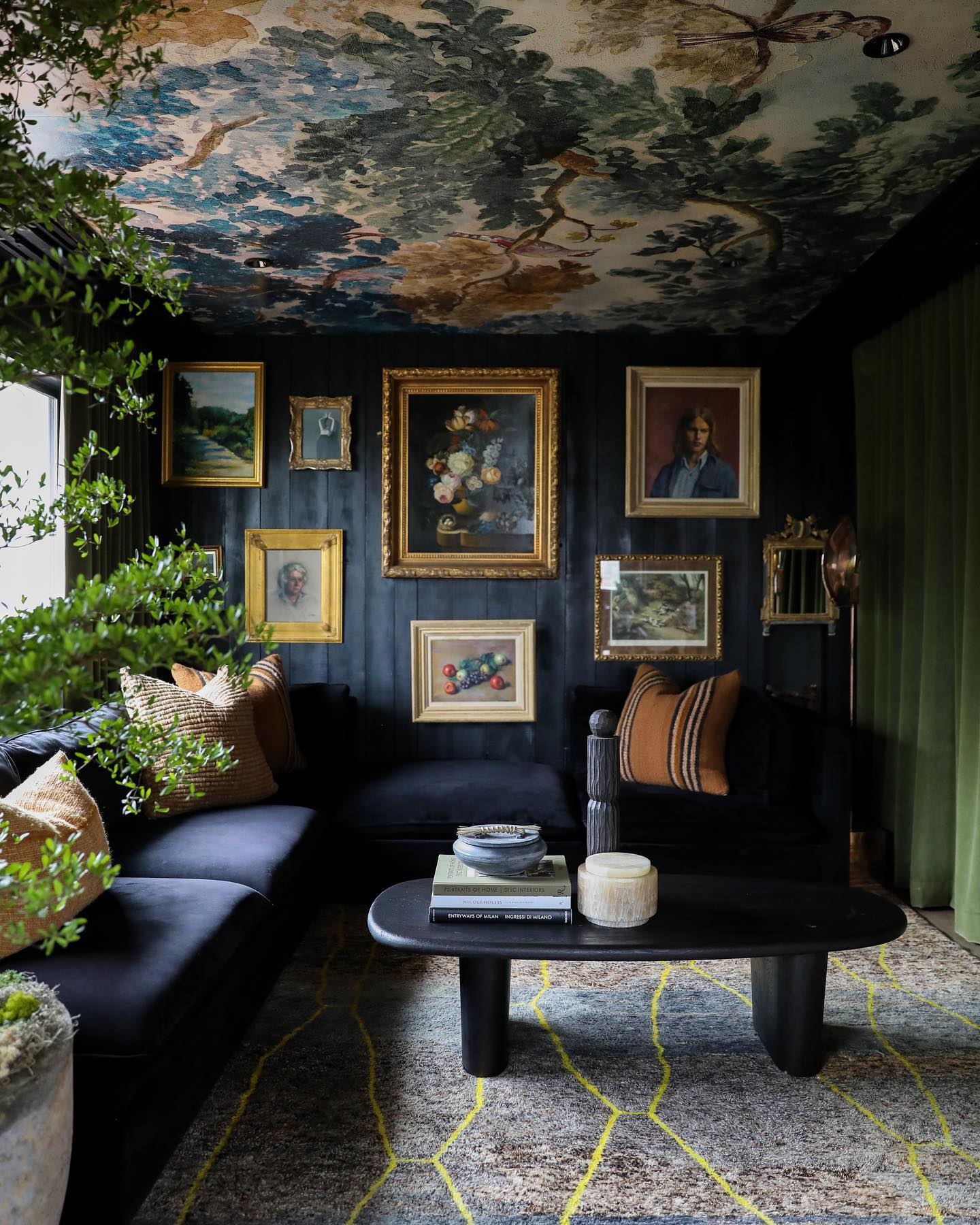
A leafy ceiling pattern changes the entire feel of this dark sitting room. Blue, green, and cream branches spread overhead, while nearly black walls and seating give the eye somewhere quieter to land.
Green curtains pick up a color from the ceiling, connecting the two surfaces. The gold picture frames add small bright edges without taking over the room.
If you want this effect, compare a large pattern sample with your wall color before committing. Fine details can disappear overhead, especially after sunset, so judge the design from a seated position.
Keep major upholstery fairly plain to avoid competing patterns at eye level. Ceiling wallpaper takes careful preparation and alignment; budget for installation help if working overhead is beyond you.
Let Stone Texture Break Up Deep Brown Walls
Credits: Instagram
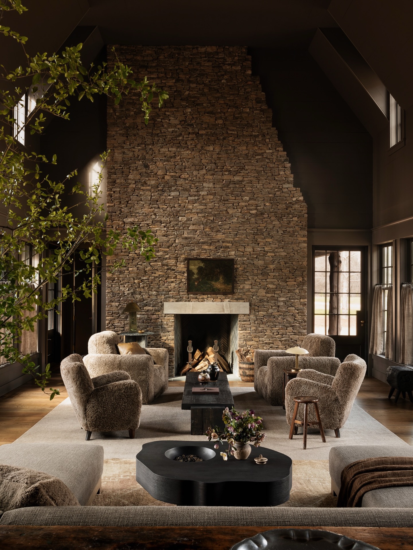
This tall stone fireplace gives the dark brown room a textured center. Its uneven surface catches the daylight in small patches, creating variation that a plain painted wall would lack.
The surrounding walls stay quiet, and the simple artwork leaves most of the stone exposed. Pale chairs and a broad light rug provide contrast closer to the floor.
If your living room already has a stone fireplace, take paint samples to the stone rather than choosing a wall color in isolation. Look for a brown or charcoal that relates to its darker tones.
Keep nearby decorations restrained so the texture remains visible. A large dark surface will still need thoughtful lighting; stone brings visual interest but cannot replace useful illumination.
Pair an Olive Wall with a Rust Sofa
Credits: Instagram
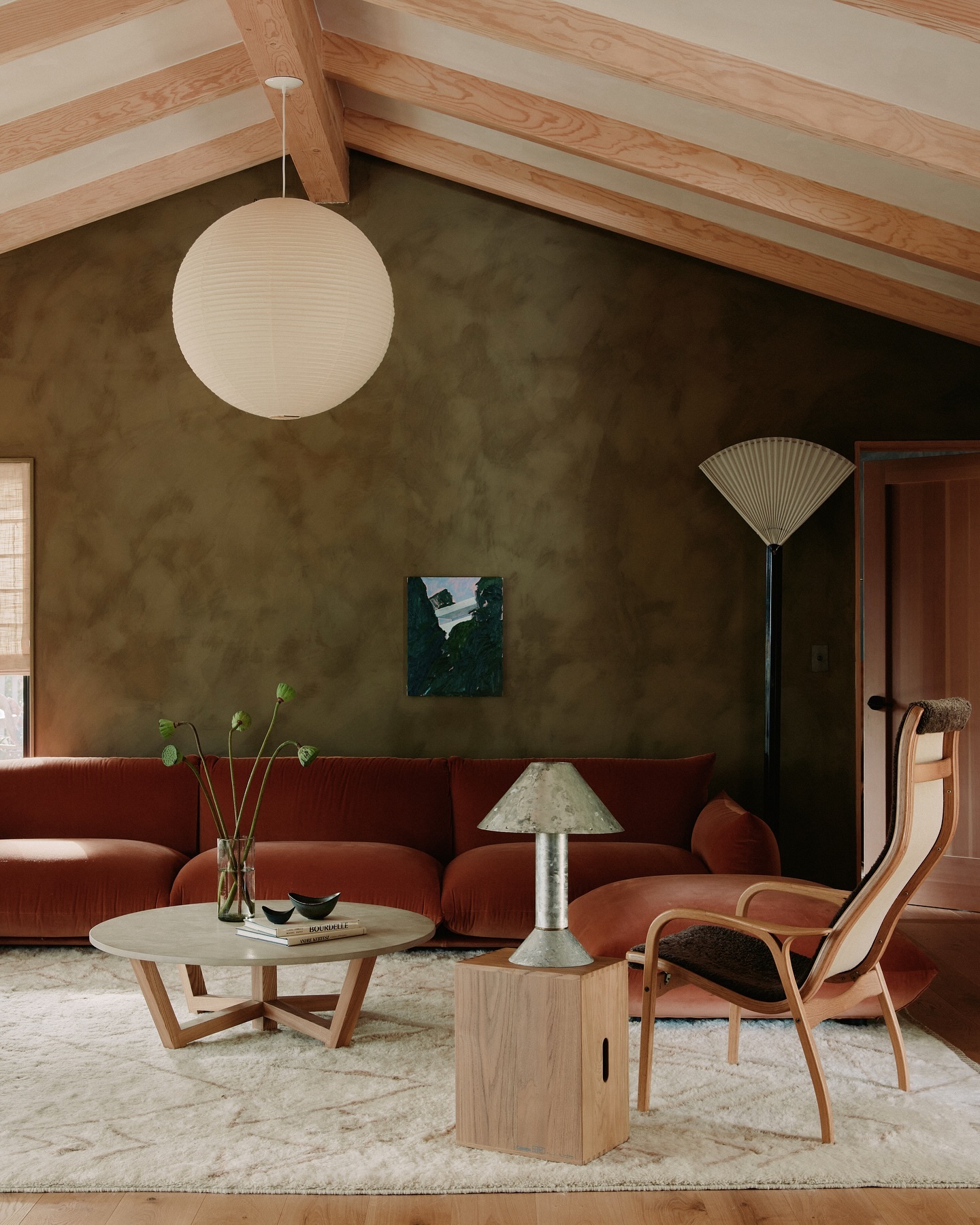
The rust sofa holds its own against this mottled olive wall, giving the seating area a strong color pairing without bright white upholstery.
A pale rug and light wood pieces keep the lower half of the room from becoming uniformly dark. The open chair frame is especially useful because it reveals the rug and sofa behind it.
Try a warm rust, brick, or cinnamon fabric beside your green paint sample before choosing a large piece. Both colors can shift considerably under warm bulbs.
Keep the remaining furniture lighter and allow some bare wall around the artwork. If replacing the sofa is unrealistic, start with a substantial throw or upholstered ottoman; either can introduce the same warm contrast at smaller scale.
Help the Television Recede into Dark Shelving
Credits: Instagram
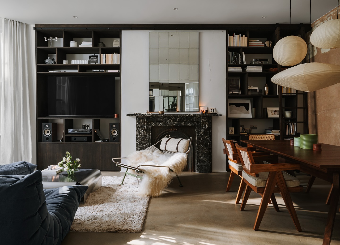
The television blends into the dark shelving on the left of this fireplace wall. Matching dark shelves and cabinet fronts reduce the contrast around the screen, while books and pale objects give the surrounding compartments a purpose beyond electronics.
The white wall above the fireplace keeps the whole arrangement from becoming one solid dark block. This is a useful option when you want a moodier focal wall without repainting the entire living room.
Carry the dark color across the shelf backs as well as their edges for a consistent frame. Before changing an existing unit, check the television's ventilation requirements and keep cables accessible.
Leave some compartments sparsely filled; crowded shelves would compete with the screen whenever it is on.
Mix Patterns Against a Consistent Deep Background
Credits: Instagram
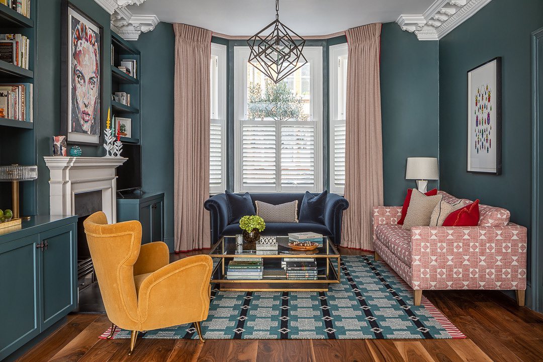
A pink geometric sofa and a larger geometric rug bring two different patterns into this teal living room. The walls and built-in cabinets share the same deep color, giving those patterns a consistent background.
Solid upholstery on the blue loveseat and yellow chair provides a break between the busier surfaces. To borrow the idea, choose one pattern with a smaller repeat and another with larger shapes.
Spread them across separate surfaces so they can be appreciated individually. Repeat a color between the patterns or nearby fabrics; here, the pale pink curtains relate to the sofa.
Compare full samples together instead of relying on small online swatches. If the combination feels restless, remove patterned pillows before abandoning either main patterned piece.
Balance Dark Walls with Open Furniture Frames
Credits: Instagram
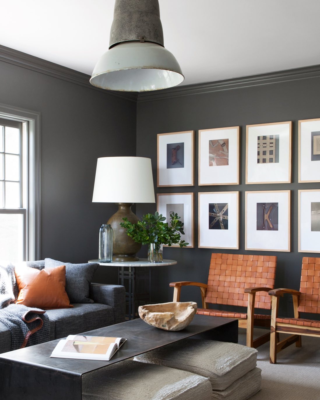
The two warm brown chairs bring lighter, more open shapes into this charcoal room. Their narrow arms and exposed legs leave space visible around the seats, balancing the substantial gray sofa and dark rectangular coffee table.
A pale floor and white picture mats add contrast without changing that restrained palette. When choosing chairs for a dark living room, look beyond their color and consider how much of the view their frames block.
Open arms can make a useful difference beside a deep sofa. Test the seat height and comfort before buying, especially if these will be everyday reading chairs.
Keep the space underneath reasonably clear; baskets and stored items would fill the gaps that make these furniture shapes feel lighter.
Leave Breathing Room in a Dark Bookcase
Credits: Instagram
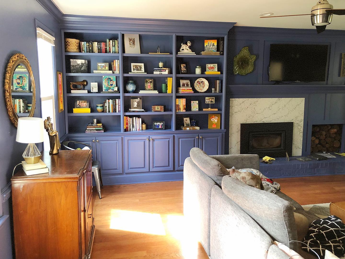
This blue bookcase holds books, photographs, pottery, and small keepsakes without filling every shelf from end to end. Short upright book groups alternate with horizontal stacks, and patches of the blue back remain visible between them.
Those gaps help individual objects stand out against the dark finish. Begin with the books you actually use, then add a few larger objects rather than many tiny ornaments.
Vary the height of neighboring groups and leave room above their tallest pieces. Pale frames and colorful covers are easy to see here, while darker items need more surrounding space.
Use the closed cabinets below for things you do not want on display. Revisit the arrangement after adding books so useful storage does not disappear.
Add a Few Reflective Pieces to Plum Walls
Credits: Instagram
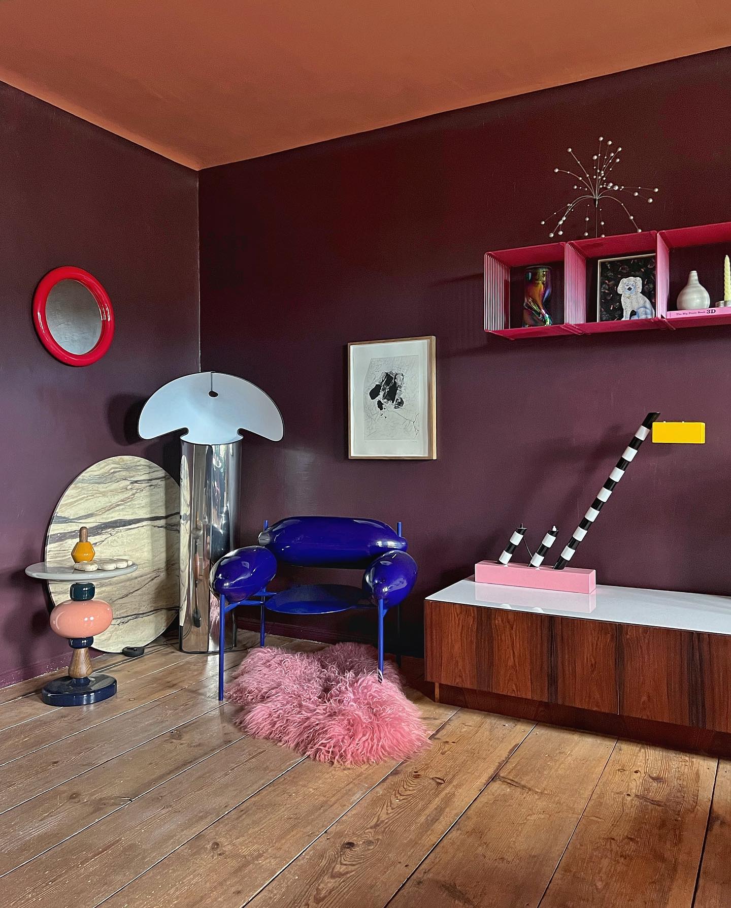
The tall reflective floor lamp and glossy blue chair create bright highlights against these deep plum walls. Their curved surfaces catch light differently from the broad painted background, bringing contrast without a large pale sofa or rug.
A peach ceiling and warm wood cabinet add another layer of color. Choose one or two shiny pieces for a similar effect, then leave enough plain wall around them to show their outlines.
Check their position from your usual seat as well as the doorway; a reflection that looks attractive from one angle may produce glare from another.
Reflective finishes also show fingerprints and dust, so put frequently handled pieces where they are easy to clean. A small polished lamp offers an introduction.
Connect Dark and Light Rooms with Repeated Color
Credits: Instagram
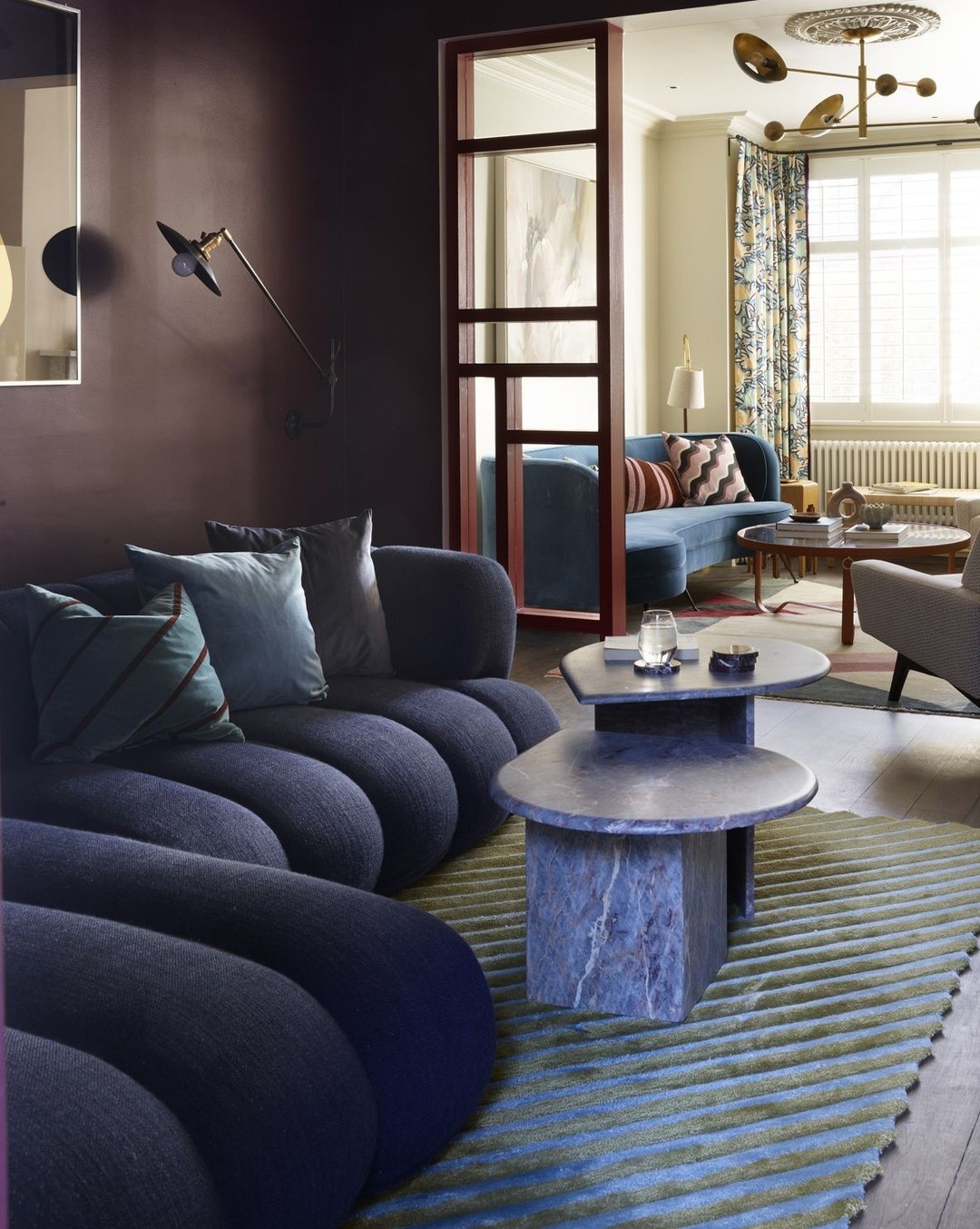
Blue seating links the dark burgundy room in front with the pale room beyond its glazed doorway. The sofas have different shapes, but their related colors make the change in wall color feel deliberate.
From this viewpoint, the lighter room becomes part of the darker room's composition. Before painting adjoining spaces, stand where you will see both at once and identify one color you can repeat across the opening.
Upholstery works well because it occupies enough space to register from a distance. Smaller repeats can come from pillows or curtains if the furniture is staying.
Avoid forcing every finish to match; the contrast between the rooms is part of the appeal. Keep the sightline clear enough to reveal that connection.
Use Fine Stripes for a Quieter Upholstery Pattern
Credits: Instagram
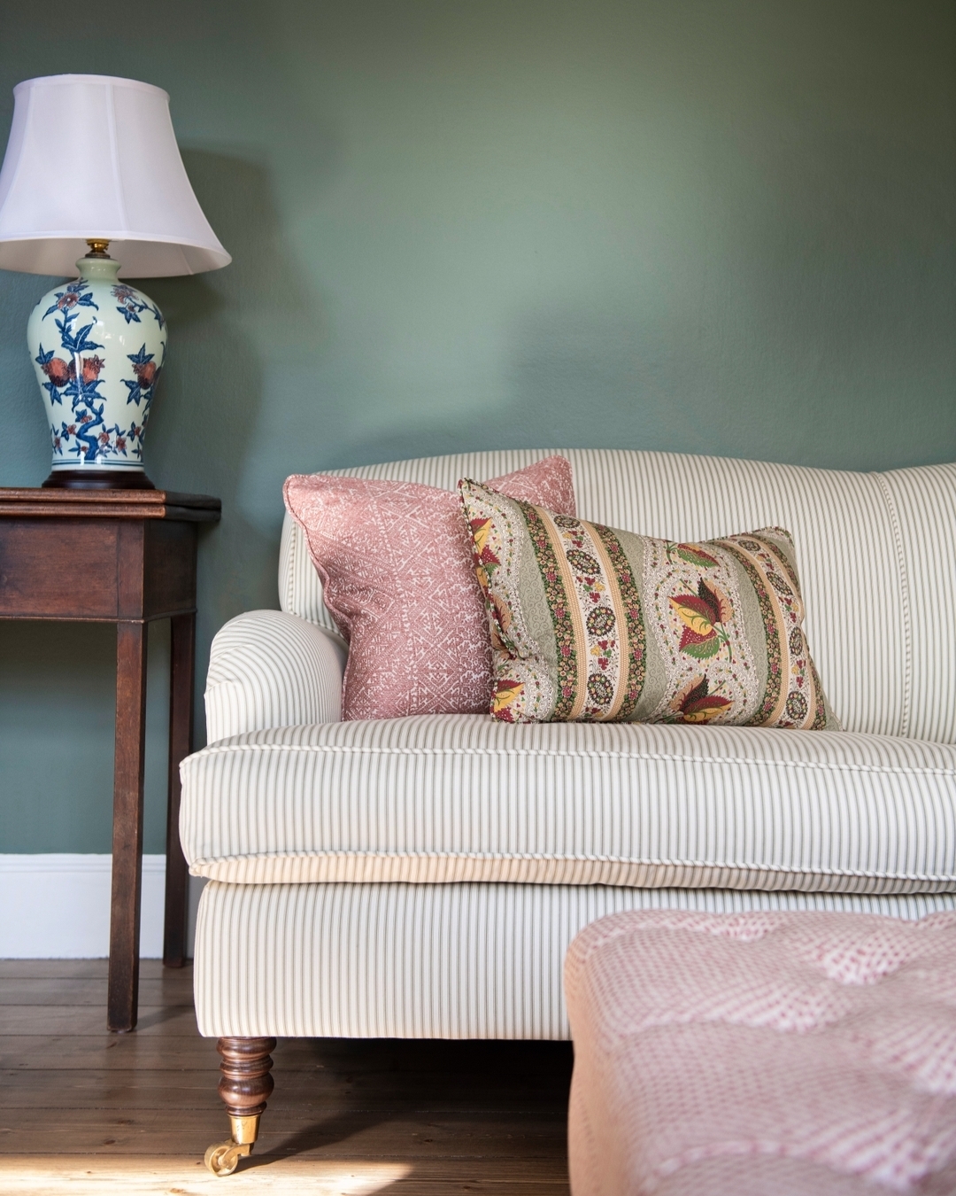
Narrow stripes give this pale sofa detail without overpowering the muted green wall behind it. From farther away, the upholstery reads almost as a solid light surface; closer up, the repeated lines emphasize the sofa's curves.
Pink pillows and a floral lamp introduce larger decorative details around that quieter pattern. Choose stripes with relatively little contrast between their colors if you want a similar effect.
View a generous fabric sample from across the room before deciding, since tiny swatches can exaggerate the pattern. On curved arms, the direction and alignment of stripes will be noticeable, so discuss placement with your upholsterer.
A striped cushion or slipcover can test the idea before you commit to recovering an entire sofa or chair.
Paint Wall Molding the Same Deep Color

Credits: Instagram
The lower wall molding in this brown living room uses the same color as the wall above it. Its raised edges still create small shadows, adding depth without introducing another stripe of contrasting paint.
The pale fireplace surround becomes the stronger outline, while the panel details stay subtle beside it. If your room already has molding, try a single wall color across the flat surfaces and raised profiles.
Clean, fill, and prepare the edges carefully because uneven joints can remain visible under dark paint. Compare the finish on both surfaces before completing the room; different sheens may look less coordinated than you expect.
Keep furniture far enough away to reveal some of the panels, otherwise that quieter architectural detail disappears.
Define Dark Seating with a Generous Pale Rug
Credits: Instagram
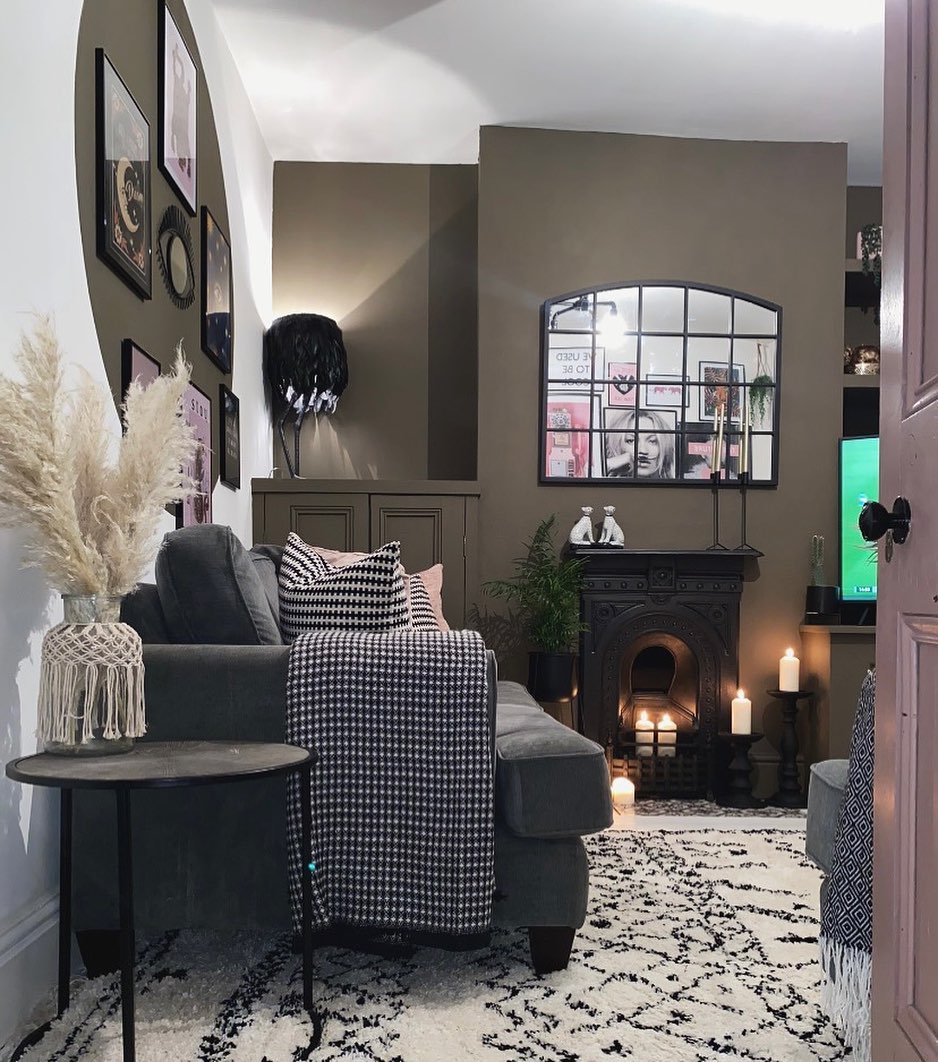
A pale rug with black diamond lines makes the dark gray seating easier to distinguish in this narrow room.
It extends beneath the sofa and through the visible floor area, creating a continuous lighter surface rather than a small patch between furniture. Black and white throws and pillows repeat the rug's colors, keeping the different patterns connected.
Measure the seating group before choosing a rug, and check that the size leaves a usable path through the room. A pale background can show everyday dirt, so consider cleaning requirements alongside the pattern.
Sparse dark lines keep this rug readable beside busier textiles. Use a suitable rug pad to reduce shifting, and make sure nearby doors can open freely over its thickness.
Choose a Mirror for the View It Reflects
Credits: Instagram
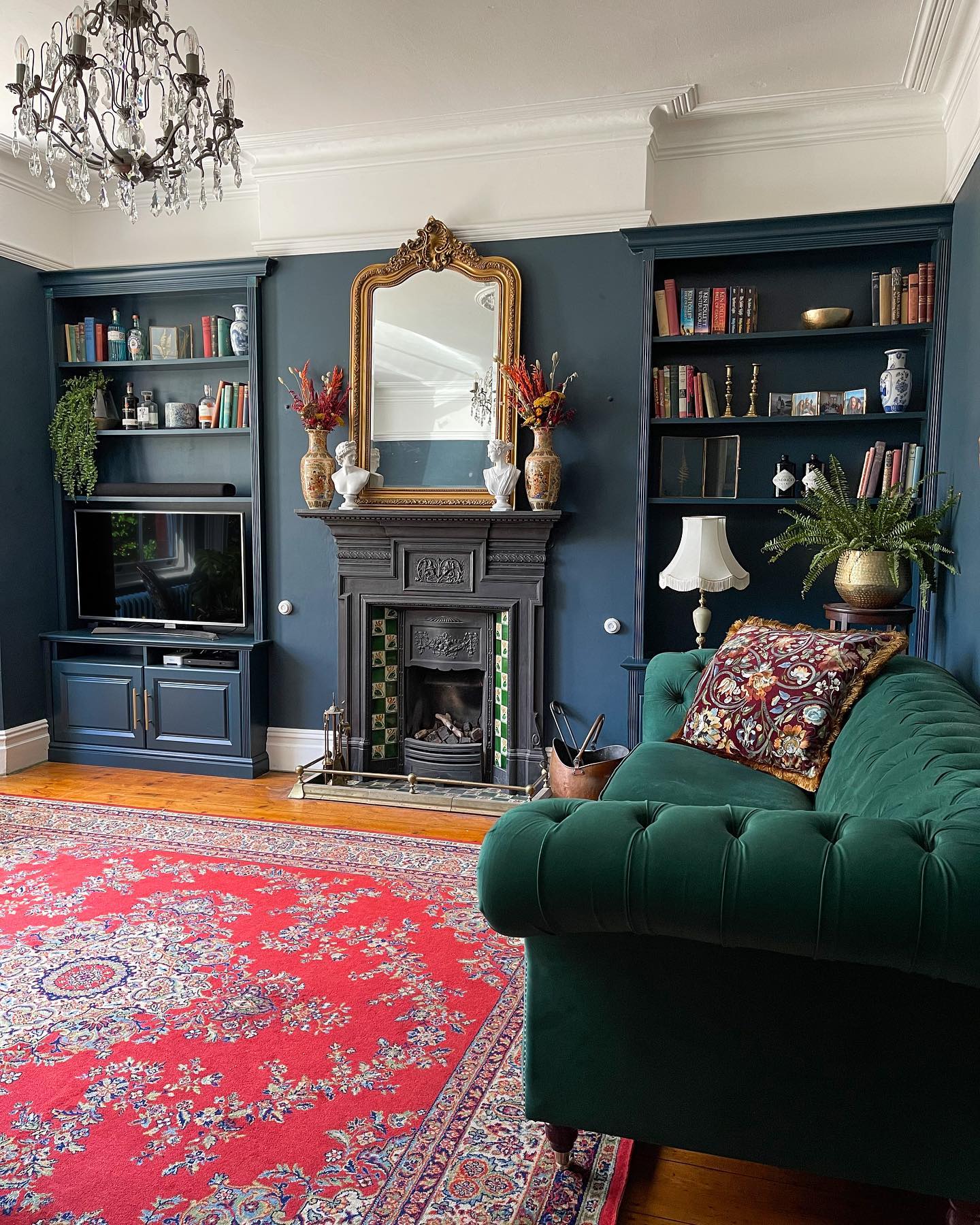
The tall mirror above this fireplace reflects the pale ceiling and part of the chandelier. That reflection brings a lighter patch into the blue wall, while its gold frame stands apart from the matching dark bookcases.
The result depends on what the mirror catches, not simply on adding a reflective surface. Before hanging one, have someone hold it securely at the proposed height while you check the view from the sofa and doorway.
A slightly different position may show a window, attractive artwork, or an unwanted television reflection. Choose the size in relation to the mantel and allow space around decorative edges.
Check that the wall and fixings can support its weight before buying a large or heavily framed mirror.
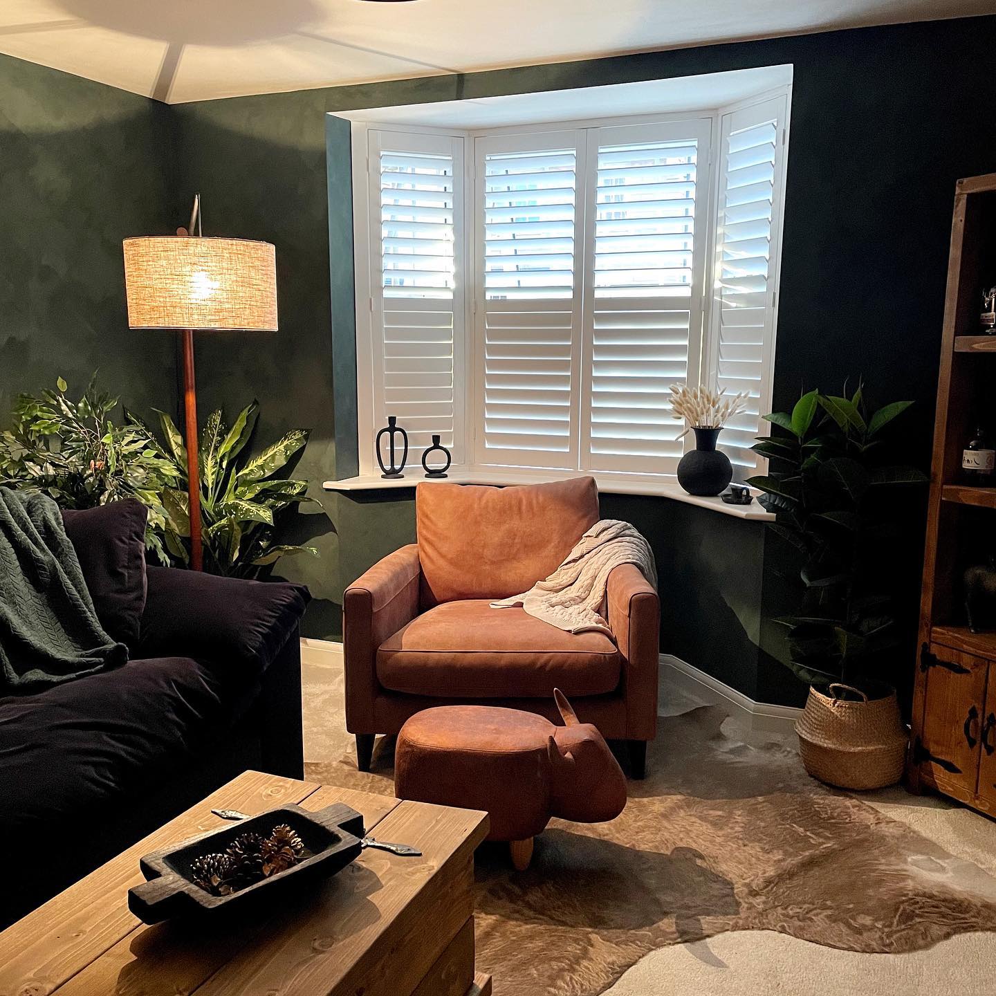
Give Dark Green Walls Subtle Tonal Variation
Credits: Instagram
Soft, brushy shifts in green give these walls more movement than a uniform coat of paint. The variation is easiest to see beside the glowing floor lamp, while the darker wall near the window provides a quieter background for plants.
White shutters make the green look deeper by comparison. A mottled decorative finish can create this effect, but the application matters as much as the color.
Test a large sample using the intended tools and follow the manufacturer's instructions for preparation, layering, and drying. Check the result with your daytime and evening lighting before expanding across the room.
Keep the surrounding fabrics fairly simple if the wall variation is pronounced. Uneven patches should look intentional, so practice before tackling corners.
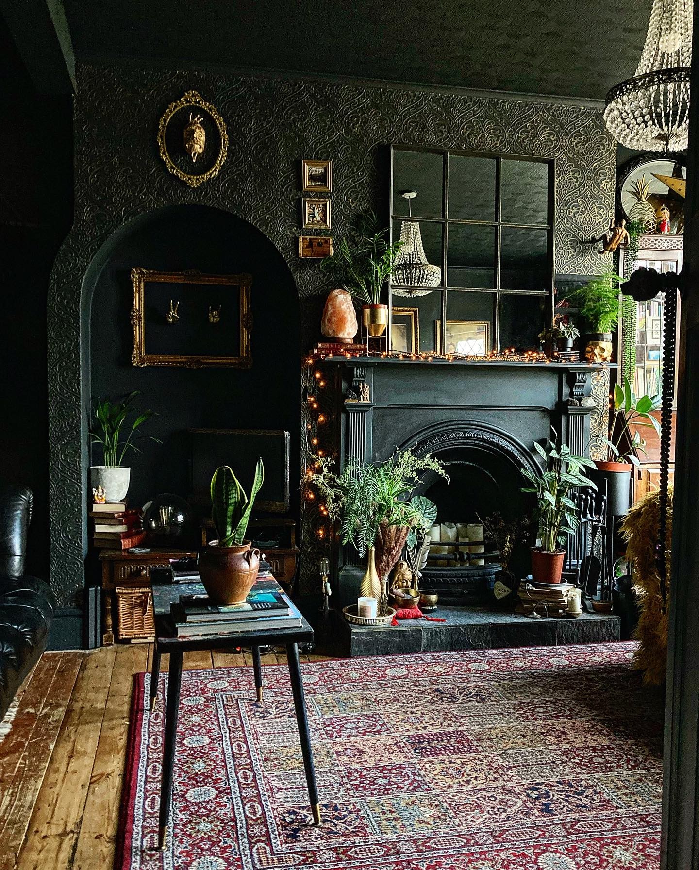
Carry the Dark Color Across the Ceiling
Credits: Instagram
The dark ceiling continues the enveloping effect of the patterned walls in this living room. Without a bright border overhead, the upper edges feel less pronounced, and the black fireplace and arched recess belong to the same deep backdrop.
Warm floorboards, a red patterned rug, and gold frames provide relief closer to eye level. Try this approach when you want a deliberately intimate room rather than a crisp contrast between walls and ceiling.
View ceiling samples horizontally under your actual lighting; a color can look different overhead. Plan useful lamps before committing, since dark surfaces will reflect less light around the room.
Keep a few lighter or reflective details where you want attention, instead of adding bright trim around everything.
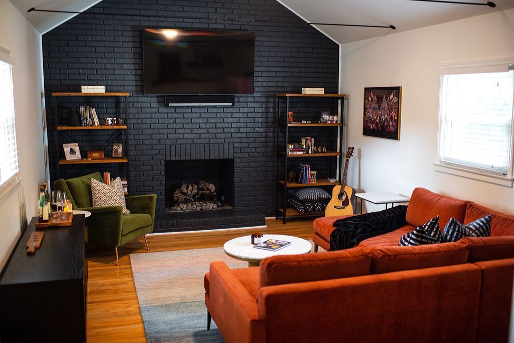
Make the Gable End Wall Your Dark Feature
Credits: Instagram
Black brick follows the peaked outline of this room's end wall, making the architecture the main feature. The side walls and sloping ceiling stay white, so the deep color has a clear stopping point.
An orange sectional and green chair add strong color at floor level without spreading darkness across every surface.
Look for a complete architectural plane when choosing a feature wall, such as a gable end or a wall bounded by distinct corners. Carry the color to those edges rather than stopping partway across an uninterrupted surface.
If brick is already painted, check its condition and use a compatible coating. Unpainted masonry needs separate consideration because future paint removal can be difficult and may damage the original surface.