
A bedroom wall does not need an elaborate mural to stand out; paint can follow a sloped ceiling, define a corner, or make existing texture more noticeable.
These Bedroom Accent Wall Ideas show how color, pattern, and a few unexpected materials can give the bed wall or a smaller nook a clear focal point.
Consider a sage accent that traces an angled ceiling, a lavender scalloped border that marks a bedroom zone, or white paint that lets brick relief remain visible.
Each approach offers a different way to work with the room’s shape and surfaces.
1. Sage Accent Wall Following a Sloped Ceiling
Credits: Instagram
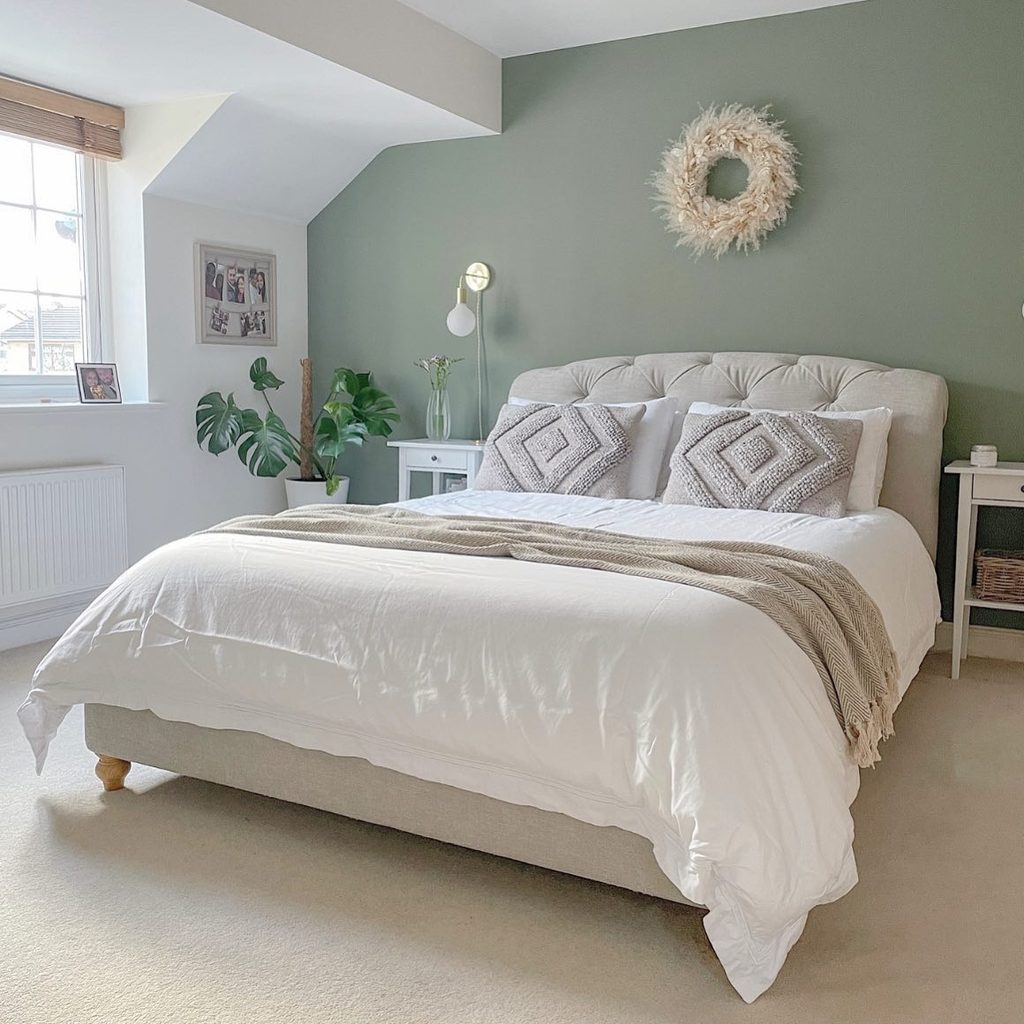
An uneven roofline can become the strongest outline in a bedroom when the wall beneath it receives continuous color. Here, sage paint follows the sloping ceiling behind a pale tufted headboard, while the adjoining surfaces stay light.
A dried wreath draws attention to the center without concealing the shape above. The wall lamps and bedside tables introduce a balanced arrangement within that asymmetrical boundary.
If your bedroom has similar angles, study the entire silhouette before deciding where the accent should stop. Keeping the ceiling separate makes the transition easy to read.
Let bedding repeat the surrounding light tones, then bring in a warmer throw for contrast. The architecture supplies enough interest without needing additional trim or a complicated paint pattern.
2. Rich Plum Paint Across Vertical Wall Boards
Credits: Chris Loves Julia
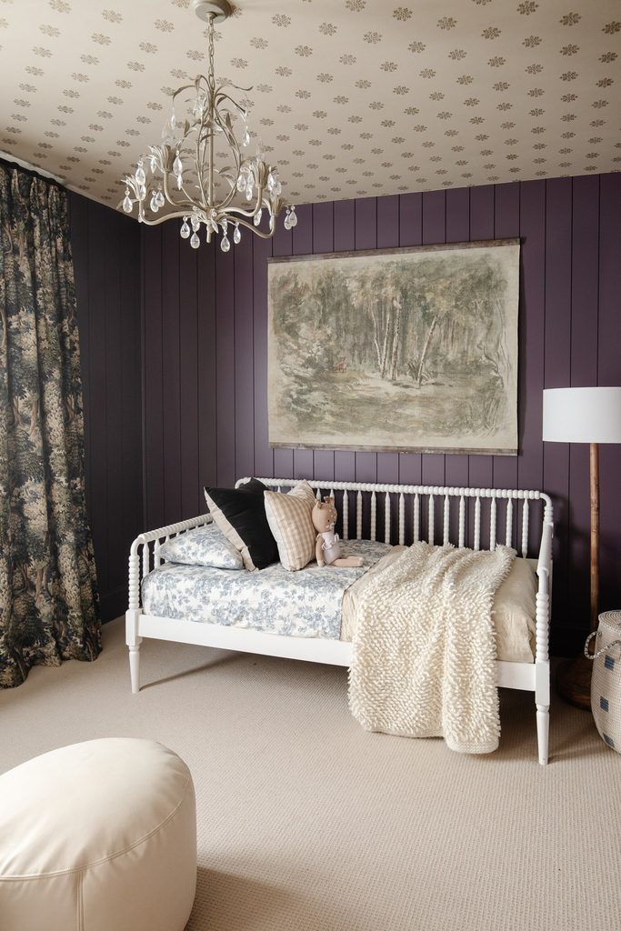
Plum boards establish a strong backdrop for the white daybed, using their vertical seams as the wall’s decoration. The large woodland picture interrupts those straight lines without covering the paneling.
Above it, a pale patterned ceiling creates a distinct stopping point for the dark finish. To adapt the idea, decide whether the boards should continue around a corner or stay behind the bed.
Consider how their spacing will look beside window trim and electrical fittings before fixing them. Paint a sample with an actual joint to see the shadow it produces.
Light upholstery is especially effective here because its open outline remains visible against the plum. Keep smaller accessories restrained, allowing the repeated lines and rich color to work together.
3. A Lavender Scalloped Border Around a Bedroom Corner
Credits: Lianne Hempsall / Makes, Bakes and Decor
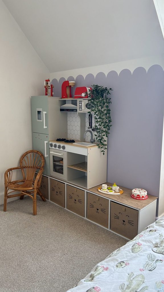
Lavender paint rises behind this bedroom’s play and storage corner, ending in a row of rounded scallops. The white upper wall remains open, making the curved boundary the main decorative feature.
A bed edge in the foreground shows how the accent belongs to the larger sleeping room. Set the dividing height with the furniture in place so the scallops remain visible above it.
Use one consistent template and plan how the repeat will finish at each corner. A modest contrast between the two colors keeps the effect gentle, while stronger contrast would emphasize every curve.
Leave the upper area relatively uncluttered. This treatment can define a secondary bedroom zone without covering all four walls or relying on an elaborate mural.
4. Carry One Color Through a Sleeping Nook
Credits: Kim and Scott Vargo / Yellow Brick Home
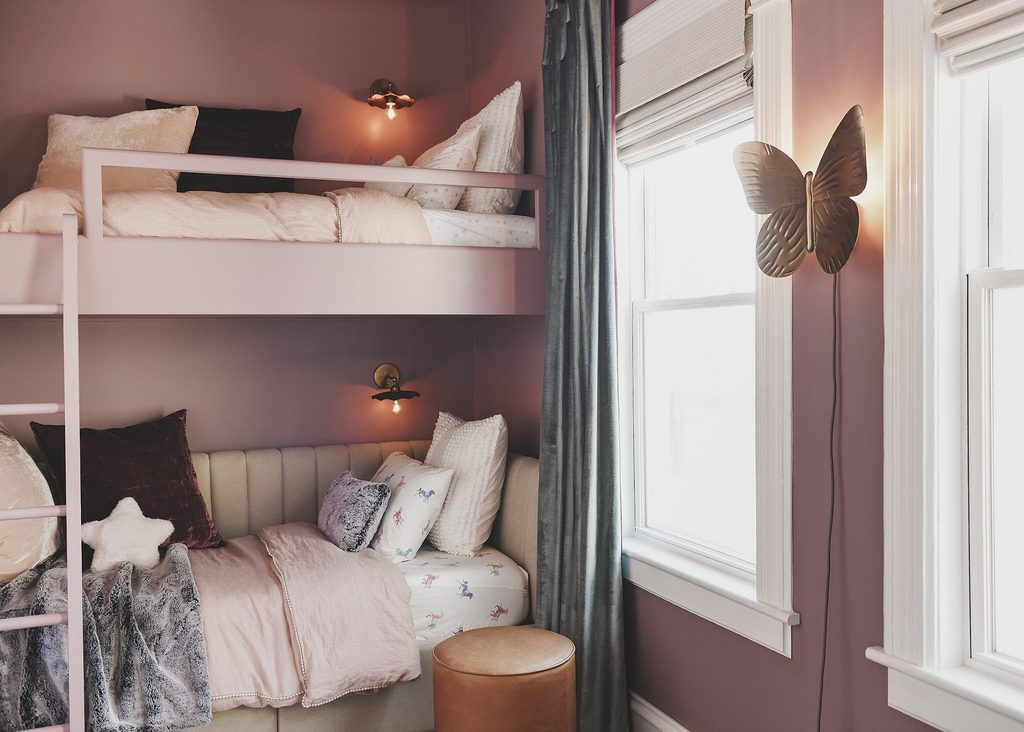
Mauve paint gives this stacked sleeping nook a continuous backdrop from the wall to the loft frame. Pale bedding stands forward against the muted color, while white window trim provides a clear boundary beside it.
The finish connects the different levels without requiring another pattern or decorative panel. Borrow the color continuity even if your bedroom has ordinary furniture rather than a built in sleeping arrangement.
Test your chosen shade on adjoining surfaces because daylight reaches each at a different angle. Keep pillows and linens lighter when you want the bed to remain distinct.
A small bedside light can reveal the wall color after sunset. This approach is especially useful for making an awkward alcove feel like a deliberate feature.
5. Let White Paint Emphasize a Brick Wall
Credits: Jordyn / Our PNW Home
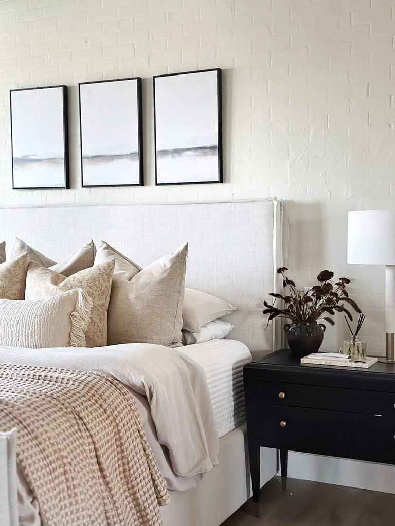
Painted brick can create an accent through relief instead of a bold change in color. In this bedroom, white covers both the bricks and mortar, but their irregular outlines remain visible behind three narrow framed pictures.
The upholstered headboard sits lower, leaving a band of texture above the pillows. Treat the condition of any existing masonry as the starting point, and get suitable advice before painting it.
A sample area can reveal whether the finish preserves enough surface character for your taste. Choose frames with some space between them so the brick remains part of the composition.
Dark furniture provides contrast at the bedside. Pale linens then connect the bed with the wall while their softness offsets its rougher texture.
6. Create an Open Book Installation Above the Bed
Credits: Emma Chapman / A Beautiful Mess
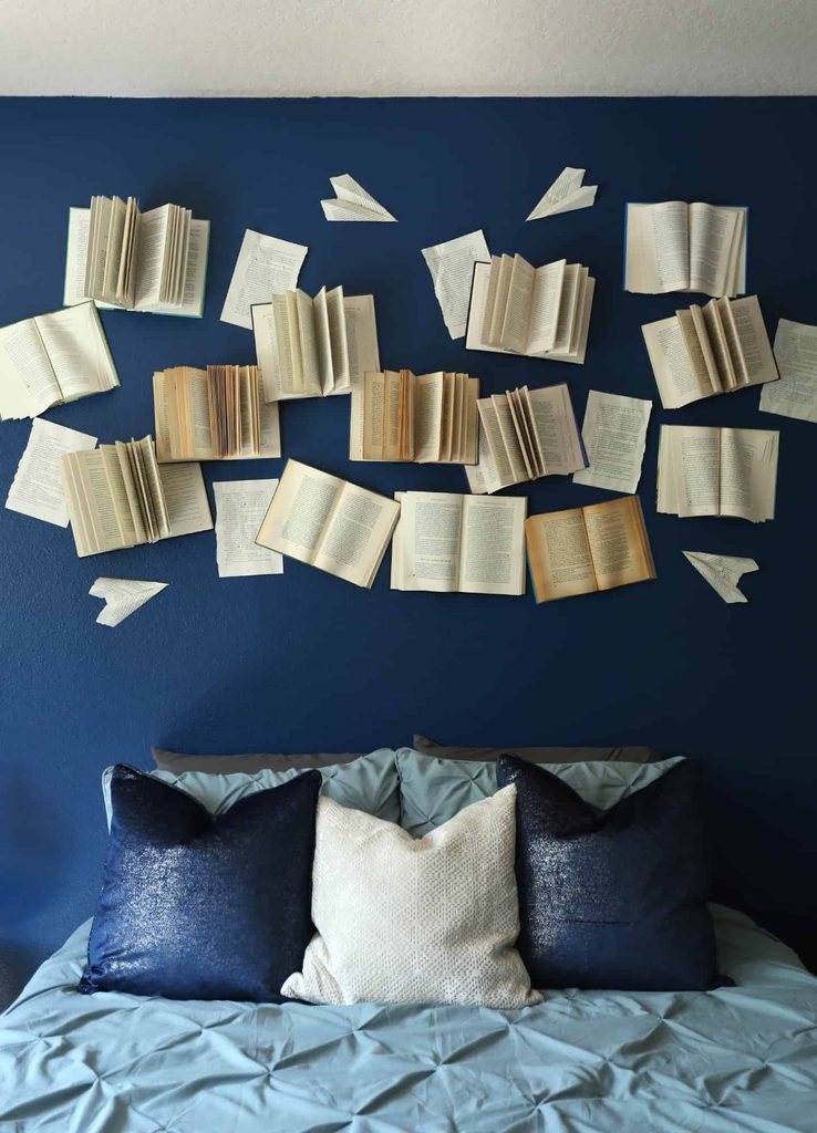
Open books form an irregular sculptural arrangement against this deep blue bedroom wall. Their cream pages catch the light differently, with folded corners and loose paper shapes giving the display movement.
The broad blue background makes each outline clear above the pillows. Plan an arrangement on the floor before making holes, allowing some gaps between the books so the wall remains visible.
Lightweight pieces are easier to support, but every attachment still needs to suit its weight and the wall material. Keep protruding pages beyond the area where someone might sit or lean.
Choose expendable books rather than treasured editions. A restrained bedding palette lets the layered paper become the feature without needing several additional decorations around the same wall.
7. Build a Changeable Accent From Album Covers
Credits: Kelley Nan
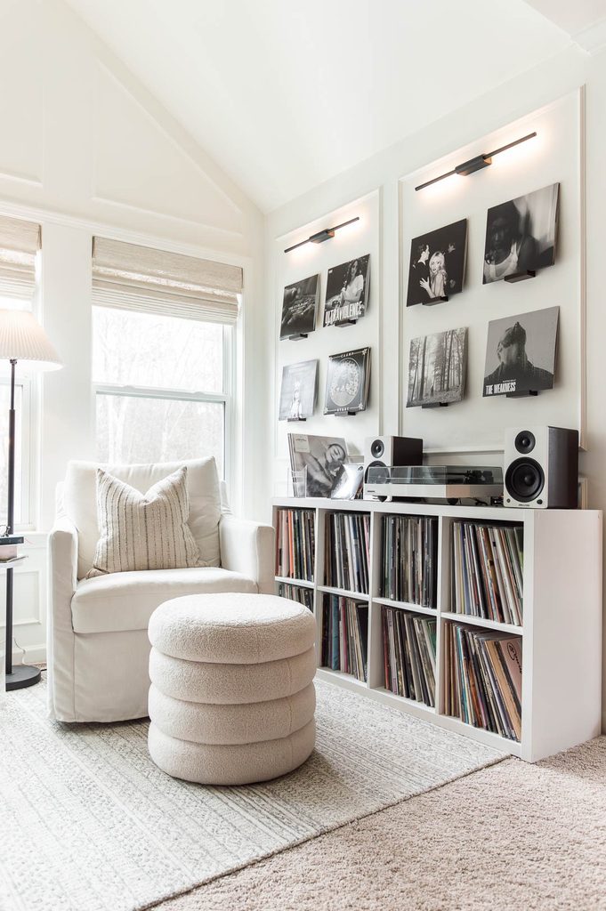
A bedroom accent can come from a collection arranged with enough consistency to read as one feature. This listening corner uses album sleeves in two orderly groups above a white record cabinet.
Slim picture lights emphasize the arrangement, while individual supports make the covers easy to exchange. Plan the display around the furniture below, including the space needed to open or handle records.
Start with similarly toned covers if you want the calm appearance shown here. Matching gaps matter more than making every image identical.
Keep the display clear of direct sunlight and choose supports that will not crease valuable sleeves. The result gives a plain bedroom wall a personal focus tied to music rather than a permanent printed pattern.
8. Fit a Painted Grid to a Vaulted Wall
Credits: Sam Raimondi / DIY Huntress
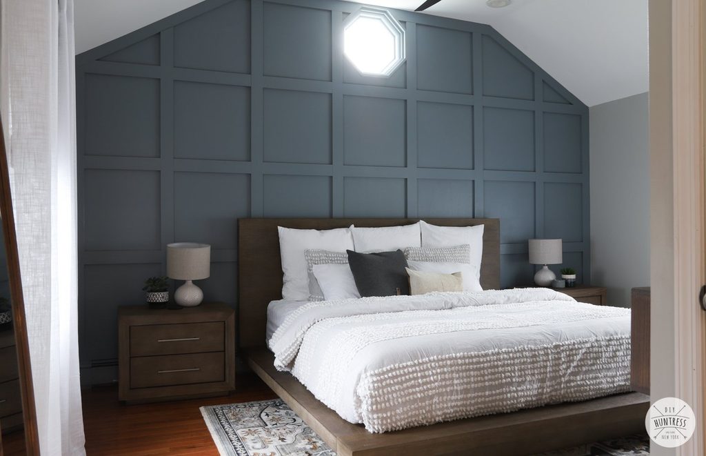
A blue gray grid turns the tall wall behind this bed into an architectural feature. Its outer edge follows the vaulted ceiling, while the small high window interrupts the repeated rectangles.
Because the raised strips share the background color, shadows provide the pattern instead of contrasting paint. Draw the complete layout before installation, including windows, sockets, and the planned headboard position.
Check which intersections will remain visible above the pillows. Equal spacing gives the broad surface a calm rhythm, even beneath an angled roofline.
Keep adjacent walls lighter to emphasize the boundary. Here, pale bedding and simple bedside furniture leave the grid readable.
The result feels substantial without requiring deep shelving, heavy cladding, or a separate gallery of framed pictures.
9. Give Deep Teal Beadboard a Full Wall
Credits: Angie / How We Do
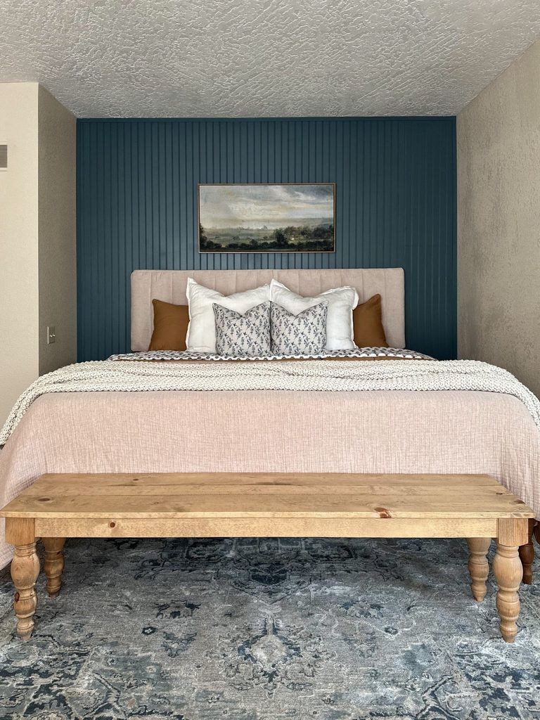
Fine vertical grooves add texture to this deep teal wall behind a pale upholstered bed. The narrow beadboard rhythm remains visible around the headboard, artwork, and bedside furniture, creating a continuous accent rather than separate framed panels.
Light adjoining walls keep the saturated surface clearly defined. Before choosing a similar treatment, compare a full panel sample with the room’s natural and evening light.
Small grooves can look quite different once shadows settle into them. Plan neat finishing at the ceiling, baseboard, and corners, and account for outlets before fitting the panels.
A simple landscape print provides one quiet focal point above the bed. Warm wood at the foot balances the cool wall color without interrupting its clean arrangement of lines.
10. Use a Soft Faux Limewash Finish Behind the Bed
Credits: Manda / The Merrythought
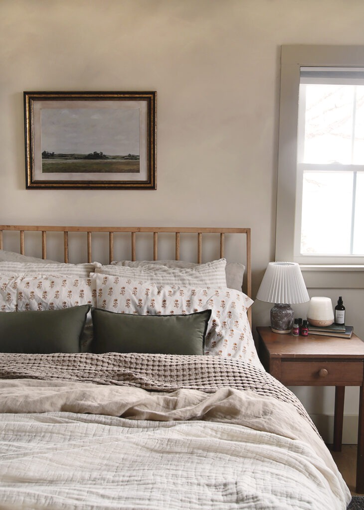
Cloudy beige color gives the wall behind this spindle bed a quiet presence. Its shifting tones are most noticeable around the small landscape picture and beside the window, where light reveals the uneven effect.
The creator calls the treatment faux limewash, so the photograph illustrates a painted appearance rather than proving a particular mineral finish. Make a practice panel before attempting your own version.
Judge the marks from across the room as well as nearby, since a technique that looks subtle close up may become patchy at a distance.
Muted bedding and warm timber suit the soft variation here. Keep wall decoration sparse enough to expose the finish, letting the surface contribute interest without depending on strong color or pattern.
11. Shape Tall Moldings With Stepped Corners
Credits: Hana / Hana’s Happy Home
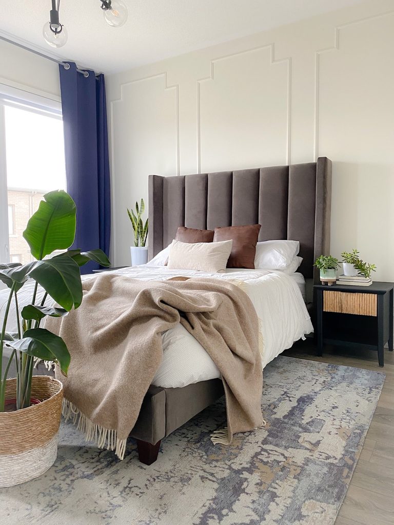
Tall molding outlines rise behind this upholstered bed, with stepped corners adding detail to their otherwise simple shape. The white paint matches the wall, so the pattern appears through fine shadows rather than a change of color.
That restraint leaves room for the dark headboard, blue curtains, and leafy plant to stand out. Sketch the panels around your furniture before deciding on their widths.
Keep the upper edges visible above the bed and check how the outer panels meet curtains or corners. A sample section can help you compare trim depth under bedside lighting.
Painting everything together creates a unified surface. Leave the spaces inside the outlines mostly clear if you want their unusual stepped geometry to remain the accent.
12. Repeat Small Black Triangles Across a Pale Wall
Credits: Aniko / Place of My Taste
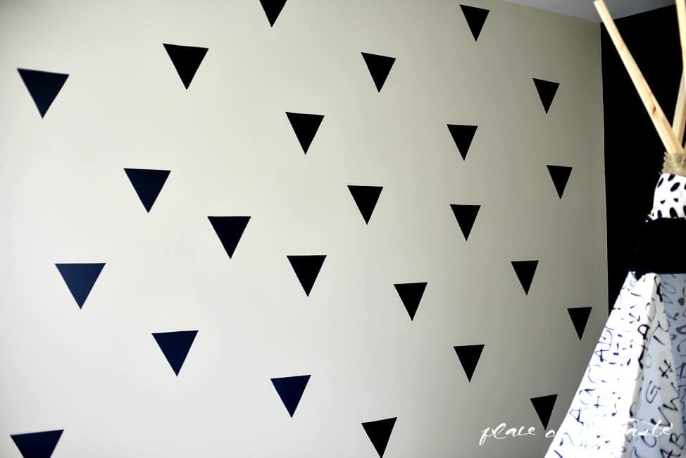
Black triangles create a graphic pattern across this pale bedroom wall without covering its background. Their downward points and loose rows give the surface a recognizable rhythm beside the fabric play corner.
The shapes are cut from vinyl in the creator’s project, making the design a collection of individual pieces rather than printed wallpaper. Use paper templates to test the spacing before applying anything permanently.
Check the adhesive on an inconspicuous area and follow removal instructions appropriate to your paint finish. Repeating one shape keeps the effect coherent even when the arrangement is relaxed.
Leave enough blank wall between motifs so they remain distinct from a distance. Simple surrounding textiles help this small repeated pattern become the room’s main accent.
13. Choose a Teal Backdrop for a Dark Canopy Bed

Credits: Elsie Larson / A Beautiful Mess
A saturated teal wall gives the dark canopy frame a colorful background in this bedroom. The adjoining white surfaces make the painted section feel deliberate, while the patterned quilt repeats related blues and greens below.
Large lettering fills the space within the frame without hiding the wall color. Choose your accent shade beside the actual bedding rather than from an isolated paint chip.
A generous sample will show how the color changes behind dark furniture and under evening lamps. Keep the paint boundary aligned with the room’s natural corners.
If your bed has a tall frame, consider its outline when placing artwork. One strong painted plane can supply plenty of character while the surrounding walls preserve a lighter overall impression.
14. Make a Soft Floral Mural the Bed Wall
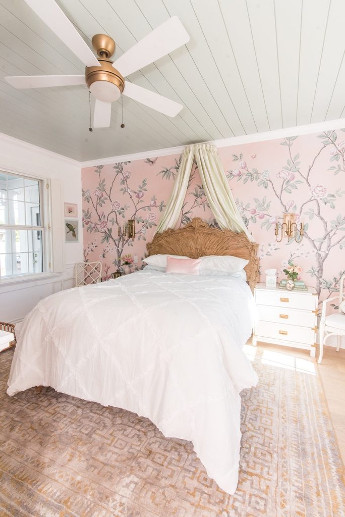
Credits: Ashley Wilson / At Home with Ashley
Delicate flowering branches extend across the pink wall behind this carved headboard. Their winding outlines offer a softer counterpoint to the room’s straight ceiling boards, while pale green details connect the mural with the color overhead.
A light draped canopy frames the bed without hiding the illustration. When planning a similar accent, look at the mural as a complete scene rather than choosing from a tiny swatch.
Check where branches, birds, and blossoms will land around the headboard and bedside lights. A scaled layout helps avoid losing the appealing details behind furniture.
Keep the largest bedding surfaces quiet so the wall remains legible. The gentle background color allows abundant botanical detail to feel airy instead of visually crowding the bed.
15. Paint One Oversized Orange Circle Above the Pillows
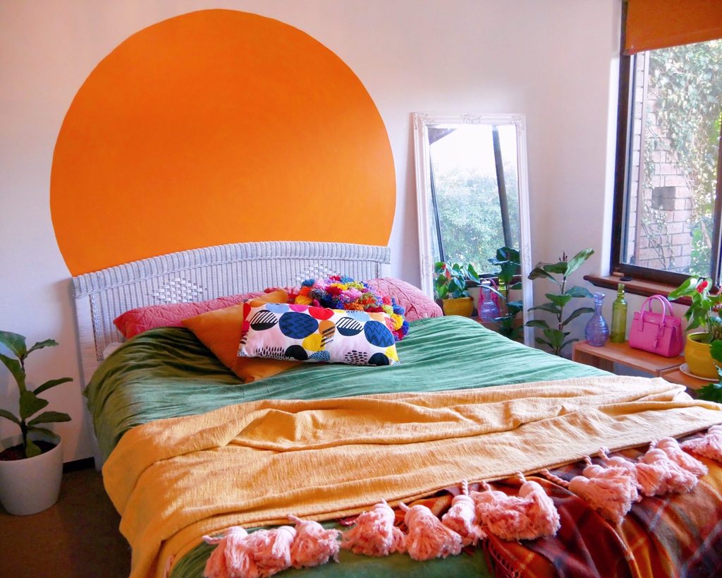
Credits: Kate Hannah / An Artful Life
An oversized orange circle supplies a bright focal point above this woven headboard. Its curved edge stands clearly against the pale pink wall, echoing the warm bedding while leaving the room’s corners untouched.
The single shape feels bold without requiring a pattern across the entire surface. Decide where your bed will remain before marking the circle, then check how much will disappear behind pillows.
A centered starting point and a consistent radius help the curve look intentional. Test the color beside your textiles and in different light before painting the full area.
Keep nearby artwork limited so the circle remains recognizable. You can borrow this simple geometry in a quieter shade if a vivid orange feels too energetic for sleeping.
16. Arrange Charcoal Wood in a Herringbone Pattern
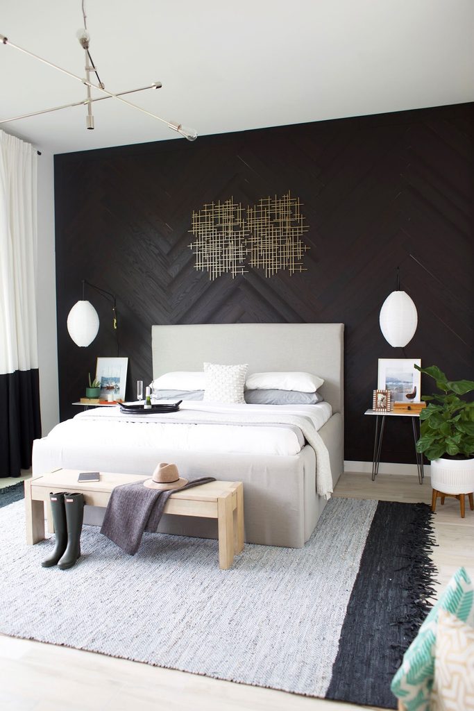
Credits: Kristi Murphy
Dark wood pieces meet in a herringbone pattern behind this pale upholstered bed. The diagonal joins create movement across the wall, while the charcoal finish keeps the texture quieter than a strongly contrasting timber mix.
White bedding and light curtains separate the sleeping area from the darker background. Consider the complete wall width when planning where the central zigzag will land.
Work from a measured layout so the edges and corners finish deliberately rather than with awkward scraps. Compare several planks together before choosing a finish, since grain variation affects the final pattern.
A restrained piece of wall art lets the geometry remain visible. This treatment adds direction and texture even when the rest of the bedroom stays relatively simple.
17. Stretch Broad Painted Planks Across the Headboard Wall
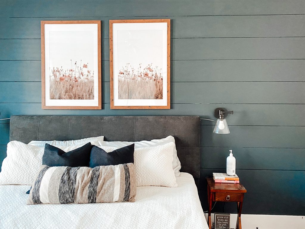
Credits: Emma Shoemaker / Shoe Makes New
Broad horizontal planks give this dark accent wall a different rhythm from narrow vertical paneling. Their long seams continue behind the headboard and artwork, making the surface feel connected across the bed’s width.
Pale bedding keeps the foreground bright, while warm wooden picture frames soften the cool charcoal color. Plan the board heights against the full wall before installation, allowing for consistent gaps and a neat final row.
Think about the background color within those gaps as well as the visible faces. A smooth painted finish emphasizes the lines rather than exposed grain.
Choose fewer larger pictures instead of filling every plank with accessories. The wide bands already provide structure, so a simple arrangement lets them remain easy to appreciate.
18. Show Warm Wood Grain in Staggered Rectangular Panels
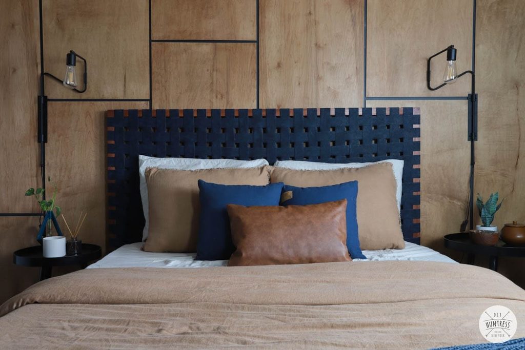
Credits: Sam Raimondi / DIY Huntress
Warm plywood panels create an accent wall with broad areas of visible grain behind this woven headboard. Dark gaps separate the rectangles, and staggered horizontal joins stop the layout from becoming a rigid grid.
The wood supplies warmth beside blue cushions and black wall lamps. Lay out the panel sizes before cutting, checking which joints will show above the bed and beside the lights.
Consider the grain direction across neighboring pieces so their variation looks intentional. Test the stain and finish on an offcut before treating the complete wall.
Keep the gaps consistent and finish the exposed edges neatly. Simple bedding gives the wood enough space to register, while the headboard adds another texture without concealing the entire patterned surface.
19. Paint Oversized Daisies Over a Blush Bedroom Wall
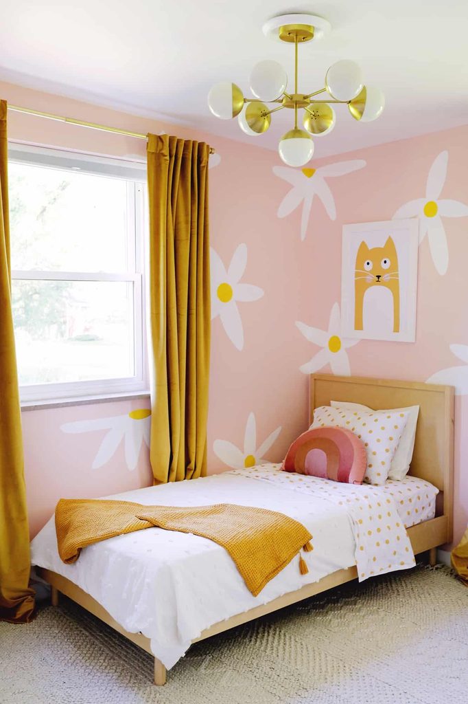
Credits: Laura Gummerman / A Beautiful Mess
Large white daisies brighten the blush walls around this small wooden bed. Their yellow centers connect with the curtains and bedding, giving the painted pattern a clear relationship to the room’s everyday furnishings.
The flowers remain widely spaced, so the pink background stays visible between them. This creator’s design is hand painted, despite its wallpaper effect.
Sketch the repeat at room scale before painting and consider how each flower meets windows, corners, and the headboard. A limited palette helps oversized shapes feel cheerful without introducing too many competing colors.
Keep small accessories simpler where the pattern is busiest. You could use the treatment on just the bed wall, letting neighboring surfaces stay plain while the broad petals supply the accent.
20. Choose Monochrome Palm Pattern for a Single Wall
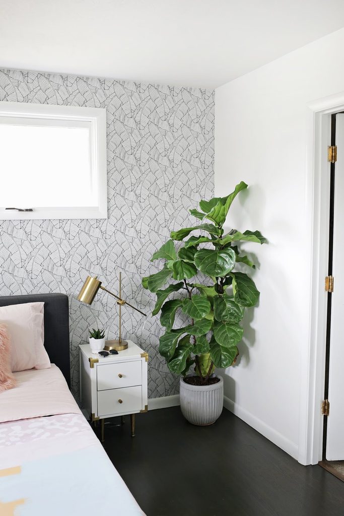
Credits: Laura Gummerman and Elsie Larson / A Beautiful Mess
Black palm outlines fill the wall beside this bed with a fine, continuous pattern. Because the print stays monochrome, it sits comfortably beside white window trim and a small white nightstand.
The leafy plant introduces a bolder organic shape, and the brass lamp gives the corner a warm highlight. Consider using a detailed print on one bounded wall when the room already contains several colors.
Check how the pattern finishes around windows, sockets, and corners before ordering paper or planning installation. A larger sample makes the line density easier to judge behind your headboard.
Plain bedding prevents another small pattern from competing. Here, generous white areas around the accent keep the botanical wall visible without making every surface equally busy.