
A purple room can feel either soft and restful or bold and graphic, depending on where the color lands.
These Purple Bedroom Ideas show how placement and contrast shape the mood, from lilac bedding paired with mint pillows to plum paneling beneath a pale patterned ceiling.
You’ll also find ways to carry mauve across a ceiling and bed frame, or try a smaller accent with a patterned lampshade or a deep-plum bedside piece.
Use the examples to decide whether purple should anchor the bed, define a wall, or appear in just a few details.
1. Balance Lilac Bedding With Mint Pillows
Credits: Instagram
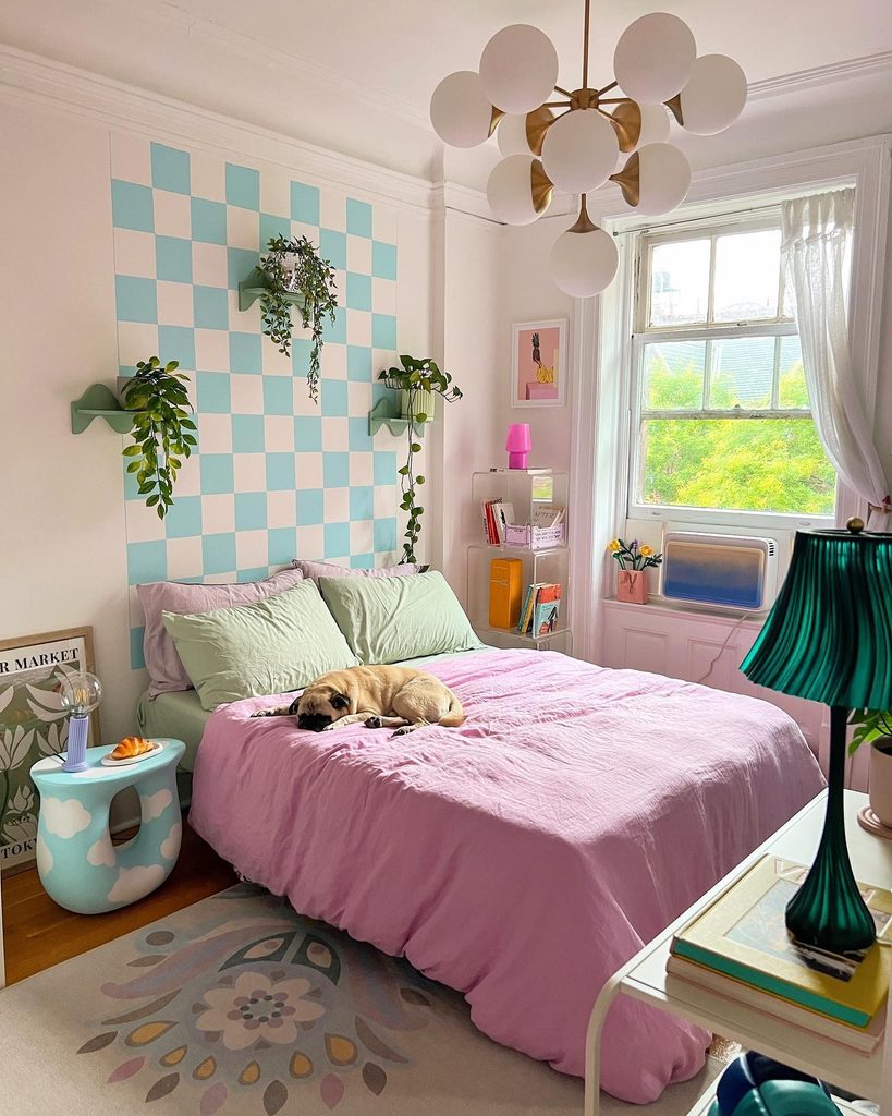
Lilac and mint make an easygoing pair when their tones are light. Here, the purple duvet covers most of the bed, while mint pillowcases connect it with the aqua checkerboard wall behind.
A green pleated lamp adds another variation of the cooler accent. White surrounding walls give those colors space, and the floral rug introduces smaller details below.
For a comparable purple bedroom, start with lilac as the largest textile area and repeat your secondary color in just a few places.
The checkerboard brings structure to the relaxed folds of the bedding, so a simple geometric detail can be useful alongside softer fabrics. Matching every shade precisely matters less than keeping the overall palette gentle and the bed visually clear.
2. Outline a Saturated Purple Headboard in Black
Credits: Phyrra
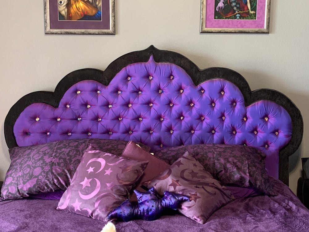
A black border traces the scalloped outline of this vivid purple headboard, making its shape easy to recognize against the pale wall. Reflective buttons add small highlights across the tufting, while deeper purple pillows connect the upholstery with the bedding.
The design concentrates its strongest color on the bed rather than every surrounding surface. For a similar approach, compare the headboard’s width and height with the room before selecting a dramatic silhouette.
Leave enough clear wall around its upper edge to appreciate the outline. Plain neighboring furniture can support a detailed piece without competing with it.
If you prefer fewer motifs, simplify the cushions. The purple upholstery and dark border already provide a clear focal point for the sleeping area.
3. Carry Mauve Across the Ceiling and Bed Frame
Credits: Yellow Brick Home
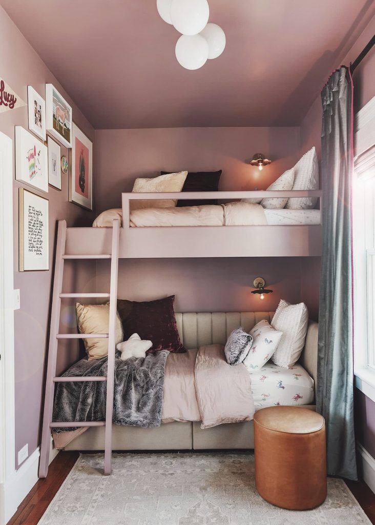
Mauve continues from the walls onto the ceiling and lofted bed frame in this bedroom. The repeated color makes the different planes feel connected, while pale bedding and the lower upholstered daybed remain distinct inside the enclosure.
White window trim provides a brighter boundary along one side. The useful idea is color continuity rather than the particular construction of the beds.
Test your chosen purple on vertical and overhead surfaces before committing, because each receives light differently. Keep a few lighter materials visible so the furniture does not disappear into the backdrop.
Any loft or bunk arrangement must suit its users and follow appropriate installation requirements. You can borrow the coordinated paint treatment with ordinary furniture in a simpler room.
4. Wrap Lavender Around the Upper Wall and Ceiling
Credits: Sarah Barnard Design
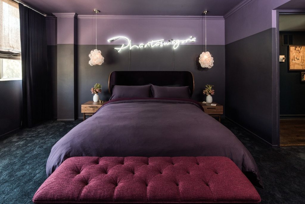
A lavender ceiling continues down into a broad upper wall band above the darker plum surfaces in this bedroom.
The straight boundary gives the strong colors a structure, while purple bedding connects the lower part of the room with the overhead treatment. Light pendant shades provide smaller bright shapes beside the headboard.
This is a distinctive option when you want an enveloping room without painting every plane the same shade. Plan the dividing line around doors, corners, and existing trim before starting.
Compare both colors in daylight and with your usual evening lamps. Keep other large surfaces quieter if the paint relationship is already bold.
The continuous upper band should organize the room rather than compete with its furniture layout.
5. Pull Lavender Bedding From a Forest Wall Mural
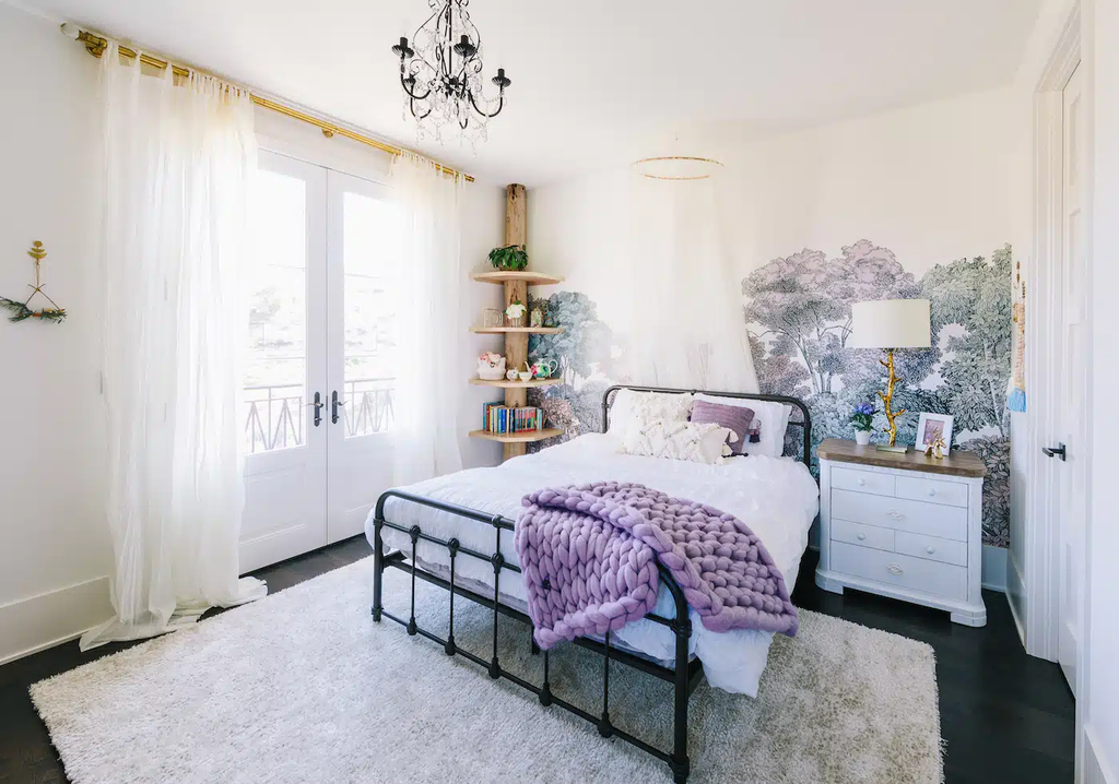
Credits: Little Crown Interiors
Lavender tones in the forest mural repeat in the chunky knitted throw across this white bed. The tree shapes give the wall depth, while a black metal frame provides a clear outline against the pale background.
Most other bedding remains simple, keeping the mural easy to appreciate. This is useful when you want purple to appear in both a permanent backdrop and a movable textile.
Choose the wall treatment first, then compare fabric samples with one of its quieter colors. You do not need to match every leaf or repeat the landscape elsewhere.
Leave some plain wall or light furniture around a detailed mural. A restrained supporting palette helps the bedroom feel connected without turning every surface into another pattern.
6. Set Plum Paneling Beneath a Pale Patterned Ceiling
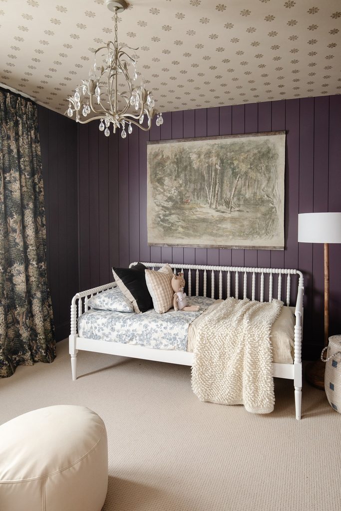
Credits: Chris Loves Julia
Deep plum vertical paneling gives this bedroom a backdrop beneath a much lighter patterned ceiling. A white spindle daybed remains clearly outlined against the purple, while softly colored bedding and a woodland hanging keep the setting varied.
The contrast in pattern scale matters: narrow panel lines below, small repeated motifs overhead. If you want a similar purple bedroom, study the ceiling and wall samples together before treating them as separate decisions.
Leave enough contrast for the room’s boundaries to remain visible. Simple furniture can help a dark wall feel organized rather than crowded.
You can keep the bedding plainer than this example if the ceiling already supplies plenty of detail. Let the architectural surfaces carry most of the decorating effort.
7. Lighten a Mauve Storage Corner With Pale Furniture
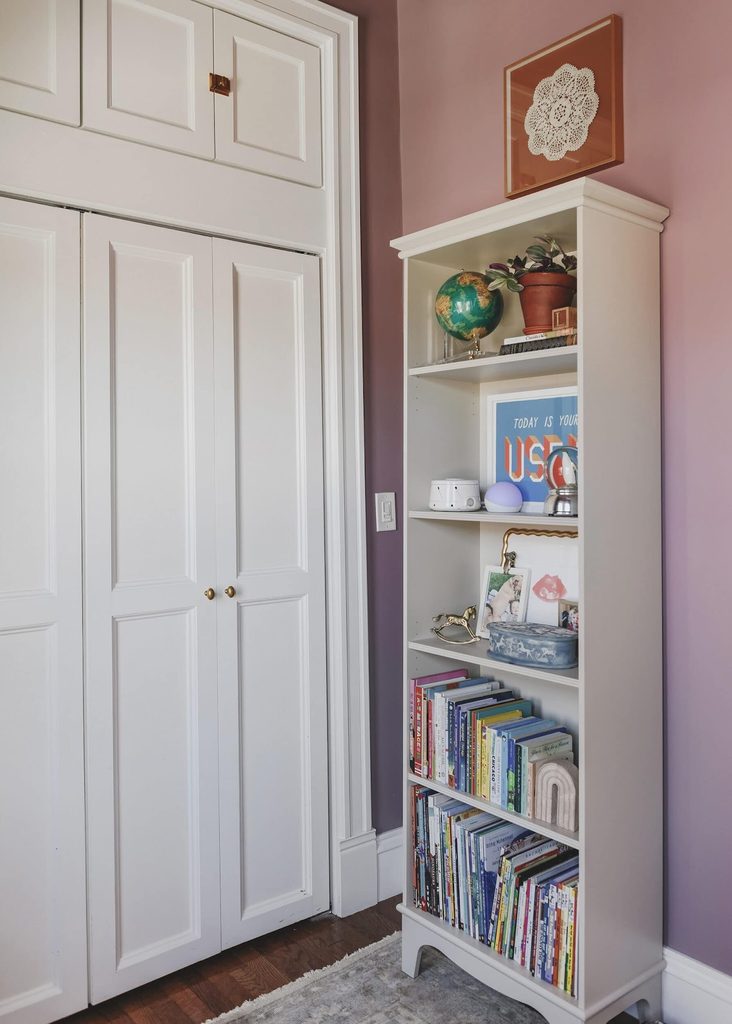
Credits: Yellow Brick Home
A pale bookcase stands clearly against the mauve wall in this bedroom corner. White closet doors beside it create another light vertical surface, while the darker wall remains visible around the storage.
The arrangement shows how a purple room can include furniture without making every piece colorful. Start with the shelves and cupboard space you actually need, then consider how their finishes relate to the wall.
A lighter cabinet can make books and everyday objects easier to distinguish against a deeper backdrop. Keep some shelf space visible instead of filling every opening with decoration.
Secure tall furniture appropriately and preserve access to doors and switches. The color relationship should help the storage feel integrated while its daily function remains straightforward.
8. Start Small With a Patterned Lilac Lampshade
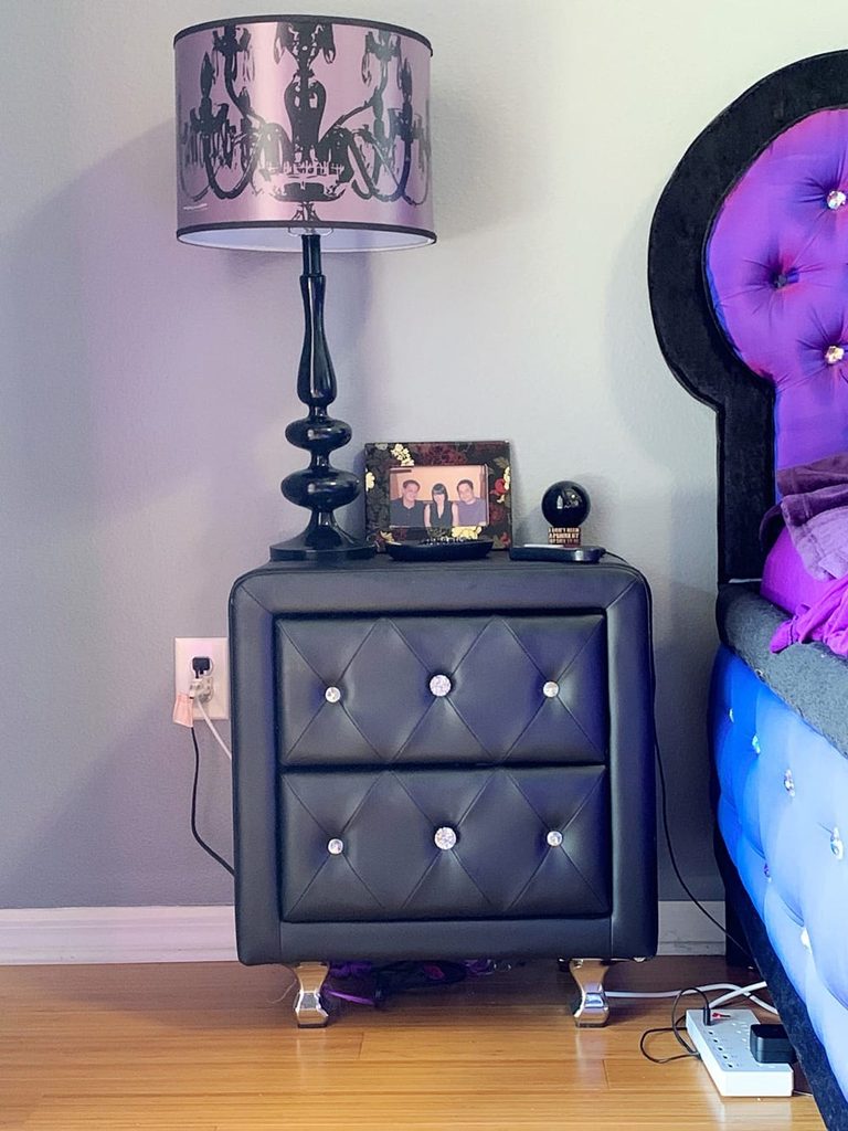
Credits: Phyrra
A lilac lampshade printed with dark chandelier silhouettes brings purple to this bedside corner on a scale.
Its black shaped base and darker cabinet provide a clear contrast, while the nearby purple headboard connects the small accessory with the larger room. The shade remains decorative even when the lamp is switched off.
This is useful when you want to test purple before changing walls or major furniture. Compare the fabric with your existing bedding under both daylight and the lamp’s own bulb.
Check that the shade fits the base and follows the fixture’s clearance requirements. Keep enough tabletop available for ordinary essentials.
One patterned shade can supply a focal point without needing several matching objects around the bed as well.
9. Frame a Bedroom Corner With Lavender Scallops
Credits: Makes, Bakes and Decor
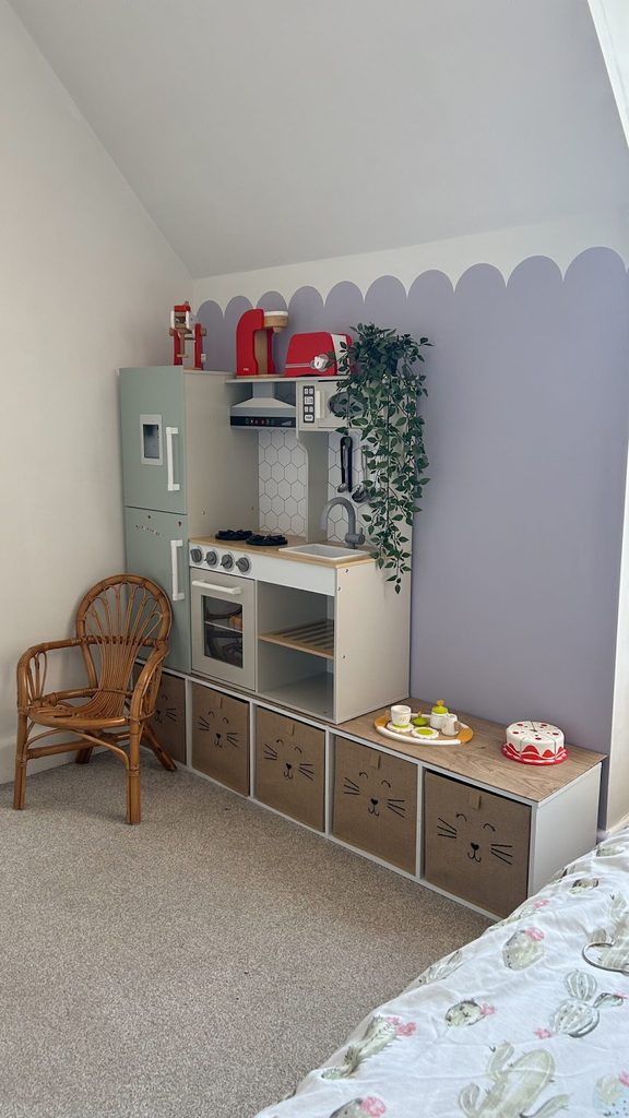
A scalloped paint boundary makes this lavender bedroom wall feel playful without covering the upper wall or ceiling in color. The rounded shapes run above low storage, linking the play corner with the sleeping area visible in the foreground.
White furniture and neutral storage boxes keep the lower half from becoming crowded. To try the idea, establish a level baseline before marking evenly spaced curves with a reusable template.
Test the purple shade beside existing bedding in daylight. Keep the remaining walls simple so the painted edge remains easy to read.
This approach can also frame a low dresser or reading bench. Adjust the scallop size to the furniture beneath it rather than filling the wall with tiny repeated shapes.
10. Refinish One Bedside Piece in Deep Plum
Credits: Love and Luck Photography / Rural Route Raised
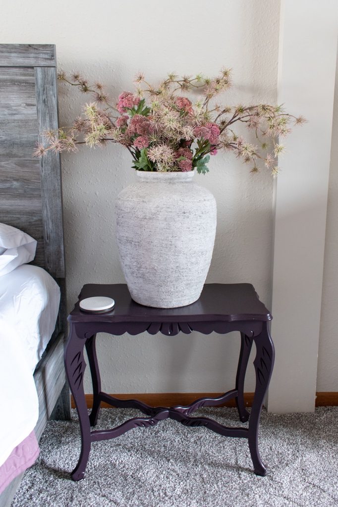
Deep plum paint gives this carved bedside table a identity beside the gray wooden bed. The color emphasizes the shaped apron and curved legs, while a pale vase keeps the tabletop arrangement lighter.
Rather than replacing every piece of bedroom furniture, this idea concentrates purple on one useful object. If you have a suitable table to refinish, assess its condition and finish before choosing the preparation and paint system.
Test the color near the bed so it works with the surrounding wood and textiles. Leave the decorative outline visible instead of crowding the piece with accessories.
A practical tabletop still needs space for everyday items. The purple finish can make an existing piece feel deliberate without changing the whole bedroom.
11. Pair a Purple Dresser With Vertical Accessory Storage
Credits: Bombshell Bling
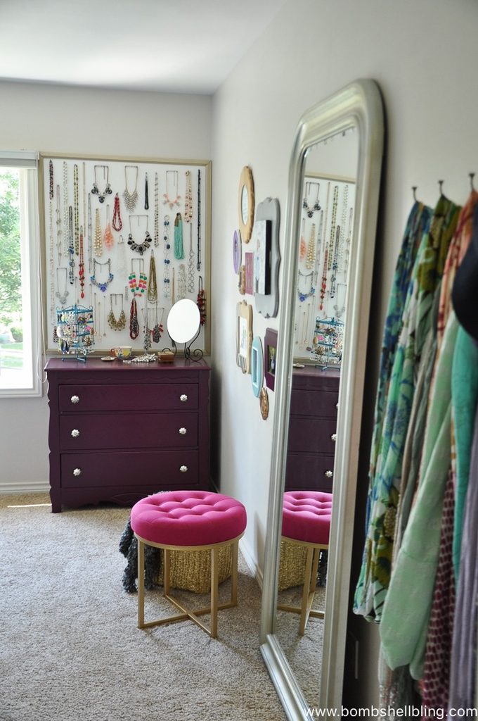
A deep purple dresser gives this bedroom dressing corner a clear anchor beneath a tall necklace display. The drawers provide enclosed storage, while the wall above keeps accessories visible without spreading them across the top.
A full length mirror reflects the purple finish and sits beside a pink stool, connecting practical routines with the room’s colorful palette. To adapt the idea, choose a dresser that leaves comfortable space for standing and opening drawers.
Secure the mirror and display with fixings suited to the wall. Group jewelry by length so pieces remain easy to separate.
Leave a small clear surface for daily essentials. Purple furniture can carry the color theme even when the surrounding walls and carpet stay pale and simple.
12. Pair Lilac Upholstery With Aubergine and Rust
Credits: Melanie Lissack Interiors
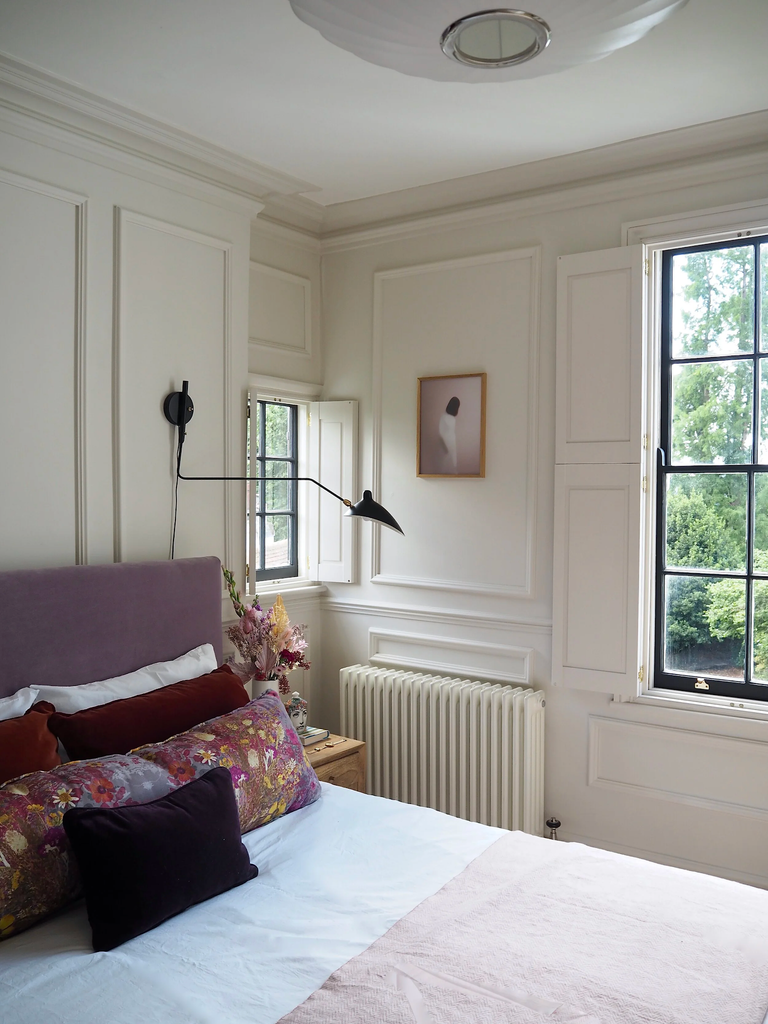
A lilac upholstered headboard introduces a purple surface beneath this bedroom’s cream wall moldings. An aubergine cushion and rust pillows deepen the palette, while a floral bolster brings the related colors together in one print.
White bedding separates those accents from the main upholstery. This is useful when a pale purple bed feels too delicate on its own and needs a little contrast.
Begin with one darker cushion rather than buying a complete new set. Compare its undertone with the headboard and any patterned fabric already in the room.
Warm surrounding walls can soften the contrast without making every shade identical. Keep the largest bedding layers simple so the mix of purple, rust, and floral detail remains easy to read.
13. Add a Narrow Plum Layer to a White Bed
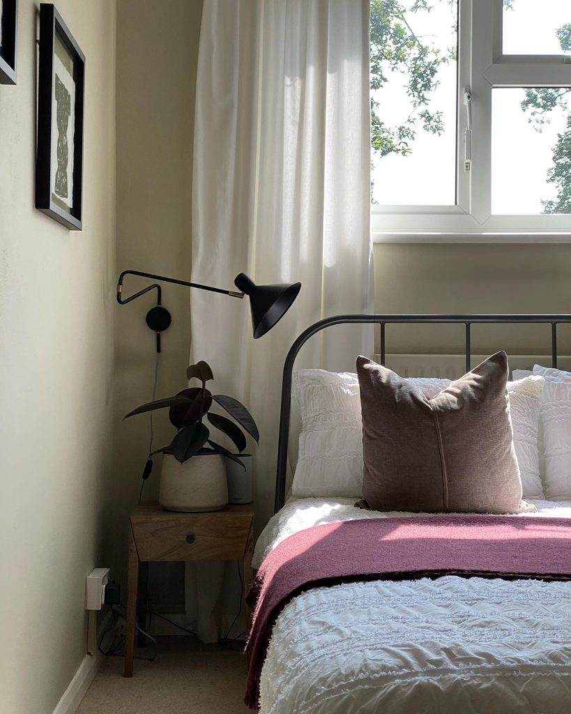
Credits: Instagram
A narrow plum blanket introduces purple across this otherwise white bed without covering its textured coverlet. The muted cushion above provides a softer related tone, while the open metal frame and wooden nightstand keep the arrangement simple.
The color occupies one area, making it easy to change with your preferences. Try this approach when you want to experiment with purple before repainting or replacing furniture.
Fold an existing blanket into different widths and judge the balance from the doorway. A small amount can be enough if the surrounding textiles are light.
Keep nearby accessories restrained so the plum stripe remains the clearest accent. Choose a layer that feels comfortable and useful, rather than one that only works as a display.
14. Unify Twin Beds With Matching Purple Bed Skirts
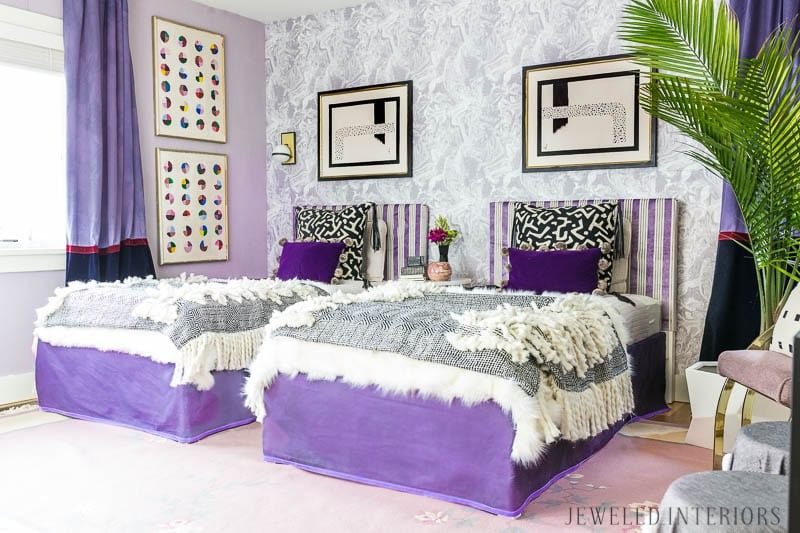
Credits: Amy Greene / Jewel Marlowe
Matching purple bed skirts connect these sleeping areas at floor level. The strong color remains visible below lighter quilts, while striped headboards and purple cushions repeat it higher in the room.
Black and white patterns keep the arrangement graphic without changing its purple foundation. This is a useful way to coordinate twin beds even when their upper layers are rearranged.
Compare the skirt length with each frame and leave clearance for cleaning and everyday movement. You can simplify the surrounding prints if your room already has patterned walls.
A consistent lower edge can provide enough repetition on its own. Keep each sleeping area practical for its user, allowing the shared textile color to supply visual order rather than identical accessories.
15. Give Violet Bedding a Warm Orange Counterpoint
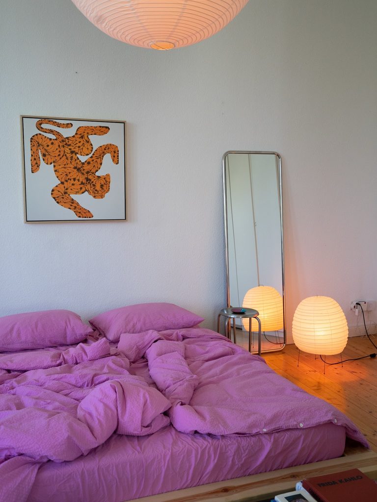
Credits: Instagram
Violet bedding becomes the largest color area in this bedroom, with an orange print introducing a concentrated warm contrast above it. White walls and a narrow mirror leave both colors easy to distinguish.
The combination feels lively because the orange has a clear place rather than appearing on every object. You can borrow this pairing through one artwork or accessory while keeping the bed’s purple textiles plain.
Compare the two colors together in the room before adding a third strong accent. A light background around the artwork helps separate it from the duvet below.
Keep practical lighting comfortable from the pillow. The useful principle is proportion: one broad purple surface, one smaller warm color, and enough quiet space between them.
16. Connect Lavender Walls With Blue and Floral Seating
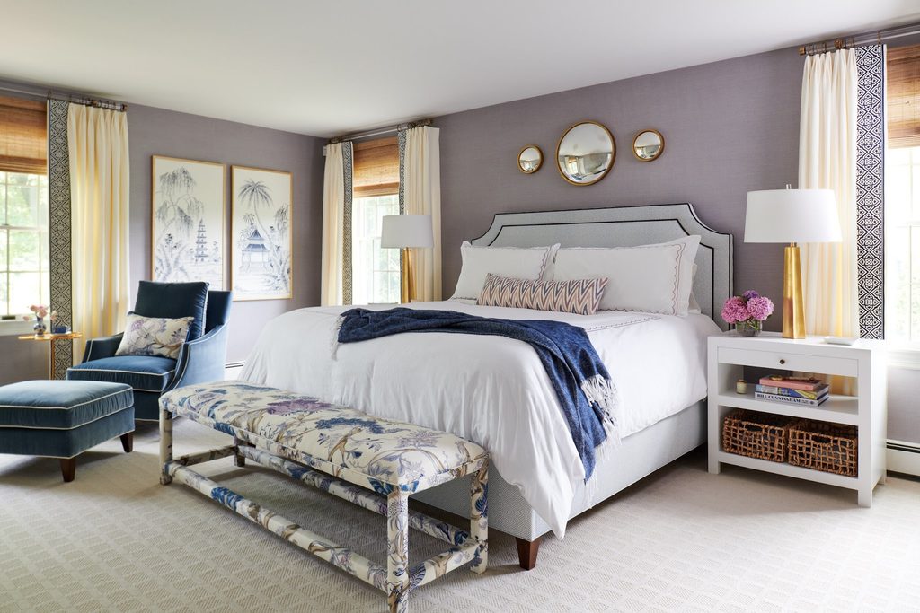
Credits: Kristina Phillips Interior Design
Muted lavender wallcovering gives this bedroom a backdrop for blue seating and a pale upholstered bed. A floral bench repeats both purple and blue, helping the furniture pieces feel connected rather than separately chosen.
Cream curtains and white bedding provide lighter pauses between the colors. This is a useful direction when you already own blue furniture and want to introduce purple without replacing it.
Start with one connecting textile, such as a cushion or bench fabric, that includes both tones. Compare a large sample with the wallcovering in daylight.
Keep its pattern distinct from other nearby prints by varying scale or leaving plain areas around it. The shared colors should explain the combination while each piece retains its own shape.
17. Finish Purple Curtains With a Dark Lower Band
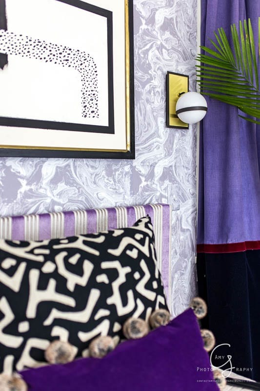
Credits: Amy Greene / Jewel Marlowe
A dark lower band gives these purple curtains a edge, with a narrow red stripe marking the transition between the two fabrics.
The stronger hem relates to the black details around the bed, while the upper purple remains visible beside the pale patterned wall.
This is a useful idea when plain curtains feel unfinished but an entirely patterned fabric would be too busy. Test the band height against the window and bed before choosing its proportions.
A modest contrasting strip can be enough to connect existing room colors. Keep the curtain length practical and the fabric clear of heaters or fixtures.
The detail should support the larger purple area rather than turn the window into several competing blocks of color.
18. Warm Plum Velvet With Antique Cane and Blush
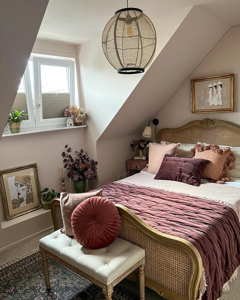
Credits: Instagram
Plum velvet adds a surface across this bed, balanced by blush cushions and the cane furniture around it. The pale walls keep the darker textile from filling the room, while a related plum cushion repeats the color near the pillows.
Texture carries much of the contrast between the smooth upholstery, open weave, and softly folded cover. This is useful if you like purple but want a softer setting than black and white.
Compare the velvet with existing wood finishes before adding more furniture. One warm neutral can connect several materials without making them match exactly.
Leave some light bedding visible so the plum retains a clear shape. A restrained mixture of textures can feel layered without needing another strong pattern.
19. Repeat Lavender Bedding Tones in Pale Wall Art
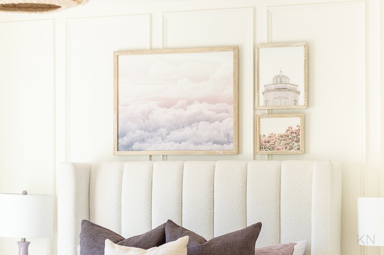
Credits: Kelley Nan
Lavender and soft pink clouds in the picture above this bed relate to the deeper purple cushions below. Smaller pale framed prints sit beside it, creating a gallery without filling the paneled wall.
The light upholstered headboard keeps the artwork and bedding visually separate. This is a useful way to connect purple textiles with a room that still has mostly neutral walls.
Look for artwork you enjoy that includes related colors rather than trying to find an exact fabric match. Arrange the pieces together before deciding on their positions, and secure them appropriately.
Leave enough space around the group for each outline to remain readable. A few shared tones can make the gallery feel connected to the bed without repetition.
20. Warm Lavender Bedding With Woven Storage
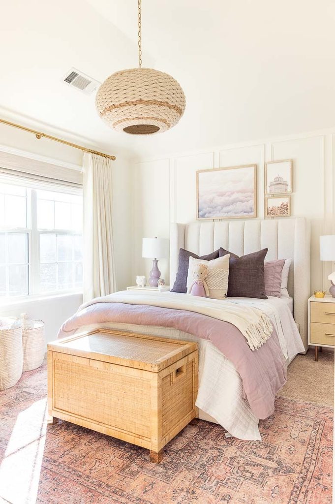
Credits: Kelley Nan
A woven wooden trunk adds a natural surface at the foot of this lavender bed. Its texture relates to the overhead pendant and storage baskets, while pale upholstery and white linens keep the purple layers distinct.
The room shows how practical furniture can soften a cool color palette without adding another strong hue.
If you choose a trunk, check its dimensions against the walking space around your bed and consider how often you need to open it. Select hardware appropriate for its users and intended storage.
Repeat the wood’s warmth in only a few places rather than replacing everything. A simple material relationship can give lavender bedding a grounded setting while preserving useful storage and comfortable movement within the bedroom.