
A bedroom palette can feel easier to pull together when one color leads and the others have clear supporting roles.
These Bedroom Color Ideas show how to make that work with choices such as charcoal walls grounded by mauve rug accents, powder blue balanced by cobalt and white linens, or warm timber set against ivory.
Other combinations use a small, vivid detail—a yellow door within pink storage or a blush shape behind dusty blue bedding—to create a focal point without spreading color across every surface.
Compare shades with the textiles and finishes already in the room to keep the mix feeling connected.
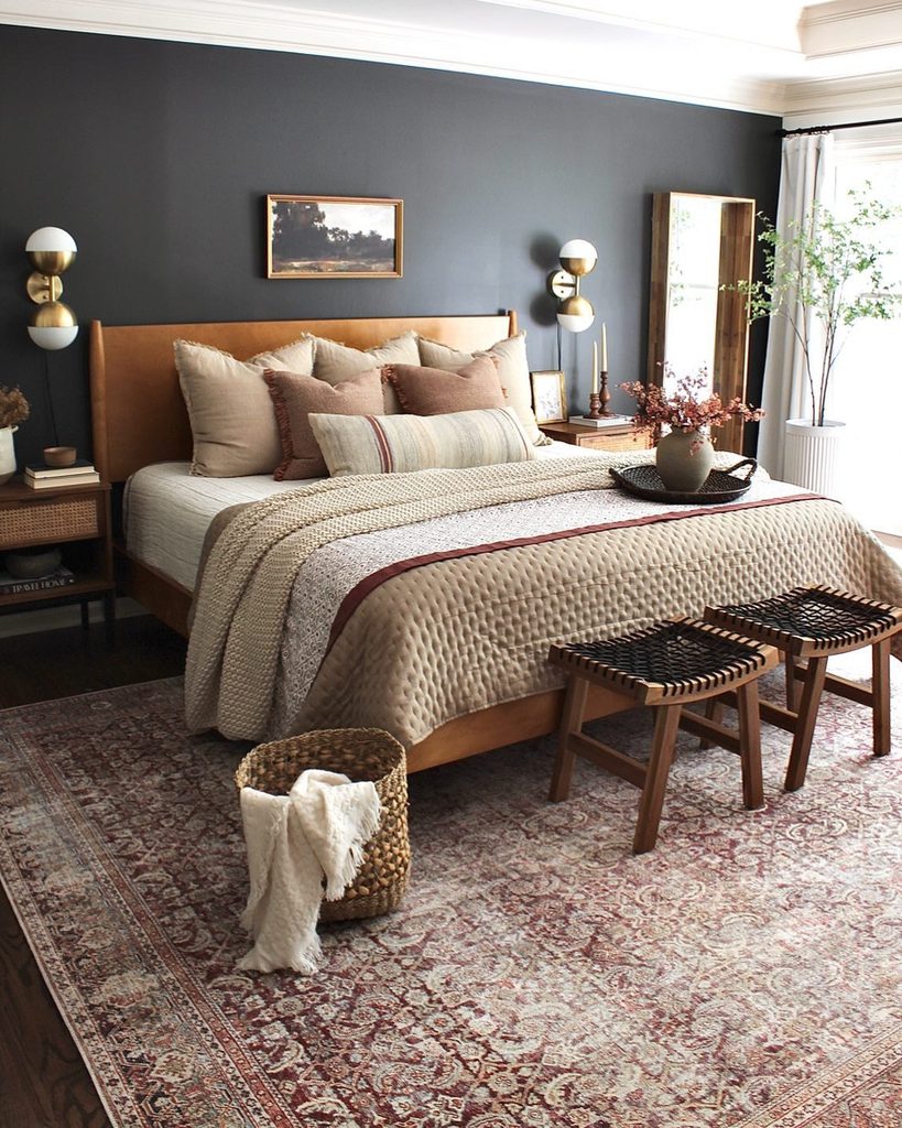
Charcoal Walls With Mauve Rug Accents
Credits: Instagram
A rug can supply the starting palette when choosing wall colors feels overwhelming. In this room, mauve and burgundy details in the floor pattern connect with cushions and a narrow accent across the bed.
Charcoal walls give those softer colors definition, while cream bedding prevents the center from becoming too dark. Start with an item you already enjoy and identify two useful shades within it.
One can become a accent rather than another painted surface. Compare samples beside the rug at different times of day, since its colors may shift under lamps.
Warm wooden furniture helps bridge the dark wall and pale textiles. The goal is a connected palette that still leaves pieces room to look different from each other.
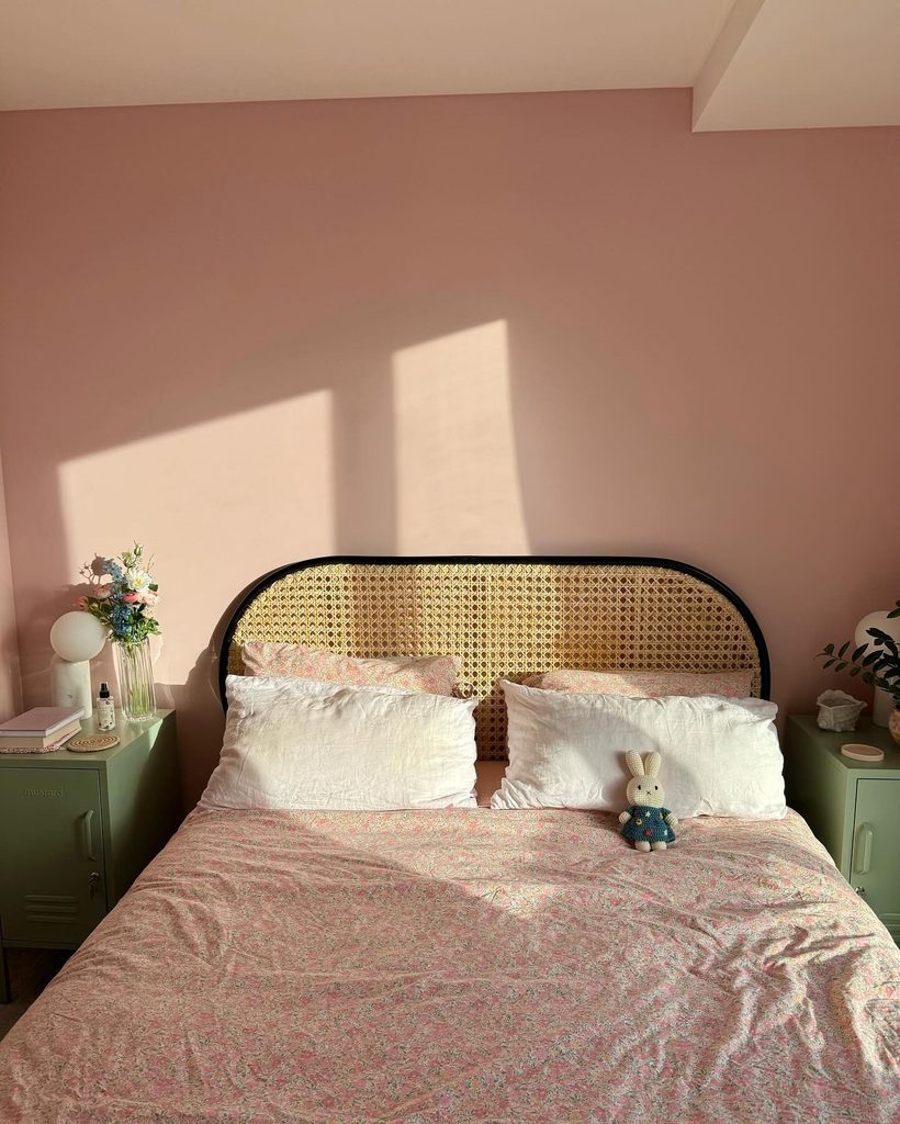
Blush Walls With Sage Bedside Lockers
Credits: Instagram
Bedside furniture does not have to disappear into the background. Sage green lockers give this blush bedroom two blocks of contrasting color, while the black rim of the cane headboard defines the middle.
The floral bedding shares the pink family without copying the wall exactly. Try this idea when repainting an room is unnecessary but the bed area needs clearer balance.
A pair of smaller colored pieces can be easier to commit to than one large wardrobe. Check their height and storage practicality first, then judge the color against your bedding.
Keeping the lamps simple helps the lockers remain visible. Pale green and muted pink work here because neither is treated as an isolated accent with nothing else supporting it.
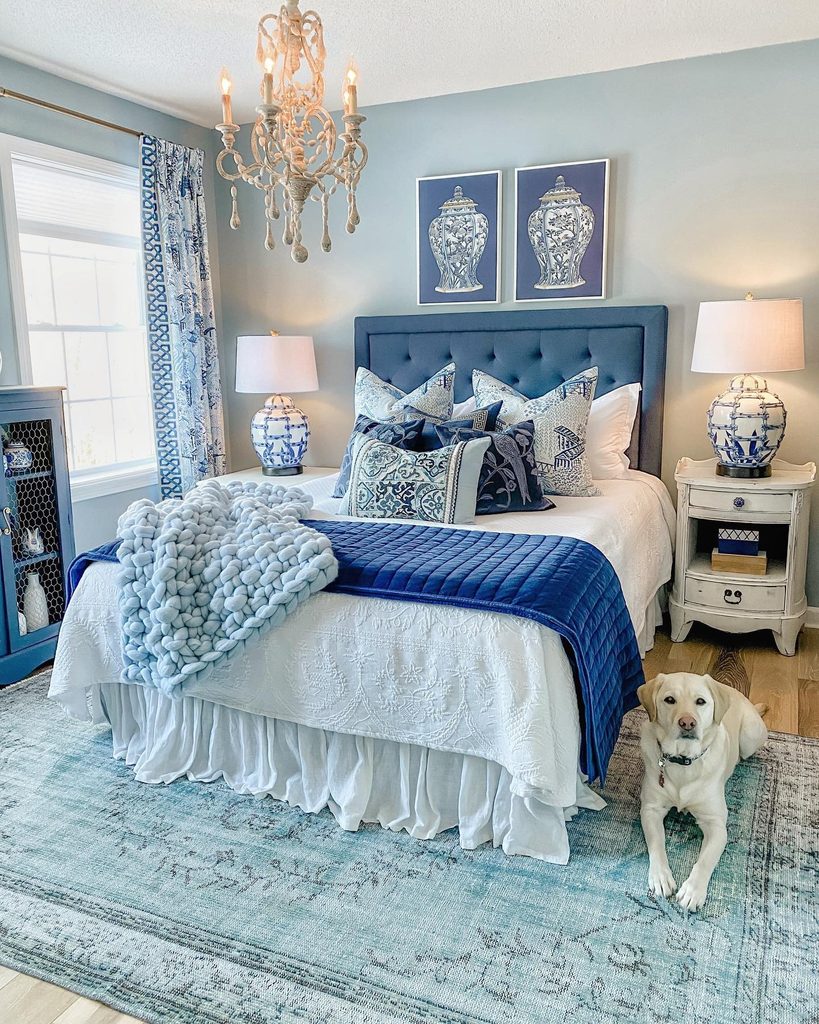
Powder Blue and Cobalt Around White Linens
Credits: Instagram
Several blues feel coordinated when their lightness changes more than their purpose. Powder blue walls and a pale rug surround a darker upholstered headboard, with cobalt bedding providing the strongest note.
White sheets separate the pillows and porcelain lamps so details remain readable. Choose one blue for the broad background and another for a more saturated area.
You do not need identical fabric and paint shades to make the room connect. Compare the undertones instead, particularly if one blue leans green and another appears violet.
The white layers give you room to make those decisions without adding another color. Repeating patterns at different scales creates variety, while the limited palette keeps the collection of furniture, lamps, and textiles feeling related.
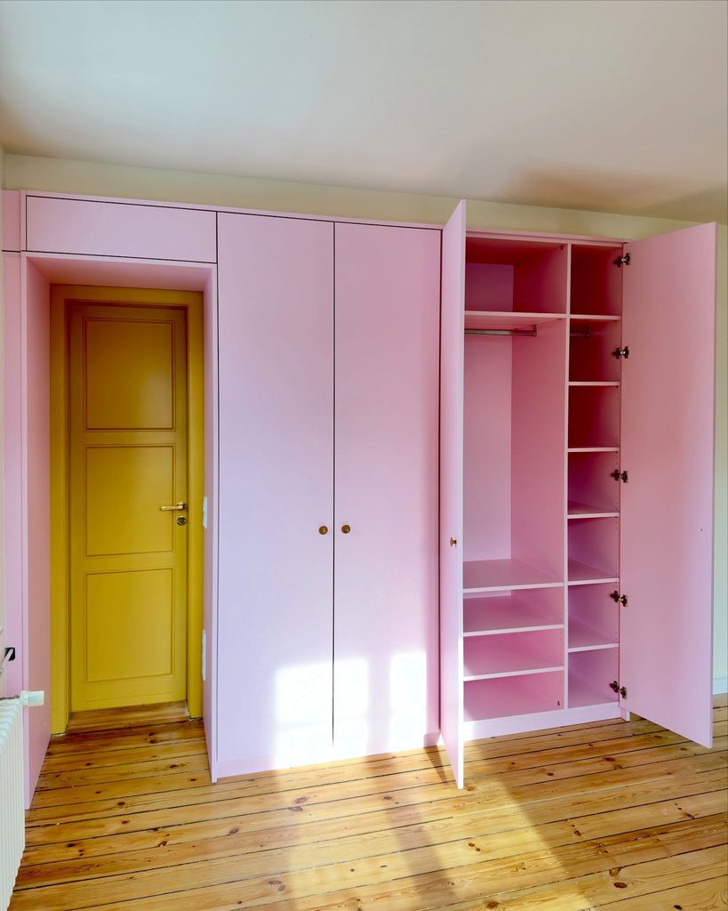
Yellow Door Within Pink Bedroom Storage
Credits: Instagram
A bright yellow door turns a practical storage wall into a deliberate color composition. Here, pale pink cupboards surround the doorway, with the same pink continuing inside the open wardrobe.
Warm floorboards connect the two colors without adding another painted surface. This detail is useful when bedroom storage occupies most of a wall and you want it to feel considered.
Decide which element should stand out before choosing samples: the smaller door can carry the stronger shade. Keep the surrounding ceiling and wall quiet so the outline remains clear.
Test paint beside the existing timber and check suitable finishes for doors and cabinetry. Repeating the cupboard color inside makes open storage look connected rather than like a separate unfinished area.
Emerald Walls With Pink Floral Accents
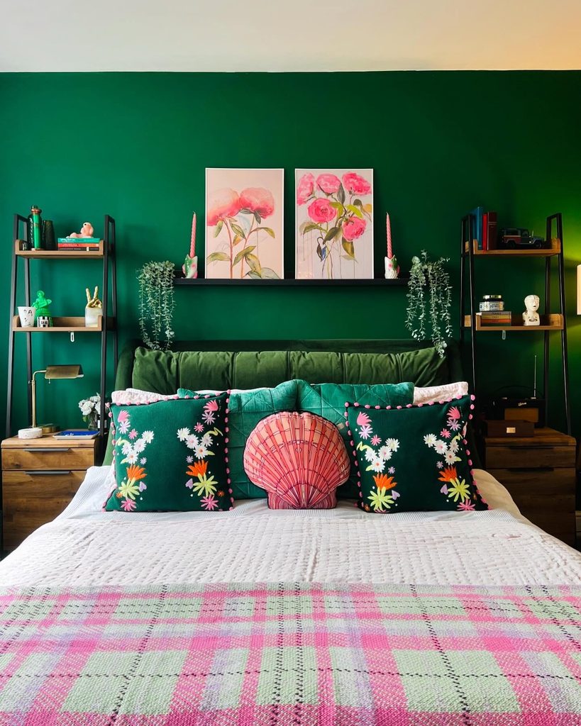
Credits: Instagram
Deep emerald provides a strong background for pink without requiring an entirely pink bedroom. In this arrangement, floral artwork, a shell shaped cushion, and a checked throw repeat pink at different heights.
Green pillows connect the bed with the wall, while white bedding gives the accents room to stand apart. Start with one pairing you enjoy, then distribute the smaller color through two or three visible objects.
The repeated pink does not need identical patterns to feel related. Keeping the shelving frames dark helps the display remain organized around the bed.
Compare saturated green samples with your actual textiles before painting. If the result feels too busy, remove a cushion rather than introducing another neutral accessory to compete with everything.
Dusty Blue Bedding Against a Blush Circle
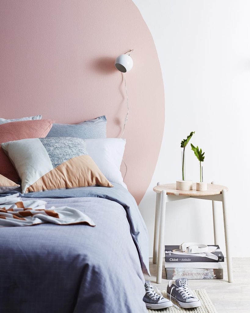
Credits: Instagram
A large curved blush shape creates a soft backdrop for dusty blue bedding. The wall stays white around the painted circle, making the warm color feel concentrated rather than overwhelming.
Small cushions repeat pink and introduce pale peach, while the round bedside table echoes the curved boundary. This is a useful approach when a bedroom needs a focal point without another large piece of furniture.
Sketch the shape in relation to the mattress and bedside lighting before marking the wall. Keep most bedding plain so the outline remains easy to read.
Test the blue and blush together in daylight and beside your evening lamp. Leaving white visible around the shape helps distinguish the painted feature from the surrounding room clearly.
Golden Curtains With Blue Patterned Bedding
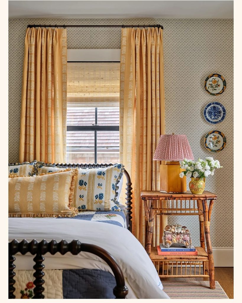
Credits: Instagram
Curtains can carry the warmest color in a bedroom without changing its wall finish. Golden patterned panels frame the window here, while blue details in the bedding and decorative plates provide a cooler contrast.
A yellow lamp base repeats the curtain color close to the bed. The small wallpaper pattern remains quieter than the larger textile shapes.
Start by comparing curtain fabric with bedding you already own, especially when a room contains several prints. Repeating one warm color helps those patterns feel connected without making them identical.
Allow enough plain fabric on the bed to keep the arrangement readable. View your samples with the curtains both open and closed, since their visible area changes considerably throughout an ordinary day indoors.
Warm Timber Within an Ivory Bedroom
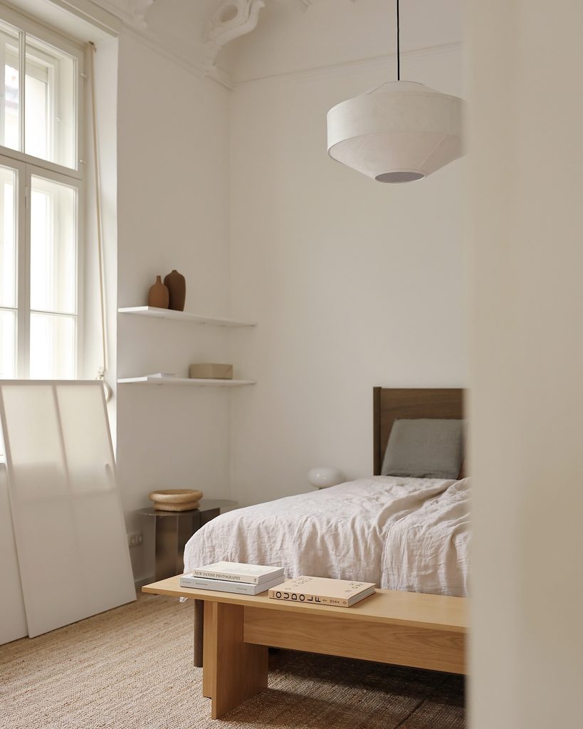
Credits: Instagram
Warm natural wood supplies the warm color in this otherwise pale bedroom. The low bench, headboard, and woven floor covering sit against ivory walls and softly rumpled bedding.
Darker ceramic vessels add a small earthy contrast without interrupting the restrained palette. Treat timber as a color choice when selecting white paint rather than assuming every neutral will work beside it.
Compare samples directly with the furniture, because some whites can make warm wood look unexpectedly orange. Keep the textile shades close but vary their surfaces, using linen folds and woven texture to prevent flatness.
A limited palette also makes individual shapes more noticeable. Choose a few useful objects and leave clear wall space so their tones can be appreciated together.
Muted Rainbow Above Plain White Bedding
Credits: Instagram
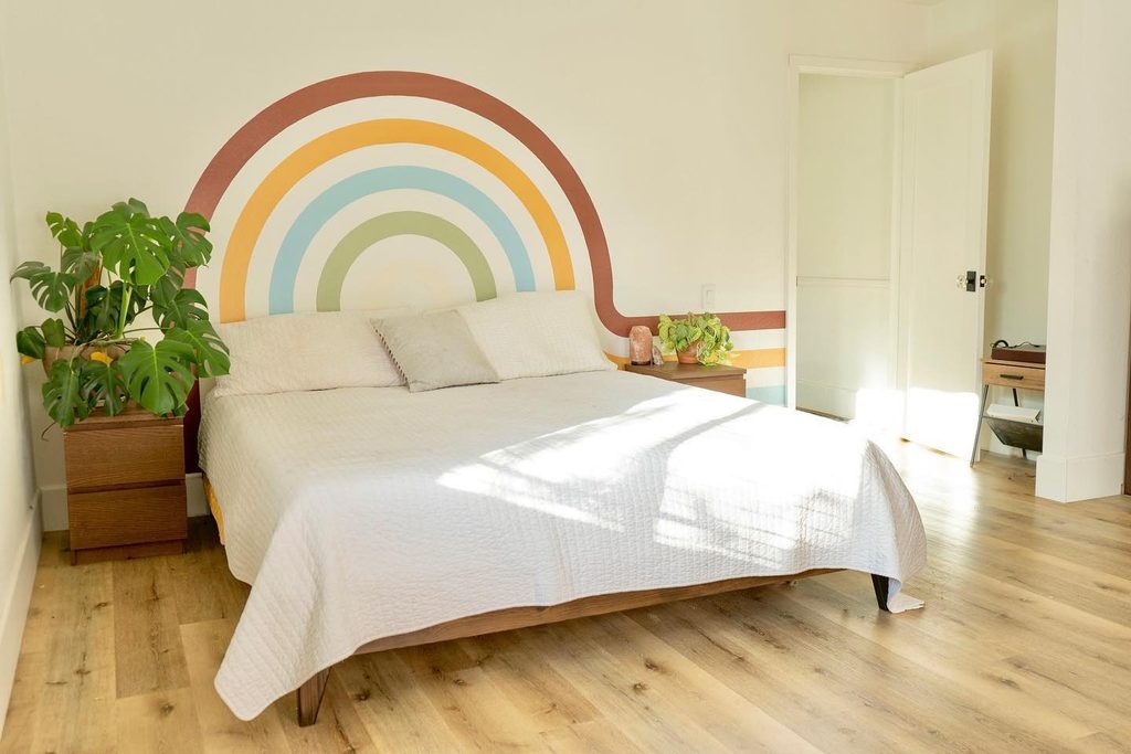
One graphic feature organizes colors that might otherwise feel visually disconnected. Terracotta, ochre, pale blue, and muted green form an arch behind this bed, with white gaps keeping the bands separate.
Plain bedding lets the mural remain the main event. Instead of scattering four colors across unrelated accessories, you could use one element to establish their relationship first.
Plan the arch around the bed’s width and consider where its horizontal extensions will end. A paper sketch helps reveal awkward edges before any paint is applied.
Choose colors with a similar softness if you want the result to feel balanced. Leaving the rest of the walls quiet gives the composition room, while a matching object can connect it to the furniture.
Sunset Stripes Across a Bedroom Feature Wall
Credits: Instagram
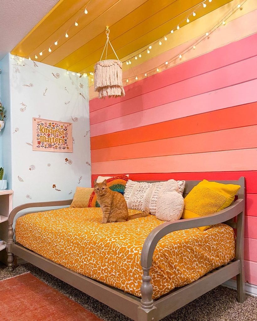
Bands of yellow, peach, coral, and pink make this bedroom wall feel like a concentrated sunset palette. The horizontal boards provide clear boundaries between shades, while a gray daybed keeps the furniture quieter.
Yellow bedding connects the sleeping area with the upper bands. Rather than scattering many bright accessories around the room, organize related colors on one surface.
Plan the sequence on paper and compare the actual paint samples side by side before starting. Leave an adjacent wall lighter so the stripes have a clear stopping point.
A mostly neutral frame helps the bed remain visible against the pattern. You can interpret the idea with fewer bands if the room is small or your existing furnishings already contain strong colors.
Blush Curtains Beside a Black Feature Wall
Credits: Instagram
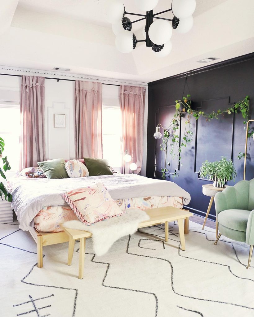
Curtains can soften a dark room without changing the wall that gives it character. Here, blush panels frame the bright windows beside a black feature wall, with green cushions and a curved chair introducing a third, quieter color.
White bedding and a pale rug connect the contrasting sides. Consider the curtains as a part of your palette rather than an accessory chosen last.
Their color will occupy more space when closed, so compare fabric samples across your bedding as well as beside the window. A warmer pink can counter a cool dark wall without requiring pink furniture too.
Keep the remaining surfaces light if you want similar balance. Touches of green can then relate to plants or existing upholstery naturally.
Yellow Gingham With Multicolored Floral Bedding
Credits: Instagram
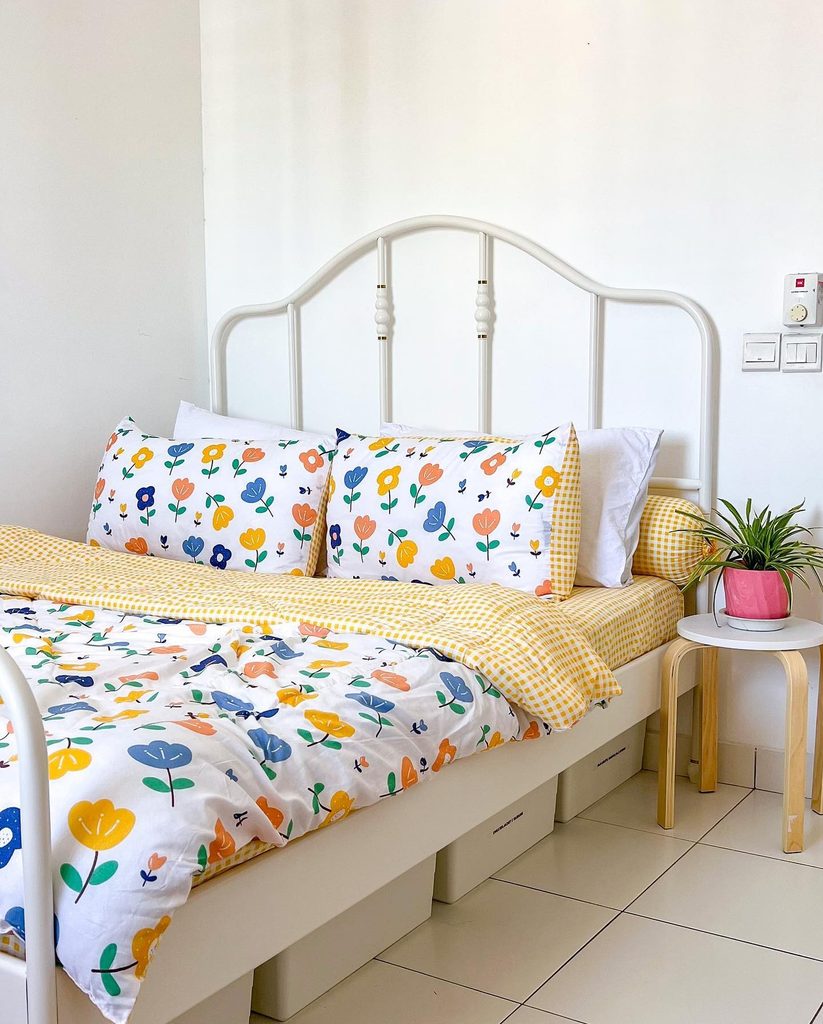
Small yellow gingham provides a steady background for the larger floral shapes on this bed. Blue, peach, and yellow flowers share white space, allowing several colors to appear without making the room feel uniformly saturated.
The white metal frame and plain walls keep attention on the textiles. This is an approachable option when you want bedroom color without painting or replacing furniture.
Choose one small repeating pattern and one larger print, checking that they share at least one useful shade. Fold the duvet back to show the contrast rather than hiding the supporting pattern completely.
A single bright plant pot can echo the playful mood. Keep additional cushions selective so the bedding remains the main source of color in view.
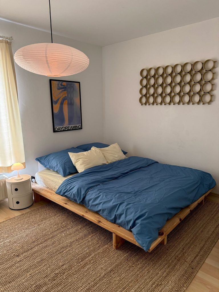
Denim Blue Linens With Soft Yellow Layers
Credits: Instagram
Denim blue bedding becomes warmer when paired with pale yellow pillows and a matching sheet. In this simple bedroom, a timber platform and woven rug support the combination without introducing another strong hue.
The cream walls and curtains keep the broad background quiet. This palette works particularly well when you prefer plain textiles to patterned bedding.
Choose a softened yellow rather than assuming every bright shade will suit your blue. Lay samples together across the bed and compare them under both daylight and your usual lamp.
A warm light can alter the balance noticeably. Artwork can repeat the two colors in a smaller area, but it does not need to match exactly. Let the bedding carry most of the contrast.
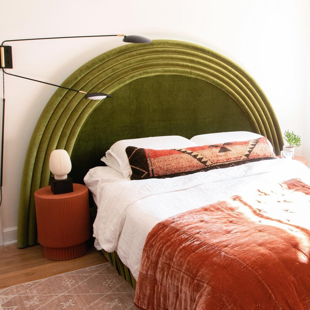
Olive Velvet With Rust Colored Textiles
Credits: Instagram
An olive upholstered headboard gives this bedroom its strongest color and curved silhouette. Rust textiles and a terracotta bedside table supply a warm partner, with white bedding separating the two saturated areas.
The long patterned cushion connects the earthy shades without covering the headboard completely. Consider this combination when you want rich bedroom color but prefer to keep the walls light.
Upholstery changes appearance with its texture and the direction of light, so examine a generous sample rather than a tiny swatch. Repeat the warmer color in one practical object to make it feel intentional.
Keep the rest of the bedding simple enough for the curved outline to remain visible. Dark lighting hardware adds definition without another competing painted surface.
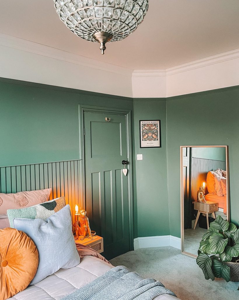
Green Walls Beneath a Blush Ceiling
Credits: Instagram
Looking upward reveals a color opportunity in this green bedroom. A blush ceiling and matching upper band create a softer boundary above the deep walls, with warm cushions repeating the pink family closer to the bed.
The green door remains part of the wall rather than becoming another contrast. This approach suits rooms with a picture rail or clear architectural dividing line.
Decide where the upper color should stop before buying paint, then test it on both horizontal and vertical surfaces. Light reaches them differently, even when the paint is identical.
Keeping the upper band consistent around corners will make the treatment feel deliberate. Accessories can remain restrained because the relationship between the two painted areas provides plenty of interest.
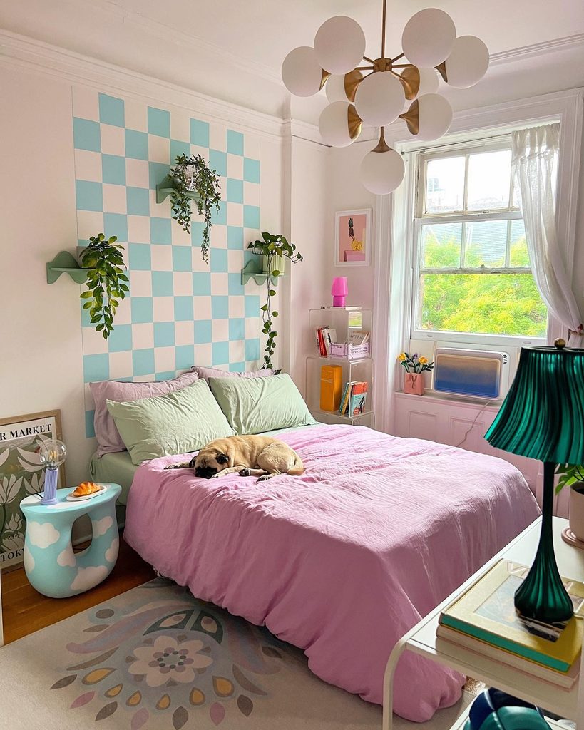
Aqua Checks With Lilac and Pale Green
Credits: Instagram
Checks create a boundary for color in a room that stays pale. The aqua and white wall panel here sits behind lilac bedding and soft green pillows, bringing three pastel shades together without painting every surface.
A darker green lamp adds definition. Work out the panel’s dimensions in relation to the bed before choosing the size of each square.
A repeat that looks attractive in isolation may end with awkward fragments beside the headboard. Keep the bedding mostly plain so the graphic wall remains easy to read.
You can borrow the palette without the pattern by using aqua artwork or a small painted panel instead. The deeper lamp color matters because it prevents every object from having the same weight.
Bright Floral Bedding With a Striped Rug
Credits: Instagram
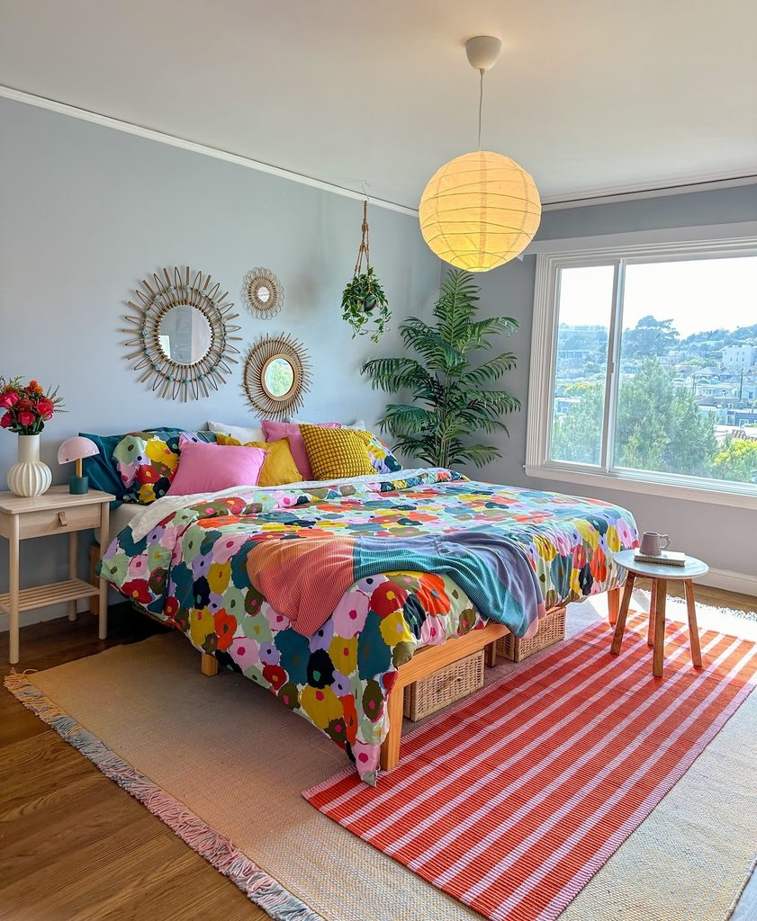
A large colorful floral duvet can organize a room containing several cheerful colors. Here, pink and yellow cushions repeat shades from the print, while a red and pink striped rug adds a different pattern near the bed.
Pale blue gray walls allow the textiles to remain dominant. The useful principle is repetition with changing scale: broad flowers and narrow stripes can coexist when their colors relate.
Start with the duvet, then select one or two shades for plain cushions before considering another patterned piece. Keep larger furniture in natural wood or a similarly quiet finish.
This leaves room for the fabrics to do the decorative work. Check the whole arrangement from the doorway, where competing colors become easier to notice.
Seafoam Bedding With Ochre and Natural Wood
Credits: Instagram
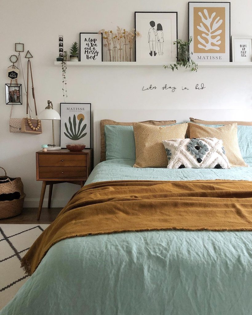
Seafoam bedding and an ochre throw create a warm and cool pairing without painting the walls. The cushions repeat the golden shade, while artwork above the bed introduces related earthy colors in smaller amounts.
A wooden bedside cabinet gives the scheme another warm surface. This approach is useful when you want seasonal flexibility or cannot change the bedroom’s permanent finishes.
Begin with two plain textile colors and let one cover more of the bed than the other. Similar intensity helps the combination feel balanced, even when the hues differ.
A textured white cushion can separate the stronger colors without becoming another focal point. Compare fabrics against your existing furniture so the wood feels included in the palette from the beginning.
Deep Teal Shelving Around Pale Upholstery
Credits: Instagram
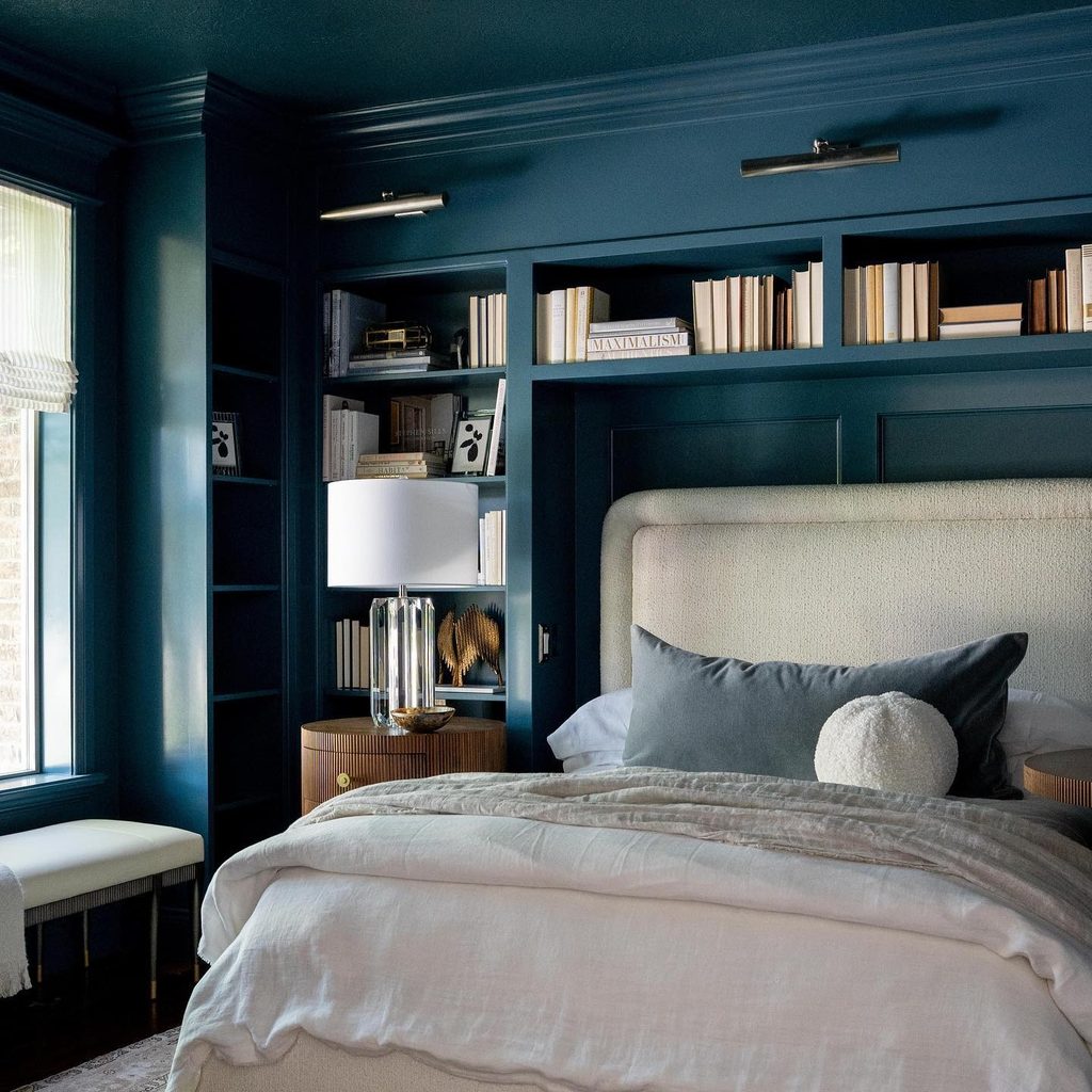
Painting shelving and surrounding walls the same deep teal turns storage into a continuous bedroom backdrop. Pale upholstery and light bedding stand clearly against it, while books and warm wood introduce smaller variations.
The matching trim keeps the eye from stopping at every edge. This is a useful alternative to painting only the wall behind the bed when fitted furniture already dominates the room.
Test the shade on both flat surfaces and recessed shelves, where shadows can make it appear considerably darker. Keep frequently used objects easy to reach and leave some open space between display pieces.
A light headboard provides contrast close to the pillows. Select bedside lighting for practical reading as well as the way it highlights color.
Terracotta Cupboards Above a Gray Sleeping Area

Credits: Instagram
Warm terracotta cupboard fronts create a distinct upper band above this gray sleeping area.
Vertical wall details and upholstered panels keep the lower half in a cooler palette, while pale curtains and flooring prevent the narrow room from feeling visually crowded.
The color placement makes functional storage part of the design. Consider a warm accent on cabinet doors when repainting every wall would be unnecessary.
Compare it against the upholstery and wood finishes already in the room before committing. Keep handles and nearby accessories simple so the cupboard fronts remain a clear block of color.
A small cushion can echo the warmth lower down without matching everything. The result uses contrast between upper storage and lower furniture rather than pattern.