
A richly painted bedroom can feel cozy without disappearing into one solid block of color.
The Best Olive Green Bedroom Ideas show how to give the shade structure and warmth, from carrying it across the ceiling to defining one wall with tall panels.
You can also pair olive with wallpaper for subtle movement, use it to connect layered prints, or balance exposed brick with green around the windows.
Details like pale bedding, warm wood, and a rounded nightstand help the color feel considered while letting the room’s textures and furnishings stand out.
Carry Olive Onto The Ceiling
Credits: Instagram
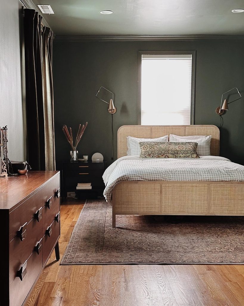
A continuous color can make an ordinary bedroom feel enveloping. Chelsea Bieber takes deep olive across the walls and ceiling, then repeats it in long curtains for a connected backdrop.
The pale woven bed prevents that surrounding color from becoming the only thing you notice. Wood furniture and a patterned rug introduce warmth at a lower level, while the bright window remains a clear break in the scheme.
Before trying this approach, compare a generous paint sample on both a vertical surface and overhead. The same shade can appear different as light moves around the room.
Choose bedding that remains distinguishable from the painted surfaces, especially if you want the bed’s outline to stay prominent within a deeply colored space.
Let Wallpaper Add Subtle Movement
Credits: Instagram
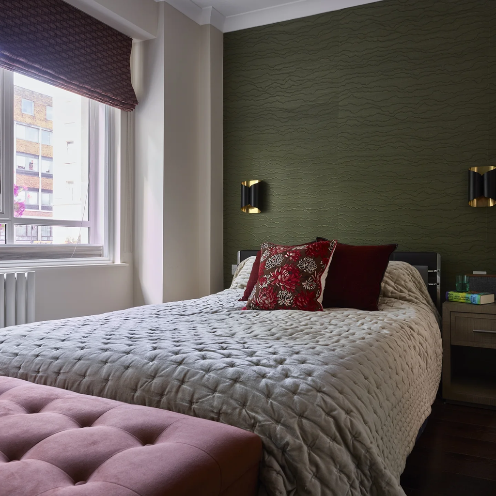
Texture gives a single accent color more to do. In this bedroom by Sarah Fox, an olive wallcovering has irregular horizontal ridges that create variation behind the bed.
Black sconces with warm metallic details emphasize the surface, while claret pillows and a pink bench provide small departures from the green. If a flat painted wall feels unfinished, consider a textured sample before adding more artwork or furniture.
View it with the lamps you plan to use, since grazing light can make a subtle pattern much stronger. Keep the bedding comparatively restrained so the wall remains legible.
A limited red accent, such as one pillow, is enough to test this pairing without committing every textile to the same saturated color scheme.
Use Olive To Connect Layered Prints
Credits: Instagram
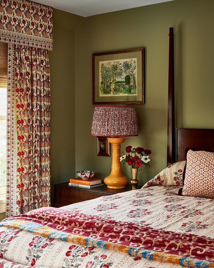
Busy fabrics benefit from a background that gives them somewhere to settle. This guest bedroom combines warm olive walls with patterned curtains, bedding, and a lampshade.
A yellow ceramic lamp brings out the warmer notes in those prints, while dark wood provides a steady outline around the bed and nightstand.
Start with one textile you love, then look for an earthy green within its pattern when choosing paint. The colors do not need to match exactly, but their undertones should feel compatible in your room’s light.
Vary the scale of neighboring prints so they remain distinct. A smaller pattern on a shade can sit comfortably beside broader curtain motifs without making every surface compete for attention across the whole bedroom.
Soften Olive With A Rounded Nightstand
Credits: Instagram
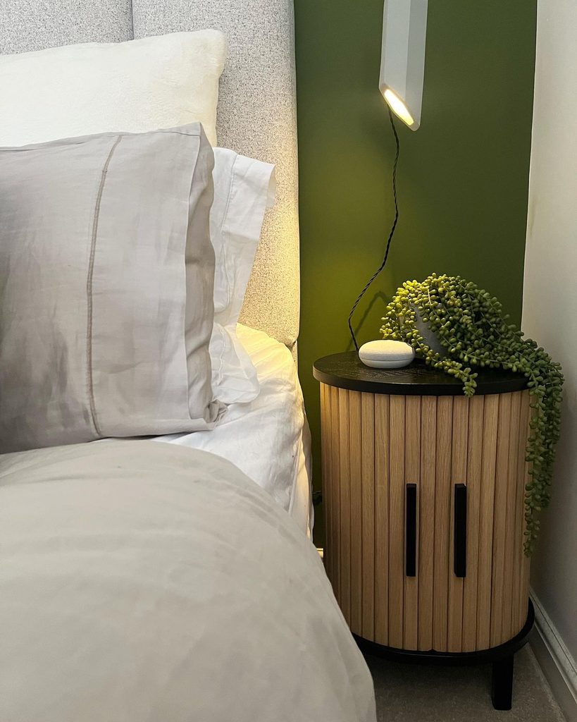
Curved furniture can soften the point where a bed meets a strongly colored wall. Here, a wood nightstand has a rounded outline and closely spaced vertical slats, offering a warm contrast to olive paint.
Its dark top connects with the small black details nearby, while a slim wall light leaves most of the surface available.
If your bedside corner feels tight, compare the usable top and door clearance before choosing a table purely for its shape. A rounded front may look lighter, but it still needs to hold your everyday essentials.
Keep trailing greenery clear of handles and electrical cords. The pale headboard and bedding make the green section feel intentional without requiring the entire bed to match the wall.
Define One Wall With Tall Olive Panels
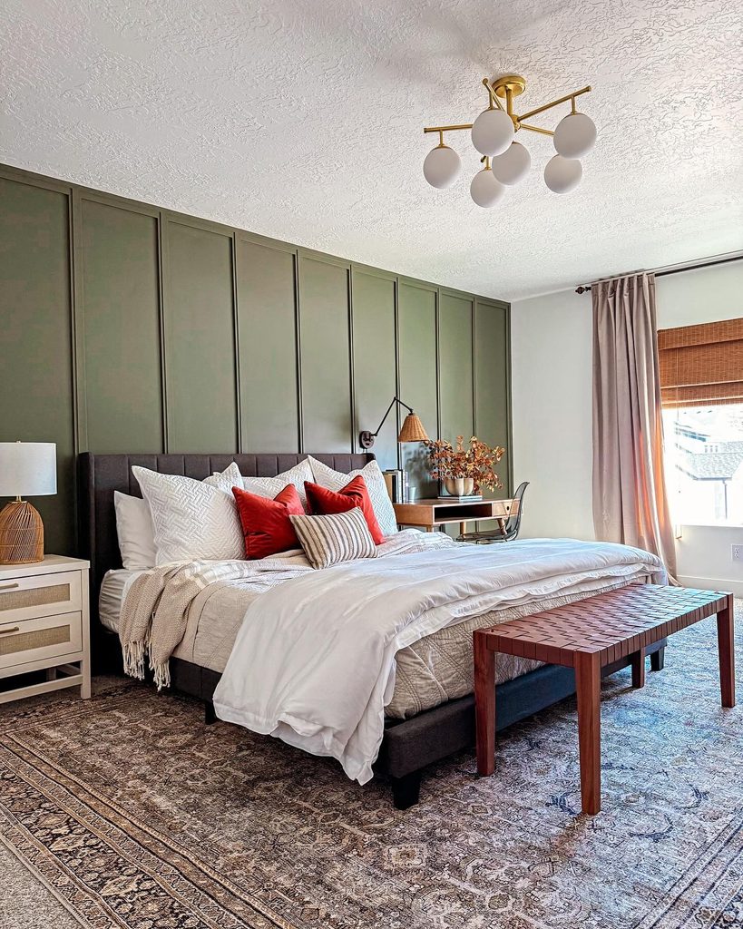
Credits: Instagram
Architectural detail can give a single painted surface enough presence for the whole room. This makeover uses paired battens to create tall olive panels behind a dark upholstered bed.
The adjoining wall and ceiling remain light, so the room has a clear focal point without being enclosed in green. Rust pillows and a reddish wood bench add warmth against pale bedding.
Before installing trim, mark the proposed spacing beside your bed, outlets, and nightstands. Small adjustments on paper are easier than correcting an awkward final panel.
Keep the upper wall free of unnecessary decoration if you want those vertical lines to remain prominent. A patterned rug can supply interest below while allowing the paneled backdrop to maintain its quiet rhythm.
Balance Exposed Brick With Olive
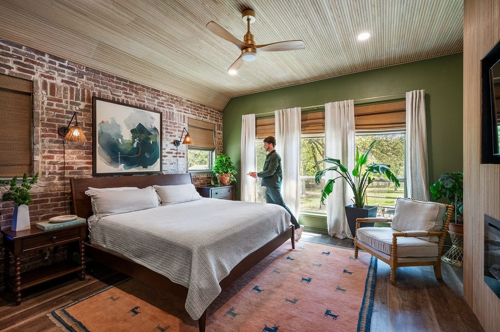
Credits: Instagram
Existing materials often suggest a convincing color palette. Travis Jones pairs an exposed brick bedroom wall with olive around the windows, letting the green temper the brick’s warm red tones.
Pale curtain panels separate the windows, and simple light bedding keeps the arrangement from becoming visually heavy. Wood overhead and along the floor adds another natural surface without needing to match every other finish.
If your room already has brick, compare paint beside its mortar as well as its warmer faces. Both affect how the green will read.
Repeat a little olive through plants or artwork rather than covering the bed in identical color. This approach lets the architecture remain visible while giving its different textures a more cohesive setting.
Set Olive Velvet Beside Dark Wood
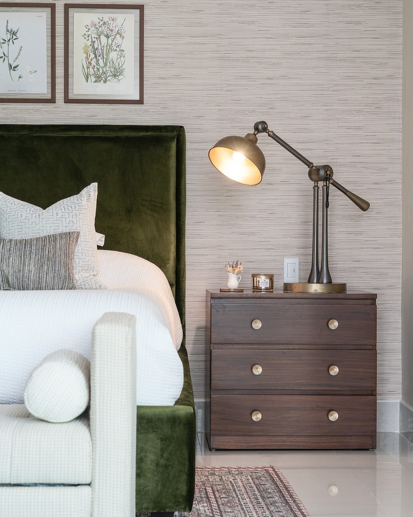
Credits: Instagram
Soft fabric makes an earthy color feel inviting at the head of the bed. PATH Interior Design uses an olive velvet headboard with an inset border, setting it beside a dark wood nightstand and beneath botanical drawings.
White bedding gives the upholstery a clean edge, while smaller patterned cushions keep the arrangement from feeling too formal. To borrow the idea, compare fabric samples upright instead of laying them flat on a table.
Velvet changes with the direction of its pile and the position of the light. Choose nearby wood for a pleasing contrast rather than an exact color match.
A restrained pair of drawings can complete the composition without hiding the headboard or adding another large block of saturated color.
Frame Olive Upholstery With Carved Wood
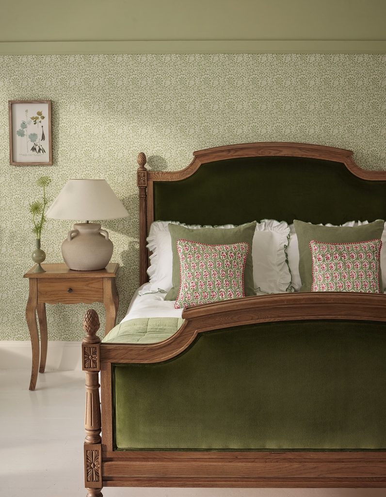
Credits: Instagram
Traditional furniture can carry green without depending on painted walls. This bed places olive upholstery inside a carved wood frame, allowing the padded panels and detailed edges to stand out separately.
White linens lighten the center, while delicate leafy wallpaper continues the natural palette around it. The result feels layered because the largest shapes stay easy to recognize.
If you already own an ornate bed, try an olive coverlet or cushions before considering professional reupholstery. Either can test the relationship between green and the existing wood.
Avoid piling pillows so high that they conceal the frame’s best details. A simple bedside lamp gives the eye a quieter place to rest beside the carving, pattern, and soft sheen of the upholstery.
Extend A Scalloped Headboard Sideways
Credits: Instagram
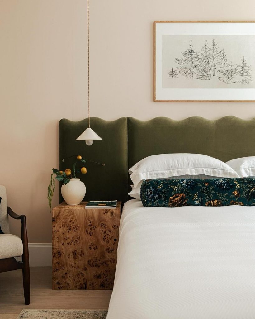
An undulating outline can replace the collection of objects above a bed. Bergman & Mar’s olive headboard extends sideways behind the nightstand, with a gentle scalloped top that becomes the room’s main decorative gesture.
A compact pendant hangs in front, and a blocky wood bedside table introduces a contrasting shape. Keep a similar arrangement simple enough that the curve remains visible from the doorway.
Before commissioning a wide headboard, plan the positions of lights, switches, and tables together rather than treating each as a separate purchase. White bedding and one long patterned cushion leave generous areas of upholstery exposed.
The muted pink wall provides warmth while allowing the yellow-green fabric to retain a distinct outline across the whole sleeping area.
Unite Twin Beds With Olive Paneling
Credits: Instagram
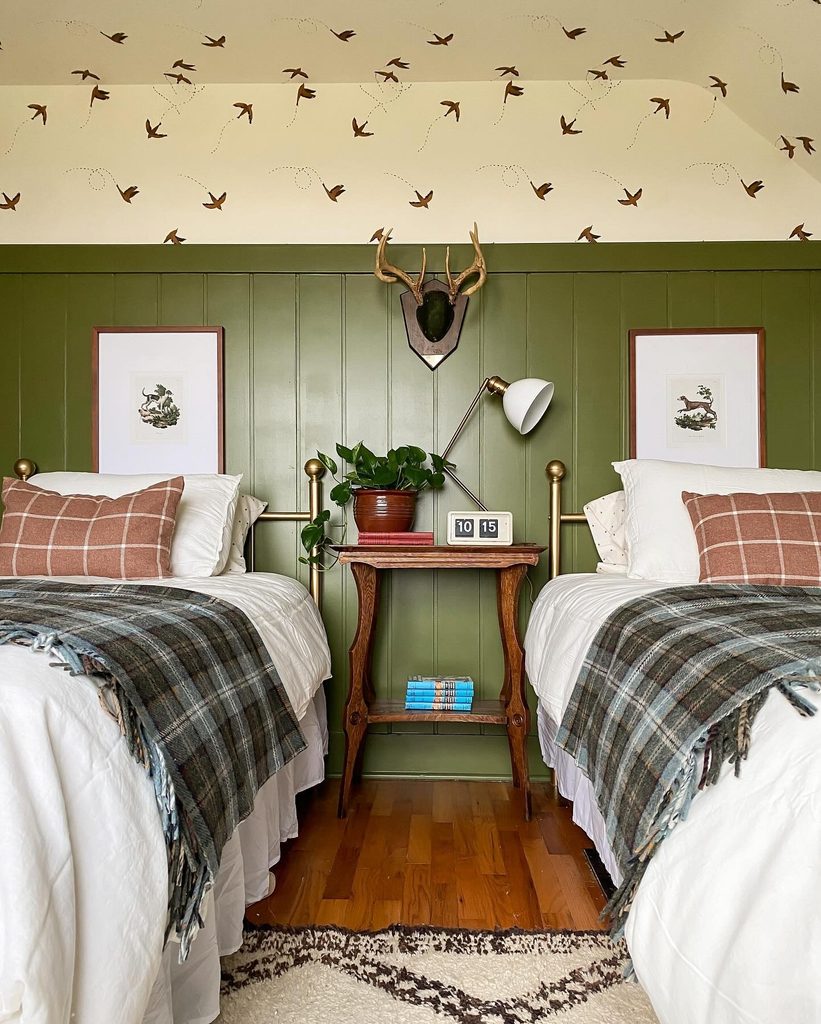
Sharing a room can feel orderly without making everything identical. These twin beds sit against warm olive paneling, with one wooden table between them and a single lamp serving the central space.
Bird wallpaper above keeps the upper walls lively, while white bedding separates the darker bed frames from the green backdrop. If you are planning a similar guest arrangement, decide what each sleeper needs within reach before choosing a shared table.
Its surface should support practical use without becoming crowded with decoration. Repeating the same bedding on both beds creates continuity; smaller cushions can introduce variation.
Carry a little warm color through those accents so the olive connects naturally with the wood and metallic details already in the room.
Blend Wardrobes Into Olive Walls
Credits: Instagram
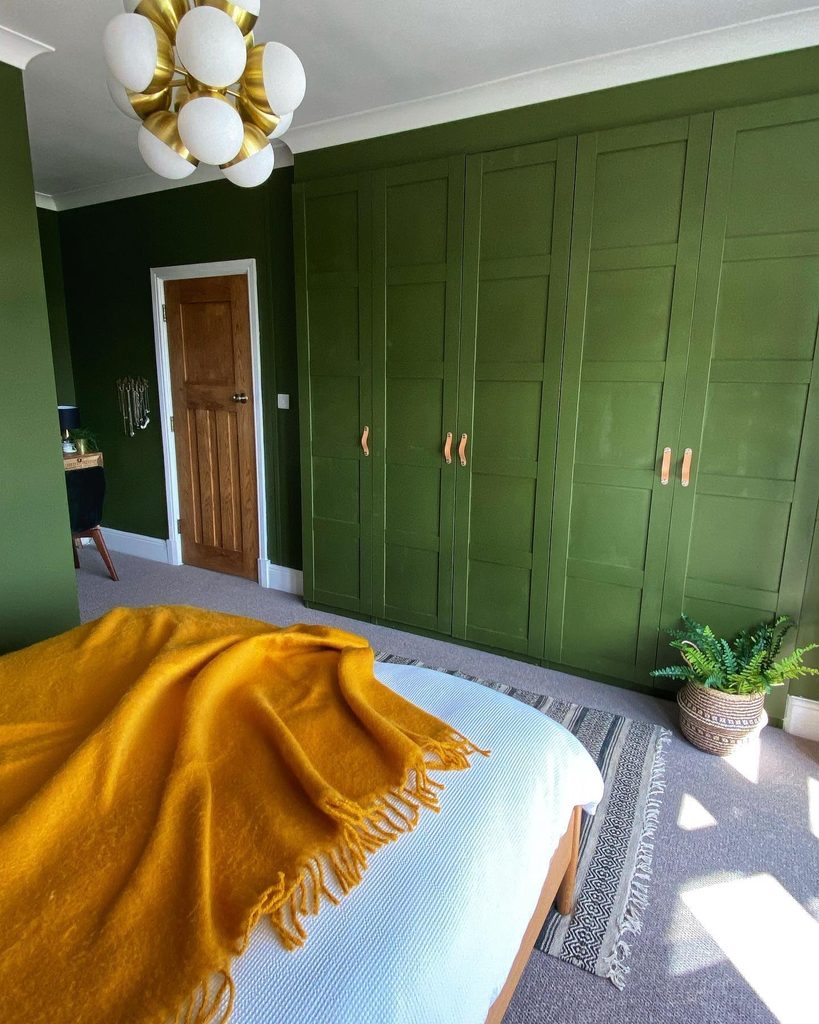
Storage pieces can become part of the background when their color follows the surrounding wall. This bedroom uses olive across tall paneled wardrobe doors and adjoining surfaces, with warm-toned handles providing just enough definition.
White trim overhead and a natural wood door keep the scheme from becoming completely uniform. The golden throw offers a smaller, brighter note near the bed.
To adapt the idea, assess the doors’ existing finish and choose a preparation method suited to that surface. Test the paint beside flooring and hardware before tackling the whole bank.
Matching color does not require hiding every seam: the door panels still provide useful rhythm. Leave handles visually distinct enough to find easily, especially when the bedroom lighting is low.
Break Up Olive With Wood Slats
Credits: Instagram
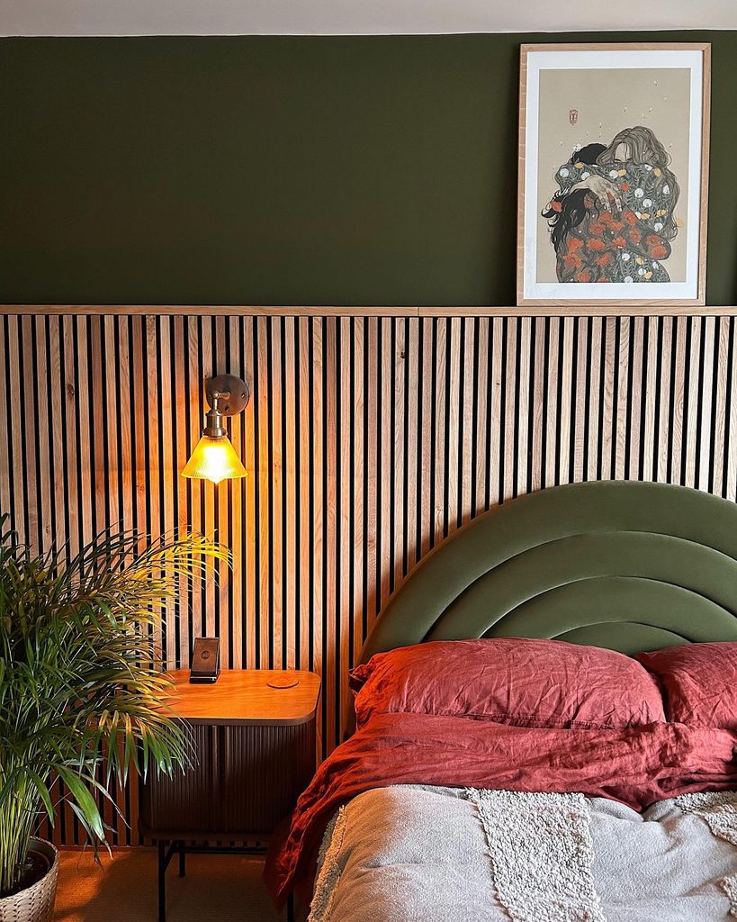
Contrasting surfaces can make a green bedroom feel richer without adding more colors. In this room, an arched olive headboard sits against vertical wood slats, with a darker olive section above the ledge.
The repeated curved upholstery interrupts the straight lines behind it, while brick-red bedding warms the composition. If you want to combine wall paneling with an upholstered bed, compare their patterns at full scale before ordering.
Slender slats and broad padded curves work differently from two equally fine textures. Keep the ledge lightly styled so its horizontal edge remains readable.
A single framed print is enough here. Plan the bedside lighting alongside the paneling so cords and fittings have a deliberate place within the arrangement around the bed.
Build A Bed Around Olive Linen
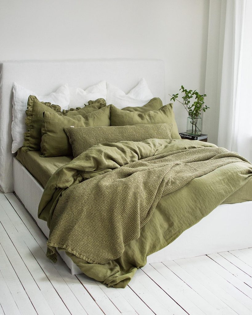
Credits: Instagram
Changing the bed linens is a straightforward way to try a substantial amount of green.
This maker’s photograph layers olive bedding on a pale bed, with ruffled shams and a loose knitted throw adding different textures within the same color family.
The white surroundings keep the folds and edges easy to see. When building your own combination, compare the pieces together in daylight; two products labeled olive may have quite different yellow or gray undertones.
You can allow that variation as long as it looks intentional. Choose a simpler pillow arrangement if the ruffles already provide enough detail.
For everyday use, check each item’s care instructions before mixing textures that need different washing routines or are awkward to maintain together.
Frame A Bedroom Approach With Olive
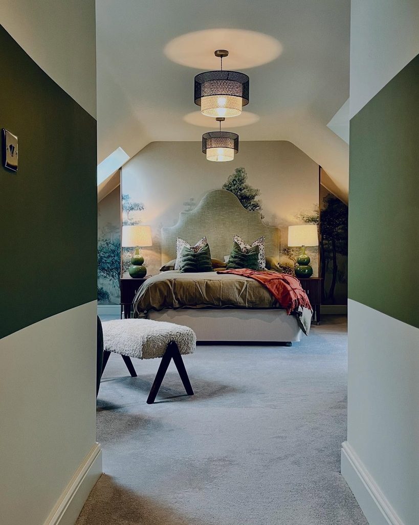
Credits: Instagram
The route into a bedroom can be part of its design. This project places olive bands across the walls of the approach, leading the eye toward a woodland mural and shaped headboard farther inside.
Pale areas above and below the bands prevent the passage from becoming one solid dark tunnel. If your room has a similar entry, mark the proposed line at several points before painting, then check it from both directions.
The band should relate comfortably to nearby doors and furniture rather than cutting through them accidentally. Repeat a little of the color at the bed to connect the two areas.
A rust throw adds warmth at the destination, giving the deeper green another earthy tone to sit beside.
Highlight A Dark Bedroom Fireplace
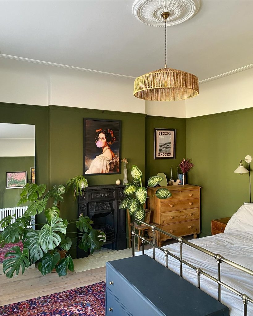
Credits: Instagram
Period features often look sharper against a color with some depth. Olive paint surrounds this bedroom’s dark fireplace, giving its outline definition without resorting to a white feature wall.
A playful portrait, plants, and a wood chest keep the corner personal, while the broad pale strip overhead preserves a lighter transition to the ceiling.
When working around an existing mantel, choose artwork in proportion to its width and leave space for the surrounding wall to show. You do not need to fill every nearby surface with matching accessories.
Repeating warm wood or woven texture elsewhere can connect the corner to the bed. Keep any styling appropriate to the fireplace’s actual use, and follow its requirements if it is still operational.
Give A Bedroom Desk A Quiet Backdrop
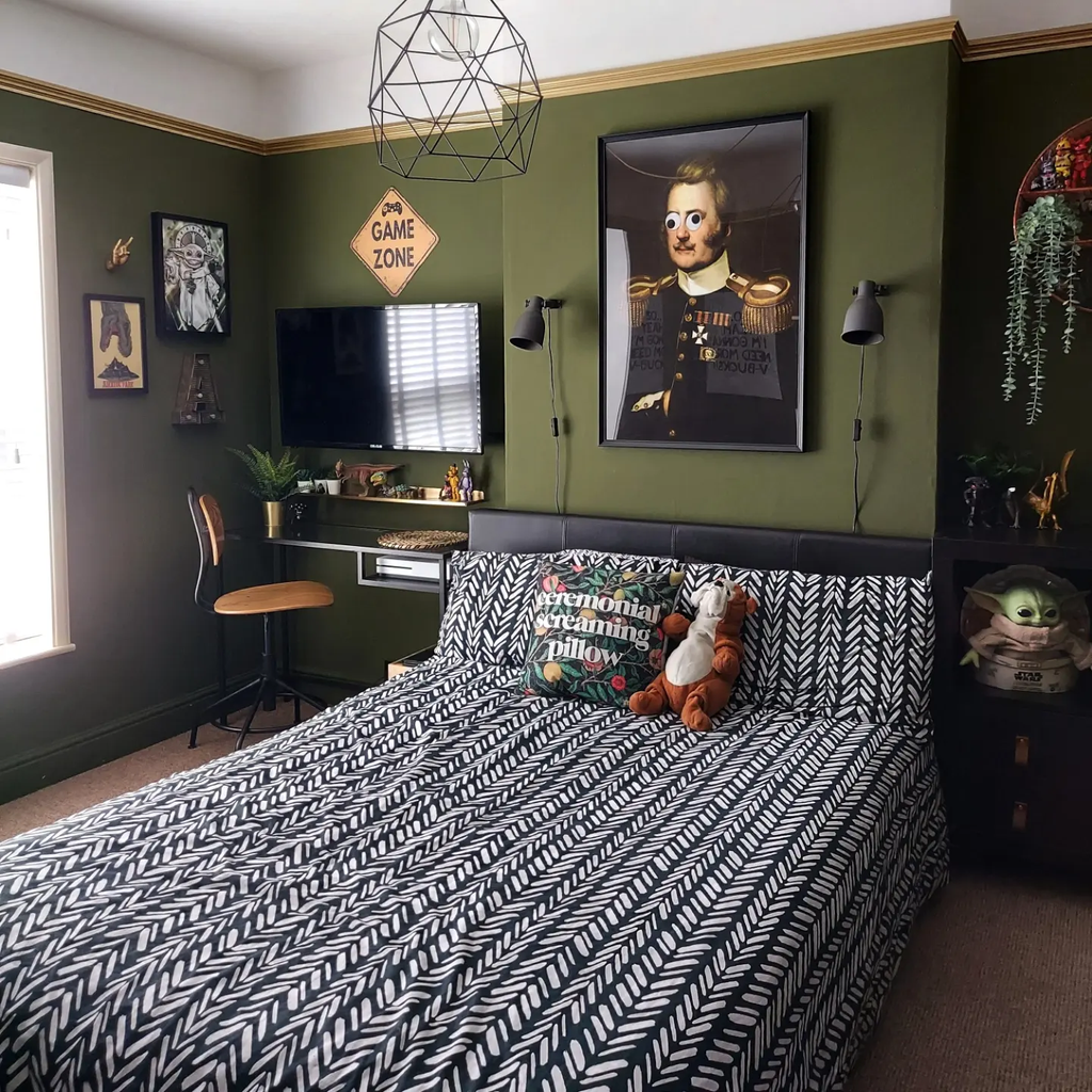
Credits: Instagram
A work area can feel less intrusive when it shares the bedroom’s main palette. Here, a dark desk sits beside the bed against olive walls, with a wood-seat chair and wall-mounted screen keeping the arrangement compact.
Black reading lights and a simple headboard repeat the darker details across the sleeping area. For a similar layout, measure the chair’s movement as carefully as the desk itself.
The path beside the bed needs to remain usable when someone is seated. Keep frequently handled items within reach and provide lighting suited to the work you do.
Graphic bedding can bring personality to the room while the green background connects the desk, pictures, and bed into one coherent arrangement instead of separate competing zones.
Make Room For A Woven Reading Chair
Credits: Instagram
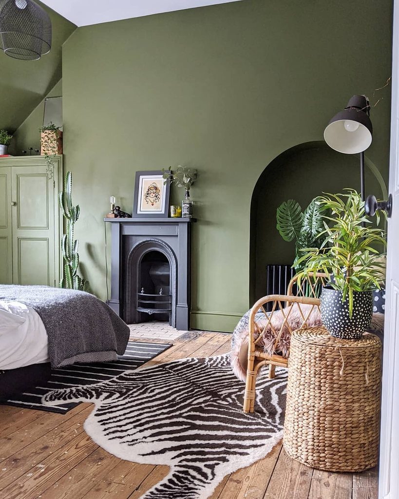
A corner becomes more inviting when it has a clear purpose. This olive bedroom includes a woven chair, a small woven side table, and an adjustable floor lamp beside an arched recess.
The natural texture contrasts with the painted wall, while a zebra-pattern rug gives the corner a stronger identity. Before adding seating, check that you can still open nearby furniture and walk around the bed comfortably.
A chair should earn its footprint through regular use, rather than becoming another place to stack laundry. Position the lamp for the seated person instead of centering it only for appearance.
One nearby plant can soften the arrangement, provided its light requirements suit the spot and its leaves do not crowd the chair.
Repeat Olive In Lighter Bedding
Credits: Instagram
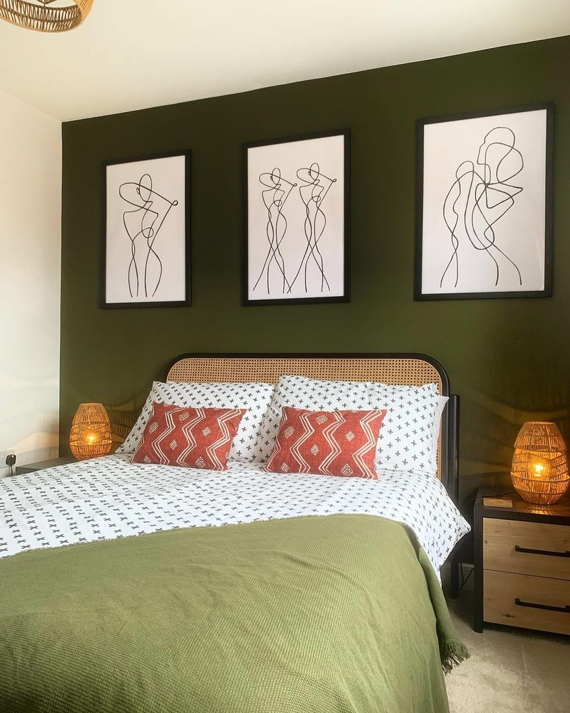
A paler version of the wall color can connect the bed without making it disappear. In this room, a pale olive coverlet repeats the deeper green behind the headboard, while white patterned bedding creates a clear break between them.
Three black-framed line drawings add contrast above, and coral cushions introduce warmth near the center. This is a useful approach when you like a strong accent wall but want seasonal flexibility in the textiles.
Compare greens together rather than searching for an exact match. A shared yellow undertone usually matters more than identical depth.
Keep enough pale bedding exposed for the different shades to remain distinguishable. Simple artwork helps maintain that balance without introducing another dense pattern beside the patterned pillows.
Pair Olive Upholstery With Cooler Greens
Credits: Instagram
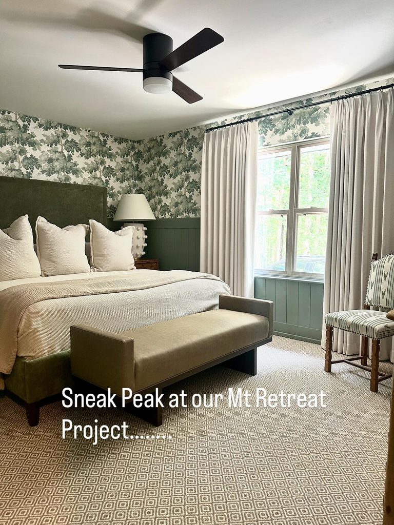
Different greens can belong together when their roles are clear. This bedroom pairs an earthy olive upholstered bed with cooler green paneling and leafy wallpaper, using cream bedding and curtains to separate the surfaces.
A muted bench continues the soft furnishings at the foot without copying the wall’s pattern. If you want to combine olive with sage, collect samples of every finish and view them as one group before committing.
Let one green dominate and use the others more selectively. The plain bed upholstery provides a resting point beneath the busier wallpaper here.
Keep additional accessories restrained so the contrast between warmer fabric and cooler walls remains the interesting part, rather than burying it under many more competing accent colors.
Try Golden Olive In Small Cushions
Credits: Instagram
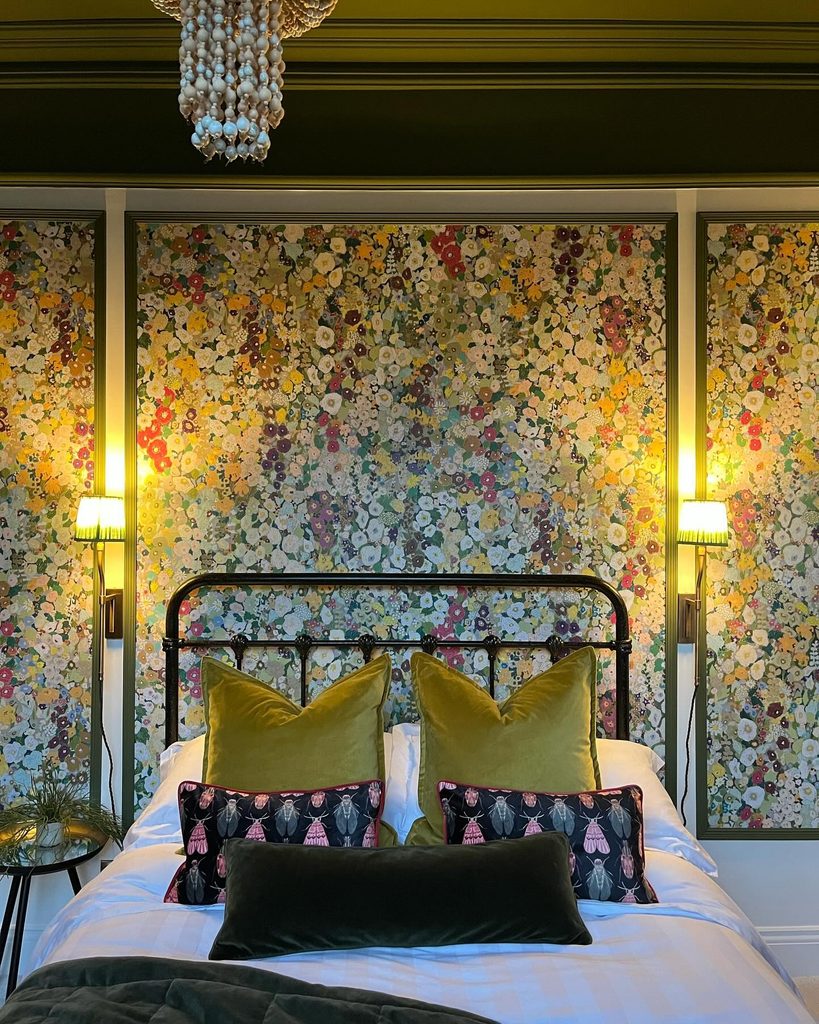
Textile accents let you explore the warmer end of the green spectrum. In this bedroom, golden-olive cushions brighten white bedding, with darker green layers and colorful floral wall panels surrounding them.
Their sheen makes the yellow undertone noticeable beneath the warm lamps. If that effect appeals to you, try a pair of cushion covers before committing to a larger upholstered piece.
View them beside your existing bedding during the day and evening, since the color may shift considerably. Use one plain layer between busy patterns to keep the arrangement readable.
These cushions stand out because they offer a broad, simple surface against the floral background, giving the eye a pause while still participating in the room’s lively mix of colors.